
Strategy Hub: Thoughts Module
Strategy Hub: Thoughts Module
The Thoughts module within the Strategy Hub functions as a digital canvas or whiteboard, allowing you to visually map out brainstorming sessions, strategy links, and project ideas using interactive shapes.
Managing Thoughts Boards
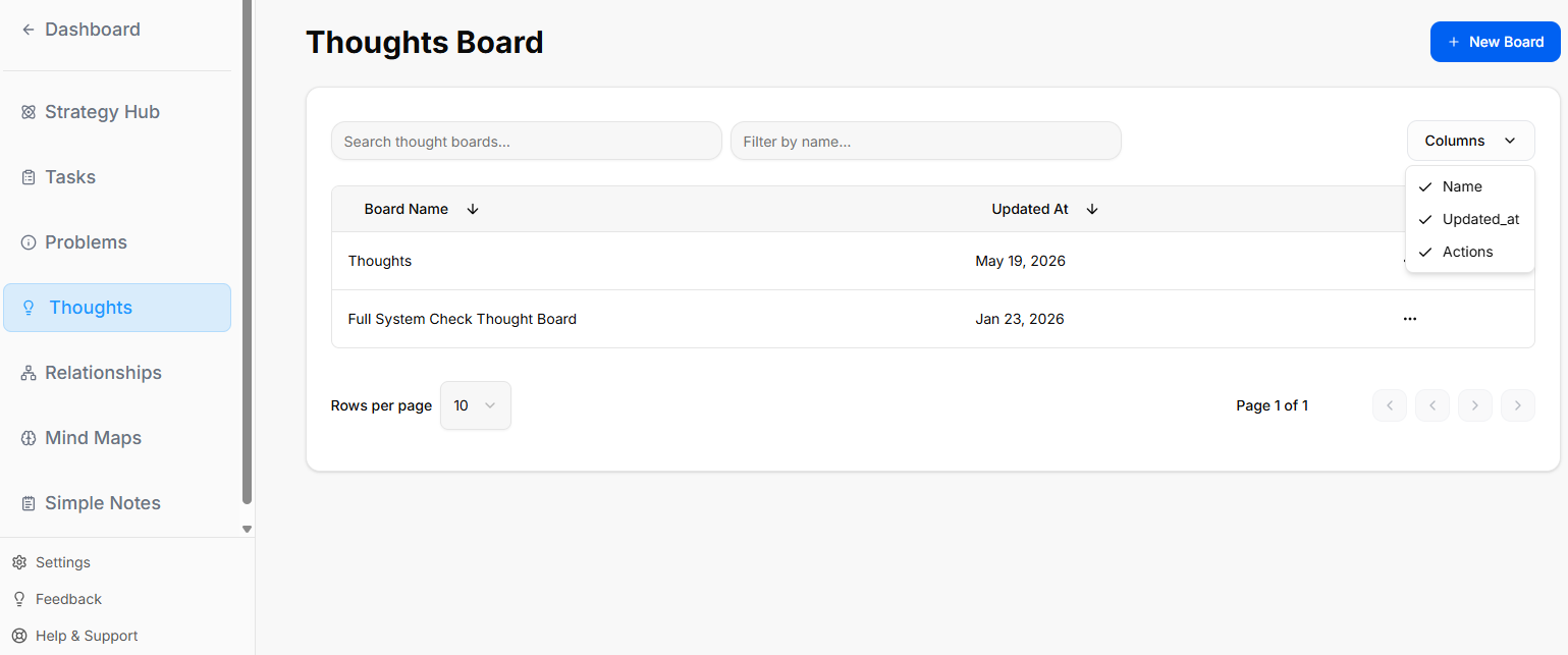
When you enter the Thoughts module, you are presented with a global directory of your active brainstorming and strategy environments:
-
Creating a Whiteboard: Click the blue + New Whiteboard button at the top right to start a fresh visual planning environment.
-
Board Directory View: Track active design spaces along with their last relative modification date under the Updated At column.
-
Filtering & Columns: Use the top text bars to search specific whiteboard names. Use the Columns dropdown tool to show or hide parameters like Name, Updated_at, or Actions.
-
Board Context Menu: Clicking the three dots icon (
...) on the right side of any individual board row opens control configurations to View, Rename, or Delete that whiteboard.
Inside a Thoughts Board
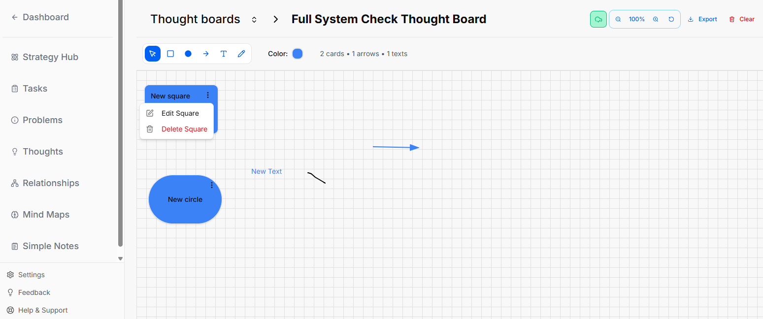
When you select and open an individual whiteboard from your directory, you enter an interactive grid canvas workspace where you can sketch, label, and manipulate shapes.
Canvas Layout & Header Controls
The top header of the whiteboard area contains configuration data, canvas actions, and canvas statistics:
The Canvas Toolbar
A horizontal toolbar floats at the top-left section of the grid canvas to let you build out your board:
-
Selection Tool (Cursor Icon): The primary blue pointer used to select, drag, or highlight elements on the grid.
-
Square Shape: Click this icon to drop a customizable square onto the workspace.
-
Circle Shape: Click this icon to drop a customizable circle onto the workspace.
-
Connection Arrow: Click this tool to manually draw directional lines connecting your elements.
-
Text Tool ("T" Icon): Allows you to drop standalone text blocks directly onto the open canvas grid.
-
Draw Tool (Pencil Icon): Activates freehand drawing or sketching directly on top of the grid space.
-
Global Canvas Color: Shows a Color circle indicator (e.g., blue) that tracks your currently selected element tint.
-
Board Statistics: Live counters immediately follow the color wheel to show you the exact total of items placed on the canvas (e.g.,
2 cards • 1 arrows • 1 texts).
Editing a Shape Modal
When you click the three dots menu (...) on a shape and choose to edit it, a modal pop-up window appears in the center of the screen with the following configuration fields:
-
Modal Title: Displays the name of the shape type (e.g., Circle) at the top left.
-
Title Field: A text input box where you can type or change the main title text displayed on the shape.
-
Description Field: A larger text area box labeled Description to add detailed notes or context inside the shape properties.
-
Color Selection: A row of interactive circular color buttons that allows you to click and choose the color styling for the shape.
-
Action Buttons: Two options sit at the bottom right corner of the window to finalize your changes:
-
Cancel: Closes the modal without saving any modifications.
-
Update: Saves your text and color changes directly to the canvas element.
-
Editing Canvas Text Blocks
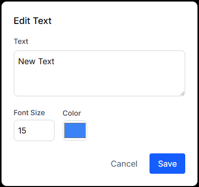
When managing a standalone text element on the canvas, the properties window changes to a streamlined Edit Text modal with specific sizing attributes:
-
Text: A multi-line editing box where you input the literal message displayed on the canvas grid.
-
Font Size: A numerical box where you manually type or change the font scaling size directly (e.g., 15). Note: There is no font-family picker layout; styling changes are strictly adjusted by size.
-
Color: A color indicator box showing the current color assigned to the text layer.
-
Form Submissions:
-
Cancel: Standard link text button to abandon changes.
-
Save: A blue button to lock in your text edits and font scaling parameters.
-
No comments to display
No comments to display