
Brand Foundations & Brand Kit Stage
Brand Foundations & Brand Kit Stage
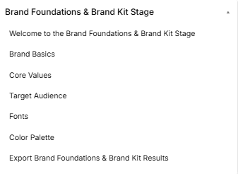
The Brand Foundations & Brand Kit Stage is the creative identity phase of the roadmap, broken down into seven distinct sequential sub-stages accessed via the left-hand sidebar dropdown:
-
Sub-Stage 1: Welcome to the Brand Foundations & Brand Kit Stage
-
This is the initial onboarding landing view that provides context, a core introduction video, and foundational directions before branding work begins.
-
-
Sub-Stage 2: Brand Basics
-
The second item within the sequence, focusing on uploading a company logo, setting basic brand details, selecting baseline communication styles, and inputting your industry classification code.
-
-
Sub-Stage 3: Core Values
-
The third item within the sequence, helping founders select or customize three to five key company tenets that define organizational culture and align marketing practices.
-
-
Sub-Stage 4: Target Audience
-
The fourth item within the sequence, allowing creators to select or manually describe primary target audience segments to ensure visual branding connects with the right market.
-
-
Sub-Stage 5: Fonts
-
The fifth item within the sequence, dedicated to testing, previewing, and assigning official typography configurations for both primary headlines and paragraph text.
-
-
Sub-Stage 6: Color Palette
-
The sixth item within the sequence, focusing on selecting predefined themes or customizing individual hex codes to lock down a primary, secondary, and accent color palette.
-
-
Sub-Stage 7: Export Brand Foundations & Brand Kit Results
-
The final technical milestone within this phase, presenting a read-only historical review layout of all branding asset selections with a tool to generate an exportable summary PDF report.
-
Stage Controls
Sub-Stage 1: Welcome to the Brand Foundations & Brand Kit Stage
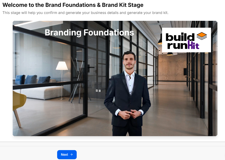
This sub-stage screen serves as the formal onboarding gateway for the branding phase, introducing the founder to identity creation and visual asset generation.
Canvas Layout & Workspace Components
-
Main Workspace Title: Displays "Welcome to the Brand Foundations & Brand Kit Stage".
-
Instructional Subtitle: “This stage will help you confirm and generate your business details and generate your brand kit.”
-
Branding Foundations Media Panel: Features a large, central display graphic or video asset set in an office hallway. The media asset displays the title text "Branding Foundations" on the upper-left area and features the official buildrunkit logo badge on the upper-right corner.
Navigation Controls
Sub-Stage 2: Brand Basics
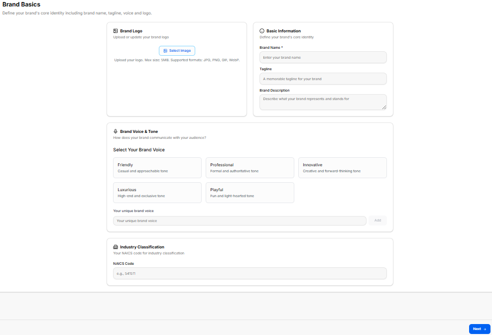
This sub-stage screen focuses on defining your brand's foundational identity parameters. It establishes core visual traits, essential baseline information, and conversational values that dictate how your brand communicates with your audience.
Canvas Layout & Workspace Components
-
Main Workspace Title: Displays "Brand Basics" accompanied by a clear setup subtitle: “Define your brand's core identity including brand name, tagline, voice and logo.”
-
Brand Logo Upload Panel: A structured block dedicated to media configuration on the upper left:
-
Header: Brand Logo (accompanied by an image icon)
-
Subtitle: “Upload or update your brand logo”
-
Upload Trigger: Features a clear blue border Select Image button.
-
File Constraints Label: Specifies “Upload your logo. Max size: 5MB. Supported formats: JPG, PNG, GIF, WebP.”
-
-
Basic Information Form Panel: A structured data input layout placed on the upper right side:
-
Header: Basic Information (accompanied by a clock/target icon)
-
Subtitle: “Define your brand's core identity”
-
Brand Name Input Field: A text entry field designated with a required indicator labeled *“Brand Name ” and displaying placeholder text “Enter your brand name”.
-
Tagline Input Field: A text entry container labeled “Tagline” with a placeholder reading “A memorable tagline for your brand”.
-
Brand Description Input Area: A larger, multi-line text input block labeled “Brand Description” showing placeholder text “Describe what your brand represents and stands for”.
-
Brand Voice & Tone Configuration Suite
A wide, centralized setting segment located below the foundational data inputs allows creators to define market messaging styles:
-
Header: Brand Voice & Tone (accompanied by a microphone icon)
-
Instructional Guide: “How does your brand communicate with your audience?”
-
Preset Tone Selector Blocks: Displays five interactive presets arranged in a layout grid to capture your brand positioning:
-
Friendly: “Casual and approachable tone”
-
Professional: “Formal and authoritative tone”
-
Innovative: “Creative and forward-thinking tone”
-
Luxurious: “High-end and exclusive tone”
-
Playful: “Fun and light-hearted tone”
-
-
Custom Tone Utility: Features a text box field labeled “Your unique brand voice” alongside an interactive Add button, enabling users to register their own communication values manually.
Industry Classification Component
-
Header: Industry Classification (accompanied by a building icon)
-
Label Text: “Your NAICS code for industry classification”
-
NAICS Code Field: Provides a standard numerical text entry layout container labeled “NAICS Code” with placeholder text “e.g., 541511”.
Navigation Controls
-
Next Button: A blue Next → navigation utility button is located at the lower right margin of the footer line to save your brand basics profile data and advance straight to Sub-Stage 3 (Core Values).
Sub-Stage 3: Core Values
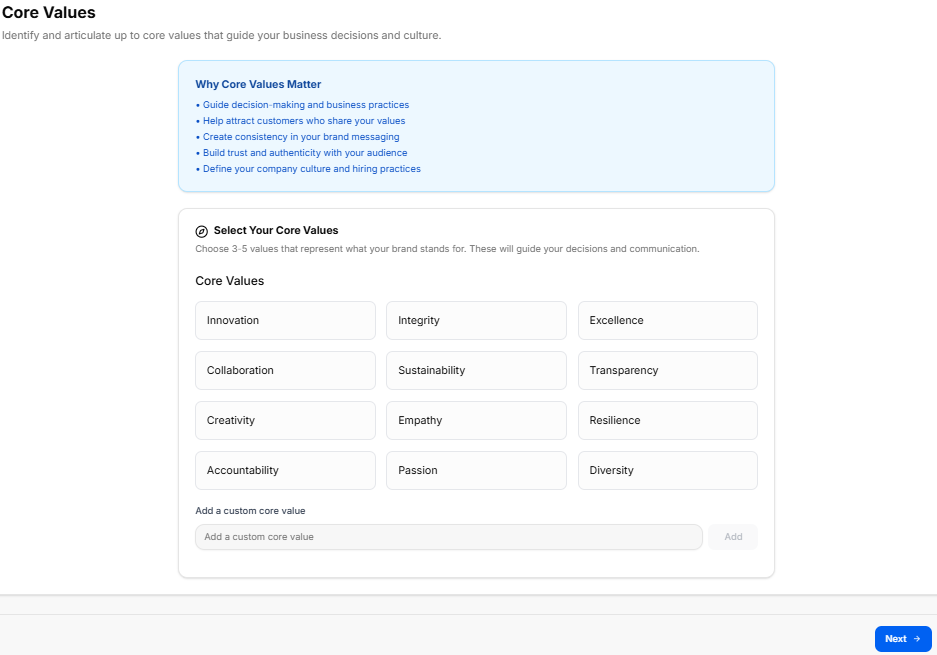
This sub-stage centers on identifying and articulating the core foundational values that guide your business choices, shape your organizational culture, and keep your marketing messages clear and consistent.
Canvas Layout & Workspace Components
-
Main Workspace Title: Displays "Core Values" with a guiding subtitle: “Identify and articulate up to core values that guide your business decisions and culture.”
-
Educational Information Panel: A full-width light-blue callout container positioned at the top of the workspace:
-
Header: Why Core Values Matter
-
Bullet Points:
-
Guide decision-making and business practices
-
Help attract customers who share your values
-
Create consistency in your brand messaging
-
Build trust and authenticity with your audience
-
Define your company culture and hiring practices
-
-
Core Values Selection Suite
A comprehensive configuration area below the educational panel allows founders to choose and build out their cultural anchors:
-
Selection Header: Select Your Core Values (accompanied by a target/compass icon)
-
Instructional Label: “Choose 3-5 values that represent what your brand stands for. These will guide your decisions and communication.”
-
Preset Values Grid: Twelve modular select buttons arranged in a clean, three-column layout:
-
Innovation | Integrity | Excellence
-
Collaboration | Sustainability | Transparency
-
Creativity | Empathy | Resilience
-
Accountability | Passion | Diversity
-
-
Custom Core Value Utility: Includes an input field labeled “Add a custom core value” with an adjacent Add button, allowing users to define specific individual tenets that might not be captured by the defaults.
Navigation Controls
Sub-Stage 4: Target Audience
This sub-stage centers on refining and defining your primary target audience based on your market research insights. Selecting these audience tags ensures your upcoming visual identity and messaging connect with the right groups.
Canvas Layout & Workspace Components
-
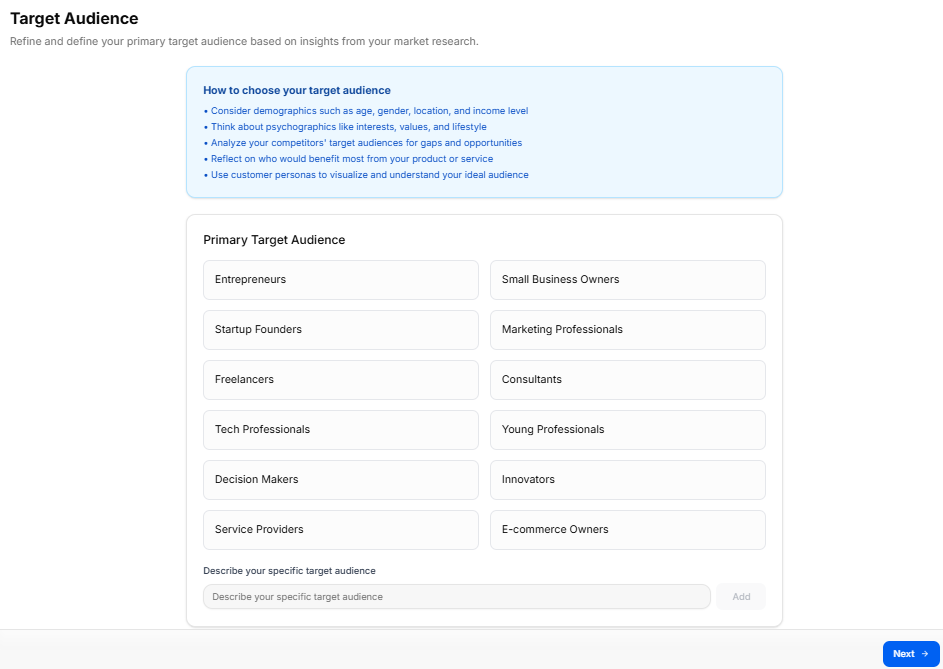
Main Workspace Title: Displays "Target Audience" accompanied by an instructional subtitle: “Refine and define your primary target audience based on insights from your market research.”
-
Educational Information Panel: A full-width blue callout container positioned at the top of the workspace canvas:
-
Header: How to choose your target audience
-
Bullet Points:
-
Consider demographics such as age, gender, location, and income level
-
Think about psychographics like interests, values, and lifestyle
-
Analyze your competitors' target audiences for gaps and opportunities
-
Reflect on who would benefit most from your product or service
-
Use customer personas to visualize and understand your ideal audience
-
-
Primary Target Audience Selection Suite
A wide configuration panel below the guide area allows creators to segment their primary user profiles:
-
Selection Header: Primary Target Audience
-
Preset Audience Tags Grid: Twelve interactive selection options organized neatly into a two-column layout:
-
Entrepreneurs | Small Business Owners
-
Startup Founders | Marketing Professionals
-
Freelancers | Consultants
-
Tech Professionals | Young Professionals
-
Decision Makers | Innovators
-
Service Providers | E-commerce Owners
-
-
Custom Audience Utility: Includes a manual text entry line labeled “Describe your specific target audience” paired with an adjacent Add button to register unique user segments.
Navigation Controls
-
Next Button: A blue Next → action button is positioned at the lower right-hand edge of the footer line. Clicking this locks in your selected audience criteria and moves directly to Sub-Stage 5 (Fonts).
Sub-Stage 5: Fonts
This sub-stage workspace lets founders select, preview, and assign their platform's official typography pairing, defining separate font styles for core marketing headlines and general readable body content.
Canvas Layout & Workspace Components
-
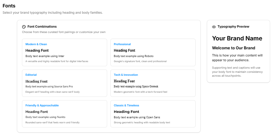
Main Workspace Title: Displays "Fonts".
-
Instructional Subtitle: “Select your brand typography including heading and body families.”
-
Typography Preview Card: A sticky vertical container docked on the right side of the workspace to display real-time configuration changes:
-
Header Title: Typography Preview (accompanied by an eye icon).
-
Live Render Content: Displays a sample layout structure reading: “Your Brand Name — Welcome to Our Brand — This is how your main content will appear to your audience. Supporting text and captions will use your body font to maintain consistency across all touchpoints.”
-
Font Selection & Discovery Tools
The workspace details three main interaction methods to browse and assign typography choices:
-
1. Curated Font Combinations Suite (Upper Left):
-
Header: Font Combinations (accompanied by a palette icon).
-
Description: “Choose from these curated font pairings or customize your own”.
-
Preset Pairing Choices: Six pre-packaged design blocks are available for quick selection:
-
Modern & Clean: Heading Font / Body text example using Inter.
-
Professional: Heading Font / Body text example using Roboto.
-
Editorial: Heading Font / Body text example using Source Sans Pro.
-
Tech & Innovation: Heading Font / Body text example using Space Grotesk.
-
Friendly & Approachable: Heading Font / Body text example using Nunito.
-
Classic & Timeless: Heading Font / Body text example using Open Sans.
-
-
-
2. Browse Heading Fonts Catalog (Middle Panel):
-
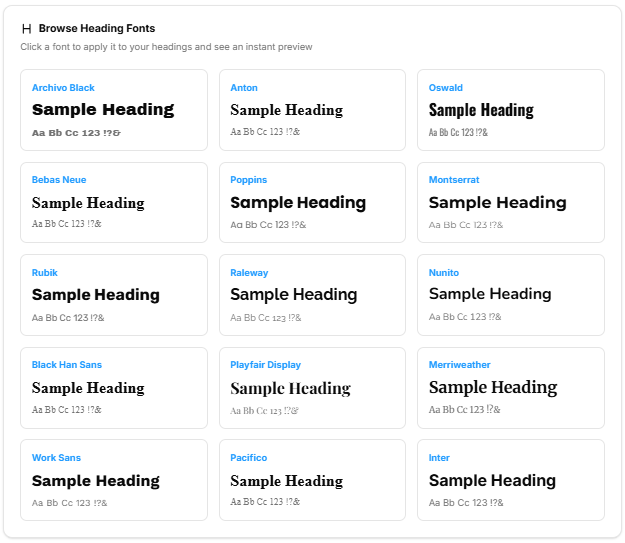
Header: Browse Heading Fonts (accompanied by a large "H" letter icon).
-
Description: “Click a font to apply it to your headings and see an instant preview”.
-
Font Library Grid: Displays 15 selectable heading options, showing typography styling for options like Archivo Black, Anton, Oswald, Bebas Neue, Poppins, Montserrat, Rubik, Raleway, Nunito, Black Han Sans, Playfair Display, Merriweather, Work Sans, Pacifico, and Inter.
-
-
3. Browse Body Fonts Catalog (Lower Panel):
-
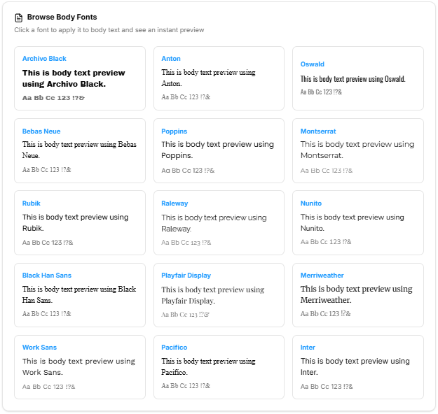
Header: Browse Body Fonts (accompanied by a document text icon).
-
Description: “Click a font to apply it to body text and see an instant preview”.
-
Font Library Grid: Offers the same 15 selectable style options optimized for paragraphs, long descriptions, and readable layouts.
-
Final Font Assignment Matrix (Bottom Canvas)
Once specific options are selected from the menus above, the system locks them into the primary setup inputs:
-
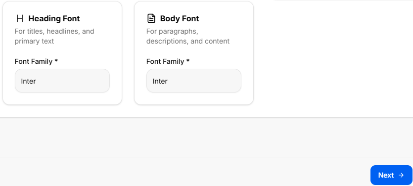
Heading Font Selection Card:
-
Details: “For titles, headlines, and primary text”.
-
Selection Field: Required dropdown menu labeled Font Family * (e.g., displaying Inter).
-
-
Body Font Selection Card:
-
Details: “For paragraphs, descriptions, and content”.
-
Selection Field: Required dropdown menu labeled Font Family * (e.g., displaying Inter).
-
Navigation Controls
-
Next Button: A blue Next → navigation utility button is located at the lower right margin of the footer. Clicking this saves your assigned font configuration preferences and routes directly to Sub-Stage 6 (Color Palette).
Sub-Stage 6: Color Palette
This sub-stage workspace allows founders to design and implement a cohesive brand color system. By selecting primary, secondary, and accent colors, creators establish a visual hierarchy that ensures consistency across all digital and physical brand touchpoints.
Canvas Layout & Workspace Components
-
Main Workspace Title: Displays "Color Palette".
-
Instructional Subtitle: “Design your brand’s color system including primary, secondary, and accent colors.”
-
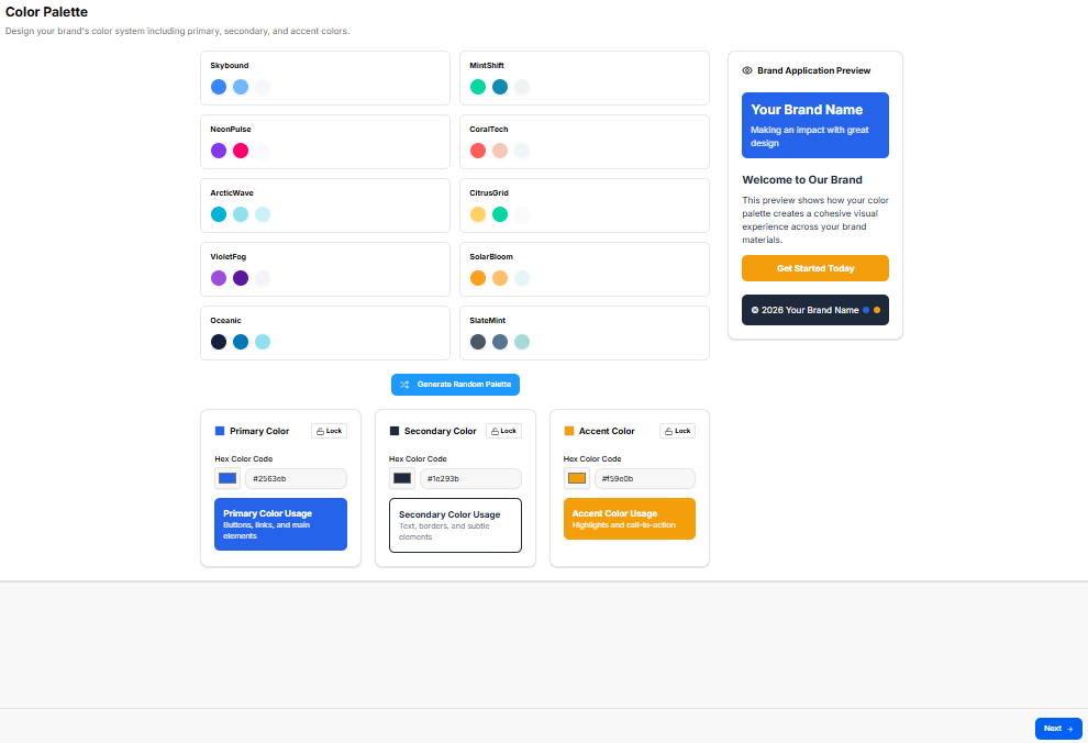
Brand Application Preview Card: A sticky vertical container docked on the right side of the workspace to demonstrate real-time color application:
-
Header Title: Brand Application Preview (accompanied by a palette icon).
-
Live Render Content: Shows how the selected palette applies to a sample interface, including the brand name, descriptive text, and a primary action button labeled "Get Started Today".
-
Color Selection & Customization Suite
The workspace provides multiple ways to discover and lock in the brand's color identity:
-
1. Predefined Color Palettes (Top Left):
-
Description: A grid of eight professionally curated color schemes designed for different brand personalities:
-
Skybound, MindShift, NoirGlow, PastelBloom, ArcticWave, CitrusGrid, Oceanic, and SlateMist.
-
-
Interaction: Clicking a palette automatically updates the primary, secondary, and accent fields below.
-
-
2. Automated Generation:
-
Action Button: A "Generate Random Palette" utility button centered above the customization fields for rapid ideation.
-
-
3. Color Specification Matrix (Bottom Canvas):
-
A row of three interactive color-configuration blocks:
-
Primary Color (Blue Icon): Labeled for usage in “Buttons, links, and main elements.” Includes a Hex Color Code input (e.g., #0263fb) and a Lock toggle.
-
Secondary Color (Navy Icon): Labeled for usage in “Icons, borders, and subtle elements.” Includes a Hex Color Code input (e.g., #1e293b) and a Lock toggle.
-
Accent Color (Yellow Icon): Labeled for usage in “Highlights and call-to-action.” Includes a Hex Color Code input (e.g., #f5b02b) and a Lock toggle.
-
-
Navigation Controls
Sub-Stage 7: Export Brand Foundations & Brand Kit Results
This final checkpoint compiles all inputs, selections, and chosen brand identity assets from the Brand Foundations phase into a centralized review layout. It offers a read-only historical overview alongside file export features before finalizing the stage.
Canvas Layout & Workspace Components
-
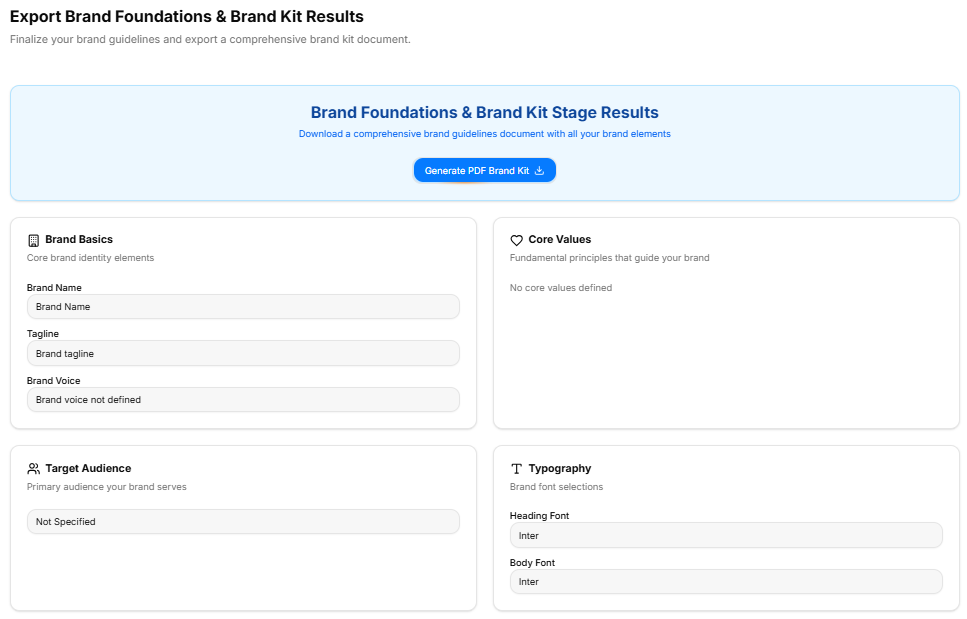
Main Workspace Title: Displays "Export Brand Foundations & Brand Kit Results" accompanied by an instructional subtitle: “This is an overview of what you told us in the brand foundations & brand kit stage, you can also export a brief summary of your findings as a pdf file.”
-
Document Generation Panel: A full-width light-blue callout container positioned at the top of the canvas:
-
Description: Instructs the user to “Download a comprehensive PDF report containing all your brand foundations & brand kit findings”.
-
Action Button: Features a centered blue Generate PDF Report action key with an integrated download tray icon.
-
Core Identity Settings Summary Grid (Upper Panel)
The top half of the summary layout utilizes a two-column grid framework to display foundational identity selections:
-
Brand Basics Card:
-
Label: “Your brand basics details”
-
Data Rows: Displays the confirmed brand name, tagline, description, chosen brand tone, and industry NAICS code classification.
-
-
Core Values Card:
-
Label: “The core values for your brand”
-
Data Field: Displays the list of selected cultural anchors and operational principles.
-
-
Target Audience Card:
-
Label: “The target audience classification for your brand”
-
Data Field: Displays the chosen audience segments and primary user profiles.
-
Visual Brand Kit Summaries (Lower Panel)
The bottom section tracks the visual assets, color systems, and typographic pairings logged throughout the creative development phase:
-
Fonts Summary Block:
-
Header Title: Fonts Summary
-
Label: “Your chosen typography families for heading and body text”
-
Data Field: Displays the locked-in heading and body text font family designations.
-
-
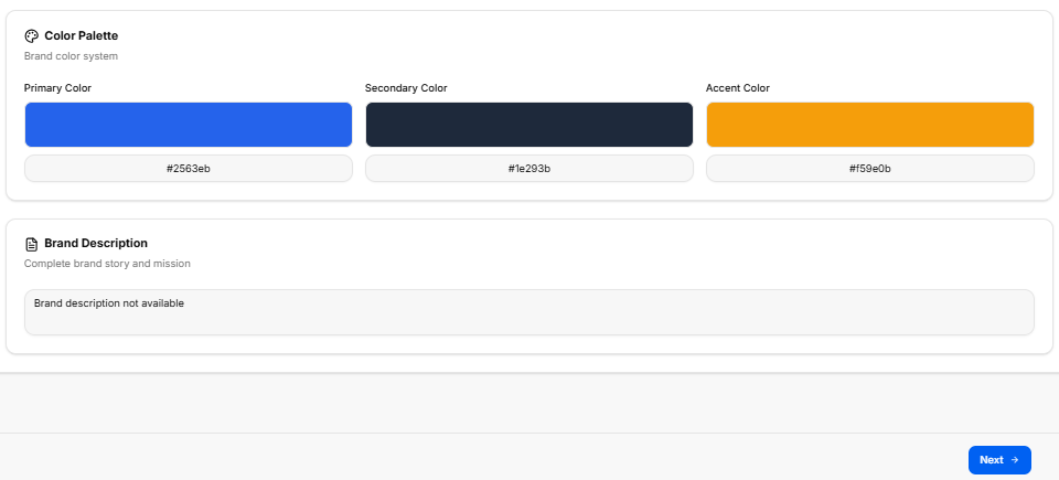
Color Palette Summary Block:
-
Header Title: Color Palette Summary
-
Label: “Your designed brand color system including primary, secondary, and accent colors”
-
Data Field: Displays the verified primary, secondary, and accent hexadecimal color codes.
-
No comments to display
No comments to display