
BuildRunKit Platform: Brands Management Walkthrough
BuildRunKit Platform: Brands Management Walkthrough
Here is the breakdown of the user flow when navigating, viewing, and managing brand properties within the workspace ecosystem, moving step-by-step through the layout interfaces.
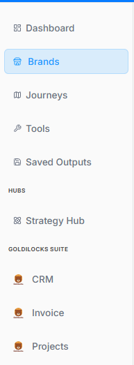
1. Navigation Sidebar Initialization
The process begins on the platform's primary left-hand navigation panel:
-
Active Tab: The Brands menu option is highlighted with a light blue background, indicating it has been selected to open the brand repository.
2. Brands Directory Dashboard
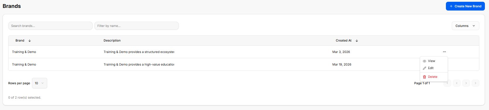
Once inside the directory, the workspace loads a master data table displaying all configured brand profiles:
-
Global Actions: A blue + Create New Brand button anchors the top right corner for deploying brand templates.
-
Search & Filter Utilities: Features a text input for "Search brands..." alongside a "Filter by name..." drop-menu tool.
-
The Brand Registry Table: Currently lists two active entries under the same primary name:
-
First Entry: Training & Demo | Description: "Training & Demo provides a structured ecosystem..." | Created At: Mar 3, 2026.
-
Second Entry: Training & Demo | Description: "Training & Demo provides a high-value education..." | Created At: Mar 19, 2026.
-
-
Inline Action Submenu: Clicking the ellipsis (
...) tool on a row unrolls an active contextual menu with three administrative routes: View, Edit, and a red-text Delete button.
3. Brand Profile Workspace Overview
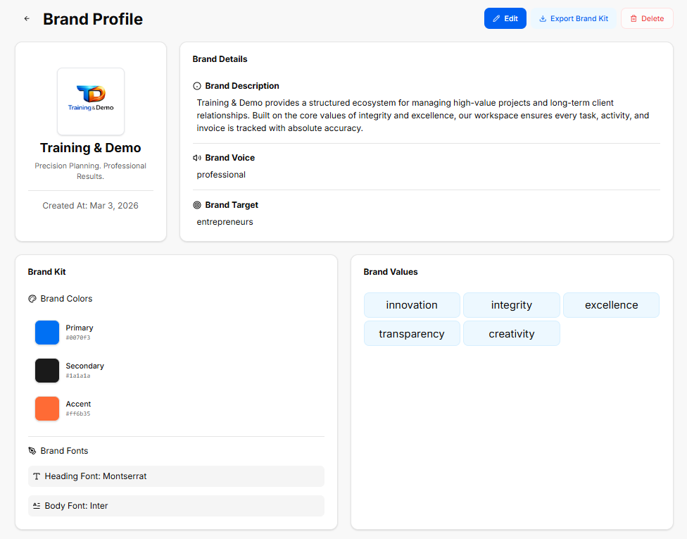
Selecting the View action from the directory opens the complete brand asset library.
Header Controls & Brand Sidebar
-
Top Utility Bar: Displays global data controls including a blue Edit button, a white Export Brand Kit icon button, and a red Delete button.
-
Profile Summary Card: Displays the company logo graphic, the main title (Training & Demo), a brand slogan statement ("Precision Planning. Professional Results."), and the core stamp Created At: Mar 3, 2026.
Brand Details Canvas
-
Brand Description: "Training & Demo provides a structured ecosystem for managing high-value projects and long-term client relationships. Built on the core values of integrity and excellence, our workspace ensures every task, activity, and invoice is tracked with absolute accuracy."
-
Brand Voice: Configured strictly as professional.
-
Brand Target: Configured for entrepreneurs.
Brand Kit Asset Specification
-
Brand Colors Grid:
-
Primary:
#007bff(Classic Blue) -
Secondary:
#1a1a1a(Dark Charcoal) -
Accent:
#ff6b35(Vibrant Orange)
-
-
Brand Fonts:
-
Heading Font: Montserrat
-
Body Font: Inter
-
Brand Values Configuration
The final section collects the foundational core values powering this specific profile's identity architecture, rendered across distinct pill tags:
-
innovation
-
integrity
-
excellence
-
transparency
-
creativity