BuildRunKit Platform: Brands Management Walkthrough
BuildRunKit Platform: Brands Management Walkthrough
Here is the breakdown of the user flow when navigating, viewing, and managing brand properties within the workspace ecosystem, moving step-by-step through the layout interfaces.
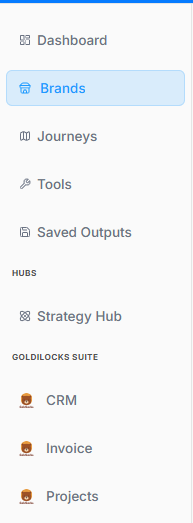
1. Navigation Sidebar Initialization
The process begins on the platform's primary left-hand navigation panel:
-
Active Tab: The Brands menu option is highlighted with a light blue background, indicating it has been selected to open the brand repository.
2. Brands Directory Dashboard
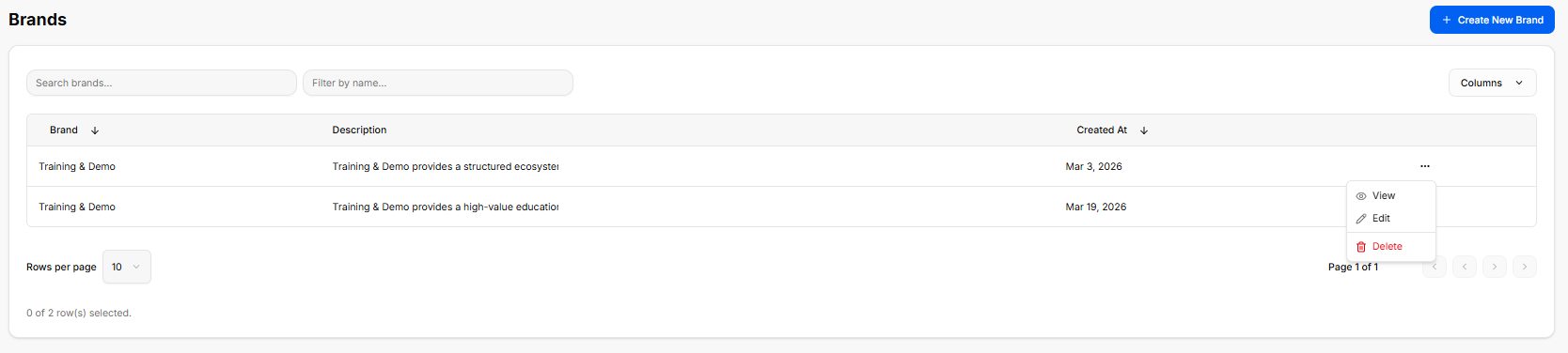
Once inside the directory, the workspace loads a master data table displaying all configured brand profiles:
-
Global Actions: A blue + Create New Brand button anchors the top right corner for deploying brand templates.
-
Search & Filter Utilities: Features a text input for "Search brands..." alongside a "Filter by name..." drop-menu tool.
-
The Brand Registry Table: Currently lists two active entries under the same primary name:
-
First Entry: Training & Demo | Description: "Training & Demo provides a structured ecosystem..." | Created At: Mar 3, 2026.
-
Second Entry: Training & Demo | Description: "Training & Demo provides a high-value education..." | Created At: Mar 19, 2026.
-
-
Inline Action Submenu: Clicking the ellipsis (
...) tool on a row unrolls an active contextual menu with three administrative routes: View, Edit, and a red-text Delete button.
3. Brand Profile Workspace Overview
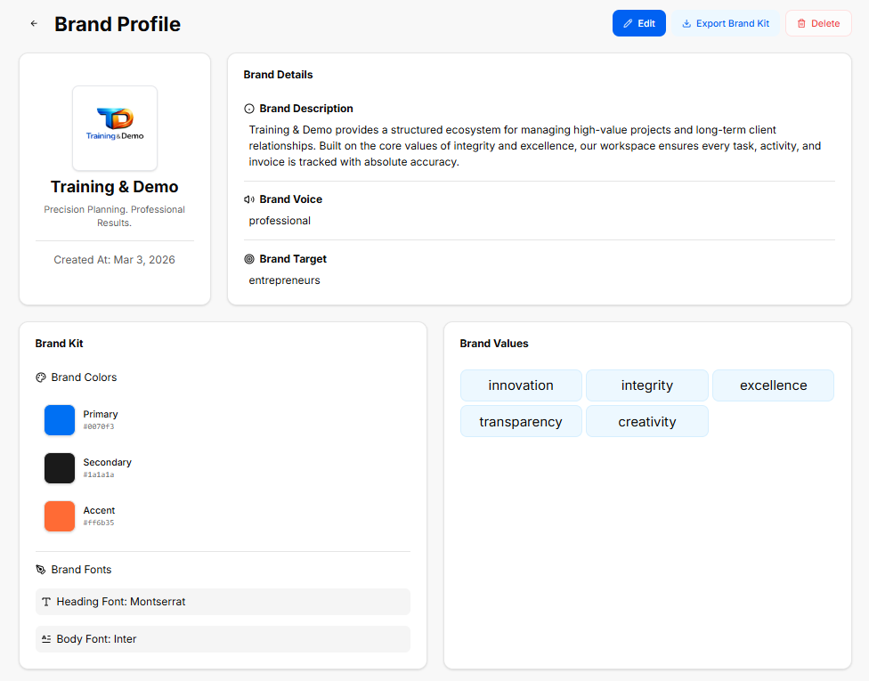
The Brand Profile is a central hub within the platform designed to store, manage, and showcase a company's foundational identity. It ensures that all technical workflows, marketing campaigns, and business documents stay strictly aligned with a unified corporate image.
Brand Details & Identity
This section defines the core parameters of the business entity, serving as the strategic reference point for all generated content:
-
Brand Description: A definitive summary explaining what the business does, its operational framework, and how it handles client relationships or projects.
-
Brand Voice: The consistent tone, style, and personality used across all company communications (for example, keeping language strictly professional and avoiding specific forbidden internal terms).
-
Brand Target: The primary audience, demographic, or ideal customer profile the platform's tools and messaging are tailored to reach.
Visual Asset Specification (The Brand Kit)
The Brand Kit acts as a visual guide, ensuring that any user-facing asset matches the company's aesthetic requirements:
-
Brand Colors: A structured palette containing hexadecimal color codes for consistent interface and asset styling:
-
Primary: The dominant color used for primary buttons, headers, and major brand elements.
-
Secondary: A supporting shade used for text, background contrast, or neutral structural components.
-
Accent: A high-contrast color reserved for call-to-action buttons, notifications, or specific highlights.
-
-
Brand Fonts: The typography rules defined for the ecosystem, standardizing a clean look across both high-level Headings and readable Body text.
The Role of Brand Values
Instead of looking at them as operational settings, the platform treats Brand Values as the definitive identity markers of your company:
-
The Core Identity: They define the unchanging principles, ethics, and beliefs that your brand is built upon.
-
The Blueprint for Trust: They show clients, partners, and your team exactly what your business cares about and how you commit to showing up every single day.
-
The Foundation of the Brand: They are the deep-seated standards that give the business its unique personality, making it more than just a list of products or services.