# BuildRunKit Manual

The complete manual for all of the applications included in BuildRunKit

# BuildRunKit - Account and core features

# Overview and Account Setup

![](https://library.buildrunkit.com/uploads/images/gallery/2026-05/embedded-image-qgzf5vru.png)

  
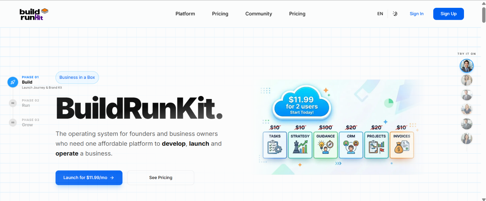
BuildRunKit is an all-in-one business operating system designed for founders, entrepreneurs, and growing teams. It bridges the gap between high-level strategy and daily execution by providing a unified workspace for planning, building, and running every aspect of a modern business.

##   


### Creating Your Account:
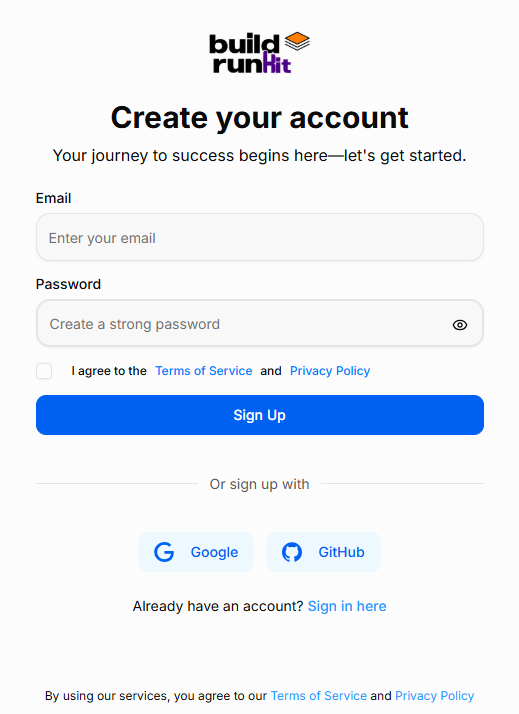
![](https://library.buildrunkit.com/uploads/images/gallery/2026-05/embedded-image-qcsbxiji.png)

**How to Sign Up:**   
 Starting your journey with BuildRunKit is quick and easy. Follow these steps to set up your new account:

1. Email Address: Enter your primary email address in the Email field.
2. Create a Password: Enter a strong, secure password. Use the eye icon to double-check your typing.
3. Terms &amp; Privacy: Review the Terms of Service and Privacy Policy, then check the box to confirm your agreement. This is required to proceed.
4. Complete Registration: Click the blue Sign Up button to create your account.
5. Alternative Options: You can also register instantly using your existing Google or GitHub account by clicking the buttons at the bottom.
6. Already a User? If you accidentally landed on this page, click "Sign in here" at the bottom to go back to the login screen.

### Accessing Your Workspace
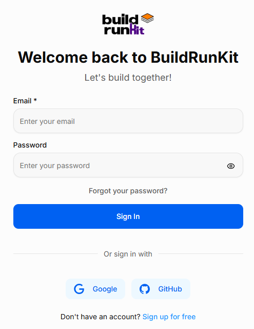
![](https://library.buildrunkit.com/uploads/images/gallery/2026-05/embedded-image-4vlijpif.png)

**How to Sign In:**   
 Accessing BuildRunKit is simple and secure. Follow these steps to log in to your account:

1. Email &amp; Password: Enter your registered work email address and password in the provided fields. You can click the eye icon in the password field to verify your entry.
2. Social Login: For faster access, you can choose to sign in using your Google or GitHub account by clicking the respective buttons at the bottom.
3. Forgot Password: If you’ve forgotten your credentials, click the "Forgot your password?" link just above the Sign In button to receive a reset link via email.
4. New Users: If you don't have an account yet, click the "Sign up for free" link at the very bottom to begin your registration.

# Features

Exhaustive documentation of the features across all applications -- this is not to be divided by application but rather what the feature is and where to find it.. so it can include references to other chapters/pages
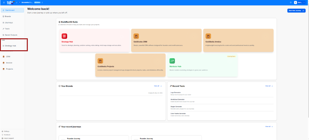
# Strategy Hub

# The Strategy Hub Dashboard

## The Strategy Hub Dashboard  
 

<div drawio-diagram="318"><img src="https://library.buildrunkit.com/uploads/images/drawio/2026-05/drawing-4-1779191062.png" alt=""/></div>


[![Screenshot 2026-05-19 133542.png](https://library.buildrunkit.com/uploads/images/gallery/2026-05/scaled-1680-/screenshot-2026-05-19-133542.png)](https://library.buildrunkit.com/uploads/images/gallery/2026-05/screenshot-2026-05-19-133542.png)

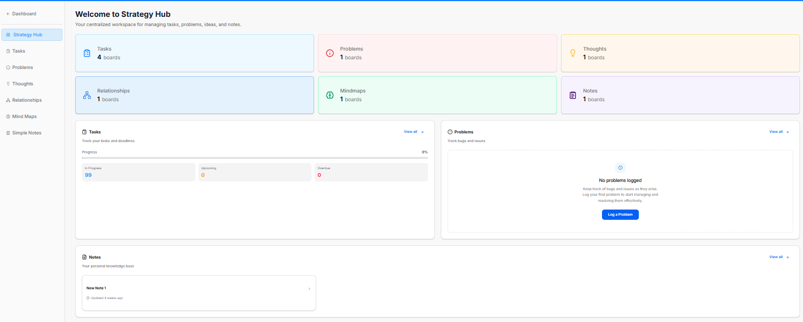
The Strategy Hub dashboard serves as your centralized workspace for managing tasks, problems, ideas, and notes. It provides a high-level view of your active boards and tracks real-time progress across key workflow segments.

<div _ngcontent-ng-c2372931610="" class="container" id="bkmrk--5"><div _ngcontent-ng-c2383366420="" aria-busy="false" aria-live="polite" class="markdown markdown-main-panel enable-updated-hr-color" dir="ltr" inline-copy-host="">---

</div></div>### Overview Cards

The top metric cards show the total number of active tracking boards within each core strategic category:

<div _ngcontent-ng-c2372931610="" class="container" id="bkmrk-tasks%3A-displays-the-"><div _ngcontent-ng-c2383366420="" aria-busy="false" aria-live="polite" class="markdown markdown-main-panel enable-updated-hr-color" dir="ltr" inline-copy-host="">- Tasks: Displays the total number of task boards active in your workspace (e.g., 4 boards).
- Problems: Tracks active issue or bug logging boards (e.g., 1 boards).
- Thoughts: Aggregates brainstorms, ideas, and strategic thoughts (e.g., 1 boards).
- Relationships: Manages network, partner, or team connection boards (e.g., 1 boards).
- Mindmaps: Provides quick access to visual brainstorming or mind mapping workspaces (e.g., 1 boards).
- Notes: Collects knowledge base and documentation folders (e.g., 1 boards).

---

</div></div>### Dashboard Trackers &amp; Widgets

The lower half of the dashboard features dedicated summary panels to track your items and jump directly into deep-dive views:

**Tasks Panel**

This section helps you track your tasks and deadlines.

<div _ngcontent-ng-c2372931610="" class="container" id="bkmrk-progress-bar%3A-displa"><div _ngcontent-ng-c2383366420="" aria-busy="false" aria-live="polite" class="markdown markdown-main-panel enable-updated-hr-color" dir="ltr" inline-copy-host="">- Progress Bar: Displays a total visual percentage completion rate of your combined task workload.
- In Progress: Counts active tasks currently being worked on.
- Upcoming: Lists scheduled or future action items.
- Overdue: High-priority alert counting tasks that have passed their set deadlines.
- View all: Click the blue View all <span class="math-inline" data-index-in-node="34" data-math="\rightarrow"><span class="katex"><span aria-hidden="true" class="katex-html"><span class="base"><span class="mrel">→</span></span></span></span></span> link to manage your complete task records.

</div></div>Problems Panel

A dedicated tracking area to monitor workspace bugs and issues.

<div _ngcontent-ng-c2372931610="" class="container" id="bkmrk-log-a-problem%3A-if-no"><div _ngcontent-ng-c2383366420="" aria-busy="false" aria-live="polite" class="markdown markdown-main-panel enable-updated-hr-color" dir="ltr" inline-copy-host="">- Log a Problem: If no items are listed, click the blue Log a Problem button to record a new bug or block.
- View all: Click the blue View all <span class="math-inline" data-index-in-node="34" data-math="\rightarrow"><span class="katex"><span aria-hidden="true" class="katex-html"><span class="base"><span class="mrel">→</span></span></span></span></span> link to navigate directly to the dedicated Problems module.

</div></div>**Notes Panel**

Acts as your personal knowledge base framework directly on the main dashboard layout.

<div _ngcontent-ng-c2372931610="" class="container" id="bkmrk-quick-access-blocks%3A"><div _ngcontent-ng-c2383366420="" aria-busy="false" aria-live="polite" class="markdown markdown-main-panel enable-updated-hr-color" dir="ltr" inline-copy-host="">- Quick Access Blocks: Lists your recent documents, displaying individual row titles and their last updated relative timestamp (e.g., *Updated 4 weeks ago*).
- View all: Click the blue View all <span class="math-inline" data-index-in-node="34" data-math="\rightarrow"><span class="katex"><span aria-hidden="true" class="katex-html"><span class="base"><span class="mrel">→</span></span></span></span></span> link to open up the complete knowledge module.

---

</div></div>### Left Navigation Sidebar

Quickly navigate between specific strategic tools via the left-side index:

<div _ngcontent-ng-c2372931610="" class="container" id="bkmrk-dashboard%3A-jumps-bac"><div _ngcontent-ng-c2383366420="" aria-busy="false" aria-live="polite" class="markdown markdown-main-panel enable-updated-hr-color" dir="ltr" id="bkmrk-dashboard%3A-jumps-bac-1" inline-copy-host="">- Dashboard: Jumps back to your global dashboard hub.
- Strategy Hub: Refreshes or returns you to this primary workspace layout.
- Tasks: Direct link to your expanded task listings.
- Problems: Opens your complete workspace issue tracker.
- Thoughts: Accesses your logged ideas and concepts.
- Relationships: Opens your contact network maps.
- Mind Maps: Launches your visual planning boards.
- Simple Notes: Links to your full documentation knowledge base.

</div></div>

# Strategy Hub: Tasks Module

## **Strategy Hub: Tasks Module**

**[![Screenshot 2026-05-19 134615.png](https://library.buildrunkit.com/uploads/images/gallery/2026-05/scaled-1680-/screenshot-2026-05-19-134615.png)](https://library.buildrunkit.com/uploads/images/gallery/2026-05/screenshot-2026-05-19-134615.png)**

The Tasks module within the Strategy Hub enables you to organize, track, and manage your operational action items using flexible Kanban boards or structured table lists.

<div _ngcontent-ng-c2372931610="" class="container" id="bkmrk--1"><div _ngcontent-ng-c2383366420="" aria-busy="false" aria-live="polite" class="markdown markdown-main-panel enable-updated-hr-color" dir="ltr" inline-copy-host="">---

</div></div>### Managing Tasks Boards

When you enter the Tasks module, you are presented with a global directory of your active planning environments:

<div _ngcontent-ng-c2372931610="" class="container" id="bkmrk-creating-a-board%3A-cl"><div _ngcontent-ng-c2383366420="" aria-busy="false" aria-live="polite" class="markdown markdown-main-panel enable-updated-hr-color" dir="ltr" inline-copy-host="">- Creating a Board: Click the blue + New Board button at the top right to start a fresh project environment.
- Board Directory View: Track active spaces like your Core Functionality Check Board or Full System Check Task Board, along with their last relative modification date under the Updated At column.
- Filtering &amp; Columns: Use the top text bars to search specific project names. Use the Columns dropdown tool to show or hide parameters like *Name*, *Updated\_at*, or *Actions*.
- Board Context Menu: Clicking the three dots icon (`...`) on the right side of any individual board row opens control configurations to View, Rename, or Delete that board.

---

</div></div>### Working Inside a Task Board

[![Screenshot 2026-05-19 134753.png](https://library.buildrunkit.com/uploads/images/gallery/2026-05/scaled-1680-/screenshot-2026-05-19-134753.png)](https://library.buildrunkit.com/uploads/images/gallery/2026-05/screenshot-2026-05-19-134753.png)

Opening an individual board reveals your workflow columns (lists) where standalone action cards reside:

<div _ngcontent-ng-c2372931610="" class="container" id="bkmrk-lists-management%3A-or"><div _ngcontent-ng-c2383366420="" aria-busy="false" aria-live="polite" class="markdown markdown-main-panel enable-updated-hr-color" dir="ltr" inline-copy-host="">- Lists Management: Organize progression stages by clicking the + Add List container. Clicking the three dots (`...`) next to a column header like "First List" allows you to select Rename, Bulk Options, or Delete List.
- Board Layout Controls: Switch between dynamic visual cards using Kanban view or structural line rows using Table view.
- Data Retrieval: Use the Export button to extract your active list details, or utilize the right-hand Filters side-panel to slice view parameters by Priority (*Low, Medium, High*), Due Date (*Overdue, Due Today, Next 7/30 Days*), or completion Status.

---

</div></div>### Quick Board Switching

[![Screenshot 2026-05-19 152605.png](https://library.buildrunkit.com/uploads/images/gallery/2026-05/scaled-1680-/screenshot-2026-05-19-152605.png)](https://library.buildrunkit.com/uploads/images/gallery/2026-05/screenshot-2026-05-19-152605.png)

- Arrow Navigation: When working inside an individual board view, you can seamlessly navigate between your different workspace environments without returning to the main registry list.
- How to Use: Click the up and down arrow buttons located directly to the right of the board's name at the top-left of your workspace header. This allows you to cycle through your boards on the fly.

### Adding and Populating Tasks

You can populate your workflow boards using quick single entries or rapid multi-line creation tools:

#### **Bulk Tasks Creation**

**[![Screenshot 2026-05-19 135411.png](https://library.buildrunkit.com/uploads/images/gallery/2026-05/scaled-1680-/screenshot-2026-05-19-135411.png)](https://library.buildrunkit.com/uploads/images/gallery/2026-05/screenshot-2026-05-19-135411.png)**

**[![Screenshot 2026-05-19 135001.png](https://library.buildrunkit.com/uploads/images/gallery/2026-05/scaled-1680-/screenshot-2026-05-19-135001.png)](https://library.buildrunkit.com/uploads/images/gallery/2026-05/screenshot-2026-05-19-135001.png)**

To quickly seed a list with multiple workflow elements without opening individual cards:

<div _ngcontent-ng-c2372931610="" class="container" id="bkmrk-click-the-list-setti"><div _ngcontent-ng-c2383366420="" aria-busy="false" aria-live="polite" class="markdown markdown-main-panel enable-updated-hr-color" dir="ltr" inline-copy-host="">1. Click the list settings menu and select Bulk Options.
2. In the Bulk Tasks workspace modal, enter one task item per line.
3. Use the explicit colon format: `task:description` (e.g., `Fix login bug:Investigate why the auth token expires early`).
4. Click the blue Save button to automatically generate distinct task cards down your targeted list.

</div></div>#### Individual Task Management &amp; Customization

[![Screenshot 2026-05-19 135506.png](https://library.buildrunkit.com/uploads/images/gallery/2026-05/scaled-1680-/screenshot-2026-05-19-135506.png)](https://library.buildrunkit.com/uploads/images/gallery/2026-05/screenshot-2026-05-19-135506.png)

To configure granular details for an individual work item, click + Add task or click on any existing card to launch the editor window:

<div _ngcontent-ng-c2372931610="" class="container" id="bkmrk-task-title%3A-provide-"><div _ngcontent-ng-c2383366420="" aria-busy="false" aria-live="polite" class="markdown markdown-main-panel enable-updated-hr-color" dir="ltr" inline-copy-host="">- Task Title: Provide a concise action statement at the top input line.
- Assignee: Use the selection dropdown to route accountability to a team member, or click Add External Assignee + to invite an outside contributor.
- Due Date: Use the interactive Pick a date calendar picker to establish your hard deadline.
- Priority: Designate importance tiers using the classification selector (*Low, Medium, High*).
- Color: Assign colored visual identifiers (such as *Pink*) to make cards stand out on your board grid.
- Task Templates:
    
    [![Screenshot 2026-05-19 135758.png](https://library.buildrunkit.com/uploads/images/gallery/2026-05/scaled-1680-/screenshot-2026-05-19-135758.png)
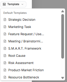
](https://library.buildrunkit.com/uploads/images/gallery/2026-05/screenshot-2026-05-19-135758.png)   
    Avoid starting from scratch by clicking the Template dropdown tool on the description block. Select from pre-structured blueprint outlines, including:
    
    
    - *Strategic Decision*
    - *Marketing Task*
    - *Feature Request / User Story*
    - *Meeting / Brainstorming*
    - *S.M.A.R.T. Framework*
    - *Root Cause*
    - *Risk Assessment*
    - *Product-Market Friction*
    - *Resource Bottleneck*
    - *Technical Debt Audit* *(Note: If you haven't saved any custom layouts yet, the system will display a "No workspace templates yet" notice at the bottom of the list until you toggle on the "Save description as a template" switch.)*
- Description Editor: Fill out your action details manually, or toggle the Save description as a template switch at the bottom to store your layout for future use.
- Status Action: Click the Mark as done check button to shift the task state instantly. Click Create Task to finalize.

---

</div></div>### Advanced Ticket Details: Comments &amp; Attachments

[![Screenshot 2026-05-19 144913.png](https://library.buildrunkit.com/uploads/images/gallery/2026-05/scaled-1680-/screenshot-2026-05-19-144913.png)](https://library.buildrunkit.com/uploads/images/gallery/2026-05/screenshot-2026-05-19-144913.png)

Once an individual task card is generated, you can open it to access dedicated deep-dive tabs for enhanced team collaboration and evidence tracking:

**Details Tab**

- Context &amp; Metadata: Displays your foundational core settings, including assigned team owners, set deadlines, importance tiers, and template-guided problem descriptions.

**Comments Tab**

- Team Communication: Exchange real-time feedback directly within the card context window.
- Posting Updates: Type message notes directly into the Add a comment... text entry block and click the blue Send arrow button to publish.
- Activity Stream: Tracks a clear, chronological conversation log underneath the main card workspace history.

**Attachments Tab**

- Evidence Collection: Centralize external files, technical logs, or system screenshots directly onto the task record.
- Uploading Files: Click the Choose Files icon block to drag and drop or browse local storage for relevant documentation items.
- Storage Rules: The platform handles image verification and securely anchors your uploaded assets right inside the targeted issue ticket layout.

### Task Card Actions &amp; Migration Assistant

[![Screenshot 2026-05-19 142147.png](https://library.buildrunkit.com/uploads/images/gallery/2026-05/scaled-1680-/screenshot-2026-05-19-142147.png)](https://library.buildrunkit.com/uploads/images/gallery/2026-05/screenshot-2026-05-19-142147.png)

[![Screenshot 2026-05-19 140117.png](https://library.buildrunkit.com/uploads/images/gallery/2026-05/scaled-1680-/screenshot-2026-05-19-140117.png)](https://library.buildrunkit.com/uploads/images/gallery/2026-05/screenshot-2026-05-19-140117.png)

Once a card is created on your workspace list, clicking the three vertical dots icon directly on that task card opens immediate item controls:

<div _ngcontent-ng-c2372931610="" class="container" id="bkmrk-open%3A-launches-the-f"><div _ngcontent-ng-c2383366420="" aria-busy="false" aria-live="polite" class="markdown markdown-main-panel enable-updated-hr-color" dir="ltr" id="bkmrk-open%3A-launches-the-f-1" inline-copy-host="">- Open: Launches the full individual configuration details view.
- Delete: Permanently drops the selected card from your board workspace records.
- Move or Copy (Migration Assistant): Selecting this action triggers a modal that helps you reposition or duplicate task items across different spaces without losing formatting details:
    
    
    - Existing Board Tab: Reposition or duplicate your item into another list layer inside any active environment already saved to your workspace profile.
    - New Board Tab: Type in a brand-new Board name and List name inline to build a fresh destination space on the fly, immediately routing the migrated card there.
    - Execution: Click the soft Copy button to clone the item, or click the blue Move button to shift the original record entirely.

</div></div>

# Strategy Hub: Problems Module

## **Strategy Hub: Problems Module**

**[![Screenshot 2026-05-19 143343.png](https://library.buildrunkit.com/uploads/images/gallery/2026-05/scaled-1680-/screenshot-2026-05-19-143343.png)](https://library.buildrunkit.com/uploads/images/gallery/2026-05/screenshot-2026-05-19-143343.png)**

The Problems module within the Strategy Hub enables teams to log, track, and systematically resolve bugs, operational issues, or blockers using Kanban boards or structured data tables.

<div _ngcontent-ng-c2372931610="" class="container" id="bkmrk--1"><div _ngcontent-ng-c2383366420="" aria-busy="false" aria-live="polite" class="markdown markdown-main-panel enable-updated-hr-color" dir="ltr" inline-copy-host="">---

</div></div>### Managing Problems Boards

The primary interface provides a high-level overview of all active issue-tracking environments:

<div _ngcontent-ng-c2372931610="" class="container" id="bkmrk-creating-a-board%3A-cl"><div _ngcontent-ng-c2383366420="" aria-busy="false" aria-live="polite" class="markdown markdown-main-panel enable-updated-hr-color" dir="ltr" inline-copy-host="">- Creating a Board: Click the blue + New Board button in the top-right corner to initiate a separate issue-tracking workspace.
- Directory List: View all active boards (such as the "Core Bug Tracker"), searchable by title and filterable using the Columns dropdown configuration menu.
- Board Options Menu: Click the three dots icon (`...`) on the right side of any listed board row to View, Rename, or Delete that board environment.

---

</div></div>### Working Inside a Problems Board

[![Screenshot 2026-05-19 143701.png](https://library.buildrunkit.com/uploads/images/gallery/2026-05/scaled-1680-/screenshot-2026-05-19-143701.png)](https://library.buildrunkit.com/uploads/images/gallery/2026-05/screenshot-2026-05-19-143701.png)

Opening an issue board displays tracking columns where individual problem entries are managed:

<div _ngcontent-ng-c2372931610="" class="container" id="bkmrk-columns-%26-views%3A-org"><div _ngcontent-ng-c2383366420="" aria-busy="false" aria-live="polite" class="markdown markdown-main-panel enable-updated-hr-color" dir="ltr" inline-copy-host="">- Columns &amp; Views: Organize your issue lifecycles dynamically across columns (e.g., "First List") using either the Kanban grid arrangement or a clean line-by-line Table view.
- List Configurations: Click the three dots icon (`...`) next to any column title header to Rename the list, access Bulk Options, or select Delete List.
- Filtering &amp; Export: Extract your active data sets using the Export function, or use the right-hand Filters side-panel to isolate entries by Priority (*Low, Medium, High*), Due Date, or completion Status.

---

</div></div>### Quick Board Switching

[![Screenshot 2026-05-19 160129.png](https://library.buildrunkit.com/uploads/images/gallery/2026-05/scaled-1680-/screenshot-2026-05-19-160129.png)](https://library.buildrunkit.com/uploads/images/gallery/2026-05/screenshot-2026-05-19-160129.png)

- Arrow Navigation: When working inside an individual board view, you can seamlessly navigate between your different workspace environments without returning to the main registry list.
- How to Use: Click the up and down arrow buttons located directly to the right of the board's name at the top-left of your workspace header. This allows you to cycle through your boards on the fly.

### Logging and Customizing Problems

You can log workspace issues individually or seed structural workflows simultaneously:

#### **Bulk Problems Logging**

**[![Screenshot 2026-05-19 144500.png](https://library.buildrunkit.com/uploads/images/gallery/2026-05/scaled-1680-/screenshot-2026-05-19-144500.png)](https://library.buildrunkit.com/uploads/images/gallery/2026-05/screenshot-2026-05-19-144500.png)**

**[![Screenshot 2026-05-19 144430.png](https://library.buildrunkit.com/uploads/images/gallery/2026-05/scaled-1680-/screenshot-2026-05-19-144430.png)](https://library.buildrunkit.com/uploads/images/gallery/2026-05/screenshot-2026-05-19-144430.png)**

To quickly register multiple issues or tickets without opening separate cards:

<div _ngcontent-ng-c2372931610="" class="container" id="bkmrk-click-your-list-conf"><div _ngcontent-ng-c2383366420="" aria-busy="false" aria-live="polite" class="markdown markdown-main-panel enable-updated-hr-color" dir="ltr" inline-copy-host="">1. Click your list configuration menu and choose Bulk Options.
2. Use the standard colon format: `problem:description` (entering one distinct issue ticket per line).
3. Click the blue Save button to populate your board instantly.

</div></div>#### Individual Problem Configuration

[![Screenshot 2026-05-19 144604.png](https://library.buildrunkit.com/uploads/images/gallery/2026-05/scaled-1680-/screenshot-2026-05-19-144604.png)](https://library.buildrunkit.com/uploads/images/gallery/2026-05/screenshot-2026-05-19-144604.png)

Click + Add task or open an existing card to configure deep-dive issue parameters inside the ticket modal:

<div _ngcontent-ng-c2372931610="" class="container" id="bkmrk-title-%26-mark-done%3A-p"><div _ngcontent-ng-c2383366420="" aria-busy="false" aria-live="polite" class="markdown markdown-main-panel enable-updated-hr-color" dir="ltr" inline-copy-host="">- Title &amp; Mark Done: Provide a descriptive title at the top, or toggle Mark as done to clear the card.
- Assignee: Designate a team member via the dropdown, or select Add External Assignee + to collaborate with outside support.
- Due Date: Set a target resolution deadline using the interactive calendar picker.
- Priority &amp; Color Tiers: Flag critical blockers by defining their importance level (*Low, Medium, High*) and assigning a distinct card accent color (e.g., *Pink*).
- Problem Templates: Drop in pre-structured frameworks by selecting the Template utility dropdown above the description text area. Options include specialized problem-solving blueprints such as Strategic Decision, Root Cause, Risk Assessment, or Technical Debt Audit.

---

</div></div>### Advanced Ticket Details: Comments &amp; Attachments

[![Screenshot 2026-05-19 144913.png](https://library.buildrunkit.com/uploads/images/gallery/2026-05/scaled-1680-/o7gscreenshot-2026-05-19-144913.png)](https://library.buildrunkit.com/uploads/images/gallery/2026-05/o7gscreenshot-2026-05-19-144913.png)

Once an individual problem card is generated, you can open it to access dedicated deep-dive tabs for enhanced team collaboration and evidence tracking:

##### **Details Tab**

<div _ngcontent-ng-c2372931610="" class="container" id="bkmrk-context-%26-metadata%3A-"><div _ngcontent-ng-c2383366420="" aria-busy="false" aria-live="polite" class="markdown markdown-main-panel enable-updated-hr-color" dir="ltr" inline-copy-host="">- Context &amp; Metadata: Displays your foundational core settings, including assigned team owners, set deadlines, importance tiers, and template-guided problem descriptions.

</div></div>##### **Comments Tab**

<div _ngcontent-ng-c2372931610="" class="container" id="bkmrk-team-communication%3A-"><div _ngcontent-ng-c2383366420="" aria-busy="false" aria-live="polite" class="markdown markdown-main-panel enable-updated-hr-color" dir="ltr" inline-copy-host="">- Team Communication: Exchange real-time feedback directly within the card context window.
- Posting Updates: Type message notes directly into the Add a comment... text entry block and click the blue Send arrow button to publish.
- Activity Stream: Tracks a clear, chronological conversation log underneath the main card workspace history.

</div></div>##### **Attachments Tab**

<div _ngcontent-ng-c2372931610="" class="container" id="bkmrk-evidence-collection%3A"><div _ngcontent-ng-c2383366420="" aria-busy="false" aria-live="polite" class="markdown markdown-main-panel enable-updated-hr-color" dir="ltr" inline-copy-host="">- Evidence Collection: Centralize external files, technical logs, or system screenshots directly onto the problem record.
- Uploading Files: Click the Choose Files icon block to drag and drop or browse local storage for relevant documentation items.
- Storage Rules: The platform handles image verification and securely anchors your uploaded assets right inside the targeted issue ticket layout.

---

</div></div>### Card Item Menus &amp; Migrations

[![Screenshot 2026-05-19 144742.png](https://library.buildrunkit.com/uploads/images/gallery/2026-05/scaled-1680-/screenshot-2026-05-19-144742.png)](https://library.buildrunkit.com/uploads/images/gallery/2026-05/screenshot-2026-05-19-144742.png)

Clicking the three vertical dots directly on any active board card reveals prompt item actions:

<div _ngcontent-ng-c2372931610="" class="container" id="bkmrk-open-%26-delete%3A-acces"><div _ngcontent-ng-c2383366420="" aria-busy="false" aria-live="polite" class="markdown markdown-main-panel enable-updated-hr-color" dir="ltr" id="bkmrk-open-%26-delete%3A-acces-1" inline-copy-host="">- Open &amp; Delete: Access full collaboration tabs or wipe obsolete records from the workspace tracking board entirely.
- Move or Copy: Launch the Migration Assistant modal to copy or move issue records. You can copy/move the ticket into an Existing Board layout list, or type a fresh identifier to establish a New Board workspace directly on the fly.

</div></div>

# Strategy Hub: Thoughts Module

## **Strategy Hub: Thoughts Module**

**[![Screenshot 2026-05-20 141803.png](https://library.buildrunkit.com/uploads/images/gallery/2026-05/scaled-1680-/screenshot-2026-05-20-141803.png)](https://library.buildrunkit.com/uploads/images/gallery/2026-05/screenshot-2026-05-20-141803.png)**

The Thoughts module within the Strategy Hub functions as a digital canvas or whiteboard, allowing you to visually map out brainstorming sessions, strategy links, and project ideas using interactive shapes.

### Managing Thoughts Boards

When you enter the Thoughts module, you are presented with a global directory of your active brainstorming and strategy environments:

- Creating a Whiteboard: Click the blue + New Whiteboard button at the top right to start a fresh visual planning environment.
- Board Directory View: Track active design spaces along with their last relative modification date under the Updated At column.
- Filtering &amp; Columns: Use the top text bars to search specific whiteboard names. Use the Columns dropdown tool to show or hide parameters like Name, Updated\_at, or Actions.
- Board Context Menu: Clicking the three dots icon (`...`) on the right side of any individual board row opens control configurations to View, Rename, or Delete that whiteboard.

### Inside a Thoughts Board

[![Screenshot 2026-05-20 141837.png](https://library.buildrunkit.com/uploads/images/gallery/2026-05/scaled-1680-/screenshot-2026-05-20-141837.png)](https://library.buildrunkit.com/uploads/images/gallery/2026-05/screenshot-2026-05-20-141837.png)

[![Screenshot 2026-05-20 141911.png](https://library.buildrunkit.com/uploads/images/gallery/2026-05/scaled-1680-/screenshot-2026-05-20-141911.png)](https://library.buildrunkit.com/uploads/images/gallery/2026-05/screenshot-2026-05-20-141911.png)

When you select and open an individual whiteboard from your directory, you enter an interactive grid canvas workspace where you can sketch, label, and manipulate shapes.

### Canvas Layout &amp; Header Controls

The top header of the whiteboard area contains configuration data, canvas actions, and canvas statistics:

<div _ngcontent-ng-c2170363542="" class="container" id="bkmrk-breadcrumb-navigatio"><div _ngcontent-ng-c1323015604="" aria-busy="false" aria-live="polite" class="markdown markdown-main-panel enable-updated-hr-color" dir="ltr" inline-copy-host="">- Breadcrumb Navigation: The top left displays the active path, showing Thought boards followed by an arrow pointing to your currently opened board name (e.g., *Full System Check Thought Board*).
- Quick Switch Dropdown: Clicking the small up and down arrow icon directly next to "Thought boards" pulls up a quick menu to toggle between your saved boards or click + Create new board without returning to the main directory.
- Canvas Settings &amp; Zoom Toolbar: Located at the top right of the canvas, this bar gives you layout controls:
    
    
    - Zoom Controls: Use the zoom-out (`minus`), percentage display (e.g., `100%`), zoom-in (`plus`), and `reset` icons to navigate a dense board.
    - Export: Click the download arrow icon to save a local copy of your canvas layout.
    - Clear (Trash Can Icon): A red button that completely wipes all shapes, lines, and data off the current canvas.

</div></div>### The Canvas Toolbar

A horizontal toolbar floats at the top-left section of the grid canvas to let you build out your board:

<div _ngcontent-ng-c2170363542="" class="container" id="bkmrk-selection-tool-%28curs"><div _ngcontent-ng-c1323015604="" aria-busy="false" aria-live="polite" class="markdown markdown-main-panel enable-updated-hr-color" dir="ltr" inline-copy-host="">- Selection Tool (Cursor Icon): The primary blue pointer used to select, drag, or highlight elements on the grid.
- Square Shape: Click this icon to drop a customizable square onto the workspace.
- Circle Shape: Click this icon to drop a customizable circle onto the workspace.
- Connection Arrow: Click this tool to manually draw directional lines connecting your elements.
- Text Tool ("T" Icon): Allows you to drop standalone text blocks directly onto the open canvas grid.
- Draw Tool (Pencil Icon): Activates freehand drawing or sketching directly on top of the grid space.
- Global Canvas Color: Shows a Color circle indicator (e.g., blue) that tracks your currently selected element tint.
- Board Statistics: Live counters immediately follow the color wheel to show you the exact total of items placed on the canvas (e.g., `2 cards • 1 arrows • 1 texts`).

</div></div>### Editing a Shape Modal

[![Screenshot 2026-05-20 142022.png](https://library.buildrunkit.com/uploads/images/gallery/2026-05/scaled-1680-/screenshot-2026-05-20-142022.png)](https://library.buildrunkit.com/uploads/images/gallery/2026-05/screenshot-2026-05-20-142022.png)

When you click the three dots menu (`...`) on a shape and choose to edit it, a modal pop-up window appears in the center of the screen with the following configuration fields:

- Modal Title: Displays the name of the shape type (e.g., Circle) at the top left.
- Title Field: A text input box where you can type or change the main title text displayed on the shape.
- Description Field: A larger text area box labeled Description to add detailed notes or context inside the shape properties.
- Color Selection: A row of interactive circular color buttons that allows you to click and choose the color styling for the shape.
- Action Buttons: Two options sit at the bottom right corner of the window to finalize your changes:
    
    
    - Cancel: Closes the modal without saving any modifications.
    - Update: Saves your text and color changes directly to the canvas element.

### Editing Canvas Text Blocks

[![Screenshot 2026-05-20 142641.png](https://library.buildrunkit.com/uploads/images/gallery/2026-05/scaled-1680-/screenshot-2026-05-20-142641.png)](https://library.buildrunkit.com/uploads/images/gallery/2026-05/screenshot-2026-05-20-142641.png)

When managing a standalone text element on the canvas, the properties window changes to a streamlined Edit Text modal with specific sizing attributes:

- Text: A multi-line editing box where you input the literal message displayed on the canvas grid.
- Font Size: A numerical box where you manually type or change the font scaling size directly (e.g., *15*). Note: There is no font-family picker layout; styling changes are strictly adjusted by size.
- Color: A color indicator box showing the current color assigned to the text layer.
- Form Submissions:
    
    
    - Cancel: Standard link text button to abandon changes.
    - Save: A blue button to lock in your text edits and font scaling parameters.

<div _ngcontent-ng-c2170363542="" class="container" id="bkmrk--5"></div><div _ngcontent-ng-c2372931610="" class="container" id="bkmrk--6"></div><div _ngcontent-ng-c2372931610="" class="container" id="bkmrk--7"></div>

# Strategy Hub: Mind Maps Module

## **Strategy Hub: Mind Maps Module**

The Mind Maps module within the Strategy Hub enables you to organize, track, and manage your operational action items using flexible visual mapping environments.

### Managing Mind Maps Boards

[![Screenshot 2026-05-21 131753.png](https://library.buildrunkit.com/uploads/images/gallery/2026-05/scaled-1680-/screenshot-2026-05-21-131753.png)](https://library.buildrunkit.com/uploads/images/gallery/2026-05/screenshot-2026-05-21-131753.png)

When you enter the Mind Maps module, you are presented with a global directory of your active planning environments:

- Creating a Board: Click the blue + New Board button at the top right to start a fresh project environment.
- Board Directory View: Track active spaces like your *Mind Maps* board or *Full System Check Mind Map Board*, along with their last relative modification date under the Updated At column.
- Filtering &amp; Columns: Use the top text bars to search specific project names. Use the Columns dropdown tool to show or hide parameters like Name, Updated\_at, or Actions.
- Board Context Menu: Clicking the three dots icon (`...`) on the right side of any individual board row opens control configurations for that board.

### Inside a Mind Maps Board

[![Screenshot 2026-05-21 131930.png](https://library.buildrunkit.com/uploads/images/gallery/2026-05/scaled-1680-/screenshot-2026-05-21-131930.png)](https://library.buildrunkit.com/uploads/images/gallery/2026-05/screenshot-2026-05-21-131930.png)

[![Screenshot 2026-05-21 132234.png](https://library.buildrunkit.com/uploads/images/gallery/2026-05/scaled-1680-/screenshot-2026-05-21-132234.png)](https://library.buildrunkit.com/uploads/images/gallery/2026-05/screenshot-2026-05-21-132234.png)

When you select and open an individual mind map board from your directory, you enter a canvas space designed to build out ideas and branches.

### Canvas Layout &amp; Header Controls

The top header of an active mind map board provides specific controls for styling, adding nodes, and exporting your map:

- Breadcrumb Navigation: The top left displays your current location, showing Mindmap boards next to an arrow pointing to the title of your active board (e.g., *Full System Check Mind Map Board*).
- Quick Switch Dropdown: Clicking the up and down arrow icon directly next to "Mindmap boards" allows you to quickly switch between different mind map boards in your workspace without exiting to the main menu.
- Style Dropdown: A dedicated Style selector menu allows you to alter the visual appearance of your map. Clicking the dropdown reveals five distinct options:
    
    
    - Classic (selected by default with a checkmark)
    - Modern
    - Minimal
    - Corporate
    - Playful
- Canvas Actions: Located at the top right of the screen are your action keys:
    
    
    - \+ Add Root Node: A blue button used to place a main foundational node onto the canvas.
    - Mini-Map Toggle (Green Icon): Toggles a small overlay window to help navigate around your branches.
    - Export PNG: Click to export and download your current mind map structure as an image file.
    - Export PDF: Click to save your structural layout as a document file.

### Managing Mind Map Nodes

[![Screenshot 2026-05-21 132508.png](https://library.buildrunkit.com/uploads/images/gallery/2026-05/scaled-1680-/screenshot-2026-05-21-132508.png)](https://library.buildrunkit.com/uploads/images/gallery/2026-05/screenshot-2026-05-21-132508.png)

When interacting with an active node (e.g., *New Idea*) on the canvas, a quick action toolbar appears directly inside the card boundaries to manage branches:

- Add a Node (Green Cross Icon): Click the green + button to branch off and add a connected sub-node to your mind map.
- Edit Node Title (Pencil Icon): Click the purple pencil button to quickly rename or modify the text displayed inside that specific node card.
- Delete Node (Trash Can Icon): Click the red trash can button to permanently remove the node from your mind map layout.

# Strategy Hub: Simple Notes Module

## Strategy Hub: Simple Notes Module

[![Screenshot 2026-05-21 132939.png](https://library.buildrunkit.com/uploads/images/gallery/2026-05/scaled-1680-/screenshot-2026-05-21-132939.png)](https://library.buildrunkit.com/uploads/images/gallery/2026-05/screenshot-2026-05-21-132939.png)

The Simple Notes module within the Strategy Hub enables you to organize, track, and manage your operational action items using structured note directories and document environments.

### Managing Notes Boards

When you enter the Simple Notes module, you are presented with a global directory of your active planning environments:

- Creating a Board: Click the blue + New Board button at the top right to start a fresh project environment.
- Board Directory View: Track active spaces like your Simple Notes board or Full System Check Notes Board, along with their last relative modification date under the Updated At column.
- Filtering &amp; Columns: Use the top text bars to search specific project names. Use the Columns dropdown tool to show or hide parameters like Name, Updated\_at, or Actions.
- Board Context Menu: Clicking the three dots icon (`...`) on the right side of any individual board row opens control configurations for that board.

### Inside a Simple Notes Board

[![Screenshot 2026-05-21 133420.png](https://library.buildrunkit.com/uploads/images/gallery/2026-05/scaled-1680-/screenshot-2026-05-21-133420.png)](https://library.buildrunkit.com/uploads/images/gallery/2026-05/screenshot-2026-05-21-133420.png)

[![Screenshot 2026-05-21 133455.png](https://library.buildrunkit.com/uploads/images/gallery/2026-05/scaled-1680-/screenshot-2026-05-21-133455.png)](https://library.buildrunkit.com/uploads/images/gallery/2026-05/screenshot-2026-05-21-133455.png)

When you select and open an individual notes board from your directory, you enter a split-screen document editor environment designed to create, filter, and write detailed records.

### Canvas Layout &amp; Header Controls

The top header of an active notes board keeps track of your location and provides options to download your text files:

- Breadcrumb Navigation: The top left displays your current navigation track, showing Notes boards next to a selector arrow pointing to the active board title (e.g., *Full System Check Notes Board*).
- Quick Switch Dropdown: Clicking the up and down arrow icon directly next to "Notes boards" opens a quick selection menu to swap between your different notes directories without having to go back to the main menu page.
- Export PDF: A blue button located at the top right of the editor workspace allows you to immediately export and download your active note document as a PDF file.

### The Notes Sidebar Menu (Left Panel)

The left side of the workspace acts as a navigation column to search, organize, and toggle through the documents assigned to this specific board:

- Search Bar: A text search box labeled Search notes... allows you to look up existing documents inside the board by typing keywords from their titles.
- Sort Dropdown: Clicking the Sort button opens a configuration filter layout to rearrange how your document list is organized. It features three sorting criteria options:
    
    
    - Updated (Newest)
    - Created (Newest)
    - Title (A-Z)
- Add Note Button (Plus Icon): Clicking the blue + icon directly to the right of the sort dropdown creates a brand-new blank document inside the directory folder.
- Document Cards: Individual text logs are listed vertically as clickable preview cards showing the card title (e.g., *New Note 3*, *New Note 2*, *New Note 1*) and a subtitle logging its exact relative save status date (e.g., *Last updated: May 21, 2026*).
- Live Counter: The very bottom of the left column tracks your folder volume with a static counter showing the exact total numbers of documents stored inside the active board (e.g., *3 notes*).

### The Rich Text Editor (Right Panel)

Selecting any card from the sidebar opens its contents inside the primary workspace panel on the right:

- Document Title Input: A prominent text box located at the top of the workspace allows you to add or modify the title of your active card text document (e.g., *New Note 3*).
- Text Formatting Toolbar: A horizontal utility bar floats directly above the main text workspace area to give you text-styling options:
    
    
    - B: Bold
    - *I*: Italic
    - U: Underline
    - H1 / H2 / H3: Main headers and subsection headers styling options
    - Bullet Points: Bullet list toggle button
    - Numbered List: Numbered list tracking toggle button
    - Link (Chain-link Icon): Insert hyperlinked text parameters
    - Image (Picture Icon): Insert external image variables into your text canvas
    - Undo / Redo (Arrows): Backtrack text entries or restore modifications on the fly
- Editor Stats Footer: The footer bar running along the bottom edge of the document workspace tracks your formatting updates live:
    
    
    - Counters: Displays real-time content size variables on the left side of the row (e.g., *0 characters • 0 words*).
    - Auto-Save Status: Displays a confirmation timestamp indicator on the right edge of the row tracking exactly when the system last secured your updates.

# Goldilocks CRM

# Goldilocks CRM: Overview and Account Setup

### **Goldilocks CRM: Introduction**

**[![Screenshot 2026-05-14 134548.png](https://library.buildrunkit.com/uploads/images/gallery/2026-05/scaled-1680-/screenshot-2026-05-14-134548.png)](https://library.buildrunkit.com/uploads/images/gallery/2026-05/screenshot-2026-05-14-134548.png)**

Goldilocks CRM is the customer relationship and sales management module within the BuildRunKit ecosystem. Designed specifically for founders and small businesses, it provides a simple yet powerful interface to track leads, manage deals, and organize your sales pipeline without the clutter of enterprise-level software.

---

### Getting Started

[![Screenshot 2026-05-12 115729.png](https://library.buildrunkit.com/uploads/images/gallery/2026-05/scaled-1680-/screenshot-2026-05-12-115729.png)](https://library.buildrunkit.com/uploads/images/gallery/2026-05/screenshot-2026-05-12-115729.png)

BuildRunKit is a unified workspace designed to help you plan, build, and run your business. One account gives you full access to the core platform plus the Goldilocks Suite (CRM, Invoices, and Projects).

Exploring the Platform Before signing in, you can use the landing page to explore the resources available to your business:

- Navigation Menu: Use the top links to view Features, the Platform overview, Pricing tiers, Contact Us details, and the Blog.
- Call-to-Action Buttons:
    
    
    - Get Started: Click this to begin the registration and onboarding process.
    - See Plans: Review subscription levels and feature limits.

---

### Accessing Your Account

[![Screenshot 2026-05-12 115821.png](https://library.buildrunkit.com/uploads/images/gallery/2026-05/scaled-1680-/screenshot-2026-05-12-115821.png)](https://library.buildrunkit.com/uploads/images/gallery/2026-05/screenshot-2026-05-12-115821.png)

Once you have created your account, you can enter your workspace directly from the main landing page.

Entry Points

- Go to App: Click the brown button at the top right of the screen to launch the CRM application.
- Language Selection: Use the EN dropdown to choose your preferred interface language.
- Theme Toggle: Click the Moon Icon next to the language settings to switch between Light and Dark modes.

#### Alternative Login Options

If you registered using a third-party account, you can log in instantly by clicking:

- Google
- GitHub

> Note: If you are on this page by mistake and need to register, click the "Create one for free" link at the top right of the login box.

# Goldilocks CRM Dashboard

## Goldilocks CRM Dashboard

[![Screenshot 2026-05-14 142207.png](https://library.buildrunkit.com/uploads/images/gallery/2026-05/scaled-1680-/screenshot-2026-05-14-142207.png)](https://library.buildrunkit.com/uploads/images/gallery/2026-05/screenshot-2026-05-14-142207.png)

Once you have successfully signed in, you will be greeted by the Dashboard. This page is designed to give you an "at a glance" view of your latest sales activity, offer advanced filtering for your records, and provide fast jumps into your most important CRM workflows.

### Managing Your Workspace

[![Screenshot 2026-05-14 142241.png](https://library.buildrunkit.com/uploads/images/gallery/2026-05/scaled-1680-/screenshot-2026-05-14-142241.png)](https://library.buildrunkit.com/uploads/images/gallery/2026-05/screenshot-2026-05-14-142241.png)

At the very top of the left sidebar, you will see your current workspace name. The platform allows you to manage multiple business environments from a single account.

**How to Switch Workspaces:**

- Click the Workspace Selector: Click on the workspace name at the top of the sidebar.
- Select from the List: A dropdown menu will appear showing all workspaces you have access to, such as "Official BuildRunKit Employee Workspace" or "Training &amp; Demo".
- Instant Switch: Click on the desired name to instantly switch all data (Contacts, Deals, and Tasks) to that workspace.
- Create New: Click + Create workspace at the bottom of this menu to start a brand new business environment.

---

### Activity Overview Cards

The top cards provide a quick count of your latest synced data and performance metrics:

- Total Contacts: Total count of people and clients in your database.
- Pipeline Value: The total financial value of all your active deals.
- Active Deals: The number of current sales opportunities and your win rate.
- Pending Tasks: The count of upcoming work items and your completion rate.

---

### Advanced Filtering

To help teams navigate large volumes of data quickly, specialized sorting filters have been integrated directly into the primary core views:

- "Owner" Filter: Available on both the Customers and Deals views, this feature allows you to instantly filter large data sheets to isolate and display only the registries explicitly assigned to a specific team member.

---

### Quick Action Sections

- Sales Pipeline: View your progress through various sales stages. Click View Pipeline to manage your active deals.
- Recent Activity: A live log of your latest interactions, including calls and system updates with specific timestamps.
- Recent Deals: View newly created opportunities. If empty, click Add Deal at the top right to start.
- Latest Contacts: See a list of newly added contacts, their company names, and their creation dates.

---

### Dashboard Entity Deletion

You can manage and prune a contact's related records cleanly from their main overview board without opening separate global lists:

- Direct Removal: Delete associated Deals, Tasks, and Activities right from the individual contact dashboard view.
- Streamlined Workflow: This update eliminates the hassle of navigating through massive registry lists to remove obsolete or outdated relations.

---

### Navigation Sidebar

The sidebar provides quick links to the core CRM modules:

- Dashboard: Returns you to this overview page.
- Contacts: Access your full client and lead directory.
- Deals: Manage your sales opportunities and revenue.
- Pipeline: View and customize your sales workflow stages.
- Tasks: View and manage your assigned action items.
- Activities: Review the full history of interactions across your workspace.

# Goldilocks CRM Contacts

### **Goldilocks CRM Contacts Dashboard**

**[![Screenshot 2026-05-14 143039.png](https://library.buildrunkit.com/uploads/images/gallery/2026-05/scaled-1680-/screenshot-2026-05-14-143039.png)](https://library.buildrunkit.com/uploads/images/gallery/2026-05/screenshot-2026-05-14-143039.png)**

The Contacts page is your central directory for organizing and managing all individual relationships within your workspace. This page provides a high-level summary of your database through five metric cards:

- Total Contacts: Displays the absolute number of people in your CRM (e.g., 10).
- Active Contacts: Tracks the number of individuals currently engaged in active deals.
- With Email: Shows how many records include a primary email address.
- With Company: Displays the number of contacts associated with a specific business.
- Tagged: Indicates how many contacts have been categorized using custom tags.

---

### How to Add a Contact

[![Screenshot 2026-05-14 143633.png](https://library.buildrunkit.com/uploads/images/gallery/2026-05/scaled-1680-/screenshot-2026-05-14-143633.png)](https://library.buildrunkit.com/uploads/images/gallery/2026-05/screenshot-2026-05-14-143633.png)

[![Screenshot 2026-05-14 143706.png](https://library.buildrunkit.com/uploads/images/gallery/2026-05/scaled-1680-/screenshot-2026-05-14-143706.png)](https://library.buildrunkit.com/uploads/images/gallery/2026-05/screenshot-2026-05-14-143706.png)

To manually enter a new individual into the system, click the brown + Add Contact button at the top right of the screen. This opens a detailed form where you can provide the following information:

- Basic Information: Enter the contact’s First Name, Last Name, Company, Position, Email, and Website.
- Contact &amp; Billing: Store professional details like Phone and Mobile numbers, physical Addresses, and specific Billing Information for payments.
- Social &amp; Custom Data: Add Social &amp; External Links or populate specialized data in the Custom Fields section.
- Tags: Categorize the contact by selecting from preset options like Hot Lead, Customer, VIP, or Partner, or create your own unique tag.
- Notes: Add any additional context or background information in the text field.
- Finalize: Click the brown Add Contact button at the bottom of the form to save the record.

---

### Generate Report

[![Screenshot 2026-05-14 143108.png](https://library.buildrunkit.com/uploads/images/gallery/2026-05/scaled-1680-/screenshot-2026-05-14-143108.png)](https://library.buildrunkit.com/uploads/images/gallery/2026-05/screenshot-2026-05-14-143108.png)

To export your contact data for external use, click the Generate Report link located next to the add contact button.

- Choose Export Format: A window will appear allowing you to select your preferred file format.
    
    
    - PDF: Best for printing and sharing official documents.
    - Excel: Best for deep data analysis and bulk editing.
- Preview or Generate: You can choose to Preview the report first or click Generate Report to immediately create the file.

# Goldilocks CRM Deals

### **Goldilocks CRM Deals Dashboard**

**[![Screenshot 2026-05-14 144336.png](https://library.buildrunkit.com/uploads/images/gallery/2026-05/scaled-1680-/screenshot-2026-05-14-144336.png)](https://library.buildrunkit.com/uploads/images/gallery/2026-05/screenshot-2026-05-14-144336.png)**

The Deals module is where you track revenue opportunities and their progress through your sales cycle. The dashboard provides four high-level metrics to monitor your sales health:

- Total Deals: The total number of opportunities currently in your system.
- Pipeline Value: The combined financial value of all active deals.
- Avg Deal Size: The average value of your open opportunities.
- Win Rate: The percentage of deals successfully closed.

---

### How to Add a Deal

[![Screenshot 2026-05-14 144405.png](https://library.buildrunkit.com/uploads/images/gallery/2026-05/scaled-1680-/screenshot-2026-05-14-144405.png)](https://library.buildrunkit.com/uploads/images/gallery/2026-05/screenshot-2026-05-14-144405.png)

To record a new sales opportunity, click the brown + Add Deal button at the top right of the screen. This opens a form with the following fields:

- Basic Information: Enter the Deal Name and the expected Amount.
- Customer &amp; Timeline: Select the associated Customer from your contacts and set an estimated Close Date.
- Pipeline Placement: Assign the deal to a specific Pipeline and Stage (e.g., New Lead, Discovery, Proposal).
- Ownership &amp; Priority: Designate a Deal Owner and set a Priority level (Low, Medium, or High).
- Tags &amp; Notes: Categorize the deal with Tags and include any background context in the Notes section.
- Finalize: Click the brown Add Deal button to save the record.

---

### Generate Report

[![Screenshot 2026-05-14 144441.png](https://library.buildrunkit.com/uploads/images/gallery/2026-05/scaled-1680-/screenshot-2026-05-14-144441.png)](https://library.buildrunkit.com/uploads/images/gallery/2026-05/screenshot-2026-05-14-144441.png)

You can export your deal data by clicking the Generate Report link in the top right corner.

- Export Format: Choose your preferred file type.
    
    
    - PDF: Best for sharing a visual summary of your sales performance.
    - Excel: Best for calculating commissions and detailed revenue forecasting.
- Action: Select Preview to review the data or Generate Report to download the file immediately.

# Goldilocks CRM: Sales Pipeline

## **Goldilocks CRM: Sales Pipeline**

**[![Screenshot 2026-05-14 145115.png](https://library.buildrunkit.com/uploads/images/gallery/2026-05/scaled-1680-/screenshot-2026-05-14-145115.png)](https://library.buildrunkit.com/uploads/images/gallery/2026-05/screenshot-2026-05-14-145115.png)**

### Pipeline Dashboard

The Pipeline page allows you to visualize and manage your sales flow with drag-and-drop. This board provides a real-time overview of your business health through high-level metrics:

- Total Pipeline: Displays the total financial value of all deals currently in the board.
- Weighted Value: Shows the adjusted value of your pipeline based on the probability of deals closing.
- Active Deals: The total count of open opportunities currently being tracked.

---

### Customizing Your Pipeline

[![Screenshot 2026-05-14 145206.png](https://library.buildrunkit.com/uploads/images/gallery/2026-05/scaled-1680-/screenshot-2026-05-14-145206.png)](https://library.buildrunkit.com/uploads/images/gallery/2026-05/screenshot-2026-05-14-145206.png)

To modify how your sales process is organized, use the Pipeline Settings link located at the top of the board.

Managing Pipeline Stages:

- Pipeline Settings: Click this link to access the customization area where you can add or change the stages of your sales cycle.
- Customize Stages: Within the settings, you can adjust your pipeline to fit your specific business needs, such as renaming columns or reordering your workflow.
- Stage Columns: By default, your deals are organized into stages including New Lead, Discovery, Proposal, and Negotiation.
- Stage Totals: Each stage header shows the number of deals in that specific phase and their combined value.

---

### Managing Deals

- Add Deal: Click the brown + Add Deal button at the top right of the dashboard to immediately create a new opportunity within the selected pipeline.
- Deal Tracking: Individual cards on the board show the Deal Name, Customer, and the Total Amount for quick reference.

# Goldilocks CRM: Tasks

## **Goldilocks CRM: Tasks**

**[![Screenshot 2026-05-14 150603.png](https://library.buildrunkit.com/uploads/images/gallery/2026-05/scaled-1680-/screenshot-2026-05-14-150603.png)](https://library.buildrunkit.com/uploads/images/gallery/2026-05/screenshot-2026-05-14-150603.png)**

The Tasks module allows you to manage your daily to-do lists and stay on top of important project deadlines.

### Tasks Dashboard Overview

The main dashboard provides a high-level summary of your current workload through five key metric cards:

<div _ngcontent-ng-c2811658299="" class="container" id="bkmrk-total%3A-the-overall-c"><div _ngcontent-ng-c1029391613="" aria-busy="false" aria-live="polite" class="markdown markdown-main-panel enable-updated-hr-color" dir="ltr" inline-copy-host="">- Total: The overall count of all tasks assigned to you.
- Pending: Tasks that are currently open and awaiting action.
- Completed: A count of all finalized tasks.
- Overdue: Tasks that have passed their assigned due date without being completed.
- Upcoming: A look-ahead at tasks scheduled for the near future.

---

</div></div>### Managing Your Task List

You can organize and find specific tasks using the following tools:

<div _ngcontent-ng-c2811658299="" class="container" id="bkmrk-search-bar%3A-locate-t"><div _ngcontent-ng-c1029391613="" aria-busy="false" aria-live="polite" class="markdown markdown-main-panel enable-updated-hr-color" dir="ltr" inline-copy-host="">- Search Bar: Locate tasks quickly by searching for their title, description, or the assigned team member.
- Filtering: Narrow your view by using the All Priorities or Due Date dropdown menus.
- Quick View Tabs: Switch between status-specific lists, including All Tasks, Pending, Completed, Overdue, and Upcoming.

---

</div></div>### Adding a New Task

[![Screenshot 2026-05-14 150645.png](https://library.buildrunkit.com/uploads/images/gallery/2026-05/scaled-1680-/screenshot-2026-05-14-150645.png)](https://library.buildrunkit.com/uploads/images/gallery/2026-05/screenshot-2026-05-14-150645.png)

To create a new entry, click the brown + Add Task button at the top right of the screen. This opens the Add New Task window:

Task Information:

<div _ngcontent-ng-c2811658299="" class="container" id="bkmrk-task-title%3A-enter-a-"><div _ngcontent-ng-c1029391613="" aria-busy="false" aria-live="polite" class="markdown markdown-main-panel enable-updated-hr-color" dir="ltr" inline-copy-host="">- Task Title: Enter a clear, concise name for the task.
- Description: Add optional details or specific instructions for the task.
- Priority: Use the dropdown to set the importance level (e.g., Medium Priority).
- Due Date: Click the calendar icon to pick a specific deadline.

</div></div>Connections &amp; Finalization:

<div _ngcontent-ng-c2811658299="" class="container" id="bkmrk-link-to-contact-or-d"><div _ngcontent-ng-c1029391613="" aria-busy="false" aria-live="polite" class="markdown markdown-main-panel enable-updated-hr-color" dir="ltr" inline-copy-host="">- Link to Contact or Deal: Optionally link the task to a specific person or sales opportunity for better organization.
- Save: Click the brown Add Task button at the bottom right to save the task to your list.

---

</div></div>### Generating a Tasks Report

[![Screenshot 2026-05-14 150716.png](https://library.buildrunkit.com/uploads/images/gallery/2026-05/scaled-1680-/screenshot-2026-05-14-150716.png)](https://library.buildrunkit.com/uploads/images/gallery/2026-05/screenshot-2026-05-14-150716.png)

To export your current task data, click the Generate Report link in the top right corner.

<div _ngcontent-ng-c2811658299="" class="container" id="bkmrk-choose-format%3A-selec"><div _ngcontent-ng-c1029391613="" aria-busy="false" aria-live="polite" class="markdown markdown-main-panel enable-updated-hr-color" dir="ltr" id="bkmrk-choose-format%3A-selec-1" inline-copy-host="">- Choose Format: Select either PDF (best for printing/sharing) or Excel (best for data analysis).
- Finalize: Click Preview to check the layout or Generate Report to download the file.

</div></div>

# Goldilocks CRM: Activities

## **Goldilocks CRM: Activities**

**[![Screenshot 2026-05-14 151434.png](https://library.buildrunkit.com/uploads/images/gallery/2026-05/scaled-1680-/screenshot-2026-05-14-151434.png)](https://library.buildrunkit.com/uploads/images/gallery/2026-05/screenshot-2026-05-14-151434.png)**

The Activities module provides a chronological log of every interaction and system update within your workspace, ensuring you have a complete history of your engagement with contacts and deals.

### Activities Dashboard Overview

The main dashboard helps you track the volume and type of interactions across your team:

- Total Activities: The overall count of all logged interactions.
- Calls: Specifically tracks the number of phone interactions recorded.
- Notes: Displays the count of text-based updates or internal memos saved.
- Emails: Tracks the number of email communications logged in the system.
- Meetings: Shows the total number of scheduled or completed appointments.

---

### Managing the Activity Log

Use the following tools to organize your history and find specific records:

- Search Bar: Quickly find specific interactions by searching for keywords within the notes or activity titles.
- Filtering: Use the All Types and All Owners dropdown menus to narrow the log down to specific interaction categories or team members.
- Activity List: Each entry in the list displays the interaction type (e.g., Call), a brief summary (e.g., "Follow up on GoldilocksCRM activities import"), and a timestamp of when it occurred.

---

### How to Add an Activity

[![Screenshot 2026-05-14 152014.png](https://library.buildrunkit.com/uploads/images/gallery/2026-05/scaled-1680-/screenshot-2026-05-14-152014.png)](https://library.buildrunkit.com/uploads/images/gallery/2026-05/screenshot-2026-05-14-152014.png)

To manually record a new interaction, click the brown + Add Activity button at the top right. This opens a configuration window:

- Activity Title: Enter a brief name for the interaction.
- Activity Type: Use the dropdown to categorize the entry (e.g., Call, Meeting, Email, or Note).
- Date &amp; Time: Set the exact timing of when the activity took place.
- Notes: Add detailed context or specific outcomes from the interaction.
- Connections: Link the activity to a specific Contact or Deal to ensure it appears in their respective histories.
- Add Activity: Click the brown button at the bottom right to save the record.

---

### Generate Report

[![Screenshot 2026-05-14 151551.png](https://library.buildrunkit.com/uploads/images/gallery/2026-05/scaled-1680-/NDEscreenshot-2026-05-14-151551.png)](https://library.buildrunkit.com/uploads/images/gallery/2026-05/NDEscreenshot-2026-05-14-151551.png)

To export your interaction history, click the Generate Report link in the top right corner.

- Export Format: Select between PDF for a clean visual log or Excel for detailed data review.
- Action: Choose Preview to see the layout or Generate Report to download the final file.

# User Profile & Settings

## **User Profile &amp; Settings**

<div drawio-diagram="294"><img src="https://library.buildrunkit.com/uploads/images/drawio/2026-05/drawing-4-1778765541.png" alt=""/></div>

[![Screenshot 2026-05-14 152436.png](https://library.buildrunkit.com/uploads/images/gallery/2026-05/scaled-1680-/screenshot-2026-05-14-152436.png)](https://library.buildrunkit.com/uploads/images/gallery/2026-05/screenshot-2026-05-14-152436.png)

The Settings area allows you to manage your personal information, account security, and how the interface appears to you.

### Managing Personal Information

Under the User Settings tab, you can view and update your primary account details:

<div _ngcontent-ng-c2811658299="" class="container" id="bkmrk-profile-details%3A-thi"><div _ngcontent-ng-c1029391613="" aria-busy="false" aria-live="polite" class="markdown markdown-main-panel enable-updated-hr-color" dir="ltr" inline-copy-host="">- 
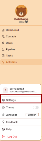
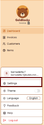
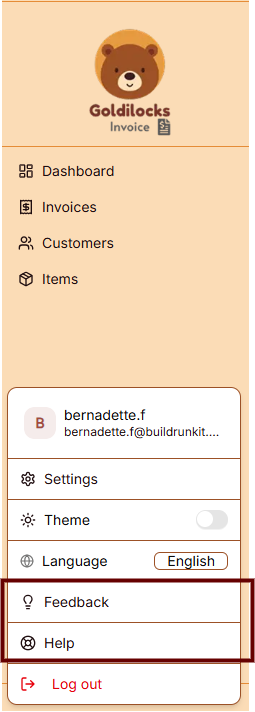
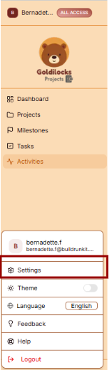
Profile Details: This section allows you to manage your identity. You can enter and update your First Name, Last Name, Email, and Phone number in the provided text fields.
- Bio: Use the larger text area to add a brief professional summary or description to your profile.
- Save Changes: Click the brown Save Changes button at the bottom right to finalize any updates to your personal information.

---

</div></div>### Account Security

You can manage your account access and protection through the Security menu:

<div _ngcontent-ng-c2811658299="" class="container" id="bkmrk-password-management%3A"><div _ngcontent-ng-c1029391613="" aria-busy="false" aria-live="polite" class="markdown markdown-main-panel enable-updated-hr-color" dir="ltr" inline-copy-host="">- Password Management: Update your login credentials to keep your account secure.
- Notifications: Configure how and when you receive system alerts and updates.

---

</div></div>### Interface Preferences

[![Screenshot 2026-05-14 152411.png](https://library.buildrunkit.com/uploads/images/gallery/2026-05/scaled-1680-/screenshot-2026-05-14-152411.png)](https://library.buildrunkit.com/uploads/images/gallery/2026-05/screenshot-2026-05-14-152411.png)

[![Screenshot 2026-05-14 152550.png](https://library.buildrunkit.com/uploads/images/gallery/2026-05/scaled-1680-/screenshot-2026-05-14-152550.png)](https://library.buildrunkit.com/uploads/images/gallery/2026-05/screenshot-2026-05-14-152550.png)

You can customize the look of your workspace through the Appearance menu to match your working environment.

Theme Selection Adjust the visual style of the application:

<div _ngcontent-ng-c2811658299="" class="container" id="bkmrk-light%3A-a-bright-inte"><div _ngcontent-ng-c1029391613="" aria-busy="false" aria-live="polite" class="markdown markdown-main-panel enable-updated-hr-color" dir="ltr" inline-copy-host="">- Light: A bright interface with a light-colored background.
- Dark: A high-contrast interface with a dark background, ideal for low-light environments.
- System: Automatically syncs the interface theme with your device's operating system settings.
- Update Theme: Click the brown Update Theme button to apply your chosen visual style.

</div></div>## Workspace Management

[![Screenshot 2026-05-15 125515.png](https://library.buildrunkit.com/uploads/images/gallery/2026-05/scaled-1680-/screenshot-2026-05-15-125515.png)](https://library.buildrunkit.com/uploads/images/gallery/2026-05/screenshot-2026-05-15-125515.png)

The Workspace settings allow you to control the environments you belong to, manage your team, and update workspace identities.

### All Workspaces

This tab provides an overview of every workspace your account is currently associated with.

- Status &amp; Plans: You can see the name of each workspace and its current subscription plan (e.g., "Custom" or "Enterprise").
- Leaving a Workspace: By clicking the three dots (actions menu) next to a workspace, you can select Exit to remove yourself from that environment.

### Edit Workspace

This is where you manage the primary identity of your current business environment.

- Changing the Name: Use the Edit Workspace section to update the display name of the workspace.
- Save Changes: Ensure you click the brown Save Changes button after renaming to apply the update across the suite.

### Manage Workspace Members

Control who has access to your workspace in this section.

- Member List: View all users, their email addresses, and their assigned roles (e.g., Owner).
- Invite Members: Click the + Invite member button at the top right to add a new person to the team via email.
- Removing Users: To revoke access, click the three dots (actions menu) next to a member's name and select Remove user.

## Subscription &amp; Billing

[![Screenshot 2026-05-15 141018.png](https://library.buildrunkit.com/uploads/images/gallery/2026-05/scaled-1680-/screenshot-2026-05-15-141018.png)](https://library.buildrunkit.com/uploads/images/gallery/2026-05/screenshot-2026-05-15-141018.png)

The Subscription area is your hub for managing plan access, tracking workspace limits, and handling payments.

### Subscription Overview

This tab provides a high-level view of your current standing:

- Active Plan: Displays the name of your current plan (e.g., "Custom").
- Cost Details: Shows the recurring price and billing frequency (e.g., "$0.00 / Monthly").
- Usage Trackers: Three progress bars track your real-time usage for Invoices, Customers, and Items against your plan’s total capacity.
- Management Buttons: \* Change Plan: Opens the tier selection menu.
    
    
    - Cancel Subscription: Initiates the process to stop recurring payments.

### Changing Your Plan

[![Screenshot 2026-05-12 133144.png](https://library.buildrunkit.com/uploads/images/gallery/2026-05/scaled-1680-/screenshot-2026-05-12-133144.png)](https://library.buildrunkit.com/uploads/images/gallery/2026-05/screenshot-2026-05-12-133144.png)

Clicking Change Plan reveals the available subscription tiers:

- Billing Toggle: A switch at the top to toggle between Monthly and Yearly pricing.
- Plan Tiers: Choose between Free, Plus, and Pro.
- Tier Limits: Each column details the specific limits for Invoices, Customers, Items, and Workspace Members.
- Action: Click the brown Choose Plan button under your desired tier to proceed.

### Add-ons

[![Screenshot 2026-05-12 131713.png](https://library.buildrunkit.com/uploads/images/gallery/2026-05/scaled-1680-/screenshot-2026-05-12-131713.png)](https://library.buildrunkit.com/uploads/images/gallery/2026-05/screenshot-2026-05-12-131713.png)

The Add-ons tab allows for modular upgrades without changing your full plan:

- Available Features: You can purchase extra Invoices, Customers, Items, or Workspace Members.
- Pricing: Each add-on lists its specific monthly cost.
- Action: Click the brown Buy button next to the relevant feature to initiate the purchase.

### Checkout Process

[![Screenshot 2026-05-12 132721.png](https://library.buildrunkit.com/uploads/images/gallery/2026-05/scaled-1680-/screenshot-2026-05-12-132721.png)](https://library.buildrunkit.com/uploads/images/gallery/2026-05/screenshot-2026-05-12-132721.png)

The Checkout page is the final step for any plan change or add-on purchase:

- Back to subscription: A link at the top left to return without purchasing.
- Payment Method: Confirms the card on file that will be charged for the transaction.
- Order Summary: Displays the Subtotal, Tax, and the final Total Amount Due.
- Action: Click the brown Pay &amp; Subscribe button to finalize the order and update your workspace limits.

## Tags Settings

[![Screenshot 2026-05-15 141457.png](https://library.buildrunkit.com/uploads/images/gallery/2026-05/scaled-1680-/screenshot-2026-05-15-141457.png)](https://library.buildrunkit.com/uploads/images/gallery/2026-05/screenshot-2026-05-15-141457.png)

The Settings area includes a dedicated section for managing your contact categorization through the Tags menu. This allows you to label and organize your contacts based on their relationship to your business.

### Contact Tag Management

In the Tags tab, you can create and manage a variety of labels to categorize your contacts effectively:

- Existing Tags: View your current list of tags, such as Hot Lead, Cold Lead, Customer, Prospect, Partner, Vendor, Lead, and Investor.
- Toggle Status: Use the toggle switch next to each tag to quickly enable or disable it within your workspace.
- Edit Tag: Click the pencil icon to rename a tag or change its associated color for better visual organization.
- Delete Tag: Click the trash can icon to permanently remove a tag from your system.

---

### Customizing Your Tags

You can further tailor your labeling system using the management buttons at the top right of the list:

- Add Tag: Click the brown + Add Tag button to create a brand-new category specific to your workflow.
- Restore Defaults: Use this button to automatically add a standard set of business tags to your workspace if you need a quick starting point.

## Pipeline Settings

[![Screenshot 2026-05-15 141633.png](https://library.buildrunkit.com/uploads/images/gallery/2026-05/scaled-1680-/screenshot-2026-05-15-141633.png)](https://library.buildrunkit.com/uploads/images/gallery/2026-05/screenshot-2026-05-15-141633.png)

The Pipeline section in Settings allows you to customize the stages of your sales process to match your specific workflow.

### Managing Pipeline Stages

In the Pipeline Stages tab, you can define the progression of your deals from initial contact to completion:

- Current Stages: View your active pipeline stages, such as New Lead, Discovery, Proposal, Negotiation, Closed Won, and Closed Lost.
- Reorder Stages: Use the drag-and-drop handle (six dots) on the left of each stage to change the order of your sales process.
- Stage Colors: Each stage is associated with a specific color for easy visual identification in the main Pipeline view.
- Deal Count: Monitor how many active deals are currently assigned to each specific stage.
- Delete Stage: Click the trash can icon to remove a stage that is no longer needed in your process.

---

### Customizing Your Workflow

You can modify the structure of your sales pipeline using the primary management tools:

- Add Stage: Click the brown + Add Stage button at the top right to create a new step in your sales cycle.
- Restore Defaults: Use this button to reset your pipeline to a standard set of business stages.
- Save Pipeline: Once you have finished making adjustments, click the brown Save Pipeline button at the bottom right to apply your changes.

## Webform

[![Screenshot 2026-05-15 142236.png](https://library.buildrunkit.com/uploads/images/gallery/2026-05/scaled-1680-/screenshot-2026-05-15-142236.png)](https://library.buildrunkit.com/uploads/images/gallery/2026-05/screenshot-2026-05-15-142236.png)

The Webform section in Settings allows you to create and manage custom contact forms to embed on your website, streamlining how you capture new leads.

### Managing Webforms

In the main Webforms tab, you can oversee your collection of active forms:

- Create Webform: Click the brown + Create Webform button to start building a new form.
- Form List: View all existing forms and their current status within your workspace.

---

### Creating a New Webform

[![Screenshot 2026-05-19 124940.png](https://library.buildrunkit.com/uploads/images/gallery/2026-05/scaled-1680-/screenshot-2026-05-19-124940.png)](https://library.buildrunkit.com/uploads/images/gallery/2026-05/screenshot-2026-05-19-124940.png)

When building a form, you can customize the information gathered, automate contact settings, and define the visual style to match your brand:

**Basic Information**

- Internal Name: Input a unique identifier for internal tracking (e.g., "contact-form").
- Form Title: Define the public-facing title displayed at the top of your form (e.g., "Contact Us").
- Description: Provide a brief public message or instructions for your visitors (e.g., "Get in touch with our team. We'd love to hear from you!").

**Contact Defaults &amp; Automation**

- Default Contact Owner (Auto-Assignment): Use the dropdown menu to assign a default team member responsible for new leads generated through this form.
    
    
    - *System Behavior:* New submissions are routed automatically to this person. If an existing contact submits the form, their current owner remains unchanged to prevent workflow disruptions.
- Apply Tags Automatically (Auto-Tagging): Select tags to apply automatically to contacts upon submission. Options include Hot Lead, Cold Lead, Customer, Prospect, Partner, Vendor, Lead, Investor, and VIP.
    
    
    - *System Behavior:* If the contact already exists in your database, these new tags are appended without deleting any of their existing tags.

**Form Fields**

**[![Screenshot 2026-05-19 125021.png](https://library.buildrunkit.com/uploads/images/gallery/2026-05/scaled-1680-/screenshot-2026-05-19-125021.png)](https://library.buildrunkit.com/uploads/images/gallery/2026-05/screenshot-2026-05-19-125021.png)**

- Field Addition: Use the Add field dropdown menu at the top right of the section to introduce new data points.
- Standard Fields: Arrange and configure core contact fields, including First Name, Last Name, and Email Address.
- Field Labels &amp; Placeholders: Customize the visible label text and the temporary placeholder hint inside the box (e.g., "your.email@example.com").
- Requirements: Toggle the Required field switch to determine if a field must be completed before submission. Mandatory fields display a red Required badge.
- Removal: Click the trash can icon on any field block to delete it from the form layout.

**Styling &amp; Submission Details**

- Background Color: Define the primary block color using hex codes (e.g., #ffffff).
- Text Color: Set the visual hex code for standard form labeling (e.g., #333333).
- Button Text: Customize the text displayed inside the submission button (e.g., "Submit").
- Button Background: Select a hex code to brand the main button element (e.g., #3b82f6).
- Button Text Color: Specify the hex value for the text inside the submission button (e.g., #ffffff) to ensure proper visual contrast.
- Live Preview: Review the interactive button component at the bottom of the panel to verify color combinations before deploying.

---

### Finalizing Your Form

- - Cancel: Click Cancel to discard changes and close the form builder.
    - Create Webform: Click the brown Create Webform button to save your settings and activate the form.

## Custom Fields

[![Screenshot 2026-05-15 142744.png](https://library.buildrunkit.com/uploads/images/gallery/2026-05/scaled-1680-/screenshot-2026-05-15-142744.png)](https://library.buildrunkit.com/uploads/images/gallery/2026-05/screenshot-2026-05-15-142744.png)

The Custom Fields section in Settings allows you to define unique attributes for your records, ensuring you can capture specific data points that are important to your business but not included in the standard fields.

### Managing Custom Fields

In the main Custom Fields tab, you can oversee all specialized data points you have created for your workspace:

- Add Custom Field: Click the brown + Add Custom Field button at the top right to define a new attribute.
- Field Overview: This area displays a list of all current custom fields. If none have been created yet, the screen will show a "No custom fields defined yet" message.

---

### Adding a Custom Field

[![Screenshot 2026-05-15 142813.png](https://library.buildrunkit.com/uploads/images/gallery/2026-05/scaled-1680-/screenshot-2026-05-15-142813.png)](https://library.buildrunkit.com/uploads/images/gallery/2026-05/screenshot-2026-05-15-142813.png)

When you create a new field, you can specify exactly how it functions and where it appears:

- Applies To: Use the dropdown menu to select whether the new field should be attached to a Contact or a Deal.
- Field Label: Enter the name of the field as you want it to appear in the interface (e.g., "Target Demographic").
- Placeholder: Customize the hint text that appears inside the input box to guide data entry (e.g., "e.g., Enter target demographic...").
- Save: Click the brown Save button to finalize the field and add it to your records.

## Import &amp; Export

[![Screenshot 2026-05-15 143120.png](https://library.buildrunkit.com/uploads/images/gallery/2026-05/scaled-1680-/screenshot-2026-05-15-143120.png)](https://library.buildrunkit.com/uploads/images/gallery/2026-05/screenshot-2026-05-15-143120.png)

The Import/Export section allows you to migrate data into your workspace or download your current records for external use.

### Data Import Process

<div drawio-diagram="310"><img src="https://library.buildrunkit.com/uploads/images/drawio/2026-05/drawing-4-1778849435.png" alt=""/></div>

To ensure your data is formatted correctly before uploading, you can use the built-in templates provided by the CRM:

<div _ngcontent-ng-c2203452768="" class="container" id="bkmrk-step-1%3A-download-tem"><div _ngcontent-ng-c488876445="" aria-busy="false" aria-live="polite" class="markdown markdown-main-panel enable-updated-hr-color" dir="ltr" inline-copy-host="">- 
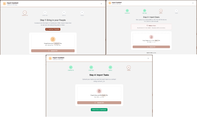
Step 1: Download Templates: Before you begin your upload, use the Download Template links for Contacts, Deals, or Tasks. These files contain the correct column headers to make mapping seamless.
- Step 2: Upload File: Once your template is filled out, select the appropriate category and upload your file.
- Step 3: Map Fields: Align your spreadsheet columns with the CRM fields.
- Step 4: Preview &amp; Finish: Review your data sample, then complete the import to add the records to your workspace.

---

</div></div>### Importing Tasks

When you reach the Tasks portion of the tool, you have two final choices:

<div _ngcontent-ng-c2203452768="" class="container" id="bkmrk-upload-tasks%3A-if-you"><div _ngcontent-ng-c488876445="" aria-busy="false" aria-live="polite" class="markdown markdown-main-panel enable-updated-hr-color" dir="ltr" inline-copy-host="">- Upload Tasks: If you have task data ready in the template, click this button to process it.
- Finish and go to Dashboard: Click this to exit the setup and return to your main dashboard.

---

</div></div>### Data Export

The export tool allows you to create portable backups of your information:

<div _ngcontent-ng-c2203452768="" class="container" id="bkmrk-select-records%3A-choo"><div _ngcontent-ng-c488876445="" aria-busy="false" aria-live="polite" class="markdown markdown-main-panel enable-updated-hr-color" dir="ltr" id="bkmrk-select-records%3A-choo-1" inline-copy-host="">- Select Records: Choose to export your Contacts, Deals, or Tasks.
- Export Action: Click the brown Export Data button.
- File Format: Your records will automatically download as a ZIP file. You must extract this folder on your computer to access the individual spreadsheet files inside.

</div></div><div _ngcontent-ng-c2811658299="" class="container" id="bkmrk--26"><div _ngcontent-ng-c1029391613="" aria-busy="false" aria-live="polite" class="markdown markdown-main-panel enable-updated-hr-color" dir="ltr" id="bkmrk-light%3A-a-bright-inte-1" inline-copy-host=""></div></div>

# Feedback and help

## Feedback and help

<div drawio-diagram="311"><img src="https://library.buildrunkit.com/uploads/images/drawio/2026-05/drawing-4-1778849676.png" alt=""/></div>

This section allows you to communicate with the team and access support resources directly within the platform.

#### Sidebar Menu

The navigation for support is located at the bottom of the sidebar:

- Feedback: The primary link to open the feedback submission window.
- Help: The link located directly underneath "Feedback" for support resources.

### Feedback

[![Screenshot 2026-05-12 143742.png](https://library.buildrunkit.com/uploads/images/gallery/2026-05/scaled-1680-/screenshot-2026-05-12-143742.png)](https://library.buildrunkit.com/uploads/images/gallery/2026-05/screenshot-2026-05-12-143742.png)

Clicking Feedback opens a window with the following fields:

- Category: A dropdown menu to select the nature of your message. The options include:
    
    
    - Bug Report
    - Feature Request
    - General Feedback
    - Question
- Subject: A text input field to summarize your feedback.
- Message: A large text area for providing the full details of your report or suggestion.
- Send Feedback: The brown button at the bottom of the form used to submit your information.

### Help

[![Screenshot 2026-05-12 151417.png](https://library.buildrunkit.com/uploads/images/gallery/2026-05/scaled-1680-/screenshot-2026-05-12-151417.png)](https://library.buildrunkit.com/uploads/images/gallery/2026-05/screenshot-2026-05-12-151417.png)

To access the support portal, click the Help option located at the bottom of the navigation sidebar. This opens the Support Center in a new window.

#### Support Center Home

The main landing page of the Support Center provides a centralized location for managing support requests:

- Search: A search bar is located at the top to search the knowledge base for specific information.
- Support Ticket System: The platform uses a ticket system where every request is assigned a unique number to track progress online.
- Email Requirement: A valid email address is required to submit a new ticket.

#### Navigation Menu

The top navigation bar within the Support Center contains the following tabs:

- Support Center Home: Returns you to the main welcome page.
- Knowledgebase: Provides access to categorized FAQs and documentation.
- Open a New Ticket: Opens a form to submit a direct support request.
- Check Ticket Status: Allows you to view the progress of existing tickets using your email and ticket number.

### Knowledgebase

[![Screenshot 2026-05-12 152011.png](https://library.buildrunkit.com/uploads/images/gallery/2026-05/scaled-1680-/screenshot-2026-05-12-152011.png)](https://library.buildrunkit.com/uploads/images/gallery/2026-05/screenshot-2026-05-12-152011.png)

The Knowledgebase tab allows you to browse support articles by category to find answers to common questions.

- Browse by Topic: Use the dropdown menu on the right to jump directly to a specific help topic.

### Open a New Ticket

[![Screenshot 2026-05-12 153034.png](https://library.buildrunkit.com/uploads/images/gallery/2026-05/scaled-1680-/screenshot-2026-05-12-153034.png)](https://library.buildrunkit.com/uploads/images/gallery/2026-05/screenshot-2026-05-12-153034.png)

This section allows you to submit a formal support request to the team.

#### Contact Information

- Email Address \*: A required field to enter your contact email.
- Full Name \*: A required field to provide your name.
- Phone Number: An optional field with a separate box for an Ext: (extension).

#### Ticket Details

- Help Topic \*: A required dropdown menu where you must "-Select a Help Topic -" to categorize your request.

#### Form Actions

- Create Ticket: Click this button to submit your request.
- Reset: Click this button to clear all information currently entered in the form.
- Cancel: Click this button to exit the ticket creation process.

### Check Ticket Status

[![Screenshot 2026-05-12 153415.png](https://library.buildrunkit.com/uploads/images/gallery/2026-05/scaled-1680-/screenshot-2026-05-12-153415.png)](https://library.buildrunkit.com/uploads/images/gallery/2026-05/screenshot-2026-05-12-153415.png)

This section allows you to track the progress of your existing support requests.

Check Status via Email To access a specific ticket, provide the following details to receive an access link via email:

- Email Address: Enter the email address associated with your ticket (e.g., john.doe@osticket.com).
- Ticket Number: Enter the unique ID assigned to your request (e.g., 051243).
- Email Access Link Button: Click this to have the login link sent to your inbox.

#### Account Access

- Sign In / Register: If you have an account, you can Sign In or register for an account to view a complete history of all your tickets in one place.
- Security: This form is protected, indicated by the padlock icon on the right.

#### Troubleshooting

- First-time contact: If you have never contacted support before or have lost your ticket number, click the open a new ticket link at the bottom of the page.

# Goldilocks Invoice

# Goldilocks Invoice: Overview and Account Setup

# **Goldilocks Invoice: Introduction**

**[![Screenshot 2026-05-12 114235.png](https://library.buildrunkit.com/uploads/images/gallery/2026-05/scaled-1680-/screenshot-2026-05-12-114235.png)](https://library.buildrunkit.com/uploads/images/gallery/2026-05/screenshot-2026-05-12-114235.png)**

**Goldilocks Invoice** is the professional billing and payment management module within the BuildRunKit ecosystem. Designed specifically for founders and growing teams, it provides a "just right" balance of professional features and ease of use, allowing you to manage your revenue without the complexity of traditional accounting software.

### Getting Started

[![Screenshot 2026-05-12 115729.png](https://library.buildrunkit.com/uploads/images/gallery/2026-05/scaled-1680-/screenshot-2026-05-12-115729.png)](https://library.buildrunkit.com/uploads/images/gallery/2026-05/screenshot-2026-05-12-115729.png)

BuildRunKit is a unified workspace designed to help you plan, build, and run your business. One account gives you full access to the core platform plus the Goldilocks Suite (CRM, Invoices, and Projects).

#### Creating Your Free Account

To begin, navigate to the registration page. You can create an account using your email or a third-party provider.

**Using Email Registration:**

1. Name: Enter your First name and Last name in the designated fields.
2. Email Address: Provide your primary work email address.
3. Password: Create a strong, secure password. You can click the eye icon to reveal the text and double-check your typing.
4. Terms &amp; Privacy: Review the Terms of Service and Privacy Policy, then check the box to confirm your agreement.
5. Create Account: Click the blue Create account button to finalize your registration.

Using Social Authentication: For faster access, you can choose to "continue with" one of the following providers:

- Google
- GitHub

###  

### Accessing Your Account

[![Screenshot 2026-05-12 115821.png](https://library.buildrunkit.com/uploads/images/gallery/2026-05/scaled-1680-/screenshot-2026-05-12-115821.png)](https://library.buildrunkit.com/uploads/images/gallery/2026-05/screenshot-2026-05-12-115821.png)

Once you have created your account, you can return to BuildRunKit at any time by using the Sign In screen. This grants you full access to the core platform, including the Goldilocks Suite (CRM, Projects, and Invoices).

#### How to Sign In

1. Email Address: Enter the email address associated with your account in the first field.
2. Password: Enter your secure password.
    
    
    - Tip: Click the eye icon on the right side of the password field to temporarily reveal the text and ensure it is typed correctly.
3. Forgot Password?: If you cannot remember your credentials, click the blue "Forgot password?" link just above the Sign In button. A reset link will be sent to your registered email address.
4. Complete Access: Click the blue Sign In button to enter your workspace.

#### Alternative Login Options

If you registered using a third-party account, you can log in instantly by clicking:

- Google
- GitHub

> Note: If you are on this page by mistake and need to register, click the "Create one for free" link at the top right of the login box.

# Goldilocks Invoice Dashboard

## Goldilocks Invoice Dashboard

[![Screenshot 2026-05-12 120753.png](https://library.buildrunkit.com/uploads/images/gallery/2026-05/scaled-1680-/screenshot-2026-05-12-120753.png)](https://library.buildrunkit.com/uploads/images/gallery/2026-05/screenshot-2026-05-12-120753.png)

Once you have successfully signed in, you will be greeted by the Dashboard. This page is designed to give you a "at a glance" view of your latest activity and provide fast jumps into your most important billing workflows.


### Managing Your Workspace

[![Screenshot 2026-05-12 121419.png](https://library.buildrunkit.com/uploads/images/gallery/2026-05/scaled-1680-/screenshot-2026-05-12-121419.png)](https://library.buildrunkit.com/uploads/images/gallery/2026-05/screenshot-2026-05-12-121419.png)

At the very top of the left sidebar, you will see your current workspace name. BuildRunKit allows you to manage multiple business environments from a single account.

**How to Switch Workspaces:**

1. Click the Workspace Selector: Click on the workspace name at the top of the sidebar.
2. Select from the List: A dropdown menu will appear showing all workspaces you have access to (such as "Official BuildRunKit Employee Workspace" or "Training &amp; Demo").
3. Instant Switch: Click on the desired name to instantly switch all data (Invoices, Customers, and Items) to that workspace.
4. Create New: You can also click "+ Create workspace" at the bottom of this menu to start a brand new business environment.

### Activity Overview Cards

The top cards provide a quick count of your latest synced data:

- Invoices: Total count of recent billable documents.
- Customers: Total number of clients in your database.
- Items: Total number of saved services/products in your catalog.

### Quick Action Sections

- Recent Invoices: View your latest drafts or sent items. Click "Create your first invoice" to start a new bill.
- Recent Customers: See newly added contacts. Click "Create your first customer" to add a new client.
- Recent Items: View recently saved services. Click "Create your first item" to expand your service catalog.

### Navigation Sidebar

The sidebar provides quick links to:

- Dashboard: Returns you to this overview page.
- Invoices: View your full history of sent, paid, and overdue bills.
- Customers: Access your full client directory.
- Items: Manage your full library of billable products and services.

# Managing Invoices

## Managing Invoices

[![Screenshot 2026-05-12 124119.png](https://library.buildrunkit.com/uploads/images/gallery/2026-05/scaled-1680-/screenshot-2026-05-12-124119.png)](https://library.buildrunkit.com/uploads/images/gallery/2026-05/screenshot-2026-05-12-124119.png)

The Invoices page is where you track the lifecycle of every bill sent from your workspace. It provides a high-level summary of your revenue and a detailed list for granular management.

### Invoice Overview

At the top of the page, four key metrics provide an instant status update for your current workspace:

- Total Invoices: The total number of invoices generated.
- Paid: The count of all completed payments.
- Pending: Invoices that have been sent and are awaiting payment.
- Overdue: Any invoices that have passed their assigned due date.

#### The Invoice List

The Invoice List table displays all records, allowing you to search and organize your data:

- Search: Use the "Search invoices by number..." bar to find a specific document quickly.
- Customizing Columns: Click the Columns dropdown to choose which details to display, such as Invoice Number, Customer, Date, Due Date, Amount, Balance, and Status.
- New Invoice: Click the + New Invoice button at the top right to start a new billing entry.

#### Generating Reports

[![c1eecf85-9c4c-4a15-845c-78c4b971ccd9.png](https://library.buildrunkit.com/uploads/images/gallery/2026-05/scaled-1680-/c1eecf85-9c4c-4a15-845c-78c4b971ccd9.png)](https://library.buildrunkit.com/uploads/images/gallery/2026-05/c1eecf85-9c4c-4a15-845c-78c4b971ccd9.png)

If you need to export your invoicing data for accounting or review, click the Generate Report button at the top right. This will open a configuration window with the following options:

- PDF: This format is best for printing and direct sharing with stakeholders.
- Excel: This format is best for detailed financial analysis and editing.

Once you have selected your preferred format, click Generate Report to download the file.

### Creating Your First Invoice

[![Screenshot 2026-05-12 124555.png](https://library.buildrunkit.com/uploads/images/gallery/2026-05/scaled-1680-/screenshot-2026-05-12-124555.png)](https://library.buildrunkit.com/uploads/images/gallery/2026-05/screenshot-2026-05-12-124555.png)

To begin a new bill, click the + New Invoice button from either the Dashboard or the Invoices page. This will open the "Create Invoice" workflow.

#### Invoice Details

In this section, you will configure the basic identity and timeline of the invoice:

- Invoice Number: This is automatically generated (e.g., INV-10001) but can be modified if you have a specific internal numbering system.
- Customer: Select a client from your saved database. If you see the message "No customers found," you must navigate to the Customers tab to add one before you can proceed.
- Dates: Use the calendar icons to set both the Invoice Date (when it is issued) and the Due Date (when payment is expected).
- Terms &amp; Tax: Use the dropdowns to set Payment Terms (such as "Due On Receipt") and enter the applicable Tax Rate percentage.

#### Adding Line Items

Line items represent the specific work or products you are charging for.

- Adding Items: Click the + Add Item button to add more rows to your invoice.
- Item Details: For each row, you can choose a saved item from your catalog or enter a "Custom" one. Fill in the Description, Quantity (Qty), and Price.
- Taxable Toggle: Check the Taxable circle for individual items if tax should be applied specifically to that row.
- Totals: The system will automatically calculate your Subtotal, any Tax amounts, and the final Total at the bottom right.

# Managing Customers

## Managing Customers

[![Screenshot 2026-05-12 124835.png](https://library.buildrunkit.com/uploads/images/gallery/2026-05/scaled-1680-/screenshot-2026-05-12-124835.png)](https://library.buildrunkit.com/uploads/images/gallery/2026-05/screenshot-2026-05-12-124835.png)

The Customers section is where you store and organize all client contact information. Having a populated customer list allows you to quickly select recipients when creating new invoices.

### The Customer List View

When you click Customers in the sidebar, you’ll see a high-level summary followed by your full database:

- Total Customers: The total number of contacts in your current workspace.
- With Email: The number of customers that have a reachable email address on file.
- With Address: The number of customers with a saved billing address.
- Search &amp; Filter: Use the search bar to find a client by Name, Email, or Company.
- Custom Columns: Click the Columns dropdown to choose which information you want to see in the table (e.g., Phone, Company, or Created Date).

### Generating Customer Reports

[![Screenshot 2026-05-12 124803.png](https://library.buildrunkit.com/uploads/images/gallery/2026-05/scaled-1680-/screenshot-2026-05-12-124803.png)](https://library.buildrunkit.com/uploads/images/gallery/2026-05/screenshot-2026-05-12-124803.png)

If you need a physical or digital list of your clients, click the Generate Report button at the top right. A window will appear with the following options:

- Content Options: Check the "Include customer notes" box if you want your internal memos about the client to be included in the file.
- Export Format:
    
    
    - PDF: Best for sharing a clean, professional-looking list.
    - Excel: Best if you need to edit the data or upload it to another system.

Click Generate Report to save the file to your computer.

### Adding a New Customer

[![Screenshot 2026-05-12 125522.png](https://library.buildrunkit.com/uploads/images/gallery/2026-05/scaled-1680-/screenshot-2026-05-12-125522.png)](https://library.buildrunkit.com/uploads/images/gallery/2026-05/screenshot-2026-05-12-125522.png)

To add a new client to your workspace, click the brown + New Customer button at the top right of the Customers page. This will open the setup form where you can enter the following details:

- Primary Identity: Enter the First Name and Last Name (required).
- Contact Details: Add their Email address and Phone number so you can reach them regarding their invoices.
- Professional Info: If they represent a business, enter the Company name and their Position (e.g., CEO, Manager).
- Billing Address: Enter the full Address (Street, City, State, Zip) to ensure it appears correctly on their generated invoices.
- Internal Notes: Use the Notes section to add any private details about this contact that you want to keep for your records. These can be included in your exported reports if you choose.

Once all the information is entered, click the brown Create Customer button to save the record to your database.

# Items Catalog

## Items Catalog

[![Screenshot 2026-05-12 125706.png](https://library.buildrunkit.com/uploads/images/gallery/2026-05/scaled-1680-/screenshot-2026-05-12-125706.png)](https://library.buildrunkit.com/uploads/images/gallery/2026-05/screenshot-2026-05-12-125706.png)

The Items page is your library of products and services. Saving your standard offerings here allows you to quickly pull them into any new invoice without re-typing details.

### The Items Overview

At the top of the screen, you can see the overall status of your service catalog:

- Total Items: The number of unique products or services you have saved.
- Taxable Items: A count of items currently marked as subject to tax.
- Average Price: The middle-point price across your entire list.
- Highest Price: The price of your most expensive single offering.

### Managing Your Catalog

The main table lists all your saved items and their key details:

- Search: Use the "Search items by name or description..." bar to find a specific service.
- Information Columns: The table displays the Name, Description, Price, and Taxable? status for each entry.
- Organization: You can see when an item was first added under the Created At column.
- New Item: Click the brown + New Item button at the top right to add a new service to your library.

### Generating Items Reports

[![Screenshot 2026-05-12 125739.png](https://library.buildrunkit.com/uploads/images/gallery/2026-05/scaled-1680-/screenshot-2026-05-12-125739.png)](https://library.buildrunkit.com/uploads/images/gallery/2026-05/screenshot-2026-05-12-125739.png)

To export a list of your products and services, click the Generate Report button. The configuration window offers the following:

- Content Options: Check "Include item descriptions" if you want the full text of your services included in the export.
- Export Format: Choose between PDF (best for printing) or Excel (best for analysis and editing).

Click the brown Generate Report button to finalize the download.

### Adding a New Item

[![Screenshot 2026-05-12 130036.png](https://library.buildrunkit.com/uploads/images/gallery/2026-05/scaled-1680-/screenshot-2026-05-12-130036.png)](https://library.buildrunkit.com/uploads/images/gallery/2026-05/screenshot-2026-05-12-130036.png)

To build your catalog of standard services or products, click the brown + New Item button at the top right of the Items page. This opens a creation form with the following fields:

- Name: Enter a clear, professional title for the service (e.g., "Consulting Hour").
- Description: Provide a detailed explanation of what is included in this item. This text can be included in your generated reports.
- Price: Set your standard rate for this item. This price will automatically populate whenever you add the item to a new invoice.
- Taxable Status: If this service is subject to sales tax, ensure the "Check if this item is subject to sales tax" box is selected.

Once the details are finalized, click the brown Create Item button to add it to your permanent catalog.

# User Profile & Settings

## User Profile &amp; Settings

<div drawio-diagram="272"><img src="https://library.buildrunkit.com/uploads/images/drawio/2026-05/drawing-4-1778678125.png" alt=""/></div>

[![Screenshot 2026-05-12 130424.png](https://library.buildrunkit.com/uploads/images/gallery/2026-05/scaled-1680-/screenshot-2026-05-12-130424.png)](https://library.buildrunkit.com/uploads/images/gallery/2026-05/screenshot-2026-05-12-130424.png)

The Settings area allows you to manage your personal information, account security, and how the interface appears to you.

### Managing Personal Information

Under the User tab, you can view and update your primary account details:

<div _ngcontent-ng-c4166715710="" class="container" id="bkmrk-user-profile%3A-this-s"><div _ngcontent-ng-c872397921="" aria-busy="false" aria-live="polite" class="markdown markdown-main-panel enable-updated-hr-color" dir="ltr" inline-copy-host="">- User Profile: This section displays your Display Name, your Phone Number, and the date you became a member. Click the Edit button to make changes to your name or phone details.
- Email Address: View the primary email associated with your account. You can update this by clicking Edit, which will trigger a confirmation link to your new address.

</div></div>### Account Security

You can update your login credentials at any time in the Change Password section:

<div _ngcontent-ng-c4166715710="" class="container" id="bkmrk-current-password%3A-en"><div _ngcontent-ng-c872397921="" aria-busy="false" aria-live="polite" class="markdown markdown-main-panel enable-updated-hr-color" dir="ltr" inline-copy-host="">- Current Password: Enter your existing password for verification.
- New Password: Create a new password containing at least 8 characters.
- Confirm: Re-enter the new password to ensure it matches, then click the brown Change Password button to finalize.

---

</div></div>### Interface Preferences

[![Screenshot 2026-05-12 130310.png](https://library.buildrunkit.com/uploads/images/gallery/2026-05/scaled-1680-/screenshot-2026-05-12-130310.png)](https://library.buildrunkit.com/uploads/images/gallery/2026-05/screenshot-2026-05-12-130310.png)  
[![Screenshot 2026-05-12 130338.png](https://library.buildrunkit.com/uploads/images/gallery/2026-05/scaled-1680-/screenshot-2026-05-12-130338.png)](https://library.buildrunkit.com/uploads/images/gallery/2026-05/screenshot-2026-05-12-130338.png)

You can customize the look and language of your workspace through the Preferences menu.

#### Language Settings

Choose the primary language for your interface:

<div _ngcontent-ng-c4166715710="" class="container" id="bkmrk-english%3A-use-the-int"><div _ngcontent-ng-c872397921="" aria-busy="false" aria-live="polite" class="markdown markdown-main-panel enable-updated-hr-color" dir="ltr" inline-copy-host="">- English: Use the interface in English.
- Español: Usar la interfaz en español.

</div></div>#### Theme Selection

Adjust the visual appearance of the application to match your working environment:

<div _ngcontent-ng-c4166715710="" class="container" id="bkmrk-light-theme%3A-a-brigh"><div _ngcontent-ng-c872397921="" aria-busy="false" aria-live="polite" class="markdown markdown-main-panel enable-updated-hr-color" dir="ltr" inline-copy-host="">- Light Theme: A bright interface with a light-colored background.
- Dark Theme: A high-contrast interface with a dark background, ideal for low-light environments.

</div></div>## Workspace Management

[![Screenshot 2026-05-12 131222.png](https://library.buildrunkit.com/uploads/images/gallery/2026-05/scaled-1680-/screenshot-2026-05-12-131222.png)](https://library.buildrunkit.com/uploads/images/gallery/2026-05/screenshot-2026-05-12-131222.png)

The Workspace settings allow you to control the environments you belong to, manage your team, and update workspace identities.

### All Workspaces

This tab provides an overview of every workspace your account is currently associated with.

- Status &amp; Plans: You can see the name of each workspace and its current subscription plan (e.g., "Custom" or "Enterprise").
- Leaving a Workspace: By clicking the three dots (actions menu) next to a workspace, you can select Exit to remove yourself from that environment.

### Edit Workspace

This is where you manage the primary identity of your current business environment.

- Changing the Name: Use the Edit Workspace section to update the display name of the workspace.
- Save Changes: Ensure you click the brown Save Changes button after renaming to apply the update across the suite.

### Manage Workspace Members

Control who has access to your workspace in this section.

- Member List: View all users, their email addresses, and their assigned roles (e.g., Owner).
- Invite Members: Click the + Invite member button at the top right to add a new person to the team via email.
- Removing Users: To revoke access, click the three dots (actions menu) next to a member's name and select Remove user.

## Subscription &amp; Billing

[![Screenshot 2026-05-12 131511.png](https://library.buildrunkit.com/uploads/images/gallery/2026-05/scaled-1680-/screenshot-2026-05-12-131511.png)](https://library.buildrunkit.com/uploads/images/gallery/2026-05/screenshot-2026-05-12-131511.png)

The Subscription area is where you manage your workspace plan, tracking limits, and payment details to ensure uninterrupted access to the Goldilocks Suite.

### Plan Overview &amp; Usage

In the Subscription tab, you can monitor your current plan's status and usage limits:

- Active Plan: View your current subscription tier (e.g., "Custom").
- Billing Cycle: Confirm the cost of your plan and the frequency of payments (e.g., "$0.00 / Monthly").
- Usage Trackers: Monitor how much of your plan you have used, including your Invoices, Customers, and Items counts.
- Plan Actions: You can click Change Plan to upgrade or downgrade your service level, or Cancel Subscription if you wish to stop your recurring payments.

### Payment Methods

The Billing tab allows you to manage the credit cards or accounts associated with your workspace:

- Saved Methods: View your currently active payment card, including the brand (e.g., Visa), the last four digits, and the expiration date.
- Primary Indicator: Your default payment method will be clearly marked with a "Primary" badge.
- Managing Cards: Click the three dots (actions menu) next to a saved card to remove it from your account.
- Adding New Payments: Click the brown + Add payment method button to securely link a new card for future billing cycles.

## Subscription &amp; Billing

[![Screenshot 2026-05-12 131511.png](https://library.buildrunkit.com/uploads/images/gallery/2026-05/scaled-1680-/aiUscreenshot-2026-05-12-131511.png)](https://library.buildrunkit.com/uploads/images/gallery/2026-05/aiUscreenshot-2026-05-12-131511.png)

The Subscription area is your hub for managing plan access, tracking workspace limits, and handling payments.

### Subscription Overview

This tab provides a high-level view of your current standing:

- Active Plan: Displays the name of your current plan (e.g., "Custom").
- Cost Details: Shows the recurring price and billing frequency (e.g., "$0.00 / Monthly").
- Usage Trackers: Three progress bars track your real-time usage for Invoices, Customers, and Items against your plan’s total capacity.
- Management Buttons: \* Change Plan: Opens the tier selection menu.
    
    
    - Cancel Subscription: Initiates the process to stop recurring payments.

### Changing Your Plan

[![Screenshot 2026-05-12 133144.png](https://library.buildrunkit.com/uploads/images/gallery/2026-05/scaled-1680-/screenshot-2026-05-12-133144.png)](https://library.buildrunkit.com/uploads/images/gallery/2026-05/screenshot-2026-05-12-133144.png)

Clicking Change Plan reveals the available subscription tiers:

- Billing Toggle: A switch at the top to toggle between Monthly and Yearly pricing.
- Plan Tiers: Choose between Free, Plus, and Pro.
- Tier Limits: Each column details the specific limits for Invoices, Customers, Items, and Workspace Members.
- Action: Click the brown Choose Plan button under your desired tier to proceed.

### Add-ons

[![Screenshot 2026-05-12 131713.png](https://library.buildrunkit.com/uploads/images/gallery/2026-05/scaled-1680-/screenshot-2026-05-12-131713.png)](https://library.buildrunkit.com/uploads/images/gallery/2026-05/screenshot-2026-05-12-131713.png)

The Add-ons tab allows for modular upgrades without changing your full plan:

- Available Features: You can purchase extra Invoices, Customers, Items, or Workspace Members.
- Pricing: Each add-on lists its specific monthly cost.
- Action: Click the brown Buy button next to the relevant feature to initiate the purchase.

### Checkout Process

[![Screenshot 2026-05-12 132721.png](https://library.buildrunkit.com/uploads/images/gallery/2026-05/scaled-1680-/screenshot-2026-05-12-132721.png)](https://library.buildrunkit.com/uploads/images/gallery/2026-05/screenshot-2026-05-12-132721.png)

The Checkout page is the final step for any plan change or add-on purchase:

- Back to subscription: A link at the top left to return without purchasing.
- Payment Method: Confirms the card on file that will be charged for the transaction.
- Order Summary: Displays the Subtotal, Tax, and the final Total Amount Due.
- Action: Click the brown Pay &amp; Subscribe button to finalize the order and update your workspace limits.

## Company Information

[![Screenshot 2026-05-19 122804.png](https://library.buildrunkit.com/uploads/images/gallery/2026-05/scaled-1680-/screenshot-2026-05-19-122804.png)](https://library.buildrunkit.com/uploads/images/gallery/2026-05/screenshot-2026-05-19-122804.png)

This information will appear on your invoices and statements.

- Logo: Displays your current business logo image.
    
    
    - Click the Change Image button to upload a new logo (Max size: 5MB).
    - Click the red X icon to remove the current logo.
- Company Name: A text field to enter your business name.
- Street: A text field to enter your street address.
- Number: A text field to enter your building or unit number.
- ZIP Code: A text field to enter your postal code.
- City: A text field to enter your city.
- State: A text field to enter your state.
- Country: A text field to enter your country.

---

This address will appear on your invoices as the 'Bill From' information.

- Save: Click the brown button at the bottom left to save your updates.

## Invoices Settings

[![Screenshot 2026-05-12 134255.png](https://library.buildrunkit.com/uploads/images/gallery/2026-05/scaled-1680-/screenshot-2026-05-12-134255.png)](https://library.buildrunkit.com/uploads/images/gallery/2026-05/screenshot-2026-05-12-134255.png)

The Invoices tab in your settings allows you to configure the numbering and default terms for your billing documents.

### Invoicing Preferences

- Invoice Number Prefix: Enter the text that will appear before every invoice number (e.g., "INV"). The system notes that a prefix like 'INV' will create a number like 'INV-10001'.
- Next Invoice Number: Displays the numerical value that will be assigned to your very next invoice.
- Default Payment Terms: Select the standard deadline for payments from the dropdown menu. Options include:
    
    
    - Due on Receipt
    - Net 15
    - Net 30 (currently selected)
    - Net 60
    - Net 90
- Save: Click the brown Save button to apply any changes made to these fields.

## Financial

[![Screenshot 2026-05-19 123334.png](https://library.buildrunkit.com/uploads/images/gallery/2026-05/scaled-1680-/screenshot-2026-05-19-123334.png)](https://library.buildrunkit.com/uploads/images/gallery/2026-05/screenshot-2026-05-19-123334.png)

The Financial settings tab allows you to configure your baseline currency and tax rules for all billing operations.

- Default Currency: A dropdown menu to select the primary currency used for generating invoices (e.g., USD - US Dollar).
- Default Tax Rate (%): A text field to enter the standard tax percentage applied automatically to taxable line items.
    
    
    - *Note:* Enter the numeric value directly without the percentage sign (e.g., 8.25 for 8.25%).

---

- Save: Click the brown button at the bottom left to finalize and apply your default financial configurations.

<div _ngcontent-ng-c4166715710="" class="container" id="bkmrk--15"><div _ngcontent-ng-c872397921="" aria-busy="false" aria-live="polite" class="markdown markdown-main-panel enable-updated-hr-color" dir="ltr" id="bkmrk--16" inline-copy-host=""></div></div>

# Feedback and help

## Feedback and help

<div drawio-diagram="237"><img src="https://library.buildrunkit.com/uploads/images/drawio/2026-05/drawing-4-1778590559.png" alt=""/></div>

This section allows you to communicate with the team and access support resources directly within the platform.

#### Sidebar Menu

The navigation for support is located at the bottom of the sidebar:

- Feedback: The primary link to open the feedback submission window.
- Help: The link located directly underneath "Feedback" for support resources.

### Feedback

[![Screenshot 2026-05-12 143742.png](https://library.buildrunkit.com/uploads/images/gallery/2026-05/scaled-1680-/screenshot-2026-05-12-143742.png)](https://library.buildrunkit.com/uploads/images/gallery/2026-05/screenshot-2026-05-12-143742.png)

Clicking Feedback opens a window with the following fields:

- Category: A dropdown menu to select the nature of your message. The options include:
    
    
    - Bug Report
    - Feature Request
    - General Feedback
    - Question
- Subject: A text input field to summarize your feedback.
- Message: A large text area for providing the full details of your report or suggestion.
- Send Feedback: The brown button at the bottom of the form used to submit your information.

### Help

[![Screenshot 2026-05-12 151417.png](https://library.buildrunkit.com/uploads/images/gallery/2026-05/scaled-1680-/screenshot-2026-05-12-151417.png)](https://library.buildrunkit.com/uploads/images/gallery/2026-05/screenshot-2026-05-12-151417.png)

To access the support portal, click the Help option located at the bottom of the navigation sidebar. This opens the Support Center in a new window.

#### Support Center Home

The main landing page of the Support Center provides a centralized location for managing support requests:

- Search: A search bar is located at the top to search the knowledge base for specific information.
- Support Ticket System: The platform uses a ticket system where every request is assigned a unique number to track progress online.
- Email Requirement: A valid email address is required to submit a new ticket.

#### Navigation Menu

The top navigation bar within the Support Center contains the following tabs:

- Support Center Home: Returns you to the main welcome page.
- Knowledgebase: Provides access to categorized FAQs and documentation.
- Open a New Ticket: Opens a form to submit a direct support request.
- Check Ticket Status: Allows you to view the progress of existing tickets using your email and ticket number.

### Knowledgebase

[![Screenshot 2026-05-12 152011.png](https://library.buildrunkit.com/uploads/images/gallery/2026-05/scaled-1680-/screenshot-2026-05-12-152011.png)](https://library.buildrunkit.com/uploads/images/gallery/2026-05/screenshot-2026-05-12-152011.png)

The Knowledgebase tab allows you to browse support articles by category to find answers to common questions.

- Browse by Topic: Use the dropdown menu on the right to jump directly to a specific help topic.

### Open a New Ticket

[![Screenshot 2026-05-12 153034.png](https://library.buildrunkit.com/uploads/images/gallery/2026-05/scaled-1680-/screenshot-2026-05-12-153034.png)](https://library.buildrunkit.com/uploads/images/gallery/2026-05/screenshot-2026-05-12-153034.png)

This section allows you to submit a formal support request to the team.

#### Contact Information

- Email Address \*: A required field to enter your contact email.
- Full Name \*: A required field to provide your name.
- Phone Number: An optional field with a separate box for an Ext: (extension).

#### Ticket Details

- Help Topic \*: A required dropdown menu where you must "-Select a Help Topic -" to categorize your request.

#### Form Actions

- Create Ticket: Click this button to submit your request.
- Reset: Click this button to clear all information currently entered in the form.
- Cancel: Click this button to exit the ticket creation process.

### Check Ticket Status

[![Screenshot 2026-05-12 153415.png](https://library.buildrunkit.com/uploads/images/gallery/2026-05/scaled-1680-/screenshot-2026-05-12-153415.png)](https://library.buildrunkit.com/uploads/images/gallery/2026-05/screenshot-2026-05-12-153415.png)

This section allows you to track the progress of your existing support requests.

Check Status via Email To access a specific ticket, provide the following details to receive an access link via email:

- Email Address: Enter the email address associated with your ticket (e.g., john.doe@osticket.com).
- Ticket Number: Enter the unique ID assigned to your request (e.g., 051243).
- Email Access Link Button: Click this to have the login link sent to your inbox.

#### Account Access

- Sign In / Register: If you have an account, you can Sign In or register for an account to view a complete history of all your tickets in one place.
- Security: This form is protected, indicated by the padlock icon on the right.

#### Troubleshooting

- First-time contact: If you have never contacted support before or have lost your ticket number, click the open a new ticket link at the bottom of the page.

<div _ngcontent-ng-c4166715710="" class="container" id="bkmrk--7"><div _ngcontent-ng-c872397921="" aria-busy="false" aria-live="off" class="markdown markdown-main-panel enable-updated-hr-color" dir="ltr" id="bkmrk--8" inline-copy-host=""></div></div>

# Goldilocks Projects

# Goldilocks Projects: Overview and Account Setup

### Getting Started

From the main landing page, you have the following options to begin:

- Get Started Free: Click this button to create your account.
- See Plans: View different pricing and feature tiers available for your needs.
- Go to App: If you already have an account, use this button in the top right corner to log in.

---

## Account Setup

Your BuildRunKit account gives you unified access to the entire suite, including CRM, Projects, and Invoices.

### Creating a Free Account

[![Screenshot 2026-05-12 115729.png](https://library.buildrunkit.com/uploads/images/gallery/2026-05/scaled-1680-/screenshot-2026-05-12-115729.png)](https://library.buildrunkit.com/uploads/images/gallery/2026-05/screenshot-2026-05-12-115729.png)

**To set up a new account, fill in the following information:**

- First name &amp; Last name: Enter your personal details.
- Email address: Provide a valid email to be used for your account.
- Password: Create a strong password (click the eye icon to toggle visibility).
- Terms &amp; Privacy: You must check the box to agree to the Terms of Service and Privacy Policy.
- Create account: Click the blue button to complete registration.

### Signing In

[![Screenshot 2026-05-12 115821.png](https://library.buildrunkit.com/uploads/images/gallery/2026-05/scaled-1680-/screenshot-2026-05-12-115821.png)](https://library.buildrunkit.com/uploads/images/gallery/2026-05/screenshot-2026-05-12-115821.png)

**If you already have an account, navigate to the "Welcome back" screen:**

- Email and Password: Enter your registered credentials.
- Forgot password?: Use this link if you need to reset your access.
- Sign in: Click the blue button to access your dashboard.

#### Alternative Login Options

If you registered using a third-party account, you can log in instantly by clicking:

- Google
- GitHub

> Note: If you are on this page by mistake and need to register, click the "Create one for free" link at the top right of the login box.

# Goldilocks Projects Dashboard

## Goldilocks Projects Dashboard

[![Screenshot 2026-05-13 132341.png](https://library.buildrunkit.com/uploads/images/gallery/2026-05/scaled-1680-/screenshot-2026-05-13-132341.png)](https://library.buildrunkit.com/uploads/images/gallery/2026-05/screenshot-2026-05-13-132341.png)

Once you have successfully signed in, you will be greeted by the Dashboard. This page is designed to give you an "at a glance" view of your latest project progress and provide fast jumps into your most important management workflows.

### Managing Your Workspace

[![Screenshot 2026-05-13 132412.png](https://library.buildrunkit.com/uploads/images/gallery/2026-05/scaled-1680-/screenshot-2026-05-13-132412.png)](https://library.buildrunkit.com/uploads/images/gallery/2026-05/screenshot-2026-05-13-132412.png)

At the very top of the left sidebar, you will see your current workspace name. BuildRunKit allows you to manage multiple project environments from a single account.

How to Switch Workspaces:

<div _ngcontent-ng-c1606423905="" class="container" id="bkmrk-click-the-workspace-"><div _ngcontent-ng-c1759311680="" aria-busy="false" aria-live="polite" class="markdown markdown-main-panel enable-updated-hr-color" dir="ltr" inline-copy-host="">- Click the Workspace Selector: Click on the workspace name at the top of the sidebar.
- Select from the List: A dropdown menu will appear showing all workspaces you have access to, labeled with their specific access level (e.g., "Official BuildRunKit..." with a CUSTOM tag or "Training &amp; Demo" with an ENTERPRISE tag).
- Instant Switch: Click on the desired name to instantly switch all project data (Tasks, Milestones, and Activities) to that workspace.
- Create New: You can also click "+ Create workspace" at the bottom of this menu to start a brand new project environment.

</div></div>### Activity Overview Cards

The top cards provide a quick count of your latest synced data and task health:

<div _ngcontent-ng-c1606423905="" class="container" id="bkmrk-total-projects%3A-show"><div _ngcontent-ng-c1759311680="" aria-busy="false" aria-live="polite" class="markdown markdown-main-panel enable-updated-hr-color" dir="ltr" inline-copy-host="">- Total Projects: Shows the total count of active projects and an overall completion percentage.
- Total Tasks: Displays the total number of tasks in the workspace and how many are finished.
- Overdue Tasks: Highlights the number of tasks that have passed their due dates and "Need attention."
- Upcoming Deadlines: Tracks tasks that are scheduled to be completed within the current week.

</div></div>### Quick Action Sections

<div _ngcontent-ng-c1606423905="" class="container" id="bkmrk-recent-projects%3A-thi"><div _ngcontent-ng-c1759311680="" aria-busy="false" aria-live="polite" class="markdown markdown-main-panel enable-updated-hr-color" dir="ltr" inline-copy-host="">- Recent Projects: This section displays your most recently accessed projects. If you are just starting, click the brown "Create Project" button in the center of the dashboard to begin your first workflow.
- View All: Click the "View All →" link to see a full list of every project in your workspace.

</div></div>### Navigation Sidebar

The sidebar provides quick links to the main modules of the platform:

<div _ngcontent-ng-c1606423905="" class="container" id="bkmrk-dashboard%3A-returns-y"><div _ngcontent-ng-c1759311680="" aria-busy="false" aria-live="polite" class="markdown markdown-main-panel enable-updated-hr-color" dir="ltr" id="bkmrk-dashboard%3A-returns-y-1" inline-copy-host="">- Dashboard: Returns you to this overview page.
- Projects: View and manage your full list of ongoing and archived projects.
- Milestones: Track major goals and roadmap targets.
- Tasks: Access your full task list and manage individual to-dos.
- Activities: View a log of recent updates and changes across the workspace.

</div></div>

# Managing Your Projects

## **Managing Projects**

**[![Screenshot 2026-05-13 134514.png](https://library.buildrunkit.com/uploads/images/gallery/2026-05/scaled-1680-/screenshot-2026-05-13-134514.png)](https://library.buildrunkit.com/uploads/images/gallery/2026-05/screenshot-2026-05-13-134514.png)**

The Projects page is designed to help you manage your high-level initiatives and track their progress through a searchable list or grid view.

### Managing Your Projects

At the top of the Projects page, you have several tools to organize and filter your workspace:

- Search: Use the search bar to find projects by title or description.
- Filter by Status: Use the dropdown menu to filter your view. Options include:
    
    
    - All Projects
    - Active
    - On Hold
    - Completed
- View Toggle: Switch between a List View or Grid View using the icons next to the status filter.
- Generate Report: Click this button to export your project data.

### Creating a New Project

[![Screenshot 2026-05-13 134705.png](https://library.buildrunkit.com/uploads/images/gallery/2026-05/scaled-1680-/screenshot-2026-05-13-134705.png)](https://library.buildrunkit.com/uploads/images/gallery/2026-05/screenshot-2026-05-13-134705.png)

To start a new initiative, click the brown "+ Create Project" button. This opens a configuration window:

- Project Title \*: Enter a unique name for your project (Required).
- Project Description: Provide a brief summary of the project’s goals or scope.
- Start Date: Select the date when work on the project begins.
- Due Date \*: Select the final deadline for the project (Required).
- Project Status: Use the dropdown to set the current state (e.g., Active).
- Create Project Button: Click the brown button to save and launch your project.

### Exporting Data

[![Screenshot 2026-05-13 134622.png](https://library.buildrunkit.com/uploads/images/gallery/2026-05/scaled-1680-/screenshot-2026-05-13-134622.png)](https://library.buildrunkit.com/uploads/images/gallery/2026-05/screenshot-2026-05-13-134622.png)

When you click Generate Report, a pop-up window allows you to choose your preferred export format:

- PDF: Best for printing and sharing official progress updates.
- Excel: Best for deep analysis and manual data editing.
- Generate Report Button: Finalize the export in your chosen format.

# Managing Your Milestones

## **Managing Your Milestones**

**[![Screenshot 2026-05-13 135558.png](https://library.buildrunkit.com/uploads/images/gallery/2026-05/scaled-1680-/screenshot-2026-05-13-135558.png)](https://library.buildrunkit.com/uploads/images/gallery/2026-05/screenshot-2026-05-13-135558.png)**

The Milestones module allows you to track major goals and key phases across your various projects. This ensures that high-level targets are visible and manageable.

### Managing Your Milestones

The Milestones page is designed to give you a clear view of your project roadmaps and upcoming deadlines.

- Navigation: Click on Milestones in the left-hand sidebar to view and manage all milestones across your workspace.
- Centralized View: From this screen, you can monitor the status of every major goal you have set, ensuring no critical phase of a project is overlooked.

> **Important:** Before you can create a milestone, you first need to create a project. BuildRunKit requires a project to act as the "home" for any milestone you define. If no projects exist in your workspace, the platform will prompt you to create your first project before proceeding.

### How to Create a Milestone

[![Screenshot 2026-05-13 135725.png](https://library.buildrunkit.com/uploads/images/gallery/2026-05/scaled-1680-/screenshot-2026-05-13-135725.png)](https://library.buildrunkit.com/uploads/images/gallery/2026-05/screenshot-2026-05-13-135725.png)

To define a new project goal, click the brown "Create Milestone →" button to open the configuration window:

- Project \*: Use the dropdown menu to select the specific project this milestone belongs to (Required).
- Title \*: Enter a clear name for the milestone (e.g., "Beta Launch" or "Design Approval") (Required).
- Description: Provide a detailed summary of what this milestone entails.
- Due Date \*: Select the target deadline for reaching this milestone (Required).
- Is Completed: A checkbox used to mark the milestone as finished once the goal is met.
- Create Milestone Button: Click the brown button at the bottom to save the milestone to your project roadmap.

# Managing Your Tasks

## **Managing Your Tasks**

[![Screenshot 2026-05-13 141109.png](https://library.buildrunkit.com/uploads/images/gallery/2026-05/scaled-1680-/screenshot-2026-05-13-141109.png)](https://library.buildrunkit.com/uploads/images/gallery/2026-05/screenshot-2026-05-13-141109.png)

The Tasks module is where you manage individual work items to ensure your projects stay on schedule. This section provides a centralized view of all to-dos across your various initiatives.

### Managing Your Tasks

The Tasks page allows you to organize and filter your workload to stay focused on high-priority items:

- Navigation: Click on Tasks in the left-hand sidebar to view and manage all tasks across your workspace.
- Status Overview: Four status cards at the top of the page provide a real-time count of your tasks:
    
    
    - All Tasks: Total number of work items.
    - To Do: Tasks that have not yet been started.
    - In Progress: Tasks currently being worked on.
    - Done: Completed tasks.
- Search &amp; Filters: You can search for specific tasks by name or description and filter the list by Project, Milestone, Assignee, Priority, and Status.
- View Options: Toggle between a Table or Cards view to change how tasks are displayed.

> **Important:** Before creating tasks, you first need to create a project. All tasks must be assigned to an existing project to ensure they are properly tracked and organized.

### How to Create a Task

[![Screenshot 2026-05-13 140741.png](https://library.buildrunkit.com/uploads/images/gallery/2026-05/scaled-1680-/screenshot-2026-05-13-140741.png)](https://library.buildrunkit.com/uploads/images/gallery/2026-05/screenshot-2026-05-13-140741.png)

To add a new work item, click the brown "+ Add Task" button in the top right corner to open the creation form:

- Title \*: Enter a clear name for the task (Required).
- Description: Provide details about what needs to be done.
- Assignee: Use the dropdown to select which team member is responsible for the task.
- Project \*: Select the project this task belongs to (Required).
- Milestone: Optionally link the task to a specific project milestone.
- Due Date \*: Select the deadline for this task (Required).
- Estimated Hours: Enter the predicted time required to complete the task.
- Priority: Set the urgency level (e.g., Low, Medium, High).
- Status: Set the current phase of the task (e.g., To Do, In Progress).
- Create Task Button: Click the brown button to save the task to your project.

### Exporting Task Data

[![Screenshot 2026-05-13 140703.png](https://library.buildrunkit.com/uploads/images/gallery/2026-05/scaled-1680-/screenshot-2026-05-13-140703.png)](https://library.buildrunkit.com/uploads/images/gallery/2026-05/screenshot-2026-05-13-140703.png)

Click the "Generate Report" button to export your task list. You can choose between two formats:

- PDF: Best for printing and sharing task summaries.
- Excel: Best for detailed analysis and manual editing of task data.

# Managing Your Activities

## **Managing Your Activities**

**[![Screenshot 2026-05-13 141603.png](https://library.buildrunkit.com/uploads/images/gallery/2026-05/scaled-1680-/screenshot-2026-05-13-141603.png)](https://library.buildrunkit.com/uploads/images/gallery/2026-05/screenshot-2026-05-13-141603.png)**

The Activities module provides a complete audit trail for your workspace, allowing you to track all project-related changes and team interactions in real time.

### Managing Your Activities

The Activities page serves as a centralized log to help you monitor productivity and workspace history:

- Navigation: Click on Activities in the left-hand sidebar to access the activity log.
- Activity Overview Cards: Three cards at the top provide quick statistics:
    
    
    - Total Activities: The cumulative number of actions recorded in the workspace.
    - Today's Activities: The number of actions performed within the last 24 hours.
    - Active Users: The count of team members who have performed actions.
- Search &amp; Filters: Narrow down the activity log using the following tools:
    
    
    - Search Bar: Search for specific entries by project, user, or action type.
    - All Projects Dropdown: Filter activities belonging to a specific initiative.
    - All Activity Types Dropdown: Filter by the nature of the change (e.g., "Created," "Updated").
- Log Table: The main table displays the following data columns:
    
    
    - Project: The initiative where the change occurred.
    - User: The name and email of the person who performed the action.
    - Activity Type: A labeled tag indicating the action (e.g., a green "created" tag).
    - Date: The specific date and time the action was logged.
- Table Customization: \* Columns Dropdown: Use the "Columns" menu to show or hide specific data fields like Project title, User, Event type, or Created at.
    
    
    - Rows per page: Adjust how many log entries are visible at once.

### Exporting Activities Data

[![Screenshot 2026-05-13 141734.png](https://library.buildrunkit.com/uploads/images/gallery/2026-05/scaled-1680-/screenshot-2026-05-13-141734.png)](https://library.buildrunkit.com/uploads/images/gallery/2026-05/screenshot-2026-05-13-141734.png)

Click the "Generate Report" button in the top right corner to export the audit log. You can select your preferred format in the pop-up window:

- PDF: Recommended for printing and sharing official workspace audits.
- Excel: Recommended for detailed data analysis and filtering.

# User Profile & Settings

## **User Profile &amp; Settings**

<div drawio-diagram="261"><img src="https://library.buildrunkit.com/uploads/images/drawio/2026-05/drawing-4-1778675764.png" alt=""/></div>

[![Screenshot 2026-05-13 142157.png](https://library.buildrunkit.com/uploads/images/gallery/2026-05/scaled-1680-/screenshot-2026-05-13-142157.png)](https://library.buildrunkit.com/uploads/images/gallery/2026-05/screenshot-2026-05-13-142157.png)

The Settings area allows you to manage your personal information, account security, and how the interface appears to you.

### Managing Personal Information

Under the User Profile tab, you can view and update your primary account details:

- User Profile: This section displays your First Name, Last Name, and Email Address. Enter your details into the text fields to keep your account information current.
- Update Profile: After making changes to your name or email, click the brown Update Profile button at the bottom of the form to save your details.

---

### Account Security

You can update your login credentials at any time in the Security section:

- Current Password: Enter your existing password for verification.
- New Password: Create a new password in the provided field.
- Confirm New Password: Re-enter the new password to ensure it matches.
- Update Password: Click the brown Update Password button to finalize your new credentials.

---

### Interface Preferences

[![Screenshot 2026-05-13 142226.png](https://library.buildrunkit.com/uploads/images/gallery/2026-05/scaled-1680-/screenshot-2026-05-13-142226.png)](https://library.buildrunkit.com/uploads/images/gallery/2026-05/screenshot-2026-05-13-142226.png)

[![Screenshot 2026-05-13 142250.png](https://library.buildrunkit.com/uploads/images/gallery/2026-05/scaled-1680-/screenshot-2026-05-13-142250.png)](https://library.buildrunkit.com/uploads/images/gallery/2026-05/screenshot-2026-05-13-142250.png)

You can customize the look of your workspace through the General Settings menu.

Theme Selection Adjust the visual appearance of the application to match your working environment:

- Dark Mode: Use the toggle switch to enable or disable the high-contrast dark theme.
    
    
    - Light Theme: When toggled off, the interface uses a bright background.
    - Dark Theme: When toggled on, the interface uses a dark background, ideal for low-light environments.

## Workspace Management

[![Screenshot 2026-05-13 144601.png](https://library.buildrunkit.com/uploads/images/gallery/2026-05/scaled-1680-/screenshot-2026-05-13-144601.png)](https://library.buildrunkit.com/uploads/images/gallery/2026-05/screenshot-2026-05-13-144601.png)

The Workspaces settings allow you to manage the different environments you belong to and see your current access levels.

### All Workspaces

This tab provides an overview of the workspace your account is currently associated with.

- Workspace Details: You can see the name of the workspace (e.g., "Goldilocks Projects") and its current subscription plan (e.g., "Free").
- Actions: By clicking the three dots (actions menu) next to the workspace, you can manage your involvement in that environment:
    
    
    - Exit: Select this to remove yourself from the workspace.

---

### Manage Workspace Members

Control who has access to your workspace in this section.

- Member List: View all users, their email addresses, and their assigned roles.
    
    
    - User: Displays the name of the member (e.g., "Bernadette F").
    - Email: Displays the email address associated with the member.
    - Role: Shows the permissions level of the user (e.g., "Owner").
- Invite Members: Click the brown "+ Invite member" button at the top right to add a new person to the team via email.
- Removing Users: To revoke access, click the three dots (actions menu) next to a member's name and select Remove user.

## Billing &amp; Plans

[![Screenshot 2026-05-13 144813.png](https://library.buildrunkit.com/uploads/images/gallery/2026-05/scaled-1680-/screenshot-2026-05-13-144813.png)](https://library.buildrunkit.com/uploads/images/gallery/2026-05/screenshot-2026-05-13-144813.png)

The Billing &amp; Plans section provides a complete overview of your current subscription, usage limits, and available upgrades to ensure your workspace has the resources it needs.

### Current Plan Overview

At the top of the page, you can see the status of your primary subscription:

- Plan Type: Displays your current level of access (e.g., "All access").
- Change Plan: Click this brown button to browse different subscription tiers.
- Manage Subscription: Click this white button to update payment methods or view billing history.

### Subscription Limits

Track your real-time resource consumption through the Subscription Limits dashboard:

- Resource Progress Bars: Visual indicators show your usage for:
    
    
    - Team Seats: Displays the number of active members out of your total limit (e.g., 2 / 2).
    - Storage: Shows how much data you have used (e.g., 0 / 1 GB).
    - AI Credits: Tracks your monthly or evergreen AI usage (e.g., 0 / 3000 credits).
- Module Statistics: Detailed cards provide a breakdown of specific workspace items:
    
    
    - Projects: Tracks active initiatives (e.g., 1 of 500 used).
    - Milestones: Tracks project phases (e.g., 0 of 2000 used).
    - Tasks: Tracks individual work items (e.g., 0 of 5000 used).

---

### Available Add-ons &amp; Expansions

[![Screenshot 2026-05-13 144905.png](https://library.buildrunkit.com/uploads/images/gallery/2026-05/scaled-1680-/screenshot-2026-05-13-144905.png)](https://library.buildrunkit.com/uploads/images/gallery/2026-05/screenshot-2026-05-13-144905.png)

Customize your workspace by adding specific resources without changing your entire plan:

- Search &amp; Filter: Use the search bar or category tags (AI &amp; Credits, CRM, Team, Invoicing, etc.) to find specific upgrades.
- Add-on Options:
    
    
    - Additional Usage Credits: A one-time top-up of 3,000 evergreen AI credits ($3 one-off).
    - CRM Expansion: Increase capacity for contacts, deals, and activities ($5/mo).
    - Extra Seat: Add a new team member to your workspace ($3/mo).
    - Invoices Expansion: Handle high-volume billing with 25,000 additional monthly invoices ($5/mo).
    - Projects Expansion: Manage 2,000 active projects and 25,000 tasks ($5/mo).
    - Storage Pack: Add 5GB of shared storage for documents and assets ($3/mo).
    - Strategy Hub Expansion: Unlock 20,000 tasks and extended mind mapping limits ($5/mo).
- Purchasing: Click the "Get" button on any card to add the expansion to your account.

### Checkout Process

[![Screenshot 2026-05-12 132721.png](https://library.buildrunkit.com/uploads/images/gallery/2026-05/scaled-1680-/screenshot-2026-05-12-132721.png)](https://library.buildrunkit.com/uploads/images/gallery/2026-05/screenshot-2026-05-12-132721.png)

The Checkout page is the final step for any plan change or add-on purchase:

- Back to subscription: A link at the top left to return without purchasing.
- Payment Method: Confirms the card on file that will be charged for the transaction.
- Order Summary: Displays the Subtotal, Tax, and the final Total Amount Due.
- Action: Click the brown Pay &amp; Subscribe button to finalize the order and update your workspace limits.

## Import &amp; Export

[![Screenshot 2026-05-13 145245.png](https://library.buildrunkit.com/uploads/images/gallery/2026-05/scaled-1680-/screenshot-2026-05-13-145245.png)](https://library.buildrunkit.com/uploads/images/gallery/2026-05/screenshot-2026-05-13-145245.png)

The Import/Export section allows you to manage your data by downloading it for external use or uploading existing records into the Goldilocks Projects ecosystem.

### Exporting Your Data

You can export your workspace records into CSV files, which are compiled into a single ZIP archive for easy download.

<div _ngcontent-ng-c1606423905="" class="container" id="bkmrk-selection-options%3A-c"><div _ngcontent-ng-c1759311680="" aria-busy="false" aria-live="polite" class="markdown markdown-main-panel enable-updated-hr-color" dir="ltr" inline-copy-host="">- Selection Options: Choose what data you wish to download by selecting All Data, or specific categories including Projects Only, Milestones Only, Tasks Only, or Activities Only.
- Download: Click the brown Download Data button to generate and save your ZIP file.
- Activities Reports: For specialized reporting, you can choose to generate an Activities Report in PDF (best for printing and sharing) or Excel (best for analysis and editing) formats.

---

</div></div>### Importing Your Data

[![Screenshot 2026-05-13 145325.png](https://library.buildrunkit.com/uploads/images/gallery/2026-05/scaled-1680-/screenshot-2026-05-13-145325.png)](https://library.buildrunkit.com/uploads/images/gallery/2026-05/screenshot-2026-05-13-145325.png)

[![Screenshot 2026-05-13 145625.png](https://library.buildrunkit.com/uploads/images/gallery/2026-05/scaled-1680-/screenshot-2026-05-13-145625.png)](https://library.buildrunkit.com/uploads/images/gallery/2026-05/screenshot-2026-05-13-145625.png)

[![Screenshot 2026-05-13 150103.png](https://library.buildrunkit.com/uploads/images/gallery/2026-05/scaled-1680-/screenshot-2026-05-13-150103.png)](https://library.buildrunkit.com/uploads/images/gallery/2026-05/screenshot-2026-05-13-150103.png)

The Import Assistant guides you through a multi-step process to ensure all data is mapped correctly between projects, milestones, and tasks.

<div _ngcontent-ng-c1606423905="" class="container" id="bkmrk-step-1%3A-import-proje"><div _ngcontent-ng-c1759311680="" aria-busy="false" aria-live="polite" class="markdown markdown-main-panel enable-updated-hr-color" dir="ltr" inline-copy-host="">- Step 1: Import Projects: Start by dragging and dropping your `projects.csv` file to create the base project records. Projects are a required component of the import process.
- Step 2: Import Milestones: Once projects are imported, upload your `milestones.csv` file so each milestone can map correctly to its parent project. Milestones are also a required component of the import.
- Step 3: Import Tasks (Optional): After the milestones are imported, you have the option to upload a `project_tasks.csv` to complete your data flow.
- Finalizing: You can choose to click Finish Import immediately after successfully importing your milestones, or you can continue to the task import step if you have task data to include.

</div></div>> **Technical Note**: All import files must be in **.csv** format with a maximum size of **5MB** per file.

<div _ngcontent-ng-c1606423905="" class="container" id="bkmrk--17"><div _ngcontent-ng-c1759311680="" aria-busy="false" aria-live="polite" class="markdown markdown-main-panel enable-updated-hr-color" dir="ltr" id="bkmrk--18" inline-copy-host=""></div></div>

# Feedback and help

## Feedback and help

<div drawio-diagram="273"><img src="https://library.buildrunkit.com/uploads/images/drawio/2026-05/drawing-4-1778678465.png" alt=""/></div>

This section allows you to communicate with the team and access support resources directly within the platform.

#### Sidebar Menu

The navigation for support is located at the bottom of the sidebar:

- Feedback: The primary link to open the feedback submission window.
- Help: The link located directly underneath "Feedback" for support resources.

### Feedback

[![Screenshot 2026-05-12 143742.png](https://library.buildrunkit.com/uploads/images/gallery/2026-05/scaled-1680-/screenshot-2026-05-12-143742.png)](https://library.buildrunkit.com/uploads/images/gallery/2026-05/screenshot-2026-05-12-143742.png)

Clicking Feedback opens a window with the following fields:

- Category: A dropdown menu to select the nature of your message. The options include:
    
    
    - Bug Report
    - Feature Request
    - General Feedback
    - Question
- Subject: A text input field to summarize your feedback.
- Message: A large text area for providing the full details of your report or suggestion.
- Send Feedback: The brown button at the bottom of the form used to submit your information.

### Help

[![Screenshot 2026-05-12 151417.png](https://library.buildrunkit.com/uploads/images/gallery/2026-05/scaled-1680-/screenshot-2026-05-12-151417.png)](https://library.buildrunkit.com/uploads/images/gallery/2026-05/screenshot-2026-05-12-151417.png)

To access the support portal, click the Help option located at the bottom of the navigation sidebar. This opens the Support Center in a new window.

#### Support Center Home

The main landing page of the Support Center provides a centralized location for managing support requests:

- Search: A search bar is located at the top to search the knowledge base for specific information.
- Support Ticket System: The platform uses a ticket system where every request is assigned a unique number to track progress online.
- Email Requirement: A valid email address is required to submit a new ticket.

#### Navigation Menu

The top navigation bar within the Support Center contains the following tabs:

- Support Center Home: Returns you to the main welcome page.
- Knowledgebase: Provides access to categorized FAQs and documentation.
- Open a New Ticket: Opens a form to submit a direct support request.
- Check Ticket Status: Allows you to view the progress of existing tickets using your email and ticket number.

### Knowledgebase

[![Screenshot 2026-05-12 152011.png](https://library.buildrunkit.com/uploads/images/gallery/2026-05/scaled-1680-/screenshot-2026-05-12-152011.png)](https://library.buildrunkit.com/uploads/images/gallery/2026-05/screenshot-2026-05-12-152011.png)

The Knowledgebase tab allows you to browse support articles by category to find answers to common questions.

- Browse by Topic: Use the dropdown menu on the right to jump directly to a specific help topic.

### Open a New Ticket

[![Screenshot 2026-05-12 153034.png](https://library.buildrunkit.com/uploads/images/gallery/2026-05/scaled-1680-/screenshot-2026-05-12-153034.png)](https://library.buildrunkit.com/uploads/images/gallery/2026-05/screenshot-2026-05-12-153034.png)

This section allows you to submit a formal support request to the team.

#### Contact Information

- Email Address \*: A required field to enter your contact email.
- Full Name \*: A required field to provide your name.
- Phone Number: An optional field with a separate box for an Ext: (extension).

#### Ticket Details

- Help Topic \*: A required dropdown menu where you must "-Select a Help Topic -" to categorize your request.

#### Form Actions

- Create Ticket: Click this button to submit your request.
- Reset: Click this button to clear all information currently entered in the form.
- Cancel: Click this button to exit the ticket creation process.

### Check Ticket Status

[![Screenshot 2026-05-12 153415.png](https://library.buildrunkit.com/uploads/images/gallery/2026-05/scaled-1680-/screenshot-2026-05-12-153415.png)](https://library.buildrunkit.com/uploads/images/gallery/2026-05/screenshot-2026-05-12-153415.png)

This section allows you to track the progress of your existing support requests.

Check Status via Email To access a specific ticket, provide the following details to receive an access link via email:

- Email Address: Enter the email address associated with your ticket (e.g., [\[email protected\]](https://library.buildrunkit.com/cdn-cgi/l/email-protection)).
- Ticket Number: Enter the unique ID assigned to your request (e.g., 051243).
- Email Access Link Button: Click this to have the login link sent to your inbox.

#### Account Access

- Sign In / Register: If you have an account, you can Sign In or register for an account to view a complete history of all your tickets in one place.
- Security: This form is protected, indicated by the padlock icon on the right.

#### Troubleshooting

- First-time contact: If you have never contacted support before or have lost your ticket number, click the open a new ticket link at the bottom of the page.

# Founder Tools

# Startup Launch Journey

## Startup Launch Journey: Initial Navigation

<div drawio-diagram="350"><img src="https://library.buildrunkit.com/uploads/images/drawio/2026-05/drawing-4-1779363856.png" alt=""/></div>

To begin your startup journey, use the primary dashboard area to navigate to the designated workspace:

- Accessing Journeys: Locate the left-hand sidebar menu under the main navigation group and click on Journeys to enter the startup launch tracking panel.
- Alternative Quick Launch: You can also initiate a fresh track directly from the top right corner of the Welcome back! main dashboard by clicking the blue Start New Journey button featuring a rocket ship icon.

### Startup Launch Journey: Journeys Directory

The Journeys module enables you to track active entrepreneurial roadmaps or launch a new guided path tailored to your business goals.

### Managing Journeys

[![Screenshot 2026-05-21 134519.png](https://library.buildrunkit.com/uploads/images/gallery/2026-05/scaled-1680-/screenshot-2026-05-21-134519.png)](https://library.buildrunkit.com/uploads/images/gallery/2026-05/screenshot-2026-05-21-134519.png)

When you enter the Journeys module, you are presented with a global directory table of your active tracking environments:

<div _ngcontent-ng-c2170363542="" class="container" id="bkmrk-creating-a-journey%3A-"><div _ngcontent-ng-c1323015604="" aria-busy="false" aria-live="polite" class="markdown markdown-main-panel enable-updated-hr-color" dir="ltr" inline-copy-host="">- 
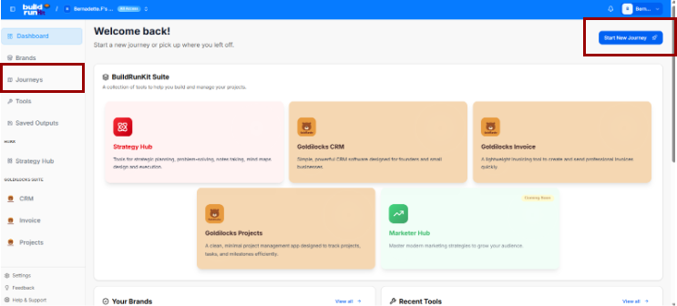
Creating a Journey: Click the blue Start New Journey button at the top right to open the startup selection layout.
- Searching and Filtering:
    
    
    - Use the Search journeys... text field above the table to filter your active paths by their specific title text.
    - Use the Filter by title... search field next to it to narrow down directory rows by matching exact title terms.
- Journey Directory Table: Track active spaces across several parameters:
    
    
    - Title: The name of the roadmap (e.g., *Founder Journey*).
    - Description: A short outline summary detailing the scope of the path.
    - Journey Type: Identifies the framework category classification (e.g., *Founder*).
    - Brand: Logs any specific internal company asset or brand associated with the tracking environment.
    - Created By: Displays the user profile who initiated the roadmap.
    - Created At: Tracks the initial date the tracking module was opened.
- Columns Visibility Tool: Click the Columns dropdown tool above the table to toggle parameters visible or hidden via checkmarks (Title, Description, Journey\_type, Brand, Created\_by, Created\_at, or Actions).
- Selection Summary: A tracking counter at the bottom left logs your selected table rows (e.g., *0 of 2 row(s) selected.*).

</div></div>### Select a Journey Menu

[![Screenshot 2026-05-21 134802.png](https://library.buildrunkit.com/uploads/images/gallery/2026-05/scaled-1680-/screenshot-2026-05-21-134802.png)](https://library.buildrunkit.com/uploads/images/gallery/2026-05/screenshot-2026-05-21-134802.png)

Clicking the Start New Journey button triggers a dropdown menu panel titled SELECT A JOURNEY TO START, prompting you to select from five guided track environments:

<div _ngcontent-ng-c2170363542="" class="container" id="bkmrk-build-and-grow-your-"><div _ngcontent-ng-c1323015604="" aria-busy="false" aria-live="polite" class="markdown markdown-main-panel enable-updated-hr-color" dir="ltr" inline-copy-host="">- Build and grow your startup from idea to success (Blue Rocket Icon): The active primary track focused on complete end-to-end business execution.
- Develop strategic plans and execute them effectively (Purple Target Icon): A strategic planning track.
- Create powerful marketing campaigns and build your brand (Green Trend Icon): A marketing and brand growth track.
- Conduct thorough research and gather valuable insights (Orange Magnifying Glass Icon): A research and market analysis track.
- Manage human resources and build great teams (Pink Team Icon): An operations and team management framework track.

</div></div>### Brand Association Modal

When you select a track type to start a new journey, a modal window explicitly titled Brand Association appears, prompting you to decide how to link your new journey to a business entity.

#### Option 1: Use an Existing Brand

[![Screenshot 2026-05-21 141121.png](https://library.buildrunkit.com/uploads/images/gallery/2026-05/scaled-1680-/screenshot-2026-05-21-141121.png)](https://library.buildrunkit.com/uploads/images/gallery/2026-05/screenshot-2026-05-21-141121.png)

Selecting the Use an existing brand radio button configures the modal with the following fields:

- Select a brand Dropdown: A selection menu field (e.g., defaulted to Untitled Brand) where you can click to choose from your already established business profiles.
- Title: A text field to input the specific name or title for this new journey setup (Enter a title for the journey).
- Description: A multi-line text block to add descriptive details or goals for this specific roadmap path (Enter a description for the journey).

#### Option 2: Create Journey Without a Brand

[![Screenshot 2026-05-21 141358.png](https://library.buildrunkit.com/uploads/images/gallery/2026-05/scaled-1680-/screenshot-2026-05-21-141358.png)](https://library.buildrunkit.com/uploads/images/gallery/2026-05/screenshot-2026-05-21-141358.png)

Switching to the Create journey without a brand radio button alters the modal layout by removing the brand selector dropdown and replacing it with an informational alert:

- System Information Banner: A light blue notification box appears with a clear message stating: “You can create a brand profile during the journey.”
- Title: The standard text input field remains to name your journey environment (Enter a title for the journey).
- Description: The multi-line text block remains available to record your initial pathway notes (Enter a description for the journey).

#### Modal Actions (Both Views)

Regardless of the radio selection, two control items sit at the bottom right corner to finalize the form:

- Cancel: A text link button to abort the journey creation process and return to the main dashboard menu.
- Continue: A solid blue button to save your brand preferences and load into your new journey canvas space.

### The Founder Journey Roadmap

<span class="citation-1 citation-end-1">The Founder Journey is a structured, interactive roadmap designed to guide entrepreneurs from an initial idea to a full market launch.<sup class="superscript" data-turn-source-index="1"></sup></span> The journey is divided into seven major operational stages, each containing sequential sub-stages that must be completed to progress.

### The Journey Stages Sidebar (Left Panel)

The left sidebar acts as the primary navigation hub. Users can expand each major stage to reveal and access the actionable sub-stages within:

1. Orientation Stage (Current)
2. Discovery Stage
3. Market Research Stage
4. Brand Foundations &amp; Brand Kit Stage
5. Admin and Operations Stage
6. Go-to-Market Stage
7. Finalize and Export Stage

<div _ngcontent-ng-c2170363542="" class="container" id="bkmrk--6"></div><div _ngcontent-ng-c2170363542="" class="container" id="bkmrk--7"><div _ngcontent-ng-c1323015604="" aria-busy="false" aria-live="polite" class="markdown markdown-main-panel enable-updated-hr-color" dir="ltr" id="bkmrk--8" inline-copy-host=""></div></div>

# Orientation Stage

## **Orientation Stage**

**[![Screenshot 2026-05-21 143630.png](https://library.buildrunkit.com/uploads/images/gallery/2026-05/scaled-1680-/screenshot-2026-05-21-143630.png)](https://library.buildrunkit.com/uploads/images/gallery/2026-05/screenshot-2026-05-21-143630.png)**

The Orientation Stage is the introductory phase of the roadmap, broken down into four distinct sequential sub-stages accessed via the left-hand sidebar dropdown:

- Sub-Stage 1: Welcome to the Founder Journey
    
    
    - This is the initial onboarding landing view that provides context, introductory media, and directional cues before operational work begins.
- Sub-Stage 2: Stages Information
    
    
    - The second item listed within the orientation sequence. (Content details pending system view selection).
- Sub-Stage 3: Basic Information
    
    
    - The third item listed within the orientation sequence. (Content details pending system view selection).
- Sub-Stage 4: Export Orientation Results
    
    
    - The final technical milestone within the initial phase, concluding the orientation sequence before transition parameters unlock. (Content details pending system view selection).

### Stage Controls

- Next Button: A blue Next → link utility centered at the bottom of the active frame allows the user to save current progress or cycle sequentially to the next sub-stage item.

### Sub-Stage 1: Welcome to the Founder Journey

[![Screenshot 2026-05-21 143945.png](https://library.buildrunkit.com/uploads/images/gallery/2026-05/scaled-1680-/screenshot-2026-05-21-143945.png)](https://library.buildrunkit.com/uploads/images/gallery/2026-05/screenshot-2026-05-21-143945.png)

This is the initial onboarding sub-stage screen that gives users their first introductory look, informational context, and directional clues before moving forward into the deeper stages of the roadmap.

#### Canvas Layout &amp; Workspace Components

- Main Workspace Title: Prominently displays "Welcome to the Founder Journey" alongside a helpful subtitle: “This stage will help you understand the journey ahead and how to navigate it effectively.”
- Orientation Media Panel: Features a large central multimedia layout titled Introduction &amp; Orientation, featuring an introductory layout badged directly with the official buildrunkit brand logo.
- Introductory Information Cards: A vertical stack of five expandable accordion style rows sits directly to the right of the media panel. These are designed to give users a quick clue about the roadmap's purpose before starting:
    
    
    - What this journey is about?: Explains that whether starting from zero or with prior business experience, this acts as a companion to guide you, record your progress, and compile your choices into a final document.
    - The core transformation/benefit: Clarifies the goal is to ensure you consider every necessary step to get a product out the door, bringing documentation and peace of mind that major decisions are locked in.
    - Who it's for?: Notes the track is built for aspiring founders, active founders, or existing business owners looking to optimize or tune up their operational gaps.
    - How long it usually takes?: Sets a realistic timeframe warning that it can take anywhere from 45 minutes to two weeks or more depending on how thoroughly you step through the phases.
    - What the outcome will be?: Confirms that completing the journey builds a comprehensive summary PDF detailing your discovery process, business structure choices, brand kits, targeted market research, financial/legal steps, and market strategies.

#### Navigation Controls

- Next Button: A bright blue Next → button is anchored perfectly in the center-bottom footer of the screen. Clicking this advances the user past this introductory screen and moves them directly to the next sequential sub-stage.

### Sub-Stage 2: Stages Information

[![Screenshot 2026-05-21 144340.png](https://library.buildrunkit.com/uploads/images/gallery/2026-05/scaled-1680-/screenshot-2026-05-21-144340.png)](https://library.buildrunkit.com/uploads/images/gallery/2026-05/screenshot-2026-05-21-144340.png)

This sub-stage screen provides a complete structural map of the seven core phases that build a business identity and strategy, combined with platform navigation tips.

#### Canvas Layout &amp; Workspace Components

- Main Workspace Title: Displays "Stages Information" with the introductory subtitle: “Here are some tips and the stages we'll take you through for this journey.”
- Journey Architecture Overview Panel: A large centralized block explicitly detailing the framework structure: “This Journey is composed of seven stages that will guide you through the process of building a business identity and strategy”.
- The Seven Stage Cards:
    
    
    - Stage 1: Orientation: Get acquainted with BuildRunKit, the Founder's journey and how to navigate it.
    - Stage 2: Discovery: Explore your business idea and validate your concept.
    - Stage 3: Market Research: Understand your target market and competition.
    - Stage 4: Brand Foundations &amp; Brand Kit: Create your brand identity and messaging.
    - Stage 5: Admin and Operations: Set up business structure and operations.
    - Stage 6: Go-to-market Planning: Plan your launch and marketing strategy.
    - Stage 7: Finalize and Export: Complete the journey and export your business plan.

#### Platform Guidance Cards (Bottom Panel)

Three distinct vertical layout columns sit at the bottom of the interface to guide data entry behaviors:

- How to Navigate (Green Card):
    
    
    - Explains that users are free to skip around or skip ahead to return later if information is missing.
    - Advises founders not to let pending meetings slow progress down, prompting: “don't be afraid to mark a stage complete.”
    - Explicitly reminds users they can navigate and hop around at any point using the sidebar navigation.
- Optional vs Required (Orange Card):
    
    
    - Highlights platform freedom: “We're not the boss of you. Nothing is required!”
    - Warns that quality suffers if steps are skipped without accurate context data.
    - Emphasizes data collection standards with a foundational reminder: “Garbage in, garbage out!”
- Save Progress (Blue Card):
    
    
    - Confirms system state tracking: “We know where you were when you navigate the journey!”
    - Explains that marking a stage complete helps track overall roadmap velocity while providing a progress dopamine hit to maintain operational momentum.

#### Navigation Controls

- Next Button: A blue Next → navigation block is anchored at the bottom right corner of the window to commit updates and advance to Sub-Stage 3.

### Sub-Stage 3: Basic Information

[![Screenshot 2026-05-21 144728.png](https://library.buildrunkit.com/uploads/images/gallery/2026-05/scaled-1680-/screenshot-2026-05-21-144728.png)](https://library.buildrunkit.com/uploads/images/gallery/2026-05/screenshot-2026-05-21-144728.png)

This sub-stage screen functions as an initial onboarding intake form, collecting foundational context from the founder to tailor the rest of the strategic journey.

#### Canvas Layout &amp; Workspace Components

<div _ngcontent-ng-c2170363542="" class="container" id="bkmrk-main-workspace-title-2"><div _ngcontent-ng-c1323015604="" aria-busy="false" aria-live="polite" class="markdown markdown-main-panel enable-updated-hr-color" dir="ltr" inline-copy-host="">- Main Workspace Title: Displays "Basic Information" with an introductory promise statement: “If you will just answer a few things we will promise to try to benefit from the knowledge and tailor your journey accordingly.”
- Question 1: Objective Tracking:
    
    
    - Label: "1. What's your biggest goal for this journey?"
    - Input Field: A multi-line text container with the placeholder instruction: “Share your primary objective or what you hope to achieve...”
- Question 2: Pain Point Analysis:
    
    
    - Label: "2. What specific challenges are you hoping to solve?"
    - Input Field: A multi-line text container with the placeholder instruction: “Describe the main obstacles or problems you're facing...”
- Question 3: Operational Status Identification:
    
    
    - Label: "3. Are you starting from scratch or already in motion?"
    - Input Field: A multi-line text container with the placeholder instruction: “Tell us about your current stage in the business journey...”

</div></div>#### Navigation Controls

<div _ngcontent-ng-c2170363542="" class="container" id="bkmrk-next-button%3A-a-blue--2"><div _ngcontent-ng-c1323015604="" aria-busy="false" aria-live="polite" class="markdown markdown-main-panel enable-updated-hr-color" dir="ltr" inline-copy-host="">- Next Button: A blue Next → button is anchored at the bottom right corner of the window to log the text input parameters and transition forward to the final orientation sub-stage (Export Orientation Results).

</div></div>### Sub-Stage 4: Export Orientation Results

[![Screenshot 2026-05-21 145143.png](https://library.buildrunkit.com/uploads/images/gallery/2026-05/scaled-1680-/screenshot-2026-05-21-145143.png)](https://library.buildrunkit.com/uploads/images/gallery/2026-05/screenshot-2026-05-21-145143.png)

This is the final sub-stage milestone of the Orientation Stage, providing a comprehensive audit log of the user's initial onboarding actions, input parameters, and platform documentation options before unlocking the next major journey stage.

#### Canvas Layout &amp; Workspace Components

<div _ngcontent-ng-c2170363542="" class="container" id="bkmrk-main-workspace-title-3"><div _ngcontent-ng-c1323015604="" aria-busy="false" aria-live="polite" class="markdown markdown-main-panel enable-updated-hr-color" dir="ltr" inline-copy-host="">- Main Workspace Title: Displays "Export Orientation Results" with the dynamic header subtitle: “This is a summary of what you learned and shared with us during the orientation stage.”
- Document Generation Panel: A stylized light-blue callout card spanning the top of the workspace labeled Orientation Stage Results:
    
    
    - Description: Prompts the user to “Download a comprehensive PDF report containing all your orientation findings”.
    - Action Button: Features a centered blue Generate PDF Report action key accompanied by a download icon.
- Sub-Stage Completion Logs (Split Grid): Two parallel tracking blocks display completion verifications for the introductory screens:
    
    
    - Orientation Welcome Block: Titled “Introduction video and Journey overview.” It presents a green status alert bar confirming: `✓ Welcome substage completed successfully.`
    - Journey Info Block: Titled “Journey content and navigation tips.” It displays a secondary system notification indicator reading: `✓ No information provided.`

</div></div>#### Basic Information Summary Hub

A unified response panel titled Basic Information presents a read-only historical overview of the data insights entered by the founder during Sub-Stage 3 (Overview of your orientation stage responses and insights.):

<div _ngcontent-ng-c2170363542="" class="container" id="bkmrk-goal-audit-row%3A-labe"><div _ngcontent-ng-c1323015604="" aria-busy="false" aria-live="polite" class="markdown markdown-main-panel enable-updated-hr-color" dir="ltr" inline-copy-host="">1. Goal Audit Row:
    
    
    - Label: `✓ What's your biggest goal for this journey?`
    - Data Block: Displays the captured multi-line text block entry summarizing primary objectives.
2. Challenge Audit Row:
    
    
    - Label: `✓ What specific challenges are you hoping to solve?`
    - Data Block: Displays the captured multi-line text block entry mapping core business obstacles.
3. Status Audit Row:
    
    
    - Label: `✓ Are you starting from scratch or already in motion?`
    - Data Block: Displays the captured multi-line text block entry noting current operational standing.

</div></div>#### Navigation Controls

<div _ngcontent-ng-c2170363542="" class="container" id="bkmrk-next-button%3A-a-blue--3"><div _ngcontent-ng-c1323015604="" aria-busy="false" aria-live="polite" class="markdown markdown-main-panel enable-updated-hr-color" dir="ltr" id="bkmrk-next-button%3A-a-blue--4" inline-copy-host="">- Next Button: A blue Next → navigation action button is anchored at the bottom right corner of the window to commit all orientation findings and transition past Stage 1 into the Discovery Stage directory list.

</div></div><div _ngcontent-ng-c2170363542="" class="container" id="bkmrk--5"><div _ngcontent-ng-c1323015604="" aria-busy="false" aria-live="polite" class="markdown markdown-main-panel enable-updated-hr-color" dir="ltr" id="bkmrk--6" inline-copy-host=""></div></div><div _ngcontent-ng-c2170363542="" class="container" id="bkmrk--7"><div _ngcontent-ng-c1323015604="" aria-busy="false" aria-live="polite" class="markdown markdown-main-panel enable-updated-hr-color" dir="ltr" id="bkmrk--8" inline-copy-host=""></div></div>

# Discovery Stage

## **Discovery Stage**

**[![Screenshot 2026-05-21 145426.png](https://library.buildrunkit.com/uploads/images/gallery/2026-05/scaled-1680-/screenshot-2026-05-21-145426.png)](https://library.buildrunkit.com/uploads/images/gallery/2026-05/screenshot-2026-05-21-145426.png)**

The Discovery Stage is the conceptual exploration phase of the roadmap, broken down into five distinct sequential sub-stages accessed via the left-hand sidebar dropdown:

- Sub-Stage 1: Welcome to the Discovery Stage
    
    
    - This is the initial onboarding landing view that provides foundational context, introductory media, and initial guidance before discovery operations begin.
- Sub-Stage 2: Core Concept
    
    
    - The second item within the sequence, focusing on defining and documenting your startup's core business idea, problem statement, and proposed solution.
- Sub-Stage 3: Market Size &amp; Opportunity
    
    
    - The third item within the sequence, dedicated to mapping out early high-level market evaluations and identifying the overall landscape potential.
- Sub-Stage 4: Industry Benchmarks
    
    
    - The fourth item within the sequence, outlining standard operational baselines, key sector metrics, and common industry performance indicators.
- Sub-Stage 5: Export Discovery Results
    
    
    - The final technical milestone within this phase, presenting a read-only data audit overview alongside an export tool to save your comprehensive discovery findings as a PDF report.

### Stage Controls

- Next Button: A blue Next → link utility centered below the active canvas area or anchored in the footer line allows users to log conceptual selections and advance sequentially into the active business planning steps.

### Sub-Stage 1: Welcome to the Discovery Stage

[![Screenshot 2026-05-21 145742.png](https://library.buildrunkit.com/uploads/images/gallery/2026-05/scaled-1680-/screenshot-2026-05-21-145742.png)](https://library.buildrunkit.com/uploads/images/gallery/2026-05/screenshot-2026-05-21-145742.png)

This sub-stage screen serves as the introductory gateway to the concept validation phase, helping founders gauge their current level of idea commitment before proceeding to deeper analysis.

#### Canvas Layout &amp; Workspace Components

<div _ngcontent-ng-c2170363542="" class="container" id="bkmrk-main-workspace-title"><div _ngcontent-ng-c1323015604="" aria-busy="false" aria-live="polite" class="markdown markdown-main-panel enable-updated-hr-color" dir="ltr" inline-copy-host="">- Main Workspace Title: Displays "Welcome to the Discovery Stage" accompanied by a clear instructional subtitle: “Get an overview of the Discovery process and learn how this stage will help you explore and validate your startup ideas.”
- Discovery Media Panel: Features a large graphic or video workspace element explicitly labeled Discovery on the top-left and badged with the official buildrunkit brand logo on the top-right.
- Concept Validation Selector: Located directly to the right of the media panel, this interactive component prompts users to define their starting point:
    
    
    - Field Label: "Do you already have a business idea you're excited about?"
    - Dropdown Selector: Clicking the "Select an option" box expands a menu containing three distinct choices to categorize the user's current stance:
        
        
        1. Yes, I have one
        2. I want to explore new ideas
        3. I have a few and want help picking

</div></div>#### Navigation Controls

<div _ngcontent-ng-c2170363542="" class="container" id="bkmrk-next-button%3A-a-blue--1"><div _ngcontent-ng-c1323015604="" aria-busy="false" aria-live="polite" class="markdown markdown-main-panel enable-updated-hr-color" dir="ltr" inline-copy-host="">- Next Button: A blue Next → action key is centered at the bottom of the workspace to log the selected ideation baseline and transition forward to Sub-Stage 2 (Founder Fit Scan).

</div></div>### Sub-Stage 2: Founder Fit Scan

[![Screenshot 2026-05-21 150749.png](https://library.buildrunkit.com/uploads/images/gallery/2026-05/scaled-1680-/screenshot-2026-05-21-150749.png)](https://library.buildrunkit.com/uploads/images/gallery/2026-05/screenshot-2026-05-21-150749.png)

[![Screenshot 2026-05-21 150958.png](https://library.buildrunkit.com/uploads/images/gallery/2026-05/scaled-1680-/screenshot-2026-05-21-150958.png)](https://library.buildrunkit.com/uploads/images/gallery/2026-05/screenshot-2026-05-21-150958.png)

This sub-stage functions as an extensive personality, skill-set, and professional mapping environment. It allows founders to log their personal traits and context to ensure the selected startup concept aligns with their foundational strengths.

#### Canvas Layout &amp; Workspace Components

<div _ngcontent-ng-c2170363542="" class="container" id="bkmrk-main-workspace-title-1"><div _ngcontent-ng-c1323015604="" aria-busy="false" aria-live="polite" class="markdown markdown-main-panel enable-updated-hr-color" dir="ltr" inline-copy-host="">- Main Workspace Title: Displays "Founder Fit Scan" with the explicit header instruction: “Reflect on your skills, interests, and motivations to ensure your startup idea aligns with your personal strengths and goals.”
- Founder Fit Analysis Context Card: A full-width text container block positioned at the top of the canvas layout:
    
    
    - Header: Founder Fit Analysis
    - Subtitle Text: “To help us provide a more tailored founder fit analysis, please share any additional context about your background, goals, or specific areas of interest.”
    - Input Area: A text entry field labeled “Your Background, Goals and Interests” with the inside placeholder prompt: “Additional context and information about your background, goals, or specific areas of interest for this journey”.
    - Action Button: A solid blue button centered below the entry field labeled Generate Founder Fit Analysis.

</div></div>#### The Core Profiling Matrices

The workspace splits into four distinct quadrant-style logging containers across the page views to capture targeted tags. Selected items display a distinct blue border framework containing a checkmark:

<div _ngcontent-ng-c2170363542="" class="container" id="bkmrk-your-strengths-matri"><div _ngcontent-ng-c1323015604="" aria-busy="false" aria-live="polite" class="markdown markdown-main-panel enable-updated-hr-color" dir="ltr" inline-copy-host="">- Your Strengths Matrix: A multi-selectable grid of behavioral traits:
    
    
    - Pre-populated Grid Items: Leadership (Selected), Communication, Problem Solving, Adaptability, Creativity, Teamwork, Analytical Thinking, Time Management, Technical Skills, Customer Focus, Strategic Planning, and Negotiation.
    - Custom Data Field: An input bar at the bottom labeled “Add a strength and press Enter” alongside an Add button.
- Your Skills Matrix: A grid mapping technical and professional operational abilities:
    
    
    - Pre-populated Grid Items: Project Management (Selected), Software Development, UI/UX Design, Data Analysis, Marketing, Sales, Customer Support, Content Creation, SEO, Social Media Management, Business Development, and Financial Management.
    - Custom Data Field: An input bar at the bottom labeled “Add a skill and press Enter” alongside an Add button.
- Your Values Matrix: A grid tracking core cultural and ethical operational drivers:
    
    
    - Pre-populated Grid Items: Innovation (Selected), Integrity, Excellence, Collaboration, Sustainability, Transparency, Creativity, Empathy, Resilience, Accountability, Passion, and Diversity.
    - Custom Data Field: An input bar at the bottom labeled “Add a value and press Enter” alongside an Add button.
- Your Experience Matrix: A grid mapping historical professional domains:
    
    
    - Pre-populated Grid Items: Leadership (Selected), Project Management, Customer Service, Conflict Resolution, Team Collaboration, Sales and Marketing, Technical Support, Data Analysis, Software Development, UI/UX Design, Content Creation, and Financial Management.
    - Custom Data Field: An input bar at the bottom labeled “Add experience and press Enter” alongside an Add button.

</div></div>#### Navigation Controls

<div _ngcontent-ng-c2170363542="" class="container" id="bkmrk-next-button%3A-a-blue--2"><div _ngcontent-ng-c1323015604="" aria-busy="false" aria-live="polite" class="markdown markdown-main-panel enable-updated-hr-color" dir="ltr" inline-copy-host="">- Next Button: A blue Next → navigation action option key is anchored at the absolute bottom right margin of the pane to lock down selected attribute parameters and progress forward to Sub-Stage 3 (Idea Generation and Selection).

</div></div>### Sub-Stage 3: Idea Generation and Selection

[![Screenshot 2026-05-21 151552.png](https://library.buildrunkit.com/uploads/images/gallery/2026-05/scaled-1680-/screenshot-2026-05-21-151552.png)](https://library.buildrunkit.com/uploads/images/gallery/2026-05/screenshot-2026-05-21-151552.png)

This sub-stage serves as the brainstorming and filtering hub of the Discovery Stage. It relies directly on the data points submitted during the previous phase to produce custom, personalized startup pathways.

#### Canvas Layout &amp; Workspace Components

- Main Workspace Title: Displays "Idea Generation and Selection" with an explanatory subtitle: “Based on your founder fit analysis, here are personalized business ideas. You can add your own ideas and then select one to continue.”
- Dynamic Ideas Panel: A large central interface area where generated startup options populate based on user profile inputs.
    
    
    - Empty State Alert: If a user proceeds to this step without fully configuring or running the preceding profile evaluation card, the platform shows a centered "No Ideas Found" message container.
    - System Instruction: Displays the fallback prompt: “Please complete the Founder Fit analysis in the previous step to generate ideas.”
    - Populated State (Expected Behavior): When the Founder Fit Scan is completed, this container populates with interactive business concept options that the founder can review, add to, and select as their core venture track.

#### Navigation Controls

- Next Button: A blue Next → action element is anchored in the lower right-hand corner of the workspace to save the chosen business option and advance to Sub-Stage 4 (Working Name + NAICS).

### Sub-Stage 4: Working Name + NAICS

<div drawio-diagram="366"><img src="https://library.buildrunkit.com/uploads/images/drawio/2026-05/drawing-4-1779369974.png" alt=""/></div>

This sub-stage screen focuses on defining the company's preliminary market presence and legal classification. It features tools to generate and log business names, tone-specific slogans, and industry taxonomy codes.

#### Canvas Layout &amp; Workspace Components

<div _ngcontent-ng-c2170363542="" class="container" id="bkmrk-main-workspace-title-3"><div _ngcontent-ng-c1323015604="" aria-busy="false" aria-live="polite" class="markdown markdown-main-panel enable-updated-hr-color" dir="ltr" inline-copy-host="">- 
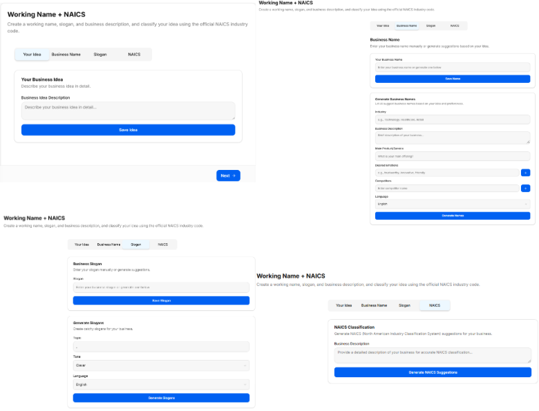
Main Workspace Title: Displays "Working Name + NAICS" with an introductory subtitle: “Let's define what your business will be called, its slogan and its formal industry classification.”
- Business Concept Recap Banner: A light gray full-width contextual alert box summarizing the selected track:
    
    
    - Text: “You have chosen to pursue the business idea: An AI assistant that helps virtual assistants optimize their workflow and automate administrative tasks.”

</div></div>#### The Core Data-Intake Sections

##### 1. Business Name Generation Hub

<div _ngcontent-ng-c2170363542="" class="container" id="bkmrk-field-label%3A-%221.-wha"><div _ngcontent-ng-c1323015604="" aria-busy="false" aria-live="polite" class="markdown markdown-main-panel enable-updated-hr-color" dir="ltr" inline-copy-host="">- Field Label: "1. What is the working name of your business?"
- Input Box: A text entry field populated with a live placeholder or typed entry.
- AI Tool Integration: Features a solid blue Suggest Business Names action button to auto-generate creative naming variations directly underneath if the founder requires inspiration.

</div></div>##### 2. Slogan Configuration Console (Tone &amp; Language Options)

<div _ngcontent-ng-c2170363542="" class="container" id="bkmrk-field-label%3A-%222.-wha"><div _ngcontent-ng-c1323015604="" aria-busy="false" aria-live="polite" class="markdown markdown-main-panel enable-updated-hr-color" dir="ltr" inline-copy-host="">- Field Label: "2. What is the slogan or tagline of your business?"
- Input Box: A text entry field with the directional placeholder text: “Enter your business slogan or tagline...”
- AI Slogan Generation Parameter Filters: Founders can customize the automated generation tool by adjusting specific behavioral selectors:
    
    
    - Slogan Tone Dropdown: Sets the branding attitude. Clicking the menu reveals four distinct choices:
        
        
        1. Clever
        2. Funny
        3. Serious
        4. Informative
    - Language Dropdown: Sets the output translation. Clicking the menu reveals two standard options:
        
        
        1. English
        2. Spanish
- Action Trigger: Features a solid blue Suggest Slogans action button to generate list options matching the targeted tone and language configuration.

</div></div>##### 3. NAICS Industry Classification Hub

<div _ngcontent-ng-c2170363542="" class="container" id="bkmrk-field-label%3A-%223.-wha"><div _ngcontent-ng-c1323015604="" aria-busy="false" aria-live="polite" class="markdown markdown-main-panel enable-updated-hr-color" dir="ltr" inline-copy-host="">- Field Label: "3. What is the NAICS code for your business?"
- Input Box: A specialized input box displaying a search placeholder: “Search NAICS code...”
- AI Classification Integration: Features a solid blue Suggest NAICS Code action button that leverages the concept description to locate matching industrial classification codes from the North American Industry Classification System database.
- Sector Search Dropdown: A secondary interactive drawer element populated with standard macroeconomic parent groupings to help narrow down industry categorization manually:
    
    
    - Agriculture, Forestry, Fishing and Hunting
    - Mining, Quarrying, and Oil and Gas Extraction
    - Utilities
    - Construction
    - Manufacturing

</div></div>#### Navigation Controls

<div _ngcontent-ng-c2170363542="" class="container" id="bkmrk-next-button%3A-a-blue--4"><div _ngcontent-ng-c1323015604="" aria-busy="false" aria-live="polite" class="markdown markdown-main-panel enable-updated-hr-color" dir="ltr" inline-copy-host="">- Next Button: A blue Next → navigation utility link is anchored at the bottom right corner of the window frame to submit name selections, tagline logs, and regulatory NAICS codes, advancing directly to Sub-Stage 5 (Early Market Signal Check).

</div></div>### Sub-Stage 5: Early Market Signal Check

[![Screenshot 2026-05-21 152708.png](https://library.buildrunkit.com/uploads/images/gallery/2026-05/scaled-1680-/screenshot-2026-05-21-152708.png)](https://library.buildrunkit.com/uploads/images/gallery/2026-05/screenshot-2026-05-21-152708.png)

This sub-stage screen functions as an initial quantitative and qualitative validation check. It enables founders to test their business concept against preliminary market indicators to gauge demand, identify industry trends, and gather strategic insights before committing capital or deep operational resources.

#### Canvas Layout &amp; Workspace Components

<div _ngcontent-ng-c2170363542="" class="container" id="bkmrk-main-workspace-title-4"><div _ngcontent-ng-c1323015604="" aria-busy="false" aria-live="polite" class="markdown markdown-main-panel enable-updated-hr-color" dir="ltr" inline-copy-host="">- Main Workspace Title: Displays "Early Market Signal Check" alongside a descriptive subtitle mapping its core objective: “Test your idea against early market signals to validate demand and gather insights before investing more resources.”
- Market Insights Generation Console: A stylized data intake card centered on the workspace canvas, titled "Generate comprehensive market insights based on your business description and NAICS classification."

</div></div>##### The Input Validation Fields

<div _ngcontent-ng-c2170363542="" class="container" id="bkmrk-naics-code-field%3A-la"><div _ngcontent-ng-c1323015604="" aria-busy="false" aria-live="polite" class="markdown markdown-main-panel enable-updated-hr-color" dir="ltr" inline-copy-host="">- NAICS Code Field:
    
    
    - Label: "NAICS Code"
    - Input Box: A text field with the placeholder instruction: “Enter your NAICS code”. This links directly with the industrial classification chosen in the previous sub-stage.
- Business Description Field:
    
    
    - Label: "Business Description"
    - Input Box: A multi-line text container with the inside placeholder prompt: “Provide a detailed description of your business...”

</div></div>##### Analysis Trigger

<div _ngcontent-ng-c2170363542="" class="container" id="bkmrk-action-button%3A-featu"><div _ngcontent-ng-c1323015604="" aria-busy="false" aria-live="polite" class="markdown markdown-main-panel enable-updated-hr-color" dir="ltr" inline-copy-host="">- Action Button: Features a solid blue, full-width action bar positioned at the bottom of the card reading "Generate Market Insights". Clicking this processes the NAICS taxonomy parameters and text entries to deliver real-world validation data, competitor trends, and target audience feedback indicators directly on screen.

</div></div>#### Navigation Controls

<div _ngcontent-ng-c2170363542="" class="container" id="bkmrk-next-button%3A-a-blue--5"><div _ngcontent-ng-c1323015604="" aria-busy="false" aria-live="polite" class="markdown markdown-main-panel enable-updated-hr-color" dir="ltr" inline-copy-host="">- Next Button: A blue Next → utility key is anchored at the absolute bottom right-hand margin of the window footer area. Clicking this locks in your validation data points and transitions the user forward to Sub-Stage 6 (Export Discovery Results), completing the entire Discovery phase sequence.

</div></div>### Sub-Stage 6: Export Discovery Results

[![Screenshot 2026-05-21 153011.png](https://library.buildrunkit.com/uploads/images/gallery/2026-05/scaled-1680-/screenshot-2026-05-21-153011.png)](https://library.buildrunkit.com/uploads/images/gallery/2026-05/screenshot-2026-05-21-153011.png)

[![Screenshot 2026-05-21 153049.png](https://library.buildrunkit.com/uploads/images/gallery/2026-05/scaled-1680-/screenshot-2026-05-21-153049.png)](https://library.buildrunkit.com/uploads/images/gallery/2026-05/screenshot-2026-05-21-153049.png)

This final checkpoint compiles all inputs, selections, and AI-generated outputs from the Discovery Stage into an organized audit summary. It offers a clean, read-only historical review alongside export capabilities before the user transitions into the next strategic phase of development.

#### Canvas Layout &amp; Workspace Components

- Main Workspace Title: Displays "Export Discovery Results" with an introductory descriptive subtitle: “This is an overview of what you told us in the discovery stage, you can also export a brief summary of your findings as a pdf file.”
- Document Generation Panel: A full-width light-blue callout banner labeled Discovery Stage Results positioned at the top of the workspace:
    
    
    - Description: Instructs the user to “Download a comprehensive PDF report containing all your discovery findings”.
    - Action Button: Centered within the panel is a blue Generate PDF Report action key complete with a download tray icon.

#### Discovery Summary Grid (Upper Panel)

The top half of the results interface uses a balanced two-column grid framework to show core branding and indexing parameters:

- Business Name Card:
    
    
    - Label: “The name you've chosen for your business”
    - Data Field: Displays the confirmed name of the business venture.
- Business Idea Card:
    
    
    - Label: “The core idea behind your business”
    - Data Field: Displays the selected startup concept track.
- Slogan Card:
    
    
    - Label: “Your business slogan or tagline”
    - Data Field: Displays the generated brand slogan or tagline.
- NAICS Classification Card:
    
    
    - Label: “Industry classification based on NAICS code”
    - Data Rows: Divided into two tracking points:
        
        
        - Code: Displays the selected regulatory classification code.
        - Industry: Displays the formal industry sector title.

#### Strategic Analysis Summaries (Lower Panel)

The bottom section handles the deep conceptual evaluations and contextual research data compiled throughout the phase:

- Founder Fit Summary Block:
    
    
    - Header Title: Founder Fit Summary
    - Label: “Analysis of how well you fit with your business idea into the market”
    - Data Field: Displays the complete alignment analysis text based on the strengths and skills assessment.
- Market Insights Summary Block:
    
    
    - Header Title: Market Insights Summary
    - Label: “Key insights about your target market, trends, and competitors”
    - Main Summary Field: Displays the captured analysis results and qualitative market landscape breakdown.
    - Granular Insight Footers: Split into two side-by-side indicator data targets:
        
        
        - Market Trends (Graph Icon): Displays the logged macroeconomic development paths and growth curves.
        - Competitors (Flag Icon): Displays the verified industry player benchmarking details.

#### Navigation Controls

- Next Button: A high-visibility blue Next → navigation element is anchored at the bottom right-hand margin of the window footer to seal the Discovery logs and open up the main stage menu for Stage 3: Market Research.

<div _ngcontent-ng-c2170363542="" class="container" id="bkmrk--10"><div _ngcontent-ng-c1323015604="" aria-busy="false" aria-live="polite" class="markdown markdown-main-panel enable-updated-hr-color" dir="ltr" id="bkmrk--11" inline-copy-host=""></div></div><div _ngcontent-ng-c2170363542="" class="container" id="bkmrk--12"><div _ngcontent-ng-c1323015604="" aria-busy="false" aria-live="polite" class="markdown markdown-main-panel enable-updated-hr-color" dir="ltr" id="bkmrk--13" inline-copy-host=""></div></div><div _ngcontent-ng-c2170363542="" class="container" id="bkmrk--14"><div _ngcontent-ng-c1323015604="" aria-busy="false" aria-live="polite" class="markdown markdown-main-panel enable-updated-hr-color" dir="ltr" id="bkmrk--15" inline-copy-host=""></div></div><div _ngcontent-ng-c2170363542="" class="container" id="bkmrk--16"><div _ngcontent-ng-c1323015604="" aria-busy="false" aria-live="polite" class="markdown markdown-main-panel enable-updated-hr-color" dir="ltr" id="bkmrk--17" inline-copy-host=""></div></div>

# Market Research Stage

## **Market Research Stage**

**[![Screenshot 2026-05-21 153730.png](https://library.buildrunkit.com/uploads/images/gallery/2026-05/scaled-1680-/screenshot-2026-05-21-153730.png)](https://library.buildrunkit.com/uploads/images/gallery/2026-05/screenshot-2026-05-21-153730.png)**

The Market Research Stage is the data and validation phase of the roadmap, broken down into nine distinct sequential sub-stages accessed via the left-hand sidebar dropdown:

- Sub-Stage 1: Welcome to the Market Research Stage
    
    
    - This is the initial onboarding landing view that provides context, introductory media, and directional cues before validation work begins.
- Sub-Stage 2: Market Type
    
    
    - The second item within the sequence, focusing on choosing your market entry strategy (Existing, New, Resegmented, or Clone) to define your positioning rules.
- Sub-Stage 3: Ideal Persona
    
    
    - The third item within the sequence, dedicated to building target customer demographical and psychographical target profiles.
- Sub-Stage 4: Market Research Questions
    
    
    - The fourth item within the sequence, organizing core informational queries used to vet market assumptions and gather structural feedback.
- Sub-Stage 5: Trends &amp; Insights
    
    
    - The fifth item within the sequence, analyzing macro trends, industrial opportunities, market headwinds, and technological shifts.
- Sub-Stage 6: Market Statistics
    
    
    - The sixth item within the sequence, delivering a quantitative sizing breakdown (TAM, SAM, SOM) along with industry growth percentages and acquisition baselines.
- Sub-Stage 7: Competitive Analysis
    
    
    - The seventh item within the sequence, functioning as an intelligence matrix to profile direct rivals, map features, and assess competitive pricing strategies.
- Sub-Stage 8: Moat
    
    
    - The eighth item within the sequence, identifying key competitive advantages, operational switching costs, barriers to entry, and network effects.
- Sub-Stage 9: Export Marketing Research Results
    
    
    - The final technical milestone within this phase, presenting a read-only data audit layout alongside a generator tool to export an official summary PDF report.

### Stage Controls

- Next Button: A blue Next → link utility centered below the active canvas or anchored in the footer line allows users to log current metrics and advance sequentially through the data validation journey.

### Sub-Stage 1: Welcome to the Marketing Research Stage

[![Screenshot 2026-05-21 153900.png](https://library.buildrunkit.com/uploads/images/gallery/2026-05/scaled-1680-/screenshot-2026-05-21-153900.png)](https://library.buildrunkit.com/uploads/images/gallery/2026-05/screenshot-2026-05-21-153900.png)

This sub-stage screen serves as the introductory gateway to the market analysis phase, ensuring the founder has clear instructional media and overview tools before deep-diving into target consumer metrics.

#### Canvas Layout &amp; Workspace Components

<div _ngcontent-ng-c2170363542="" class="container" id="bkmrk-main-workspace-title-1"><div _ngcontent-ng-c1323015604="" aria-busy="false" aria-live="polite" class="markdown markdown-main-panel enable-updated-hr-color" dir="ltr" inline-copy-host="">- Main Workspace Title: Displays "Welcome to the Marketing Research Stage" accompanied by a directional subtitle: “Get an overview of the Market Research process and learn how this stage will help you identify your target market, trends, and competitors.”
- Market Research Media Panel: Features a large central workspace graphic or video element titled Market Research on the top-left and branded directly with the official buildrunkit logo on the top-right.
- Onboarding Information Drawer (Right Panel): A structured information block or layout component sits to the right of the media display to outline immediate objectives before the founder begins editing data entries.

</div></div>#### Navigation Controls

<div _ngcontent-ng-c2170363542="" class="container" id="bkmrk-next-button%3A-a-blue--1"><div _ngcontent-ng-c1323015604="" aria-busy="false" aria-live="polite" class="markdown markdown-main-panel enable-updated-hr-color" dir="ltr" inline-copy-host="">- Next Button: A blue Next → link utility button is centered at the bottom of the interface window to save the initialization state and advance the user directly to Sub-Stage 2 (Confirm Business Details).

</div></div>### Sub-Stage 2: Confirm Business Details

[![Screenshot 2026-05-21 154129.png](https://library.buildrunkit.com/uploads/images/gallery/2026-05/scaled-1680-/screenshot-2026-05-21-154129.png)](https://library.buildrunkit.com/uploads/images/gallery/2026-05/screenshot-2026-05-21-154129.png)

This sub-stage serves as a data verification screen where the user reviews and confirms the foundational business parameters established during the Discovery Stage before launching deep market research operations.

#### Canvas Layout &amp; Workspace Components

- Main Workspace Title: Displays "Confirm Business Details" accompanied by a clear instructional subtitle: “Please confirm your business details to ensure the market research is tailored accurately to your concept.”
- Core Business Configuration Panel: A unified data entry card containing three structured verification fields:
    
    
    - 1\. Business Working Name:
        
        
        - Label: “Working Name”
        - Input Box: A text container designed to dynamically pull forward or allow editing of the company name.
    - 2\. Business Slogan:
        
        
        - Label: “Slogan”
        - Input Box: A secondary text container showing the established tagline or brand hook.
    - 3\. Business Core Description:
        
        
        - Label: “Description”
        - Input Box: A multi-line text container mapping out the specific workflow, target users, and key offerings of the business concept.

#### Navigation Controls

- Next Button: A blue Next → action utility button is anchored at the bottom right-hand margin of the page to lock down the verified data and transition directly forward to Sub-Stage 3 (Market Type).

### Sub-Stage 3: Market Type

[![Screenshot 2026-05-21 154359.png](https://library.buildrunkit.com/uploads/images/gallery/2026-05/scaled-1680-/screenshot-2026-05-21-154359.png)](https://library.buildrunkit.com/uploads/images/gallery/2026-05/screenshot-2026-05-21-154359.png)

This sub-stage screen helps the founder identify, define, and select their foundational market entry strategy. Categorizing the market type changes how the system configures customer acquisition metrics, scaling speeds, and competitive positioning strategies later in the roadmap.

#### Canvas Layout &amp; Workspace Components

<div _ngcontent-ng-c2170363542="" class="container" id="bkmrk-main-workspace-title-3"><div _ngcontent-ng-c1323015604="" aria-busy="false" aria-live="polite" class="markdown markdown-main-panel enable-updated-hr-color" dir="ltr" inline-copy-host="">- Main Workspace Title: Displays "Market Type" accompanied by a targeted operational subtitle: “Identify the type of market you are entering to better understand consumer behaviors, regulatory barriers, and market dynamics.”
- Market Type Matrix Selection: A collection of four large, interactive option cards arranged across the canvas. Each strategy type features a distinctive heading title and description block:
    
    
    - Existing Market:
        
        
        - Description: Entering an existing market with well-defined product categories, established competitors, and known customer requirements. The primary operational goal here is stealing market share from current incumbents.
    - New Market:
        
        
        - Description: Creating an entirely new market category where a product or service solves a problem that customers didn't realize they had. This path features no direct initial competitors but requires massive consumer education efforts.
    - Resegmented Market (Niche / Low Cost):
        
        
        - Description: Finding a specific group of customers in an existing market whose needs are currently ignored or underserved by massive industry giants. This relies on targeting a specific niche or leveraging a low-cost pricing strategy.
    - Clone Market:
        
        
        - Description: Taking an incredibly successful, proven business model from a foreign or distinct market and completely replicating it within a local region or unserved geographic area.

</div></div>#### Navigation Controls

<div _ngcontent-ng-c2170363542="" class="container" id="bkmrk-next-button%3A-a-blue--3"><div _ngcontent-ng-c1323015604="" aria-busy="false" aria-live="polite" class="markdown markdown-main-panel enable-updated-hr-color" dir="ltr" inline-copy-host="">- Next Button: A blue Next → action link utility button is anchored at the bottom right corner of the footer frame to lock down the chosen entry strategy and transition directly into Sub-Stage 4 (Ideal Persona).

</div></div>### Sub-Stage 4: Ideal Persona

[![Screenshot 2026-05-21 154538.png](https://library.buildrunkit.com/uploads/images/gallery/2026-05/scaled-1680-/screenshot-2026-05-21-154538.png)](https://library.buildrunkit.com/uploads/images/gallery/2026-05/screenshot-2026-05-21-154538.png)

This sub-stage screen functions as a comprehensive buyer persona development center. It uses the verified business description and market choices to generate deep biographical profiles of the business's ideal targets, mapping their behaviors, professional constraints, and software requirements.

#### Canvas Layout &amp; Workspace Components

- Main Workspace Title: Displays "Ideal Persona" accompanied by a tactical user-experience subtitle: “Define your target audience profiles or user personas to deeply understand their backgrounds, key pain points, and specific needs.”
- Persona Generation Control Card: A full-width configuration banner positioned at the top of the canvas layout:
    
    
    - Header: Generate Ideal Persona
    - Subtitle Text: “Generate an ideal user persona based on your business description and market choices to target the right customers.”
    - Action Button: A solid blue button centered below the descriptive text labeled Generate Ideal Persona. Clicking this parses the cumulative journey parameters to build targeted consumer case studies across the grid below.

#### The Generated Persona Matrix Grid

Once populated, the workspace layout organizes user attributes into four distinct, easy-to-read qualitative profiling blocks:

- 1\. Profile &amp; Demographics (User Icon):
    
    
    - Label: "1. Profile &amp; Demographics"
    - Data Field: Displays the persona's core bio traits, including typical age brackets, job titles, daily professional environments, educational backgrounds, and income ranges.
- 2\. Psychographics &amp; Behaviors (Heart Icon):
    
    
    - Label: "2. Psychographics &amp; Behaviors"
    - Data Field: Maps internal driving values, technology adoption habits, buying motivations, brand loyalties, and preferred digital communication channels.
- 3\. Pain Points &amp; Challenges (Warning Icon):
    
    
    - Label: "3. Pain Points &amp; Challenges"
    - Data Field: Identifies critical friction points, systemic workplace bottlenecks, financial leaks, and personal operational frustrations the consumer actively seeks to solve.
- 4\. Goals &amp; Desired Outcomes (Target Icon):
    
    
    - Label: "4. Goals &amp; Desired Outcomes"
    - Data Field: Highlights definition-of-success metrics, core productivity targets, long-term personal milestones, and specific software performance desires.

#### Navigation Controls

- Next Button: A blue Next → navigation action button is anchored at the bottom right corner of the window frame to log the generated customer profiles and advance to Sub-Stage 5 (Trends &amp; Insights from Market Reports).

### Sub-Stage 5: Trends &amp; Insights from Market Reports

[![Screenshot 2026-05-21 154754.png](https://library.buildrunkit.com/uploads/images/gallery/2026-05/scaled-1680-/screenshot-2026-05-21-154754.png)](https://library.buildrunkit.com/uploads/images/gallery/2026-05/screenshot-2026-05-21-154754.png)

This sub-stage screen serves as an advanced trend analysis module. It processes the confirmed business details and industry vertical classifications to generate comprehensive reports mapping out macro market shifts, growth directions, and technical disruptions.

#### Canvas Layout &amp; Workspace Components

- Main Workspace Title: Displays "Trends &amp; Insights from Market Reports" accompanied by a research-driven subtitle: “Generate comprehensive market trends and insights based on your business description and market choices to stay ahead of the competition.”
- Trends Generation Control Card: A full-width specialized action container placed at the top of the workspace:
    
    
    - Header: Generate Trends &amp; Insights
    - Subtitle Text: “Generate market trends and insights from industry reports to uncover growth opportunities and key market dynamics.”
    - Action Button: A solid blue button centered below the instructions labeled Generate Trends &amp; Insights. Clicking this runs the analysis engine to populate the thematic data grids below.

#### The Generated Strategic Insights Grid

The research engine categorizes industry macro data into four distinct quadrant-style information panels across the canvas layout:

- 1\. Market Trends (Graph Line Icon):
    
    
    - Label: "1. Market Trends"
    - Data Field: Details shifting industry directions, overall sector momentum, emergent business models, and adoption velocities within the targeted industrial landscape.
- 2\. Market Insights (Lightbulb Icon):
    
    
    - Label: "2. Market Insights"
    - Data Field: Delivers deeper qualitative breakthroughs, hidden workflow demands, under-the-radar sector anomalies, and strategic takeaways relevant to the concept.
- 3\. Opportunities (Star Icon):
    
    
    - Label: "3. Opportunities"
    - Data Field: Flags immediate operational gaps, niche market expansions, unserved customer segments, and high-growth spaces left open by existing market competitors.
- 4\. Threats &amp; Challenges (Shield/Warning Icon):
    
    
    - Label: "4. Threats &amp; Challenges"
    - Data Field: Maps incoming systemic barriers, pricing drops, changing regulatory standards, technological risks, and defensive moves from large industry incumbents.

#### Navigation Controls

- Next Button: A blue Next → navigation utility link is anchored at the bottom right-hand corner of the workspace to save the generated report parameters and progress sequentially into Sub-Stage 6 (Market Statistics).

### Sub-Stage 6: Market Statistics

[![Screenshot 2026-05-21 154957.png](https://library.buildrunkit.com/uploads/images/gallery/2026-05/scaled-1680-/screenshot-2026-05-21-154957.png)](https://library.buildrunkit.com/uploads/images/gallery/2026-05/screenshot-2026-05-21-154957.png)

This sub-stage delivers a quantitative breakdown of the industry landscape. It processes the venture's target profile and NAICS industry classification to calculate addressable market sizes, industry growth percentages, and baseline customer acquisition metrics.

#### Canvas Layout &amp; Workspace Components

- Main Workspace Title: Displays "Market Statistics" accompanied by a metrics-focused subtitle: “View key market statistics and metrics to understand the scale, growth potential, and financial dynamics of your target industry.”
- Statistics Generation Control Card: A full-width calculation container situated at the top of the workspace area:
    
    
    - Header: Generate Market Statistics
    - Subtitle Text: “Generate data-driven market statistics, including market sizing, growth rates, and average industry metrics to back your business strategy.”
    - Action Button: A solid blue button centered within the container labeled Generate Market Statistics. Clicking this runs the financial modeling engine to populate the quantitative panels below.

#### The Generated Market Metrics Grid

The reporting suite arranges the calculated industry benchmarks into four clear data visualization panels across the page layout:

- 1\. Market Sizing (TAM, SAM, SOM) (Pie Chart Icon):
    
    
    - Label: "1. Market Sizing (TAM, SAM, SOM)"
    - Data Field: Pulls dynamic calculations for Total Addressable Market (TAM), Serviceable Addressable Market (SAM), and Serviceable Obtainable Market (SOM) to illustrate the absolute scale of the revenue opportunity.
- 2\. Growth Rates &amp; Projections (Bar Chart Icon):
    
    
    - Label: "2. Growth Rates &amp; Projections"
    - Data Field: Tracks Compound Annual Growth Rate (CAGR) percentages, historical momentum, and five-year industrial trajectory forecasts.
- 3\. Key Industry Metrics (Analytics Icon):
    
    
    - Label: "3. Key Industry Metrics"
    - Data Field: Outlines core operational baselines unique to the sector, such as standard profit margins, transaction volumes, and asset utilization averages.
- 4\. Customer Acquisition Metrics (User Funnel Icon):
    
    
    - Label: "4. Customer Acquisition Metrics"
    - Data Field: Details industry standard Customer Acquisition Costs (CAC), expected Customer Lifetime Value (LTV) ratios, and average sales cycle lengths.

#### Navigation Controls

- Next Button: A blue Next → navigation action button is anchored at the bottom right-hand margin of the footer to lock down the statistical models and advance directly to Sub-Stage 7 (Competitive Analysis).

### Sub-Stage 7: Competitive Analysis

[![Screenshot 2026-05-21 155153.png](https://library.buildrunkit.com/uploads/images/gallery/2026-05/scaled-1680-/screenshot-2026-05-21-155153.png)](https://library.buildrunkit.com/uploads/images/gallery/2026-05/screenshot-2026-05-21-155153.png)

This sub-stage functions as an automated and manual benchmarking hub. It processes the company's core concept description and targeted market choices to systematically track direct and indirect market competitors.

#### Canvas Layout &amp; Workspace Components

<div _ngcontent-ng-c2170363542="" class="container" id="bkmrk-main-workspace-title-7"><div _ngcontent-ng-c1323015604="" aria-busy="false" aria-live="polite" class="markdown markdown-main-panel enable-updated-hr-color" dir="ltr" inline-copy-host="">- Main Workspace Title: Displays "Competitive Analysis" accompanied by a positioning subtitle: “Identify and analyze your competitors to understand their strengths, weaknesses, and market positioning.”
- Competitor Generation Control Card: A full-width intelligence container positioned at the top of the canvas workspace:
    
    
    - Header: Generate Competitive Analysis
    - Subtitle Text: “Generate a comprehensive competitive analysis, profiling major competitors, their market share, strategies, and features.”
    - Action Button: A solid blue button centered within the container labeled Generate Competitive Analysis. Clicking this runs the analysis to populate the matrix blocks below.

</div></div>#### The Generated Competitive Intelligence Grid

The system populates and segments competitive landscaping metrics into four standard tracking containers across the page layout:

<div _ngcontent-ng-c2170363542="" class="container" id="bkmrk-1.-top-competitors-p"><div _ngcontent-ng-c1323015604="" aria-busy="false" aria-live="polite" class="markdown markdown-main-panel enable-updated-hr-color" dir="ltr" inline-copy-host="">- 1\. Top Competitors Profile (Users Icon):
    
    
    - Label: "1. Top Competitors Profile"
    - Data Field: Displays the profiles and market data of primary competitors.
- 2\. Competitor Strengths &amp; Weaknesses (Shield Icon):
    
    
    - Label: "2. Competitor Strengths &amp; Weaknesses"
    - Data Field: Displays the core strengths and critical weaknesses identified for each competitor.
- 3\. Feature Comparison Matrix (Sliders/Settings Icon):
    
    
    - Label: "3. Feature Comparison Matrix"
    - Data Field: Displays a detailed breakdown of features across different market players.
- 4\. Pricing &amp; Market Positioning (Dollar Tag Icon):
    
    
    - Label: "4. Pricing &amp; Market Positioning"
    - Data Field: Displays the pricing tiers and strategic market positioning of competitors.

</div></div>#### Navigation Controls

<div _ngcontent-ng-c2170363542="" class="container" id="bkmrk-next-button%3A-a-blue--7"><div _ngcontent-ng-c1323015604="" aria-busy="false" aria-live="polite" class="markdown markdown-main-panel enable-updated-hr-color" dir="ltr" inline-copy-host="">- Next Button: A blue Next → navigation action button is anchored at the bottom right-hand margin of the footer. Clicking this locks in the competitor tracking data and advances directly to Sub-Stage 8 (Moat).

</div></div>### Sub-Stage 8: Moat

[![Screenshot 2026-05-21 155613.png](https://library.buildrunkit.com/uploads/images/gallery/2026-05/scaled-1680-/screenshot-2026-05-21-155613.png)](https://library.buildrunkit.com/uploads/images/gallery/2026-05/screenshot-2026-05-21-155613.png)

This sub-stage focusing on identifying and developing your venture's competitive advantages or "moat". Defining these core barriers helps secure your market position and protects your startup concept from being easily replicated by competitors.

#### Canvas Layout &amp; Workspace Components

<div _ngcontent-ng-c2170363542="" class="container" id="bkmrk-main-workspace-title-8"><div _ngcontent-ng-c1323015604="" aria-busy="false" aria-live="polite" class="markdown markdown-main-panel enable-updated-hr-color" dir="ltr" inline-copy-host="">- Main Workspace Title: Displays "Moat" accompanied by a protective strategy subtitle: “Identify and define your competitive advantages or 'moat' to protect your business from competitors and sustain long-term success.”
- Moat Generation Control Card: A full-width strategic planning container positioned at the top of the canvas workspace:
    
    
    - Header: Generate Moat
    - Subtitle Text: “Generate a comprehensive moat analysis, profiling major barriers to entry, switching costs, and network effects.”
    - Action Button: A solid blue button centered within the container labeled Generate Moat. Clicking this runs the analysis to populate the defensive strategic blocks below.

</div></div>#### The Generated Moat Analysis Grid

The system populates and segments your defensive market structures into four standard tracking containers across the page layout:

<div _ngcontent-ng-c2170363542="" class="container" id="bkmrk-1.-barriers-to-entry"><div _ngcontent-ng-c1323015604="" aria-busy="false" aria-live="polite" class="markdown markdown-main-panel enable-updated-hr-color" dir="ltr" inline-copy-host="">- 1\. Barriers to Entry (Shield Icon):
    
    
    - Label: "1. Barriers to Entry"
    - Data Field: Displays the structural roadblocks and startup challenges that prevent new players from easily entering your space.
- 2\. Switching Costs (Arrows Icon):
    
    
    - Label: "2. Switching Costs"
    - Data Field: Displays the calculated operational, financial, or psychological costs customers face if they try to leave your platform for a competitor.
- 3\. Network Effects (Network/Nodes Icon):
    
    
    - Label: "3. Network Effects"
    - Data Field: Displays how your product or service naturally becomes more valuable to existing users as your total customer base grows.
- 4\. Cost Advantages (Trending Down Bar Chart Icon):
    
    
    - Label: "4. Cost Advantages"
    - Data Field: Displays the unique operational efficiencies, scale economics, or proprietary processes that allow you to maintain lower costs than rivals.

</div></div>#### Navigation Controls

<div _ngcontent-ng-c2170363542="" class="container" id="bkmrk-next-button%3A-a-blue--8"><div _ngcontent-ng-c1323015604="" aria-busy="false" aria-live="polite" class="markdown markdown-main-panel enable-updated-hr-color" dir="ltr" inline-copy-host="">- Next Button: A blue Next → navigation action button is anchored at the bottom right-hand margin of the footer. Clicking this saves your competitive advantage profiles and advances directly to Sub-Stage 9 (Export Marketing Research Results).

</div></div>### Sub-Stage 9: Export Marketing Research Results

[![Screenshot 2026-05-21 155825.png](https://library.buildrunkit.com/uploads/images/gallery/2026-05/scaled-1680-/screenshot-2026-05-21-155825.png)](https://library.buildrunkit.com/uploads/images/gallery/2026-05/screenshot-2026-05-21-155825.png)

[![Screenshot 2026-05-21 155937.png](https://library.buildrunkit.com/uploads/images/gallery/2026-05/scaled-1680-/screenshot-2026-05-21-155937.png)](https://library.buildrunkit.com/uploads/images/gallery/2026-05/screenshot-2026-05-21-155937.png)

This final checkpoint compiles all inputs, strategy selections, and AI-generated analysis grids from the Market Research Stage into a centralized audit layout. It provides a read-only historical overview alongside comprehensive export features before unlocking progress into the next stage of development.

#### Canvas Layout &amp; Workspace Components

- Main Workspace Title: Displays "Export Marketing Research Results" accompanied by an instructional subtitle: “This is an overview of what you told us in the marketing research stage, you can also export a brief summary of your findings as a pdf file.”
- Document Generation Panel: A full-width light-blue callout container positioned at the top of the canvas:
    
    
    - Description: Instructs the user to “Download a comprehensive PDF report containing all your marketing research findings”.
    - Action Button: Features a centered blue Generate PDF Report action key with an integrated download tray icon.

#### Core Market Settings Summary Grid (Upper Panel)

The top half of the summary layout utilizes a two-column grid framework to display foundational strategic choices:

- Business Details Card:
    
    
    - Label: “Your confirmed business details”
    - Data Rows: Displays the verified company working name, brand slogan, and core concept description.
- Market Type Card:
    
    
    - Label: “The market type classification for your business”
    - Data Field: Displays the chosen market entry strategy (e.g., Existing, New, Resegmented, or Clone).
- Ideal Persona Card:
    
    
    - Label: “The target customer profile or user persona”
    - Data Field: Displays the generated customer demographic and psychographic profiles.

#### Deep Research Analysis Summaries (Lower Panel)

The bottom section handles the complex data models, industry trend forecasts, and competitive positioning metrics logged throughout the phase:

- Trends &amp; Insights Summary Block:
    
    
    - Header Title: Trends &amp; Insights Summary
    - Label: “Key trends, insights, opportunities, and threats from industry reports”
    - Data Field: Displays the compiled macro-market directions and risk profiles.
- Market Statistics Summary Block:
    
    
    - Header Title: Market Statistics Summary
    - Label: “Data-driven market statistics including sizing, growth rates, and metrics”
    - Data Field: Displays the quantitative industry benchmarks, size estimates, and growth calculations.
- Competitive Analysis Summary Block:
    
    
    - Header Title: Competitive Analysis Summary
    - Label: “Profiles, strengths, weaknesses, and features of your top competitors”
    - Data Field: Displays the competitive intelligence profiles and positioning comparisons.
- Moat Summary Block:
    
    
    - Header Title: Moat Summary
    - Label: “Your competitive advantages, barriers to entry, and network effects”
    - Data Field: Displays the identified defensive strategic barriers and switching cost advantages.

#### Navigation Controls

- Next Button: A blue Next → navigation action button is anchored at the bottom right-hand margin of the footer. Clicking this seals your market research audit logs and advances the system into Stage 4 of the startup journey.

<div _ngcontent-ng-c2170363542="" class="container" id="bkmrk--11"><div _ngcontent-ng-c1323015604="" aria-busy="false" aria-live="polite" class="markdown markdown-main-panel enable-updated-hr-color" dir="ltr" id="bkmrk--12" inline-copy-host=""></div></div><div _ngcontent-ng-c2170363542="" class="container" id="bkmrk--13"><div _ngcontent-ng-c1323015604="" aria-busy="false" aria-live="polite" class="markdown markdown-main-panel enable-updated-hr-color" dir="ltr" id="bkmrk--14" inline-copy-host=""></div></div><div _ngcontent-ng-c2170363542="" class="container" id="bkmrk--15"><div _ngcontent-ng-c1323015604="" aria-busy="false" aria-live="polite" class="markdown markdown-main-panel enable-updated-hr-color" dir="ltr" id="bkmrk--16" inline-copy-host=""></div></div><div _ngcontent-ng-c2170363542="" class="container" id="bkmrk--17"><div _ngcontent-ng-c1323015604="" aria-busy="false" aria-live="polite" class="markdown markdown-main-panel enable-updated-hr-color" dir="ltr" id="bkmrk--18" inline-copy-host=""></div></div>

# Brand Foundations & Brand Kit Stage

## **Brand Foundations &amp; Brand Kit Stage**

**[![Screenshot 2026-05-22 100841.png](https://library.buildrunkit.com/uploads/images/gallery/2026-05/scaled-1680-/screenshot-2026-05-22-100841.png)](https://library.buildrunkit.com/uploads/images/gallery/2026-05/screenshot-2026-05-22-100841.png)**

The Brand Foundations &amp; Brand Kit Stage is the creative identity phase of the roadmap, broken down into seven distinct sequential sub-stages accessed via the left-hand sidebar dropdown:

- Sub-Stage 1: Welcome to the Brand Foundations &amp; Brand Kit Stage
    
    
    - This is the initial onboarding landing view that provides context, a core introduction video, and foundational directions before branding work begins.
- Sub-Stage 2: Brand Basics
    
    
    - The second item within the sequence, focusing on uploading a company logo, setting basic brand details, selecting baseline communication styles, and inputting your industry classification code.
- Sub-Stage 3: Core Values
    
    
    - The third item within the sequence, helping founders select or customize three to five key company tenets that define organizational culture and align marketing practices.
- Sub-Stage 4: Target Audience
    
    
    - The fourth item within the sequence, allowing creators to select or manually describe primary target audience segments to ensure visual branding connects with the right market.
- Sub-Stage 5: Fonts
    
    
    - The fifth item within the sequence, dedicated to testing, previewing, and assigning official typography configurations for both primary headlines and paragraph text.
- Sub-Stage 6: Color Palette
    
    
    - The sixth item within the sequence, focusing on selecting predefined themes or customizing individual hex codes to lock down a primary, secondary, and accent color palette.
- Sub-Stage 7: Export Brand Foundations &amp; Brand Kit Results
    
    
    - The final technical milestone within this phase, presenting a read-only historical review layout of all branding asset selections with a tool to generate an exportable summary PDF report.

### Stage Controls

- Next Button: A blue Next → link utility centered below the active canvas or anchored in the footer line allows users to save active configurations and cycle sequentially through the branding lifecycle steps.

### Sub-Stage 1: Welcome to the Brand Foundations &amp; Brand Kit Stage

[![Screenshot 2026-05-22 101312.png](https://library.buildrunkit.com/uploads/images/gallery/2026-05/scaled-1680-/screenshot-2026-05-22-101312.png)](https://library.buildrunkit.com/uploads/images/gallery/2026-05/screenshot-2026-05-22-101312.png)

This sub-stage screen serves as the formal onboarding gateway for the branding phase, introducing the founder to identity creation and visual asset generation.

#### Canvas Layout &amp; Workspace Components

- Main Workspace Title: Displays "Welcome to the Brand Foundations &amp; Brand Kit Stage".
- Instructional Subtitle: “This stage will help you confirm and generate your business details and generate your brand kit.”
- Branding Foundations Media Panel: Features a large, central display graphic or video asset set in an office hallway. The media asset displays the title text "Branding Foundations" on the upper-left area and features the official buildrunkit logo badge on the upper-right corner.

#### Navigation Controls

- Next Button: A blue Next → utility button is centered directly below the main media card workspace to lock down the introductory state and advance smoothly to Sub-Stage 2 (Brand Basics).

### Sub-Stage 2: Brand Basics

[![Screenshot 2026-05-22 101503.png](https://library.buildrunkit.com/uploads/images/gallery/2026-05/scaled-1680-/screenshot-2026-05-22-101503.png)](https://library.buildrunkit.com/uploads/images/gallery/2026-05/screenshot-2026-05-22-101503.png)

This sub-stage screen focuses on defining your brand's foundational identity parameters. It establishes core visual traits, essential baseline information, and conversational values that dictate how your brand communicates with your audience.

#### Canvas Layout &amp; Workspace Components

<div _ngcontent-ng-c1763992342="" class="container" id="bkmrk-main-workspace-title-2"><div _ngcontent-ng-c2382537432="" aria-busy="false" aria-live="polite" class="markdown markdown-main-panel enable-updated-hr-color" dir="ltr" inline-copy-host="">- Main Workspace Title: Displays "Brand Basics" accompanied by a clear setup subtitle: “Define your brand's core identity including brand name, tagline, voice and logo.”
- Brand Logo Upload Panel: A structured block dedicated to media configuration on the upper left:
    
    
    - Header: Brand Logo (accompanied by an image icon)
    - Subtitle: “Upload or update your brand logo”
    - Upload Trigger: Features a clear blue border Select Image button.
    - File Constraints Label: Specifies “Upload your logo. Max size: 5MB. Supported formats: JPG, PNG, GIF, WebP.”
- Basic Information Form Panel: A structured data input layout placed on the upper right side:
    
    
    - Header: Basic Information (accompanied by a clock/target icon)
    - Subtitle: “Define your brand's core identity”
    - Brand Name Input Field: A text entry field designated with a required indicator labeled \*“Brand Name ” and displaying placeholder text “Enter your brand name”.
    - Tagline Input Field: A text entry container labeled “Tagline” with a placeholder reading “A memorable tagline for your brand”.
    - Brand Description Input Area: A larger, multi-line text input block labeled “Brand Description” showing placeholder text “Describe what your brand represents and stands for”.

</div></div>#### Brand Voice &amp; Tone Configuration Suite

A wide, centralized setting segment located below the foundational data inputs allows creators to define market messaging styles:

<div _ngcontent-ng-c1763992342="" class="container" id="bkmrk-header%3A-brand-voice-"><div _ngcontent-ng-c2382537432="" aria-busy="false" aria-live="polite" class="markdown markdown-main-panel enable-updated-hr-color" dir="ltr" inline-copy-host="">- Header: Brand Voice &amp; Tone (accompanied by a microphone icon)
- Instructional Guide: “How does your brand communicate with your audience?”
- Preset Tone Selector Blocks: Displays five interactive presets arranged in a layout grid to capture your brand positioning:
    
    
    - Friendly: “Casual and approachable tone”
    - Professional: “Formal and authoritative tone”
    - Innovative: “Creative and forward-thinking tone”
    - Luxurious: “High-end and exclusive tone”
    - Playful: “Fun and light-hearted tone”
- Custom Tone Utility: Features a text box field labeled “Your unique brand voice” alongside an interactive Add button, enabling users to register their own communication values manually.

</div></div>#### Industry Classification Component

<div _ngcontent-ng-c1763992342="" class="container" id="bkmrk-header%3A-industry-cla"><div _ngcontent-ng-c2382537432="" aria-busy="false" aria-live="polite" class="markdown markdown-main-panel enable-updated-hr-color" dir="ltr" inline-copy-host="">- Header: Industry Classification (accompanied by a building icon)
- Label Text: “Your NAICS code for industry classification”
- NAICS Code Field: Provides a standard numerical text entry layout container labeled “NAICS Code” with placeholder text “e.g., 541511”.

</div></div>#### Navigation Controls

<div _ngcontent-ng-c1763992342="" class="container" id="bkmrk-next-button%3A-a-blue--2"><div _ngcontent-ng-c2382537432="" aria-busy="false" aria-live="polite" class="markdown markdown-main-panel enable-updated-hr-color" dir="ltr" inline-copy-host="">- Next Button: A blue Next → navigation utility button is located at the lower right margin of the footer line to save your brand basics profile data and advance straight to Sub-Stage 3 (Core Values).

</div></div>### Sub-Stage 3: Core Values

[![Screenshot 2026-05-22 101721.png](https://library.buildrunkit.com/uploads/images/gallery/2026-05/scaled-1680-/screenshot-2026-05-22-101721.png)](https://library.buildrunkit.com/uploads/images/gallery/2026-05/screenshot-2026-05-22-101721.png)

This sub-stage centers on identifying and articulating the core foundational values that guide your business choices, shape your organizational culture, and keep your marketing messages clear and consistent.

#### Canvas Layout &amp; Workspace Components

- Main Workspace Title: Displays "Core Values" with a guiding subtitle: “Identify and articulate up to core values that guide your business decisions and culture.”
- Educational Information Panel: A full-width light-blue callout container positioned at the top of the workspace:
    
    
    - Header: Why Core Values Matter
    - Bullet Points:
        
        
        - Guide decision-making and business practices
        - Help attract customers who share your values
        - Create consistency in your brand messaging
        - Build trust and authenticity with your audience
        - Define your company culture and hiring practices

#### Core Values Selection Suite

A comprehensive configuration area below the educational panel allows founders to choose and build out their cultural anchors:

- Selection Header: Select Your Core Values (accompanied by a target/compass icon)
- Instructional Label: “Choose 3-5 values that represent what your brand stands for. These will guide your decisions and communication.”
- Preset Values Grid: Twelve modular select buttons arranged in a clean, three-column layout:
    
    
    - Innovation | Integrity | Excellence
    - Collaboration | Sustainability | Transparency
    - Creativity | Empathy | Resilience
    - Accountability | Passion | Diversity
- Custom Core Value Utility: Includes an input field labeled “Add a custom core value” with an adjacent Add button, allowing users to define specific individual tenets that might not be captured by the defaults.

#### Navigation Controls

- Next Button: A blue Next → navigation action button sits at the lower right-hand corner of the workspace footer. Clicking this locks in your selections and moves directly forward to Sub-Stage 4 (Target Audience).

### Sub-Stage 4: Target Audience

[![Screenshot 2026-05-22 102103.png](https://library.buildrunkit.com/uploads/images/gallery/2026-05/scaled-1680-/screenshot-2026-05-22-102103.png)](https://library.buildrunkit.com/uploads/images/gallery/2026-05/screenshot-2026-05-22-102103.png)

This sub-stage centers on refining and defining your primary target audience based on your market research insights. Selecting these audience tags ensures your upcoming visual identity and messaging connect with the right groups.

#### Canvas Layout &amp; Workspace Components

<div _ngcontent-ng-c1763992342="" class="container" id="bkmrk-main-workspace-title-4"><div _ngcontent-ng-c2382537432="" aria-busy="false" aria-live="polite" class="markdown markdown-main-panel enable-updated-hr-color" dir="ltr" inline-copy-host="">- Main Workspace Title: Displays "Target Audience" accompanied by an instructional subtitle: “Refine and define your primary target audience based on insights from your market research.”
- Educational Information Panel: A full-width blue callout container positioned at the top of the workspace canvas:
    
    
    - Header: How to choose your target audience
    - Bullet Points:
        
        
        - Consider demographics such as age, gender, location, and income level
        - Think about psychographics like interests, values, and lifestyle
        - Analyze your competitors' target audiences for gaps and opportunities
        - Reflect on who would benefit most from your product or service
        - Use customer personas to visualize and understand your ideal audience

</div></div>#### Primary Target Audience Selection Suite

A wide configuration panel below the guide area allows creators to segment their primary user profiles:

<div _ngcontent-ng-c1763992342="" class="container" id="bkmrk-selection-header%3A-pr"><div _ngcontent-ng-c2382537432="" aria-busy="false" aria-live="polite" class="markdown markdown-main-panel enable-updated-hr-color" dir="ltr" inline-copy-host="">- Selection Header: Primary Target Audience
- Preset Audience Tags Grid: Twelve interactive selection options organized neatly into a two-column layout:
    
    
    - Entrepreneurs | Small Business Owners
    - Startup Founders | Marketing Professionals
    - Freelancers | Consultants
    - Tech Professionals | Young Professionals
    - Decision Makers | Innovators
    - Service Providers | E-commerce Owners
- Custom Audience Utility: Includes a manual text entry line labeled “Describe your specific target audience” paired with an adjacent Add button to register unique user segments.

</div></div>#### Navigation Controls

<div _ngcontent-ng-c1763992342="" class="container" id="bkmrk-next-button%3A-a-blue--4"><div _ngcontent-ng-c2382537432="" aria-busy="false" aria-live="polite" class="markdown markdown-main-panel enable-updated-hr-color" dir="ltr" inline-copy-host="">- Next Button: A blue Next → action button is positioned at the lower right-hand edge of the footer line. Clicking this locks in your selected audience criteria and moves directly to Sub-Stage 5 (Fonts).

</div></div>### Sub-Stage 5: Fonts

[![Screenshot 2026-05-22 102546.png](https://library.buildrunkit.com/uploads/images/gallery/2026-05/scaled-1680-/screenshot-2026-05-22-102546.png)](https://library.buildrunkit.com/uploads/images/gallery/2026-05/screenshot-2026-05-22-102546.png)

[![Screenshot 2026-05-22 102629.png](https://library.buildrunkit.com/uploads/images/gallery/2026-05/scaled-1680-/screenshot-2026-05-22-102629.png)](https://library.buildrunkit.com/uploads/images/gallery/2026-05/screenshot-2026-05-22-102629.png)

[![Screenshot 2026-05-22 102748.png](https://library.buildrunkit.com/uploads/images/gallery/2026-05/scaled-1680-/screenshot-2026-05-22-102748.png)](https://library.buildrunkit.com/uploads/images/gallery/2026-05/screenshot-2026-05-22-102748.png)

[![Screenshot 2026-05-22 102845.png](https://library.buildrunkit.com/uploads/images/gallery/2026-05/scaled-1680-/screenshot-2026-05-22-102845.png)](https://library.buildrunkit.com/uploads/images/gallery/2026-05/screenshot-2026-05-22-102845.png)

This sub-stage workspace lets founders select, preview, and assign their platform's official typography pairing, defining separate font styles for core marketing headlines and general readable body content.

#### Canvas Layout &amp; Workspace Components

<div _ngcontent-ng-c1763992342="" class="container" id="bkmrk-main-workspace-title-5"><div _ngcontent-ng-c2382537432="" aria-busy="false" aria-live="polite" class="markdown markdown-main-panel enable-updated-hr-color" dir="ltr" inline-copy-host="">- Main Workspace Title: Displays "Fonts".
- Instructional Subtitle: “Select your brand typography including heading and body families.”
- Typography Preview Card: A sticky vertical container docked on the right side of the workspace to display real-time configuration changes:
    
    
    - Header Title: Typography Preview (accompanied by an eye icon).
    - Live Render Content: Displays a sample layout structure reading: “Your Brand Name — Welcome to Our Brand — This is how your main content will appear to your audience. Supporting text and captions will use your body font to maintain consistency across all touchpoints.”

</div></div>#### Font Selection &amp; Discovery Tools

The workspace details three main interaction methods to browse and assign typography choices:

<div _ngcontent-ng-c1763992342="" class="container" id="bkmrk-1.-curated-font-comb"><div _ngcontent-ng-c2382537432="" aria-busy="false" aria-live="polite" class="markdown markdown-main-panel enable-updated-hr-color" dir="ltr" inline-copy-host="">- 1\. Curated Font Combinations Suite (Upper Left):
    
    
    - Header: Font Combinations (accompanied by a palette icon).
    - Description: “Choose from these curated font pairings or customize your own”.
    - Preset Pairing Choices: Six pre-packaged design blocks are available for quick selection:
        
        
        - Modern &amp; Clean: Heading Font / Body text example using Inter.
        - Professional: Heading Font / Body text example using Roboto.
        - Editorial: Heading Font / Body text example using Source Sans Pro.
        - Tech &amp; Innovation: Heading Font / Body text example using Space Grotesk.
        - Friendly &amp; Approachable: Heading Font / Body text example using Nunito.
        - Classic &amp; Timeless: Heading Font / Body text example using Open Sans.
- 2\. Browse Heading Fonts Catalog (Middle Panel):
    
    
    - Header: Browse Heading Fonts (accompanied by a large "H" letter icon).
    - Description: “Click a font to apply it to your headings and see an instant preview”.
    - Font Library Grid: Displays 15 selectable heading options, showing typography styling for options like Archivo Black, Anton, Oswald, Bebas Neue, Poppins, Montserrat, Rubik, Raleway, Nunito, Black Han Sans, Playfair Display, Merriweather, Work Sans, Pacifico, and Inter.
- 3\. Browse Body Fonts Catalog (Lower Panel):
    
    
    - Header: Browse Body Fonts (accompanied by a document text icon).
    - Description: “Click a font to apply it to body text and see an instant preview”.
    - Font Library Grid: Offers the same 15 selectable style options optimized for paragraphs, long descriptions, and readable layouts.

</div></div>#### Final Font Assignment Matrix (Bottom Canvas)

Once specific options are selected from the menus above, the system locks them into the primary setup inputs:

<div _ngcontent-ng-c1763992342="" class="container" id="bkmrk-heading-font-selecti"><div _ngcontent-ng-c2382537432="" aria-busy="false" aria-live="polite" class="markdown markdown-main-panel enable-updated-hr-color" dir="ltr" inline-copy-host="">- Heading Font Selection Card:
    
    
    - Details: “For titles, headlines, and primary text”.
    - Selection Field: Required dropdown menu labeled Font Family \* (e.g., displaying Inter).
- Body Font Selection Card:
    
    
    - Details: “For paragraphs, descriptions, and content”.
    - Selection Field: Required dropdown menu labeled Font Family \* (e.g., displaying Inter).

</div></div>#### Navigation Controls

<div _ngcontent-ng-c1763992342="" class="container" id="bkmrk-next-button%3A-a-blue--5"><div _ngcontent-ng-c2382537432="" aria-busy="false" aria-live="polite" class="markdown markdown-main-panel enable-updated-hr-color" dir="ltr" inline-copy-host="">- Next Button: A blue Next → navigation utility button is located at the lower right margin of the footer. Clicking this saves your assigned font configuration preferences and routes directly to Sub-Stage 6 (Color Palette).

</div></div>### Sub-Stage 6: Color Palette

[![Screenshot 2026-05-22 104830.png](https://library.buildrunkit.com/uploads/images/gallery/2026-05/scaled-1680-/screenshot-2026-05-22-104830.png)](https://library.buildrunkit.com/uploads/images/gallery/2026-05/screenshot-2026-05-22-104830.png)

This sub-stage workspace allows founders to design and implement a cohesive brand color system. By selecting primary, secondary, and accent colors, creators establish a visual hierarchy that ensures consistency across all digital and physical brand touchpoints.

#### Canvas Layout &amp; Workspace Components

- Main Workspace Title: Displays "Color Palette".
- Instructional Subtitle: “Design your brand’s color system including primary, secondary, and accent colors.”
- Brand Application Preview Card: A sticky vertical container docked on the right side of the workspace to demonstrate real-time color application:
    
    
    - Header Title: Brand Application Preview (accompanied by a palette icon).
    - Live Render Content: Shows how the selected palette applies to a sample interface, including the brand name, descriptive text, and a primary action button labeled "Get Started Today".

#### Color Selection &amp; Customization Suite

The workspace provides multiple ways to discover and lock in the brand's color identity:

- 1\. Predefined Color Palettes (Top Left):
    
    
    - Description: A grid of eight professionally curated color schemes designed for different brand personalities:
        
        
        - Skybound, MindShift, NoirGlow, PastelBloom, ArcticWave, CitrusGrid, Oceanic, and SlateMist.
    - Interaction: Clicking a palette automatically updates the primary, secondary, and accent fields below.
- 2\. Automated Generation:
    
    
    - Action Button: A "Generate Random Palette" utility button centered above the customization fields for rapid ideation.
- 3\. Color Specification Matrix (Bottom Canvas):
    
    
    - A row of three interactive color-configuration blocks:
        
        
        - Primary Color (Blue Icon): Labeled for usage in “Buttons, links, and main elements.” Includes a Hex Color Code input (e.g., #0263fb) and a Lock toggle.
        - Secondary Color (Navy Icon): Labeled for usage in “Icons, borders, and subtle elements.” Includes a Hex Color Code input (e.g., #1e293b) and a Lock toggle.
        - Accent Color (Yellow Icon): Labeled for usage in “Highlights and call-to-action.” Includes a Hex Color Code input (e.g., #f5b02b) and a Lock toggle.

#### Navigation Controls

- Next Button: A blue Next → navigation utility button is located at the lower right margin of the footer. Clicking this saves the finalized color system and advances to the final sub-stage of this phase, Sub-Stage 7 (Export Brand Foundations &amp; Brand Kit Results).

### Sub-Stage 7: Export Brand Foundations &amp; Brand Kit Results

[![Screenshot 2026-05-22 110020.png](https://library.buildrunkit.com/uploads/images/gallery/2026-05/scaled-1680-/screenshot-2026-05-22-110020.png)](https://library.buildrunkit.com/uploads/images/gallery/2026-05/screenshot-2026-05-22-110020.png)

[![Screenshot 2026-05-22 110054.png](https://library.buildrunkit.com/uploads/images/gallery/2026-05/scaled-1680-/screenshot-2026-05-22-110054.png)](https://library.buildrunkit.com/uploads/images/gallery/2026-05/screenshot-2026-05-22-110054.png)

This final checkpoint compiles all inputs, selections, and chosen brand identity assets from the Brand Foundations phase into a centralized review layout. It offers a read-only historical overview alongside file export features before finalizing the stage.

#### Canvas Layout &amp; Workspace Components

- Main Workspace Title: Displays "Export Brand Foundations &amp; Brand Kit Results" accompanied by an instructional subtitle: “This is an overview of what you told us in the brand foundations &amp; brand kit stage, you can also export a brief summary of your findings as a pdf file.”
- Document Generation Panel: A full-width light-blue callout container positioned at the top of the canvas:
    
    
    - Description: Instructs the user to “Download a comprehensive PDF report containing all your brand foundations &amp; brand kit findings”.
    - Action Button: Features a centered blue Generate PDF Report action key with an integrated download tray icon.

#### Core Identity Settings Summary Grid (Upper Panel)

The top half of the summary layout utilizes a two-column grid framework to display foundational identity selections:

- Brand Basics Card:
    
    
    - Label: “Your brand basics details”
    - Data Rows: Displays the confirmed brand name, tagline, description, chosen brand tone, and industry NAICS code classification.
- Core Values Card:
    
    
    - Label: “The core values for your brand”
    - Data Field: Displays the list of selected cultural anchors and operational principles.
- Target Audience Card:
    
    
    - Label: “The target audience classification for your brand”
    - Data Field: Displays the chosen audience segments and primary user profiles.

#### Visual Brand Kit Summaries (Lower Panel)

The bottom section tracks the visual assets, color systems, and typographic pairings logged throughout the creative development phase:

- Fonts Summary Block:
    
    
    - Header Title: Fonts Summary
    - Label: “Your chosen typography families for heading and body text”
    - Data Field: Displays the locked-in heading and body text font family designations.
- Color Palette Summary Block:
    
    
    - Header Title: Color Palette Summary
    - Label: “Your designed brand color system including primary, secondary, and accent colors”
    - Data Field: Displays the verified primary, secondary, and accent hexadecimal color codes.

#### Navigation Controls

- Next Button: A blue Next → navigation action button is anchored at the bottom right-hand margin of the footer. Clicking this seals your brand identity logs and advances the system into Stage 5 of the startup roadmap.

<div _ngcontent-ng-c1763992342="" class="container" id="bkmrk--12"><div _ngcontent-ng-c2382537432="" aria-busy="false" aria-live="polite" class="markdown markdown-main-panel enable-updated-hr-color" dir="ltr" id="bkmrk--13" inline-copy-host=""></div></div><div _ngcontent-ng-c1763992342="" class="container" id="bkmrk--14"><div _ngcontent-ng-c2382537432="" aria-busy="false" aria-live="polite" class="markdown markdown-main-panel enable-updated-hr-color" dir="ltr" id="bkmrk--15" inline-copy-host=""></div></div><div _ngcontent-ng-c1763992342="" class="container" id="bkmrk--16"><div _ngcontent-ng-c2382537432="" aria-busy="false" aria-live="polite" class="markdown markdown-main-panel enable-updated-hr-color" dir="ltr" id="bkmrk--17" inline-copy-host=""></div></div>

# Admin & Operations Stage

## **Admin &amp; Operations Stage**

**[![Screenshot 2026-05-22 125726.png](https://library.buildrunkit.com/uploads/images/gallery/2026-05/scaled-1680-/screenshot-2026-05-22-125726.png)](https://library.buildrunkit.com/uploads/images/gallery/2026-05/screenshot-2026-05-22-125726.png)**

The Admin and Operations Stage is the operational phase of the roadmap, broken down into eight distinct sequential sub-stages accessed via the left-hand sidebar dropdown:

Sub-Stage 1: Welcome to the Admin &amp; Operations Stage This is the initial onboarding landing view that provides corporate setup context, introductory media, and operational overviews before legal structural work begins.

Sub-Stage 2: Legal Setup The second item listed within the administrative sequence, focusing on legal entity formats, registration requirements, and liability rules.

Sub-Stage 3: Banking &amp; Finance The third item listed within the administrative sequence, tracking institutional business banking setups, EIN tax identity keys, accounting methods, and integrated financial management tools.

Sub-Stage 4: CRM &amp; Customer Data The fourth item listed within the administrative sequence, managing client relationship platforms, tracking incoming lead sources, and setting operational follow-up cadences.

Sub-Stage 5: Project &amp; Task Management The fifth item listed within the administrative sequence, evaluating project spaces, configuring workflow methodologies, and defining day-to-day task trackers.

Sub-Stage 6: Document Management The sixth item listed within the administrative sequence, establishing secure cloud storage solutions, folder hierarchy standards, and data access policies.

Sub-Stage 7: Strategy and Planning The seventh item listed within the administrative sequence, mapping short-term execution goals, long-term visions, and foundational organizational roadmap milestones.

Sub-Stage 8: Compliance and Risk The eighth item listed within the administrative sequence, addressing data privacy standards, liability insurance safeguards, operational risk audits, and mitigation strategies.

Sub-Stage 9: Export Admin &amp; Operations Results The final technical milestone within this phase, concluding the operational documentation sequence before next stage parameters unlock.

Stage Controls Next Button: A blue Next → link utility centered at the bottom of the active frame allows the user to save current progress or cycle sequentially to the next sub-stage item.

### Stage Controls

- Next Button: A blue Next → link utility centered at the bottom of the active workspace layout card allows the user to log introductory configurations and cycle sequentially into the business layout configuration sub-stages.

### Sub-Stage 1: Welcome to the Admin &amp; Operations Stage

[![Screenshot 2026-05-22 130009.png](https://library.buildrunkit.com/uploads/images/gallery/2026-05/scaled-1680-/screenshot-2026-05-22-130009.png)](https://library.buildrunkit.com/uploads/images/gallery/2026-05/screenshot-2026-05-22-130009.png)

This sub-stage serves as the welcome landing screen for the administrative and operational setup phase. It establishes an overview of the core legal, financial, and procedural steps required to construct a firm corporate infrastructure.

#### Canvas Layout &amp; Workspace Components

<div _ngcontent-ng-c1763992342="" class="container" id="bkmrk-main-workspace-title"><div _ngcontent-ng-c2382537432="" aria-busy="false" aria-live="polite" class="markdown markdown-main-panel enable-updated-hr-color" dir="ltr" inline-copy-host="">- Main Workspace Title: Displays "Welcome to the Admin &amp; Operations Stage".
- Instructional Subtitle: “Get an overview of the Admin &amp; Operations process and learn how this stage will help you set up your business structure, legal requirements, and operational workflows.”
- Operations Launch Media Panel: Features a full-width workspace graphic or video element set in an open modern office environment. The media layout showcases the clean title card text "Admin &amp; Operations" on the upper-left section and incorporates the official buildrunkit logo badge on the upper-right corner.

</div></div>#### Navigation Controls

<div _ngcontent-ng-c1763992342="" class="container" id="bkmrk-next-button%3A-a-solid"><div _ngcontent-ng-c2382537432="" aria-busy="false" aria-live="polite" class="markdown markdown-main-panel enable-updated-hr-color" dir="ltr" inline-copy-host="">- Next Button: A solid blue Next → navigation action button is centered directly below the primary media display card to lock in the stage preview and proceed smoothly to Sub-Stage 2 (Legal Setup).

</div></div>### Sub-Stage 2: Legal Setup

[![Screenshot 2026-05-22 131733.png](https://library.buildrunkit.com/uploads/images/gallery/2026-05/scaled-1680-/screenshot-2026-05-22-131733.png)](https://library.buildrunkit.com/uploads/images/gallery/2026-05/screenshot-2026-05-22-131733.png)

[![Screenshot 2026-05-22 131433.png](https://library.buildrunkit.com/uploads/images/gallery/2026-05/scaled-1680-/screenshot-2026-05-22-131433.png)](https://library.buildrunkit.com/uploads/images/gallery/2026-05/screenshot-2026-05-22-131433.png)

This sub-stage workspace guides founders through selecting their legal business structure, registering their formal business entity name, and completing foundational regulatory checkboxes required to establish operations legally.

#### Canvas Layout &amp; Workspace Components

- Main Workspace Title: Displays "Legal Setup".
- Instructional Subtitle: “Choose your business structure, register your business name, and complete the necessary legal requirements to set up your entity.”

#### Legal Configuration Panels

The workspace organizes entity structure and registration across three specific modular cards:

- 1\. Business Structure (Top Left):
    
    
    - Instructional Label: “Select your business structure entity option.”
    - Entity Options Grid: Features four interactive choice cards arranged in a 2x2 grid:
        
        
        - Sole Proprietorship
        - Partnership
        - Limited Liability Company (LLC)
        - C-Corporation
- 2\. Business Registration Details (Top Right):
    
    
    - Instructional Label: “Define your business structure registration details.”
    - Registration Form Field: Contains a text entry block labeled Registered Business Name \* displaying the placeholder text: “Enter your registered business name”.
- 3\. Legal Requirements (Bottom Left):
    
    
    - Instructional Label: “Select your business structure legal requirement details.”
    - Compliance Checklist: Provides five distinct interactive checkboxes to track mandatory legal milestones:
        
        
        - Register Business Name
        - Apply for EIN / Tax ID
        - Obtain Business Licenses
        - Open Business Bank Account
        - Register for State Taxes

#### Navigation Controls

- Next Button: A blue Next → navigation action button is anchored at the bottom right-hand margin of the footer line. Clicking this locks in your legal setup entries and advances the workspace sequentially to Sub-Stage 3 (Banking &amp; Finance).

### Sub-Stage 3: Banking &amp; Finance

[![Screenshot 2026-05-22 131915.png](https://library.buildrunkit.com/uploads/images/gallery/2026-05/scaled-1680-/screenshot-2026-05-22-131915.png)](https://library.buildrunkit.com/uploads/images/gallery/2026-05/screenshot-2026-05-22-131915.png)

[![Screenshot 2026-05-22 132002.png](https://library.buildrunkit.com/uploads/images/gallery/2026-05/scaled-1680-/screenshot-2026-05-22-132002.png)](https://library.buildrunkit.com/uploads/images/gallery/2026-05/screenshot-2026-05-22-132002.png)

This sub-stage workspace focuses on setting up your business's financial infrastructure, including managing institutional banking relationships, establishing tax identifiers, and selecting integrated software solutions for accounting and invoicing.

#### Canvas Layout &amp; Workspace Components

- Main Workspace Title: Displays "Banking &amp; Finance".
- Instructional Subtitle: “Set up your financial infrastructure including business banking, employer identification numbers, and accounting frameworks.”

#### Financial Configuration Panels

The workspace organizes primary details across four modular selection and text entry cards:

- 1\. Business Banking (Top Left):
    
    
    - Instructional Label: “Define your business structure banking option.”
    - Banking Options Grid: Features four interactive choice cards for major commercial banking platforms arranged in a 2x2 grid:
        
        
        - Chase
        - Bank of America
        - Wells Fargo
        - Mercury
- 2\. Identification Details (Top Right):
    
    
    - Instructional Label: “Define your business structure tax identity numbers.”
    - Tax Identifier Form Field: Contains a text entry block labeled EIN / Tax ID Number \* displaying the placeholder text: “Enter your EIN / Tax ID number”.

#### Tools Suite Selection

- Section Title: "Choose Your Tools"
- 1\. Accounting Software: Features three selectable configuration choices:
    
    
    - QuickBooks Online (Industry Standard): The most popular choice. Every accountant knows how to use it, but it can be expensive and complex.
    - Wave (Free / Simple): Great free option for very small businesses, though features are limited compared to QuickBooks.
    - Xero (User Friendly): Strong competitor to QuickBooks with a cleaner interface.
- 2\. Invoicing Solution: Features three integrated billing choices:
    
    
    - Goldilocks Invoices (Ecosystem Choice): Integrated directly with your BuildRunKit ecosystem. Keeps your invoicing separate from your complex accounting software to keep books clean. Simplify your books by keeping invoicing separate.
    - Stripe Invoicing
    - Freshbooks

#### Strategy &amp; Summary Documentation

- 3\. Decision &amp; Outcome:
    
    
    - Form Field: A large text block labeled Final Banking &amp; Finance Strategy \* where the user outlines their selected operational path.
    - Optional Field: A secondary text input labeled Additional Notes (Optional) for supplemental documentation.

#### Navigation Controls

- Next Button: A blue Next → navigation action button is anchored at the bottom right-hand margin of the footer line. Clicking this saves your banking choices, accounting and invoicing configurations, and final text logs, advancing the user directly to Sub-Stage 4 (Budget &amp; Planning).

### Sub-Stage 4: Budget &amp; Planning

[![Screenshot 2026-05-22 132724.png](https://library.buildrunkit.com/uploads/images/gallery/2026-05/scaled-1680-/screenshot-2026-05-22-132724.png)](https://library.buildrunkit.com/uploads/images/gallery/2026-05/screenshot-2026-05-22-132724.png)

This sub-stage workspace guides founders through projecting their startup's financial path, analyzing crucial operational costs, establishing runway metrics, and defining final strategic spending choices.

#### Canvas Layout &amp; Workspace Components

- Main Workspace Title: Displays "Budget &amp; Planning".
- Instructional Subtitle: “Plan your business finances, project your startup cost, and estimate your runway.”

#### Financial Planning &amp; Strategy Sections

The workspace relies on explicit text logs to document financial trajectories and notes:

- 1\. Financial Planning &amp; Strategy:
    
    
    - Instructional Label: “Define your business structure budget option.”
    - Form Field: A required text entry block labeled Final Budget &amp; Planning Strategy \* displaying the placeholder text: “Enter your final budget &amp; planning strategy”.
    - Optional Field: A large text container labeled Additional Notes (Optional) displaying the placeholder text: “Enter your additional notes”.

#### Navigation Controls

- Next Button: A blue Next → navigation utility button is located at the lower right margin of the footer line. Clicking this locks in your budget plans and advances the workspace sequentially to Sub-Stage 5 (CRM &amp; Customer Data).

### Sub-Stage 4: CRM &amp; Customer Data

[![Screenshot 2026-05-22 132935.png](https://library.buildrunkit.com/uploads/images/gallery/2026-05/scaled-1680-/screenshot-2026-05-22-132935.png)](https://library.buildrunkit.com/uploads/images/gallery/2026-05/screenshot-2026-05-22-132935.png)

[![Screenshot 2026-05-22 133606.png](https://library.buildrunkit.com/uploads/images/gallery/2026-05/scaled-1680-/screenshot-2026-05-22-133606.png)](https://library.buildrunkit.com/uploads/images/gallery/2026-05/screenshot-2026-05-22-133606.png)

This sub-stage workspace helps founders choose how to track leads, customers, and follow-ups to keep their business organized and consistent.

#### Canvas Layout &amp; Workspace Components

- Main Workspace Title: Displays "CRM &amp; Customer Data".
- Instructional Subtitle: “Choose how you'll track leads, customers, and follow-ups to stay organized and consistent.”

#### CRM Selection Panels

The primary section allows founders to evaluate and select their CRM software:

- Section Title: "Select Your CRM Solution"
- CRM Options Grid: Features four interactive options with specific pricing and feature details:
    
    
    - Goldilocks CRM (The 'Just Right' Solution / BuildRunKit Choice / Recommended): Built specifically for the BuildRunKit ecosystem. Seamlessly integrates with your invoicing and project tools without the bloat of enterprise software.
        
        
        - Bullet features: Native integration with your current setup; Simple, clean interface for founders; One login for everything.
        - Tag: Included / Bundle.
    - Pipedrive (Sales-Focused CRM): A visual sales pipeline tool loved by deal-makers.
        
        
        - Bullet features: Excellent visual pipeline; Strong mobile app; Great for pure sales teams.
        - Tag: Paid ($15-30/mo).
    - Notion (Template) (The DIY Option): Flexible and customizable, but requires manual setup and maintenance.
        
        
        - Bullet features: Infinite flexibility; Good for documentation + data; Likely free if you already use Notion.
        - Tag: Free / Low cost.
    - HubSpot (The Enterprise Giant): Powerful marketing and sales suite. Starts free, but gets expensive very quickly.
        
        
        - Bullet features: Industry standard; Huge marketing automation features.
        - Tag: Freemium (Expensive upgrades).

#### Data Strategy Parameters

- Section Title: "Define Your Data Strategy"
- Lead Source Input: An open text field labeled “Where will your leads primarily come from?” with placeholder text “e.g., Website contact form, LinkedIn cold outreach, Referrals...”
- Key Data Checkboxes: A multi-select area asking “What key data must you capture for every lead?” containing options for:
    
    
    - Name &amp; Email
    - Company Name
    - Estimated Budget
    - Phone Number
    - Job Title
    - Timeline / Urgency
- Follow-up Cadence: A dropdown menu component labeled Follow-up Cadence Strategy with the placeholder text “Choose your follow-up approach...”

#### Strategy Summary &amp; Notes

- Section Title: "Your CRM Strategy Summary"
- Selected Solution Display: Dynamically shows the chosen platform based on the user's selection (e.g., Goldilocks CRM—Included / Bundle) along with its brief operational description.
- Final Decision Summary: A structured input block titled Final Decision Summary with the placeholder “Summarize your CRM implementation plan and next steps...”
- Additional Notes: A secondary text container labeled Additional Notes with the placeholder “Any additional context, concerns, or implementation notes...”

#### Navigation Controls

- Next Button: A blue Next → action utility button is anchored in the bottom right-hand margin of the page footer. Clicking this locks in your CRM strategy records and advances the workflow sequentially to Project &amp; Task Management.

### Sub-Stage 5: Project &amp; Task Management

[![Screenshot 2026-05-22 133741.png](https://library.buildrunkit.com/uploads/images/gallery/2026-05/scaled-1680-/screenshot-2026-05-22-133741.png)](https://library.buildrunkit.com/uploads/images/gallery/2026-05/screenshot-2026-05-22-133741.png)

[![Screenshot 2026-05-22 133836.png](https://library.buildrunkit.com/uploads/images/gallery/2026-05/scaled-1680-/screenshot-2026-05-22-133836.png)](https://library.buildrunkit.com/uploads/images/gallery/2026-05/screenshot-2026-05-22-133836.png)

This sub-stage workspace guides founders through evaluating, choosing, and establishing their workflow tracking systems to keep daily operational tasks and milestone delivery structured.

#### Canvas Layout &amp; Workspace Components

- Main Workspace Title: Displays "Project &amp; Task Management".
- Instructional Subtitle: “Choose how you'll manage your tasks, projects, and team workflows to stay execution-focused.”

#### Platform Selection Panels

The workspace provides an options matrix for evaluating project management tools:

- Section Title: "Select Your Project Management Tool"
- Tool Options Grid: Features four interactive choices with explicit ecosystem relevance and operational characteristics:
    
    
    - Goldilocks Projects (The 'Just Right' Workspace / BuildRunKit Choice / Recommended): Built directly into your BuildRunKit ecosystem. Connect tasks directly to your CRM leads and client invoices without jumping between open tabs.
        
        
        - Bullet features: Native ecosystem integration; Zero configuration required; Task-to-invoice tracking.
        - Tag: Included / Bundle.
    - Trello (Simple Kanban Boards): A visual card-based system great for simple linear workflows.
        
        
        - Bullet features: Extremely easy to learn; Great visual card layout; Free tier covers basics.
        - Tag: Freemium.
    - Asana (Team &amp; Timeline Focused): Structured project maps with list, board, and timeline views.
        
        
        - Bullet features: Powerful subtask management; Built-in team workloads; Great for collaboration.
        - Tag: Paid ($10-25/mo).
    - ClickUp (The Everything App): Highly customizable with massive features, though learning curves are steep.
        
        
        - Bullet features: Dozens of custom view types; Built-in docs and goals; Highly customizable dashboards.
        - Tag: Freemium (Feature complex).

#### Workflow Parameters

- Section Title: "Define Your Internal Workflow"
- Methodology Dropdown: A selector field labeled Primary Methodology with the placeholder text “Choose your methodology approach...”
- Task Management Checkboxes: A multi-select area asking “What project elements will you track here?” featuring the options:
    
    
    - Internal Tasks
    - Client Deliverables
    - Product Roadmap
    - Content Calendar
    - Bug / Issue Tracking
    - Team Availability
- Meeting Cadence Input: An open text entry field labeled “What is your team meeting / review cadence?” containing the placeholder text “e.g., Daily standup, Weekly sprint planning, Bi-weekly retrospectives...”

#### Strategy Summary &amp; Notes

- Section Title: "Your Workspace Strategy Summary"
- Selected Solution Display: Dynamically displays the user's active choice (e.g., Goldilocks Projects—Included / Bundle) alongside its operational summary text.
- Final Decision Summary: A required, structured text block labeled Final Decision Summary \* with the placeholder “Summarize your task management implementation plan and sprint setup...”
- Additional Notes: An open text block labeled Additional Notes (Optional) with the placeholder “Any additional workflow context, custom statuses, or onboarding steps...”

#### Navigation Controls

- Next Button: A blue Next → navigation action button is anchored at the bottom right-hand margin of the footer line. Clicking this logs your project management choices and advances the workspace sequentially to Sub-Stage 6: Document Management.

### Sub-Stage 6: Document Management

[![Screenshot 2026-05-22 134250.png](https://library.buildrunkit.com/uploads/images/gallery/2026-05/scaled-1680-/screenshot-2026-05-22-134250.png)](https://library.buildrunkit.com/uploads/images/gallery/2026-05/screenshot-2026-05-22-134250.png)

[![Screenshot 2026-05-22 134322.png](https://library.buildrunkit.com/uploads/images/gallery/2026-05/scaled-1680-/screenshot-2026-05-22-134322.png)](https://library.buildrunkit.com/uploads/images/gallery/2026-05/screenshot-2026-05-22-134322.png)

[![Screenshot 2026-05-22 134404.png](https://library.buildrunkit.com/uploads/images/gallery/2026-05/scaled-1680-/screenshot-2026-05-22-134404.png)](https://library.buildrunkit.com/uploads/images/gallery/2026-05/screenshot-2026-05-22-134404.png)

This sub-stage workspace guides founders through setting up their company's document storage system, choosing file organization frameworks, and implementing basic data security protocols to keep critical business data secure and accessible.

#### Canvas Layout &amp; Workspace Components

- Main Workspace Title: Displays "Document Management".
- Instructional Subtitle: “Choose where you'll store files, how you'll organize them, and how you'll keep your business data safe.”

#### Platform Selection Panels

The workspace provides an options matrix for evaluating cloud storage solutions:

- Section Title: "Select Your Document Storage Solution"
- Storage Options Grid: Features four interactive choices with explicit ecosystem relevance and operational characteristics:
    
    
    - Goldilocks Drive (Ecosystem Integration / BuildRunKit Choice / Recommended): Secure storage built directly into your dashboard. Best for linking contract PDFs and operational assets directly to your client profiles.
        
        
        - Bullet features: Native ecosystem file linking; Zero external accounts needed; Automatic client folder creation.
        - Tag: Included / Bundle.
    - Google Drive (Collaboration Focused): Excellent real-time editing and collaboration through Google Workspace docs.
        
        
        - Bullet features: Best-in-class live document editing; Powerful internal search tools; Ubiquitous platform familiarity.
        - Tag: Free / Part of Workspace.
    - Microsoft OneDrive (Enterprise Integration): Deep integration with desktop Office applications and corporate Windows setups.
        
        
        - Bullet features: Perfect sync with desktop Word/Excel; Strong enterprise security controls; Part of Microsoft 365.
        - Tag: Free / Part of M365.
    - Dropbox (Pure Storage &amp; Sync): Reliable file synchronization engine with advanced shared folder link features.
        
        
        - Bullet features: Fast, bulletproof file syncing; Advanced link sharing permissions; Great standalone storage tool.
        - Tag: Freemium ($10-20/mo).

#### Security &amp; Folder Strategy Parameters

- Section Title: "Define Your File Strategy"
- Folder Structure Dropdown: A selector field labeled Folder Structure Framework with the placeholder text “Choose your organization approach...”
- Security &amp; Access Checkboxes: A multi-select area asking “What security practices will you implement?” featuring the options:
    
    
    - Enforce 2FA on Storage Accounts
    - Restricted Client Data Access
    - Regular Backup Cadence
    - Standardized File Naming Rules
    - NDA Requirements for Team Share
- Retention Policy Input: An open text entry field labeled “What is your document retention / archive policy?” containing the placeholder text “e.g., Keep financial records for 7 years, Archive inactive client folders after 12 months...”

#### Strategy Summary &amp; Notes

- Section Title: "Your Storage Strategy Summary"
- Selected Solution Display: Dynamically displays the user's active choice (e.g., Goldilocks Drive—Included / Bundle) alongside its operational summary text.
- Final Decision Summary: A required, structured text block labeled Final Decision Summary \* with the placeholder “Summarize your document management implementation plan, naming conventions, and security rules...”
- Additional Notes: An open text block labeled Additional Notes (Optional) with the placeholder “Any additional storage context, third-party backup tools, or onboarding notes...”

#### Navigation Controls

- Next Button: A blue Next → navigation action button is anchored at the bottom right-hand margin of the footer line. Clicking this logs your document storage configurations and advances the workspace sequentially to Sub-Stage 7: Strategy and Planning.

### Sub-Stage 7: Strategy and Planning

[![0edb9be6-560b-4be5-b607-b1c69fec94cc.png](https://library.buildrunkit.com/uploads/images/gallery/2026-05/scaled-1680-/0edb9be6-560b-4be5-b607-b1c69fec94cc.png)](https://library.buildrunkit.com/uploads/images/gallery/2026-05/0edb9be6-560b-4be5-b607-b1c69fec94cc.png)

[![Screenshot 2026-05-22 134926.png](https://library.buildrunkit.com/uploads/images/gallery/2026-05/scaled-1680-/screenshot-2026-05-22-134926.png)](https://library.buildrunkit.com/uploads/images/gallery/2026-05/screenshot-2026-05-22-134926.png)

This sub-stage workspace serves as the master planning canvas where founders define their high-level business strategy, align on execution milestones, and establish clear operational frameworks to steer long-term growth.

#### Canvas Layout &amp; Workspace Components

- Main Workspace Title: Displays "Strategy and Planning".
- Instructional Subtitle: “Define your high-level business strategy, execution roadmap, and long-term planning frameworks.”

#### Operational Roadmap Panels

The layout organizes strategic alignment across three major structured sections:

- 1\. Define Strategy Framework (Top Left):
    
    
    - Instructional Label: “Define your business structure strategy option.”
    - Strategic Focus Area Dropdown: A structural selection menu labeled Strategic Focus Area with the active placeholder text: “Choose your strategic focus approach...”
    - Execution Framework Checkboxes: A multi-select area asking “What execution elements will you prioritize?” containing five key organizational options:
        
        
        - Milestone Tracking
        - Resource Allocation
        - Risk Mitigation
        - Growth Metrics
        - Timeline Alignment
- 2\. Core Business Strategy Logs (Top Right):
    
    
    - Instructional Label: “Outline your main strategy goals and operational roadmap milestones.”
    - Strategy Plan Inputs: Provides two large, structured text entry forms:
        
        
        - Short-Term Goals (Next 90 Days) \*: A mandatory field with the placeholder text: “Enter your short-term operational goals...”
        - Long-Term Vision (1-3 Years) \*: A mandatory field with the placeholder text: “Enter your long-term business vision...”
- 3\. Strategy Summary &amp; Documentation (Lower Section):
    
    
    - Section Title: "Your Strategy Summary"
    - Strategic Path Detail Block: A wide input block labeled Final Strategy &amp; Planning Strategy \* displaying the placeholder text: “Enter your final strategy &amp; planning strategy”.
    - Supplemental Context Block: A large text container labeled Additional Notes (Optional) displaying the placeholder text: “Enter your additional notes”.

#### Navigation Controls

- Next Button: A blue Next → navigation action link utility is anchored at the bottom right-hand margin of the footer line. Clicking this logs all execution parameters, goal texts, and strategy notes, advancing the user directly to Sub-Stage 8: Compliance &amp; Risk.

### Sub-Stage 8: Compliance &amp; Risk

[![Screenshot 2026-05-22 135256.png](https://library.buildrunkit.com/uploads/images/gallery/2026-05/scaled-1680-/screenshot-2026-05-22-135256.png)](https://library.buildrunkit.com/uploads/images/gallery/2026-05/screenshot-2026-05-22-135256.png)

[![Screenshot 2026-05-22 135349.png](https://library.buildrunkit.com/uploads/images/gallery/2026-05/scaled-1680-/screenshot-2026-05-22-135349.png)](https://library.buildrunkit.com/uploads/images/gallery/2026-05/screenshot-2026-05-22-135349.png)

This sub-stage workspace provides founders with a structured environment to evaluate organizational exposure, establish clear compliance policies, check off liability safeguards, and document their overall risk mitigation strategy.

#### Canvas Layout &amp; Workspace Components

- Main Workspace Title: Displays "Compliance &amp; Risk".
- Instructional Subtitle: “Identify potential risks, establish compliance protocols, and ensure your business is protected against legal and operational vulnerabilities.”

#### Risk Mitigation &amp; Policy Panels

The workspace divides regulatory safety and policy formulation into three targeted modular layout cards:

- 1\. Define Compliance Framework (Top Left):
    
    
    - Instructional Label: “Define your business structure compliance option.”
    - Risk Level Dropdown: A menu component labeled Risk Level Assessment displaying the active placeholder text: “Choose your risk level approach...”
    - Mitigation Checkboxes: A multi-select area asking “What compliance protocols will you implement?” containing five operational options:
        
        
        - Data Privacy Compliance (GDPR/CCPA)
        - Workplace Safety Policies
        - Intellectual Property Protection
        - Regular Audits Cadence
        - Liability Insurance Coverage
- 2\. Core Compliance Strategy Logs (Top Right):
    
    
    - Instructional Label: “Outline your main compliance goals and risk mitigation milestones.”
    - Compliance Inputs: Provides two large text entry blocks for descriptive documentation:
        
        
        - Key Operational Risks \*: A mandatory field with the placeholder text: “Enter your key operational risks...”
        - Mitigation Plan \*: A mandatory field with the placeholder text: “Enter your risk mitigation plan...”
- 3\. Compliance Summary &amp; Documentation (Lower Section):
    
    
    - Section Title: "Your Compliance Summary"
    - Final Strategy Detail Block: A wide input area labeled Final Compliance &amp; Risk Strategy \* displaying the placeholder text: “Enter your final compliance &amp; risk strategy”.
    - Supplemental Context Block: A large text container labeled Additional Notes (Optional) displaying the placeholder text: “Enter your additional notes”.

#### Navigation Controls

- Next Button: A blue Next → navigation action utility link is anchored at the bottom right-hand margin of the page footer. Clicking this logs your compliance selections, liability fields, and strategic notes, advancing the workspace sequentially to Sub-Stage 9: Export Admin &amp; Operations Results.

<div _ngcontent-ng-c1763992342="" class="container" id="bkmrk--18"><div _ngcontent-ng-c2382537432="" aria-busy="false" aria-live="polite" class="markdown markdown-main-panel enable-updated-hr-color" dir="ltr" id="bkmrk-next-button%3A-a-solid-1" inline-copy-host=""></div></div><div _ngcontent-ng-c1763992342="" class="container" id="bkmrk--19"><div _ngcontent-ng-c2382537432="" aria-busy="false" aria-live="polite" class="markdown markdown-main-panel enable-updated-hr-color" dir="ltr" id="bkmrk--20" inline-copy-host=""></div></div>

# Marketing Tools

(mostly for future use .. Tiny URL, ICP generation, market research and other tools go here.. For now - we could repurpose what we do have already in the Startup Launch Journey that is related to marketing rather than only standalone tools (and then of course, QR code generation, color palette generation and other tools we have already released that marketers use.)

# How BuildRunKit Does It

Solutions to problems our customers have in their business

# My customers never visit my website

test page

I tagged this by problem type.. and we just need to see if we can surface the available tags at the top of the chapter..