Founder Tools
- Startup Launch Journey
- Orientation Stage
- Discovery Stage
- Market Research Stage
- Brand Foundations & Brand Kit Stage
- Admin & Operations Stage
- Go-to-Market Stage
- Finalize and Export Stage
Startup Launch Journey
Startup Launch Journey: Initial Navigation

To begin your startup journey, use the primary dashboard area to navigate to the designated workspace:
-
Accessing Journeys: Locate the left-hand sidebar menu under the main navigation group and click on Journeys to enter the startup launch tracking panel.
-
Alternative Quick Launch: You can also initiate a fresh track directly from the top right corner of the Welcome back! main dashboard by clicking the blue Start New Journey button featuring a rocket ship icon.
Startup Launch Journey: Journeys Directory
The Journeys module enables you to track active entrepreneurial roadmaps or launch a new guided path tailored to your business goals.
Managing Journeys
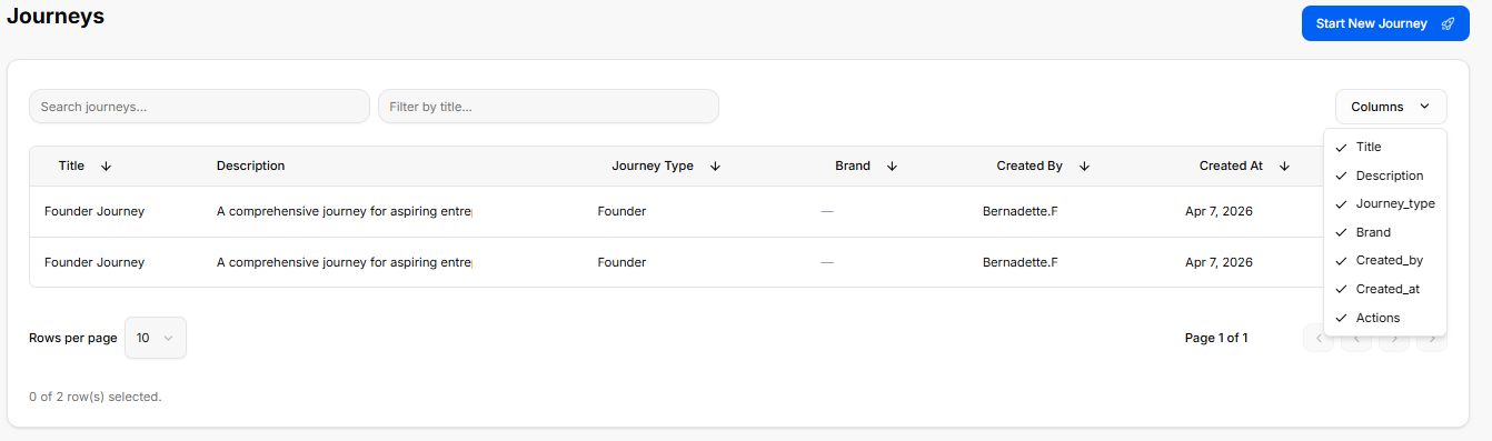
When you enter the Journeys module, you are presented with a global directory table of your active tracking environments:
-
Creating a Journey: Click the blue Start New Journey button at the top right to open the startup selection layout.
-
Searching and Filtering:
-
Use the Search journeys... text field above the table to filter your active paths by their specific title text.
-
Use the Filter by title... search field next to it to narrow down directory rows by matching exact title terms.
-
-
Journey Directory Table: Track active spaces across several parameters:
-
Title: The name of the roadmap (e.g., Founder Journey).
-
Description: A short outline summary detailing the scope of the path.
-
Journey Type: Identifies the framework category classification (e.g., Founder).
-
Brand: Logs any specific internal company asset or brand associated with the tracking environment.
-
Created By: Displays the user profile who initiated the roadmap.
-
Created At: Tracks the initial date the tracking module was opened.
-
-
Columns Visibility Tool: Click the Columns dropdown tool above the table to toggle parameters visible or hidden via checkmarks (Title, Description, Journey_type, Brand, Created_by, Created_at, or Actions).
-
Selection Summary: A tracking counter at the bottom left logs your selected table rows (e.g., 0 of 2 row(s) selected.).
Select a Journey Menu
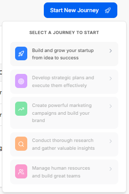
Clicking the Start New Journey button triggers a dropdown menu panel titled SELECT A JOURNEY TO START, prompting you to select from five guided track environments:
-
Build and grow your startup from idea to success (Blue Rocket Icon): The active primary track focused on complete end-to-end business execution.
-
Develop strategic plans and execute them effectively (Purple Target Icon): A strategic planning track.
-
Create powerful marketing campaigns and build your brand (Green Trend Icon): A marketing and brand growth track.
-
Conduct thorough research and gather valuable insights (Orange Magnifying Glass Icon): A research and market analysis track.
-
Manage human resources and build great teams (Pink Team Icon): An operations and team management framework track.
Brand Association Modal
When you select a track type to start a new journey, a modal window explicitly titled Brand Association appears, prompting you to decide how to link your new journey to a business entity.
Option 1: Use an Existing Brand
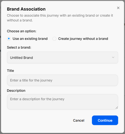
Selecting the Use an existing brand radio button configures the modal with the following fields:
-
Select a brand Dropdown: A selection menu field (e.g., defaulted to Untitled Brand) where you can click to choose from your already established business profiles.
-
Title: A text field to input the specific name or title for this new journey setup (Enter a title for the journey).
-
Description: A multi-line text block to add descriptive details or goals for this specific roadmap path (Enter a description for the journey).
Option 2: Create Journey Without a Brand
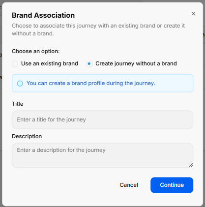
Switching to the Create journey without a brand radio button alters the modal layout by removing the brand selector dropdown and replacing it with an informational alert:
-
System Information Banner: A light blue notification box appears with a clear message stating: “You can create a brand profile during the journey.”
-
Title: The standard text input field remains to name your journey environment (Enter a title for the journey).
-
Description: The multi-line text block remains available to record your initial pathway notes (Enter a description for the journey).
Modal Actions (Both Views)
Regardless of the radio selection, two control items sit at the bottom right corner to finalize the form:
-
Cancel: A text link button to abort the journey creation process and return to the main dashboard menu.
-
Continue: A solid blue button to save your brand preferences and load into your new journey canvas space.
The Founder Journey Roadmap
The Founder Journey is a structured, interactive roadmap designed to guide entrepreneurs from an initial idea to a full market launch. The journey is divided into seven major operational stages, each containing sequential sub-stages that must be completed to progress.
The Journey Stages Sidebar (Left Panel)
-
Orientation Stage (Current)
-
Discovery Stage
-
Market Research Stage
-
Brand Foundations & Brand Kit Stage
-
Admin and Operations Stage
-
Go-to-Market Stage
-
Finalize and Export Stage
Orientation Stage
Orientation Stage
The Orientation Stage is the introductory phase of the roadmap, broken down into four distinct sequential sub-stages accessed via the left-hand sidebar dropdown:
-
Sub-Stage 1: Welcome to the Founder Journey
-
This is the initial onboarding landing view that provides context, introductory media, and directional cues before operational work begins.
-
-
Sub-Stage 2: Stages Information
-
The second item listed within the orientation sequence. (Content details pending system view selection).
-
-
Sub-Stage 3: Basic Information
-
The third item listed within the orientation sequence. (Content details pending system view selection).
-
-
Sub-Stage 4: Export Orientation Results
-
The final technical milestone within the initial phase, concluding the orientation sequence before transition parameters unlock. (Content details pending system view selection).
-
Stage Controls
Sub-Stage 1: Welcome to the Founder Journey
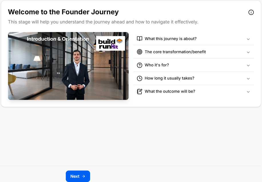
This is the initial onboarding sub-stage screen that gives users their first introductory look, informational context, and directional clues before moving forward into the deeper stages of the roadmap.
Canvas Layout & Workspace Components
-
Main Workspace Title: Prominently displays "Welcome to the Founder Journey" alongside a helpful subtitle: “This stage will help you understand the journey ahead and how to navigate it effectively.”
-
Orientation Media Panel: Features a large central multimedia layout titled Introduction & Orientation, featuring an introductory layout badged directly with the official buildrunkit brand logo.
-
Introductory Information Cards: A vertical stack of five expandable accordion style rows sits directly to the right of the media panel. These are designed to give users a quick clue about the roadmap's purpose before starting:
-
What this journey is about?: Explains that whether starting from zero or with prior business experience, this acts as a companion to guide you, record your progress, and compile your choices into a final document.
-
The core transformation/benefit: Clarifies the goal is to ensure you consider every necessary step to get a product out the door, bringing documentation and peace of mind that major decisions are locked in.
-
Who it's for?: Notes the track is built for aspiring founders, active founders, or existing business owners looking to optimize or tune up their operational gaps.
-
How long it usually takes?: Sets a realistic timeframe warning that it can take anywhere from 45 minutes to two weeks or more depending on how thoroughly you step through the phases.
-
What the outcome will be?: Confirms that completing the journey builds a comprehensive summary PDF detailing your discovery process, business structure choices, brand kits, targeted market research, financial/legal steps, and market strategies.
-
Navigation Controls
Sub-Stage 2: Stages Information
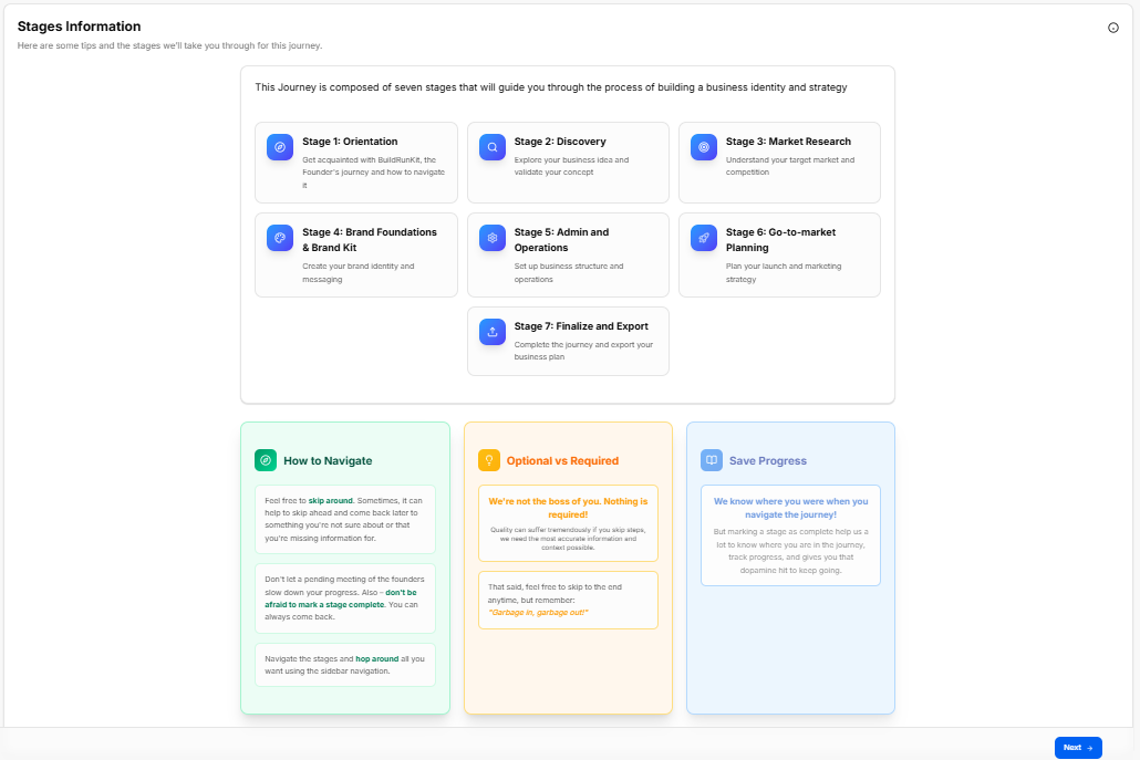
This sub-stage screen provides a complete structural map of the seven core phases that build a business identity and strategy, combined with platform navigation tips.
Canvas Layout & Workspace Components
-
Main Workspace Title: Displays "Stages Information" with the introductory subtitle: “Here are some tips and the stages we'll take you through for this journey.”
-
Journey Architecture Overview Panel: A large centralized block explicitly detailing the framework structure: “This Journey is composed of seven stages that will guide you through the process of building a business identity and strategy”.
-
The Seven Stage Cards:
-
Stage 1: Orientation: Get acquainted with BuildRunKit, the Founder's journey and how to navigate it.
-
Stage 2: Discovery: Explore your business idea and validate your concept.
-
Stage 3: Market Research: Understand your target market and competition.
-
Stage 4: Brand Foundations & Brand Kit: Create your brand identity and messaging.
-
Stage 5: Admin and Operations: Set up business structure and operations.
-
Stage 6: Go-to-market Planning: Plan your launch and marketing strategy.
-
Stage 7: Finalize and Export: Complete the journey and export your business plan.
-
Platform Guidance Cards (Bottom Panel)
Three distinct vertical layout columns sit at the bottom of the interface to guide data entry behaviors:
Navigation Controls
Sub-Stage 3: Basic Information
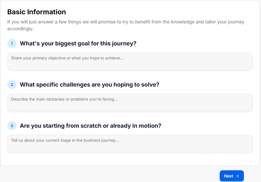
This sub-stage screen functions as an initial onboarding intake form, collecting foundational context from the founder to tailor the rest of the strategic journey.
Canvas Layout & Workspace Components
-
Main Workspace Title: Displays "Basic Information" with an introductory promise statement: “If you will just answer a few things we will promise to try to benefit from the knowledge and tailor your journey accordingly.”
-
Question 1: Objective Tracking:
-
Label: "1. What's your biggest goal for this journey?"
-
Input Field: A multi-line text container with the placeholder instruction: “Share your primary objective or what you hope to achieve...”
-
-
Question 2: Pain Point Analysis:
-
Label: "2. What specific challenges are you hoping to solve?"
-
Input Field: A multi-line text container with the placeholder instruction: “Describe the main obstacles or problems you're facing...”
-
-
Question 3: Operational Status Identification:
-
Label: "3. Are you starting from scratch or already in motion?"
-
Input Field: A multi-line text container with the placeholder instruction: “Tell us about your current stage in the business journey...”
-
Navigation Controls
-
Next Button: A blue Next → button is anchored at the bottom right corner of the window to log the text input parameters and transition forward to the final orientation sub-stage (Export Orientation Results).
Sub-Stage 4: Export Orientation Results
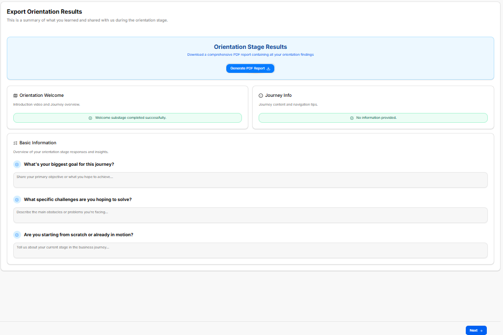
This is the final sub-stage milestone of the Orientation Stage, providing a comprehensive audit log of the user's initial onboarding actions, input parameters, and platform documentation options before unlocking the next major journey stage.
Canvas Layout & Workspace Components
-
Main Workspace Title: Displays "Export Orientation Results" with the dynamic header subtitle: “This is a summary of what you learned and shared with us during the orientation stage.”
-
Document Generation Panel: A stylized light-blue callout card spanning the top of the workspace labeled Orientation Stage Results:
-
Description: Prompts the user to “Download a comprehensive PDF report containing all your orientation findings”.
-
Action Button: Features a centered blue Generate PDF Report action key accompanied by a download icon.
-
-
Sub-Stage Completion Logs (Split Grid): Two parallel tracking blocks display completion verifications for the introductory screens:
-
Orientation Welcome Block: Titled “Introduction video and Journey overview.” It presents a green status alert bar confirming:
✓ Welcome substage completed successfully. -
Journey Info Block: Titled “Journey content and navigation tips.” It displays a secondary system notification indicator reading:
✓ No information provided.
-
Basic Information Summary Hub
A unified response panel titled Basic Information presents a read-only historical overview of the data insights entered by the founder during Sub-Stage 3 (Overview of your orientation stage responses and insights.):
-
Goal Audit Row:
-
Label:
✓ What's your biggest goal for this journey? -
Data Block: Displays the captured multi-line text block entry summarizing primary objectives.
-
-
Challenge Audit Row:
-
Label:
✓ What specific challenges are you hoping to solve? -
Data Block: Displays the captured multi-line text block entry mapping core business obstacles.
-
-
Status Audit Row:
-
Label:
✓ Are you starting from scratch or already in motion? -
Data Block: Displays the captured multi-line text block entry noting current operational standing.
-
Navigation Controls
-
Next Button: A blue Next → navigation action button is anchored at the bottom right corner of the window to commit all orientation findings and transition past Stage 1 into the Discovery Stage directory list.
Discovery Stage
Discovery Stage
The Discovery Stage is the conceptual exploration phase of the roadmap, broken down into five distinct sequential sub-stages accessed via the left-hand sidebar dropdown:
-
Sub-Stage 1: Welcome to the Discovery Stage
-
This is the initial onboarding landing view that provides foundational context, introductory media, and initial guidance before discovery operations begin.
-
-
Sub-Stage 2: Core Concept
-
The second item within the sequence, focusing on defining and documenting your startup's core business idea, problem statement, and proposed solution.
-
-
Sub-Stage 3: Market Size & Opportunity
-
The third item within the sequence, dedicated to mapping out early high-level market evaluations and identifying the overall landscape potential.
-
-
Sub-Stage 4: Industry Benchmarks
-
The fourth item within the sequence, outlining standard operational baselines, key sector metrics, and common industry performance indicators.
-
-
Sub-Stage 5: Export Discovery Results
-
The final technical milestone within this phase, presenting a read-only data audit overview alongside an export tool to save your comprehensive discovery findings as a PDF report.
-
Stage Controls
Sub-Stage 1: Welcome to the Discovery Stage
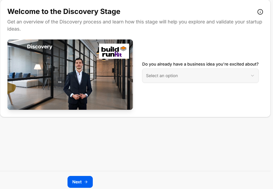
This sub-stage screen serves as the introductory gateway to the concept validation phase, helping founders gauge their current level of idea commitment before proceeding to deeper analysis.
Canvas Layout & Workspace Components
-
Main Workspace Title: Displays "Welcome to the Discovery Stage" accompanied by a clear instructional subtitle: “Get an overview of the Discovery process and learn how this stage will help you explore and validate your startup ideas.”
-
Discovery Media Panel: Features a large graphic or video workspace element explicitly labeled Discovery on the top-left and badged with the official buildrunkit brand logo on the top-right.
-
Concept Validation Selector: Located directly to the right of the media panel, this interactive component prompts users to define their starting point:
-
Field Label: "Do you already have a business idea you're excited about?"
-
Dropdown Selector: Clicking the "Select an option" box expands a menu containing three distinct choices to categorize the user's current stance:
-
Yes, I have one
-
I want to explore new ideas
-
I have a few and want help picking
-
-
Navigation Controls
-
Next Button: A blue Next → action key is centered at the bottom of the workspace to log the selected ideation baseline and transition forward to Sub-Stage 2 (Founder Fit Scan).
Sub-Stage 2: Founder Fit Scan
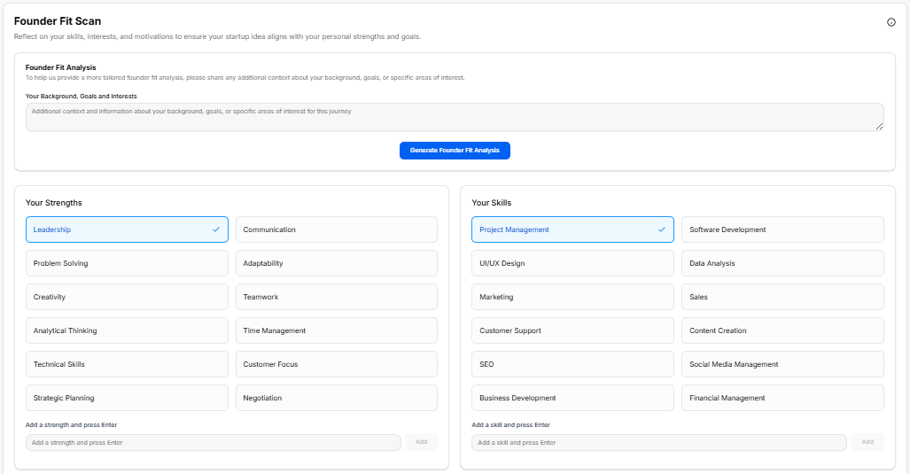
This sub-stage functions as an extensive personality, skill-set, and professional mapping environment. It allows founders to log their personal traits and context to ensure the selected startup concept aligns with their foundational strengths.
Canvas Layout & Workspace Components
-
Main Workspace Title: Displays "Founder Fit Scan" with the explicit header instruction: “Reflect on your skills, interests, and motivations to ensure your startup idea aligns with your personal strengths and goals.”
-
Founder Fit Analysis Context Card: A full-width text container block positioned at the top of the canvas layout:
-
Header: Founder Fit Analysis
-
Subtitle Text: “To help us provide a more tailored founder fit analysis, please share any additional context about your background, goals, or specific areas of interest.”
-
Input Area: A text entry field labeled “Your Background, Goals and Interests” with the inside placeholder prompt: “Additional context and information about your background, goals, or specific areas of interest for this journey”.
-
Action Button: A solid blue button centered below the entry field labeled Generate Founder Fit Analysis.
-
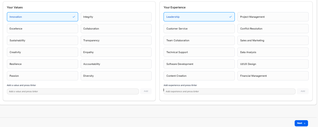
The Core Profiling Matrices
The workspace splits into four distinct quadrant-style logging containers across the page views to capture targeted tags. Selected items display a distinct blue border framework containing a checkmark:
-
Your Strengths Matrix: A multi-selectable grid of behavioral traits:
-
Pre-populated Grid Items: Leadership (Selected), Communication, Problem Solving, Adaptability, Creativity, Teamwork, Analytical Thinking, Time Management, Technical Skills, Customer Focus, Strategic Planning, and Negotiation.
-
Custom Data Field: An input bar at the bottom labeled “Add a strength and press Enter” alongside an Add button.
-
-
Your Skills Matrix: A grid mapping technical and professional operational abilities:
-
Pre-populated Grid Items: Project Management (Selected), Software Development, UI/UX Design, Data Analysis, Marketing, Sales, Customer Support, Content Creation, SEO, Social Media Management, Business Development, and Financial Management.
-
Custom Data Field: An input bar at the bottom labeled “Add a skill and press Enter” alongside an Add button.
-
-
Your Values Matrix: A grid tracking core cultural and ethical operational drivers:
-
Pre-populated Grid Items: Innovation (Selected), Integrity, Excellence, Collaboration, Sustainability, Transparency, Creativity, Empathy, Resilience, Accountability, Passion, and Diversity.
-
Custom Data Field: An input bar at the bottom labeled “Add a value and press Enter” alongside an Add button.
-
-
Your Experience Matrix: A grid mapping historical professional domains:
-
Pre-populated Grid Items: Leadership (Selected), Project Management, Customer Service, Conflict Resolution, Team Collaboration, Sales and Marketing, Technical Support, Data Analysis, Software Development, UI/UX Design, Content Creation, and Financial Management.
-
Custom Data Field: An input bar at the bottom labeled “Add experience and press Enter” alongside an Add button.
-
Navigation Controls
-
Next Button: A blue Next → navigation action option key is anchored at the absolute bottom right margin of the pane to lock down selected attribute parameters and progress forward to Sub-Stage 3 (Idea Generation and Selection).
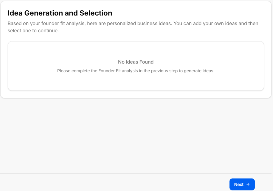
Sub-Stage 3: Idea Generation and Selection
This sub-stage serves as the brainstorming and filtering hub of the Discovery Stage. It relies directly on the data points submitted during the previous phase to produce custom, personalized startup pathways.
Canvas Layout & Workspace Components
-
Main Workspace Title: Displays "Idea Generation and Selection" with an explanatory subtitle: “Based on your founder fit analysis, here are personalized business ideas. You can add your own ideas and then select one to continue.”
-
Dynamic Ideas Panel: A large central interface area where generated startup options populate based on user profile inputs.
-
Empty State Alert: If a user proceeds to this step without fully configuring or running the preceding profile evaluation card, the platform shows a centered "No Ideas Found" message container.
-
System Instruction: Displays the fallback prompt: “Please complete the Founder Fit analysis in the previous step to generate ideas.”
-
Populated State (Expected Behavior): When the Founder Fit Scan is completed, this container populates with interactive business concept options that the founder can review, add to, and select as their core venture track.
-
Navigation Controls
Sub-Stage 4: Working Name + NAICS

This sub-stage screen focuses on defining the company's preliminary market presence and legal classification. It features tools to generate and log business names, tone-specific slogans, and industry taxonomy codes.
Canvas Layout & Workspace Components
-
Main Workspace Title: Displays "Working Name + NAICS" with an introductory subtitle: “Let's define what your business will be called, its slogan and its formal industry classification.”
-
Business Concept Recap Banner: A light gray full-width contextual alert box summarizing the selected track:
-
Text: “You have chosen to pursue the business idea: An AI assistant that helps virtual assistants optimize their workflow and automate administrative tasks.”
-
The Core Data-Intake Sections
1. Business Name Generation Hub
-
Field Label: "1. What is the working name of your business?"
-
Input Box: A text entry field populated with a live placeholder or typed entry.
-
AI Tool Integration: Features a solid blue Suggest Business Names action button to auto-generate creative naming variations directly underneath if the founder requires inspiration.
2. Slogan Configuration Console (Tone & Language Options)
-
Field Label: "2. What is the slogan or tagline of your business?"
-
Input Box: A text entry field with the directional placeholder text: “Enter your business slogan or tagline...”
-
AI Slogan Generation Parameter Filters: Founders can customize the automated generation tool by adjusting specific behavioral selectors:
-
Slogan Tone Dropdown: Sets the branding attitude. Clicking the menu reveals four distinct choices:
-
Clever
-
Funny
-
Serious
-
Informative
-
-
Language Dropdown: Sets the output translation. Clicking the menu reveals two standard options:
-
English
-
Spanish
-
-
-
Action Trigger: Features a solid blue Suggest Slogans action button to generate list options matching the targeted tone and language configuration.
3. NAICS Industry Classification Hub
-
Field Label: "3. What is the NAICS code for your business?"
-
Input Box: A specialized input box displaying a search placeholder: “Search NAICS code...”
-
AI Classification Integration: Features a solid blue Suggest NAICS Code action button that leverages the concept description to locate matching industrial classification codes from the North American Industry Classification System database.
-
Sector Search Dropdown: A secondary interactive drawer element populated with standard macroeconomic parent groupings to help narrow down industry categorization manually:
-
Agriculture, Forestry, Fishing and Hunting
-
Mining, Quarrying, and Oil and Gas Extraction
-
Utilities
-
Construction
-
Manufacturing
-
Navigation Controls
-
Next Button: A blue Next → navigation utility link is anchored at the bottom right corner of the window frame to submit name selections, tagline logs, and regulatory NAICS codes, advancing directly to Sub-Stage 5 (Early Market Signal Check).
Sub-Stage 5: Early Market Signal Check
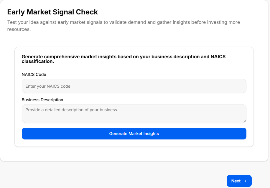
This sub-stage screen functions as an initial quantitative and qualitative validation check. It enables founders to test their business concept against preliminary market indicators to gauge demand, identify industry trends, and gather strategic insights before committing capital or deep operational resources.
Canvas Layout & Workspace Components
-
Main Workspace Title: Displays "Early Market Signal Check" alongside a descriptive subtitle mapping its core objective: “Test your idea against early market signals to validate demand and gather insights before investing more resources.”
-
Market Insights Generation Console: A stylized data intake card centered on the workspace canvas, titled "Generate comprehensive market insights based on your business description and NAICS classification."
The Input Validation Fields
-
NAICS Code Field:
-
Label: "NAICS Code"
-
Input Box: A text field with the placeholder instruction: “Enter your NAICS code”. This links directly with the industrial classification chosen in the previous sub-stage.
-
-
Business Description Field:
-
Label: "Business Description"
-
Input Box: A multi-line text container with the inside placeholder prompt: “Provide a detailed description of your business...”
-
Analysis Trigger
-
Action Button: Features a solid blue, full-width action bar positioned at the bottom of the card reading "Generate Market Insights". Clicking this processes the NAICS taxonomy parameters and text entries to deliver real-world validation data, competitor trends, and target audience feedback indicators directly on screen.
Navigation Controls
-
Next Button: A blue Next → utility key is anchored at the absolute bottom right-hand margin of the window footer area. Clicking this locks in your validation data points and transitions the user forward to Sub-Stage 6 (Export Discovery Results), completing the entire Discovery phase sequence.
Sub-Stage 6: Export Discovery Results
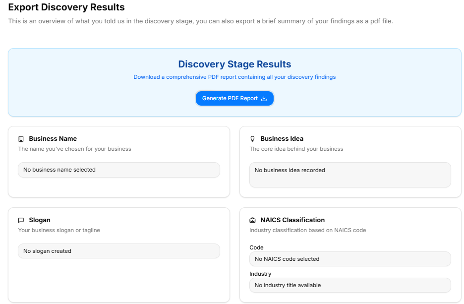
This final checkpoint compiles all inputs, selections, and AI-generated outputs from the Discovery Stage into an organized audit summary. It offers a clean, read-only historical review alongside export capabilities before the user transitions into the next strategic phase of development.
Canvas Layout & Workspace Components
-
Main Workspace Title: Displays "Export Discovery Results" with an introductory descriptive subtitle: “This is an overview of what you told us in the discovery stage, you can also export a brief summary of your findings as a pdf file.”
-
Document Generation Panel: A full-width light-blue callout banner labeled Discovery Stage Results positioned at the top of the workspace:
-
Description: Instructs the user to “Download a comprehensive PDF report containing all your discovery findings”.
-
Action Button: Centered within the panel is a blue Generate PDF Report action key complete with a download tray icon.
-
Discovery Summary Grid (Upper Panel)
The top half of the results interface uses a balanced two-column grid framework to show core branding and indexing parameters:
-
Business Name Card:
-
Label: “The name you've chosen for your business”
-
Data Field: Displays the confirmed name of the business venture.
-
-
Business Idea Card:
-
Label: “The core idea behind your business”
-
Data Field: Displays the selected startup concept track.
-
-
Slogan Card:
-
Label: “Your business slogan or tagline”
-
Data Field: Displays the generated brand slogan or tagline.
-
-
NAICS Classification Card:
-
Label: “Industry classification based on NAICS code”
-
Data Rows: Divided into two tracking points:
-
Code: Displays the selected regulatory classification code.
-
Industry: Displays the formal industry sector title.
-
-
Strategic Analysis Summaries (Lower Panel)
The bottom section handles the deep conceptual evaluations and contextual research data compiled throughout the phase:
-
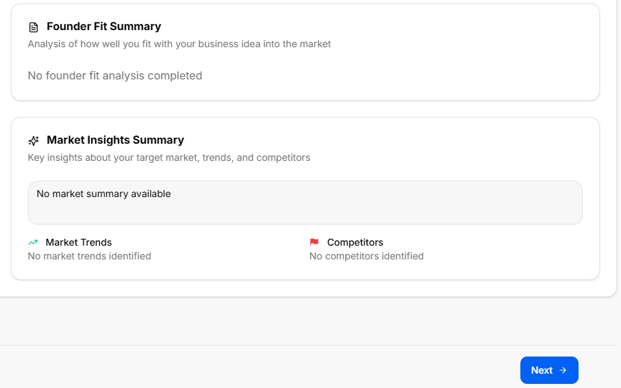
Founder Fit Summary Block:
-
Header Title: Founder Fit Summary
-
Label: “Analysis of how well you fit with your business idea into the market”
-
Data Field: Displays the complete alignment analysis text based on the strengths and skills assessment.
-
-
Market Insights Summary Block:
-
Header Title: Market Insights Summary
-
Label: “Key insights about your target market, trends, and competitors”
-
Main Summary Field: Displays the captured analysis results and qualitative market landscape breakdown.
-
Granular Insight Footers: Split into two side-by-side indicator data targets:
-
Market Trends (Graph Icon): Displays the logged macroeconomic development paths and growth curves.
-
Competitors (Flag Icon): Displays the verified industry player benchmarking details.
-
-
Navigation Controls
Market Research Stage
Market Research Stage
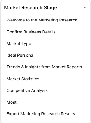
The Market Research Stage is the data and validation phase of the roadmap, broken down into nine distinct sequential sub-stages accessed via the left-hand sidebar dropdown:
-
Sub-Stage 1: Welcome to the Market Research Stage
-
This is the initial onboarding landing view that provides context, introductory media, and directional cues before validation work begins.
-
-
Sub-Stage 2: Market Type
-
The second item within the sequence, focusing on choosing your market entry strategy (Existing, New, Resegmented, or Clone) to define your positioning rules.
-
-
Sub-Stage 3: Ideal Persona
-
The third item within the sequence, dedicated to building target customer demographical and psychographical target profiles.
-
-
Sub-Stage 4: Market Research Questions
-
The fourth item within the sequence, organizing core informational queries used to vet market assumptions and gather structural feedback.
-
-
Sub-Stage 5: Trends & Insights
-
The fifth item within the sequence, analyzing macro trends, industrial opportunities, market headwinds, and technological shifts.
-
-
Sub-Stage 6: Market Statistics
-
The sixth item within the sequence, delivering a quantitative sizing breakdown (TAM, SAM, SOM) along with industry growth percentages and acquisition baselines.
-
-
Sub-Stage 7: Competitive Analysis
-
The seventh item within the sequence, functioning as an intelligence matrix to profile direct rivals, map features, and assess competitive pricing strategies.
-
-
Sub-Stage 8: Moat
-
The eighth item within the sequence, identifying key competitive advantages, operational switching costs, barriers to entry, and network effects.
-
-
Sub-Stage 9: Export Marketing Research Results
-
The final technical milestone within this phase, presenting a read-only data audit layout alongside a generator tool to export an official summary PDF report.
-
Stage Controls
Sub-Stage 1: Welcome to the Marketing Research Stage

This sub-stage screen serves as the introductory gateway to the market analysis phase, ensuring the founder has clear instructional media and overview tools before deep-diving into target consumer metrics.
Canvas Layout & Workspace Components
-
Main Workspace Title: Displays "Welcome to the Marketing Research Stage" accompanied by a directional subtitle: “Get an overview of the Market Research process and learn how this stage will help you identify your target market, trends, and competitors.”
-
Market Research Media Panel: Features a large central workspace graphic or video element titled Market Research on the top-left and branded directly with the official buildrunkit logo on the top-right.
-
Onboarding Information Drawer (Right Panel): A structured information block or layout component sits to the right of the media display to outline immediate objectives before the founder begins editing data entries.
Navigation Controls
-
Next Button: A blue Next → link utility button is centered at the bottom of the interface window to save the initialization state and advance the user directly to Sub-Stage 2 (Confirm Business Details).
Sub-Stage 2: Confirm Business Details
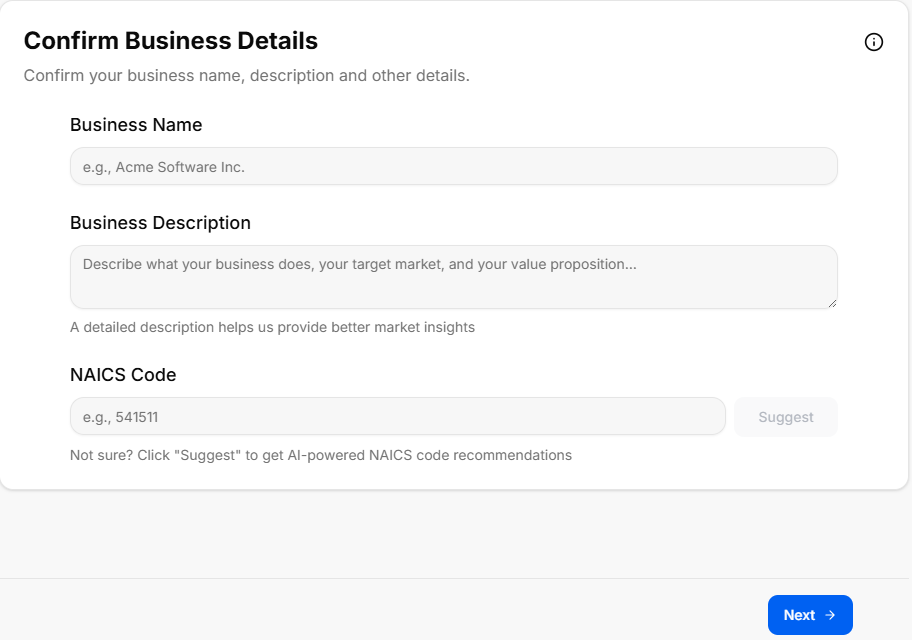
This sub-stage serves as a data verification screen where the user reviews and confirms the foundational business parameters established during the Discovery Stage before launching deep market research operations.
Canvas Layout & Workspace Components
-
Main Workspace Title: Displays "Confirm Business Details" accompanied by a clear instructional subtitle: “Please confirm your business details to ensure the market research is tailored accurately to your concept.”
-
Core Business Configuration Panel: A unified data entry card containing three structured verification fields:
-
1. Business Working Name:
-
Label: “Working Name”
-
Input Box: A text container designed to dynamically pull forward or allow editing of the company name.
-
-
2. Business Slogan:
-
Label: “Slogan”
-
Input Box: A secondary text container showing the established tagline or brand hook.
-
-
3. Business Core Description:
-
Label: “Description”
-
Input Box: A multi-line text container mapping out the specific workflow, target users, and key offerings of the business concept.
-
-
Navigation Controls
Sub-Stage 3: Market Type
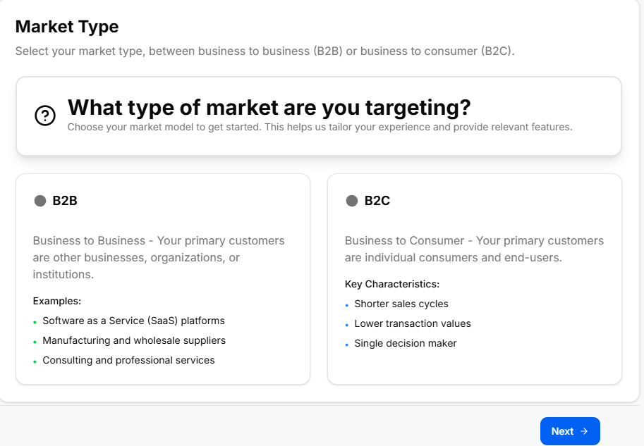
This sub-stage screen helps the founder identify, define, and select their foundational market entry strategy. Categorizing the market type changes how the system configures customer acquisition metrics, scaling speeds, and competitive positioning strategies later in the roadmap.
Canvas Layout & Workspace Components
-
Main Workspace Title: Displays "Market Type" accompanied by a targeted operational subtitle: “Identify the type of market you are entering to better understand consumer behaviors, regulatory barriers, and market dynamics.”
-
Market Type Matrix Selection: A collection of four large, interactive option cards arranged across the canvas. Each strategy type features a distinctive heading title and description block:
-
Existing Market:
-
Description: Entering an existing market with well-defined product categories, established competitors, and known customer requirements. The primary operational goal here is stealing market share from current incumbents.
-
-
New Market:
-
Description: Creating an entirely new market category where a product or service solves a problem that customers didn't realize they had. This path features no direct initial competitors but requires massive consumer education efforts.
-
-
Resegmented Market (Niche / Low Cost):
-
Description: Finding a specific group of customers in an existing market whose needs are currently ignored or underserved by massive industry giants. This relies on targeting a specific niche or leveraging a low-cost pricing strategy.
-
-
Clone Market:
-
Description: Taking an incredibly successful, proven business model from a foreign or distinct market and completely replicating it within a local region or unserved geographic area.
-
-
Navigation Controls
-
Next Button: A blue Next → action link utility button is anchored at the bottom right corner of the footer frame to lock down the chosen entry strategy and transition directly into Sub-Stage 4 (Ideal Persona).
Sub-Stage 4: Ideal Persona
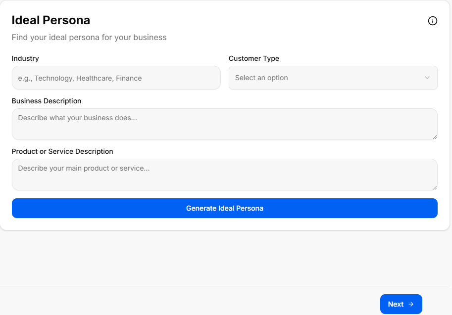
This sub-stage screen functions as a comprehensive buyer persona development center. It uses the verified business description and market choices to generate deep biographical profiles of the business's ideal targets, mapping their behaviors, professional constraints, and software requirements.
Canvas Layout & Workspace Components
-
Main Workspace Title: Displays "Ideal Persona" accompanied by a tactical user-experience subtitle: “Define your target audience profiles or user personas to deeply understand their backgrounds, key pain points, and specific needs.”
-
Persona Generation Control Card: A full-width configuration banner positioned at the top of the canvas layout:
-
Header: Generate Ideal Persona
-
Subtitle Text: “Generate an ideal user persona based on your business description and market choices to target the right customers.”
-
Action Button: A solid blue button centered below the descriptive text labeled Generate Ideal Persona. Clicking this parses the cumulative journey parameters to build targeted consumer case studies across the grid below.
-
The Generated Persona Matrix Grid
Once populated, the workspace layout organizes user attributes into four distinct, easy-to-read qualitative profiling blocks:
-
1. Profile & Demographics (User Icon):
-
Label: "1. Profile & Demographics"
-
Data Field: Displays the persona's core bio traits, including typical age brackets, job titles, daily professional environments, educational backgrounds, and income ranges.
-
-
2. Psychographics & Behaviors (Heart Icon):
-
Label: "2. Psychographics & Behaviors"
-
Data Field: Maps internal driving values, technology adoption habits, buying motivations, brand loyalties, and preferred digital communication channels.
-
-
3. Pain Points & Challenges (Warning Icon):
-
Label: "3. Pain Points & Challenges"
-
Data Field: Identifies critical friction points, systemic workplace bottlenecks, financial leaks, and personal operational frustrations the consumer actively seeks to solve.
-
-
4. Goals & Desired Outcomes (Target Icon):
-
Label: "4. Goals & Desired Outcomes"
-
Data Field: Highlights definition-of-success metrics, core productivity targets, long-term personal milestones, and specific software performance desires.
-
Navigation Controls
Sub-Stage 5: Trends & Insights from Market Reports
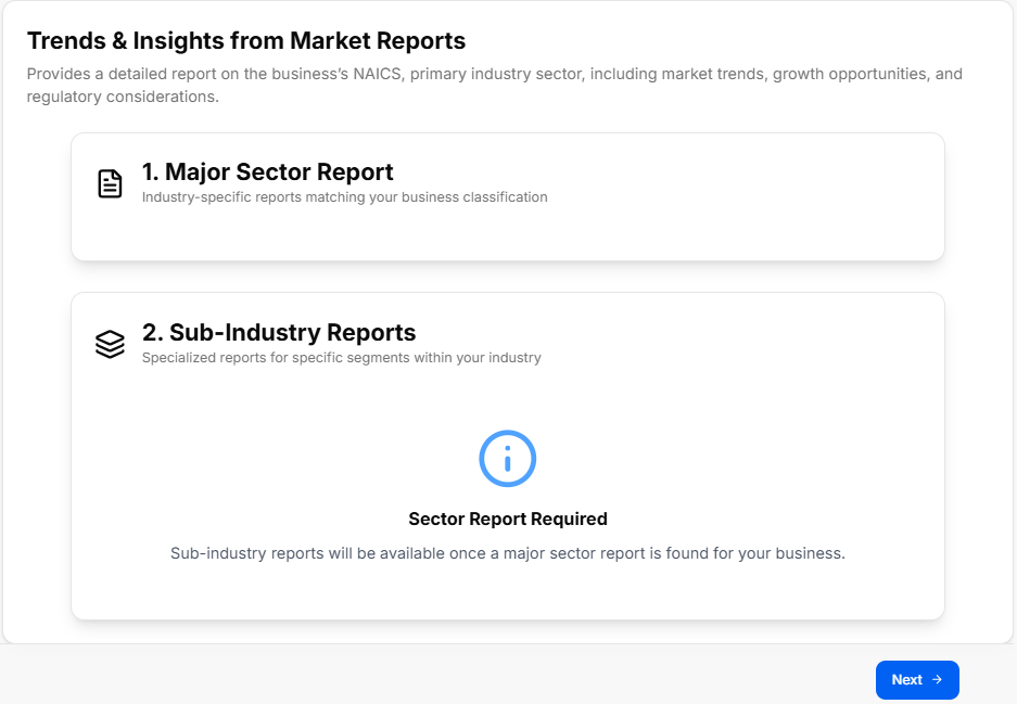
This sub-stage screen serves as an advanced trend analysis module. It processes the confirmed business details and industry vertical classifications to generate comprehensive reports mapping out macro market shifts, growth directions, and technical disruptions.
Canvas Layout & Workspace Components
-
Main Workspace Title: Displays "Trends & Insights from Market Reports" accompanied by a research-driven subtitle: “Generate comprehensive market trends and insights based on your business description and market choices to stay ahead of the competition.”
-
Trends Generation Control Card: A full-width specialized action container placed at the top of the workspace:
-
Header: Generate Trends & Insights
-
Subtitle Text: “Generate market trends and insights from industry reports to uncover growth opportunities and key market dynamics.”
-
Action Button: A solid blue button centered below the instructions labeled Generate Trends & Insights. Clicking this runs the analysis engine to populate the thematic data grids below.
-
The Generated Strategic Insights Grid
The research engine categorizes industry macro data into four distinct quadrant-style information panels across the canvas layout:
-
1. Market Trends (Graph Line Icon):
-
Label: "1. Market Trends"
-
Data Field: Details shifting industry directions, overall sector momentum, emergent business models, and adoption velocities within the targeted industrial landscape.
-
-
2. Market Insights (Lightbulb Icon):
-
Label: "2. Market Insights"
-
Data Field: Delivers deeper qualitative breakthroughs, hidden workflow demands, under-the-radar sector anomalies, and strategic takeaways relevant to the concept.
-
-
3. Opportunities (Star Icon):
-
Label: "3. Opportunities"
-
Data Field: Flags immediate operational gaps, niche market expansions, unserved customer segments, and high-growth spaces left open by existing market competitors.
-
-
4. Threats & Challenges (Shield/Warning Icon):
-
Label: "4. Threats & Challenges"
-
Data Field: Maps incoming systemic barriers, pricing drops, changing regulatory standards, technological risks, and defensive moves from large industry incumbents.
-
Navigation Controls
Sub-Stage 6: Market Statistics
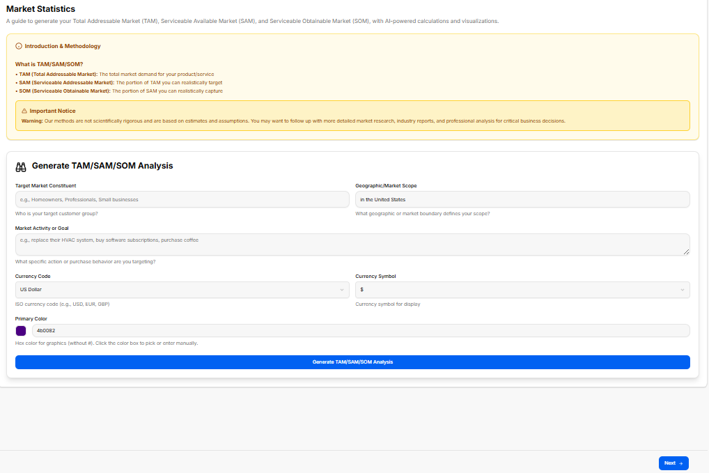
This sub-stage delivers a quantitative breakdown of the industry landscape. It processes the venture's target profile and NAICS industry classification to calculate addressable market sizes, industry growth percentages, and baseline customer acquisition metrics.
Canvas Layout & Workspace Components
-
Main Workspace Title: Displays "Market Statistics" accompanied by a metrics-focused subtitle: “View key market statistics and metrics to understand the scale, growth potential, and financial dynamics of your target industry.”
-
Statistics Generation Control Card: A full-width calculation container situated at the top of the workspace area:
-
Header: Generate Market Statistics
-
Subtitle Text: “Generate data-driven market statistics, including market sizing, growth rates, and average industry metrics to back your business strategy.”
-
Action Button: A solid blue button centered within the container labeled Generate Market Statistics. Clicking this runs the financial modeling engine to populate the quantitative panels below.
-
The Generated Market Metrics Grid
The reporting suite arranges the calculated industry benchmarks into four clear data visualization panels across the page layout:
-
1. Market Sizing (TAM, SAM, SOM) (Pie Chart Icon):
-
Label: "1. Market Sizing (TAM, SAM, SOM)"
-
Data Field: Pulls dynamic calculations for Total Addressable Market (TAM), Serviceable Addressable Market (SAM), and Serviceable Obtainable Market (SOM) to illustrate the absolute scale of the revenue opportunity.
-
-
2. Growth Rates & Projections (Bar Chart Icon):
-
Label: "2. Growth Rates & Projections"
-
Data Field: Tracks Compound Annual Growth Rate (CAGR) percentages, historical momentum, and five-year industrial trajectory forecasts.
-
-
3. Key Industry Metrics (Analytics Icon):
-
Label: "3. Key Industry Metrics"
-
Data Field: Outlines core operational baselines unique to the sector, such as standard profit margins, transaction volumes, and asset utilization averages.
-
-
4. Customer Acquisition Metrics (User Funnel Icon):
-
Label: "4. Customer Acquisition Metrics"
-
Data Field: Details industry standard Customer Acquisition Costs (CAC), expected Customer Lifetime Value (LTV) ratios, and average sales cycle lengths.
-
Navigation Controls
Sub-Stage 7: Competitive Analysis
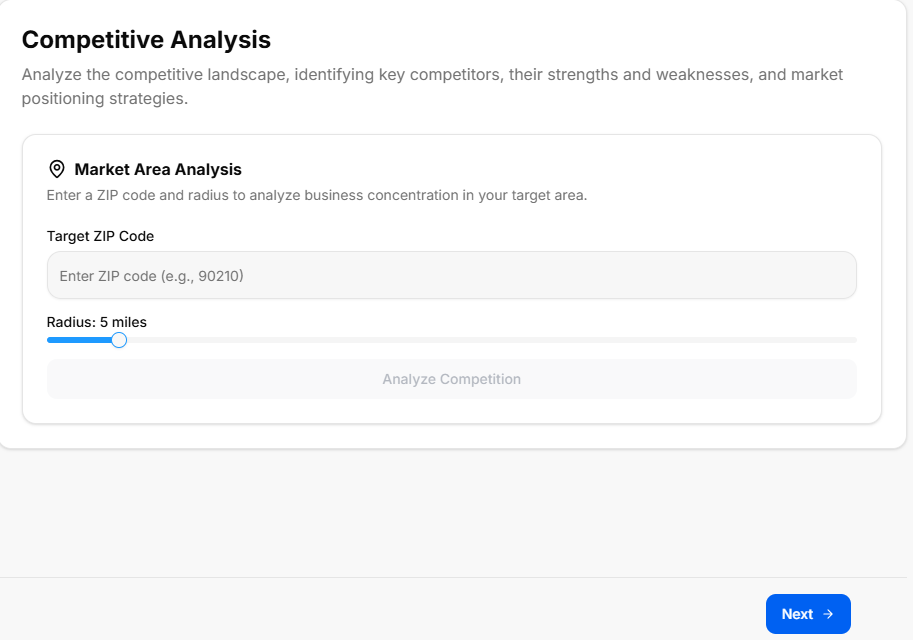
This sub-stage functions as an automated and manual benchmarking hub. It processes the company's core concept description and targeted market choices to systematically track direct and indirect market competitors.
Canvas Layout & Workspace Components
-
Main Workspace Title: Displays "Competitive Analysis" accompanied by a positioning subtitle: “Identify and analyze your competitors to understand their strengths, weaknesses, and market positioning.”
-
Competitor Generation Control Card: A full-width intelligence container positioned at the top of the canvas workspace:
-
Header: Generate Competitive Analysis
-
Subtitle Text: “Generate a comprehensive competitive analysis, profiling major competitors, their market share, strategies, and features.”
-
Action Button: A solid blue button centered within the container labeled Generate Competitive Analysis. Clicking this runs the analysis to populate the matrix blocks below.
-
The Generated Competitive Intelligence Grid
The system populates and segments competitive landscaping metrics into four standard tracking containers across the page layout:
-
1. Top Competitors Profile (Users Icon):
-
Label: "1. Top Competitors Profile"
-
Data Field: Displays the profiles and market data of primary competitors.
-
-
2. Competitor Strengths & Weaknesses (Shield Icon):
-
Label: "2. Competitor Strengths & Weaknesses"
-
Data Field: Displays the core strengths and critical weaknesses identified for each competitor.
-
-
3. Feature Comparison Matrix (Sliders/Settings Icon):
-
Label: "3. Feature Comparison Matrix"
-
Data Field: Displays a detailed breakdown of features across different market players.
-
-
4. Pricing & Market Positioning (Dollar Tag Icon):
-
Label: "4. Pricing & Market Positioning"
-
Data Field: Displays the pricing tiers and strategic market positioning of competitors.
-
Navigation Controls
-
Next Button: A blue Next → navigation action button is anchored at the bottom right-hand margin of the footer. Clicking this locks in the competitor tracking data and advances directly to Sub-Stage 8 (Moat).
Sub-Stage 8: Moat
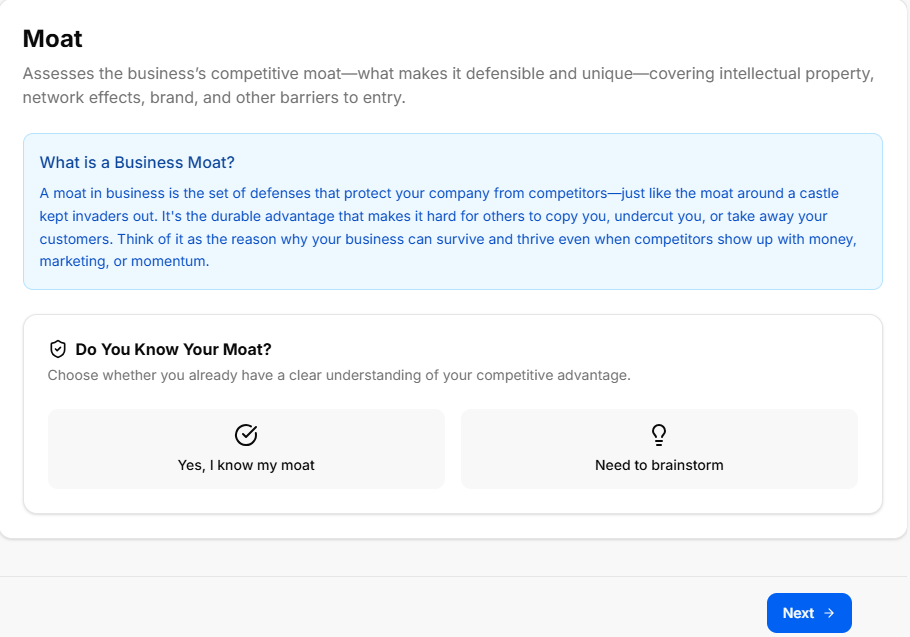
This sub-stage focusing on identifying and developing your venture's competitive advantages or "moat". Defining these core barriers helps secure your market position and protects your startup concept from being easily replicated by competitors.
Canvas Layout & Workspace Components
-
Main Workspace Title: Displays "Moat" accompanied by a protective strategy subtitle: “Identify and define your competitive advantages or 'moat' to protect your business from competitors and sustain long-term success.”
-
Moat Generation Control Card: A full-width strategic planning container positioned at the top of the canvas workspace:
-
Header: Generate Moat
-
Subtitle Text: “Generate a comprehensive moat analysis, profiling major barriers to entry, switching costs, and network effects.”
-
Action Button: A solid blue button centered within the container labeled Generate Moat. Clicking this runs the analysis to populate the defensive strategic blocks below.
-
The Generated Moat Analysis Grid
The system populates and segments your defensive market structures into four standard tracking containers across the page layout:
-
1. Barriers to Entry (Shield Icon):
-
Label: "1. Barriers to Entry"
-
Data Field: Displays the structural roadblocks and startup challenges that prevent new players from easily entering your space.
-
-
2. Switching Costs (Arrows Icon):
-
Label: "2. Switching Costs"
-
Data Field: Displays the calculated operational, financial, or psychological costs customers face if they try to leave your platform for a competitor.
-
-
3. Network Effects (Network/Nodes Icon):
-
Label: "3. Network Effects"
-
Data Field: Displays how your product or service naturally becomes more valuable to existing users as your total customer base grows.
-
-
4. Cost Advantages (Trending Down Bar Chart Icon):
-
Label: "4. Cost Advantages"
-
Data Field: Displays the unique operational efficiencies, scale economics, or proprietary processes that allow you to maintain lower costs than rivals.
-
Navigation Controls
-
Next Button: A blue Next → navigation action button is anchored at the bottom right-hand margin of the footer. Clicking this saves your competitive advantage profiles and advances directly to Sub-Stage 9 (Export Marketing Research Results).
Sub-Stage 9: Export Marketing Research Results
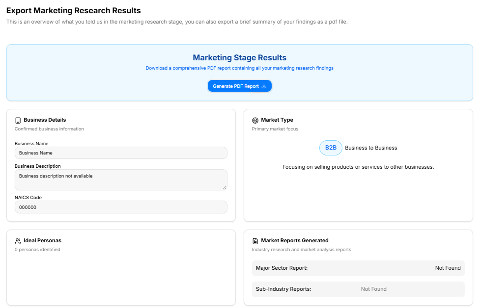
This final checkpoint compiles all inputs, strategy selections, and AI-generated analysis grids from the Market Research Stage into a centralized audit layout. It provides a read-only historical overview alongside comprehensive export features before unlocking progress into the next stage of development.
Canvas Layout & Workspace Components
-
Main Workspace Title: Displays "Export Marketing Research Results" accompanied by an instructional subtitle: “This is an overview of what you told us in the marketing research stage, you can also export a brief summary of your findings as a pdf file.”
-
Document Generation Panel: A full-width light-blue callout container positioned at the top of the canvas:
-
Description: Instructs the user to “Download a comprehensive PDF report containing all your marketing research findings”.
-
Action Button: Features a centered blue Generate PDF Report action key with an integrated download tray icon.
-
Core Market Settings Summary Grid (Upper Panel)
The top half of the summary layout utilizes a two-column grid framework to display foundational strategic choices:
-
Business Details Card:
-
Label: “Your confirmed business details”
-
Data Rows: Displays the verified company working name, brand slogan, and core concept description.
-
-
Market Type Card:
-
Label: “The market type classification for your business”
-
Data Field: Displays the chosen market entry strategy (e.g., Existing, New, Resegmented, or Clone).
-
-
Ideal Persona Card:
-
Label: “The target customer profile or user persona”
-
Data Field: Displays the generated customer demographic and psychographic profiles.
-
Deep Research Analysis Summaries (Lower Panel)
The bottom section handles the complex data models, industry trend forecasts, and competitive positioning metrics logged throughout the phase:
-
Trends & Insights Summary Block:
-
Header Title: Trends & Insights Summary
-
Label: “Key trends, insights, opportunities, and threats from industry reports”
-
Data Field: Displays the compiled macro-market directions and risk profiles.
-
-
Market Statistics Summary Block:
-
Header Title: Market Statistics Summary
-
Label: “Data-driven market statistics including sizing, growth rates, and metrics”
-
Data Field: Displays the quantitative industry benchmarks, size estimates, and growth calculations.
-
-
Competitive Analysis Summary Block:
-
Header Title: Competitive Analysis Summary
-
Label: “Profiles, strengths, weaknesses, and features of your top competitors”
-
Data Field: Displays the competitive intelligence profiles and positioning comparisons.
-
-
Moat Summary Block:
-
Header Title: Moat Summary
-
Label: “Your competitive advantages, barriers to entry, and network effects”
-
Data Field: Displays the identified defensive strategic barriers and switching cost advantages.
-
Navigation Controls
Brand Foundations & Brand Kit Stage
Brand Foundations & Brand Kit Stage
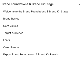
The Brand Foundations & Brand Kit Stage is the creative identity phase of the roadmap, broken down into seven distinct sequential sub-stages accessed via the left-hand sidebar dropdown:
-
Sub-Stage 1: Welcome to the Brand Foundations & Brand Kit Stage
-
This is the initial onboarding landing view that provides context, a core introduction video, and foundational directions before branding work begins.
-
-
Sub-Stage 2: Brand Basics
-
The second item within the sequence, focusing on uploading a company logo, setting basic brand details, selecting baseline communication styles, and inputting your industry classification code.
-
-
Sub-Stage 3: Core Values
-
The third item within the sequence, helping founders select or customize three to five key company tenets that define organizational culture and align marketing practices.
-
-
Sub-Stage 4: Target Audience
-
The fourth item within the sequence, allowing creators to select or manually describe primary target audience segments to ensure visual branding connects with the right market.
-
-
Sub-Stage 5: Fonts
-
The fifth item within the sequence, dedicated to testing, previewing, and assigning official typography configurations for both primary headlines and paragraph text.
-
-
Sub-Stage 6: Color Palette
-
The sixth item within the sequence, focusing on selecting predefined themes or customizing individual hex codes to lock down a primary, secondary, and accent color palette.
-
-
Sub-Stage 7: Export Brand Foundations & Brand Kit Results
-
The final technical milestone within this phase, presenting a read-only historical review layout of all branding asset selections with a tool to generate an exportable summary PDF report.
-
Stage Controls
Sub-Stage 1: Welcome to the Brand Foundations & Brand Kit Stage
This sub-stage screen serves as the formal onboarding gateway for the branding phase, introducing the founder to identity creation and visual asset generation.
Canvas Layout & Workspace Components
-
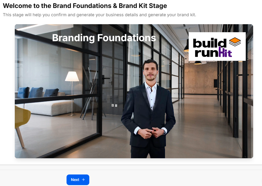
Main Workspace Title: Displays "Welcome to the Brand Foundations & Brand Kit Stage".
-
Instructional Subtitle: “This stage will help you confirm and generate your business details and generate your brand kit.”
-
Branding Foundations Media Panel: Features a large, central display graphic or video asset set in an office hallway. The media asset displays the title text "Branding Foundations" on the upper-left area and features the official buildrunkit logo badge on the upper-right corner.
Navigation Controls
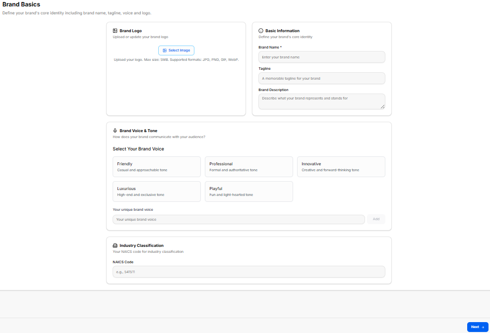
Sub-Stage 2: Brand Basics
This sub-stage screen focuses on defining your brand's foundational identity parameters. It establishes core visual traits, essential baseline information, and conversational values that dictate how your brand communicates with your audience.
Canvas Layout & Workspace Components
-
Main Workspace Title: Displays "Brand Basics" accompanied by a clear setup subtitle: “Define your brand's core identity including brand name, tagline, voice and logo.”
-
Brand Logo Upload Panel: A structured block dedicated to media configuration on the upper left:
-
Header: Brand Logo (accompanied by an image icon)
-
Subtitle: “Upload or update your brand logo”
-
Upload Trigger: Features a clear blue border Select Image button.
-
File Constraints Label: Specifies “Upload your logo. Max size: 5MB. Supported formats: JPG, PNG, GIF, WebP.”
-
-
Basic Information Form Panel: A structured data input layout placed on the upper right side:
-
Header: Basic Information (accompanied by a clock/target icon)
-
Subtitle: “Define your brand's core identity”
-
Brand Name Input Field: A text entry field designated with a required indicator labeled *“Brand Name ” and displaying placeholder text “Enter your brand name”.
-
Tagline Input Field: A text entry container labeled “Tagline” with a placeholder reading “A memorable tagline for your brand”.
-
Brand Description Input Area: A larger, multi-line text input block labeled “Brand Description” showing placeholder text “Describe what your brand represents and stands for”.
-
Brand Voice & Tone Configuration Suite
A wide, centralized setting segment located below the foundational data inputs allows creators to define market messaging styles:
-
Header: Brand Voice & Tone (accompanied by a microphone icon)
-
Instructional Guide: “How does your brand communicate with your audience?”
-
Preset Tone Selector Blocks: Displays five interactive presets arranged in a layout grid to capture your brand positioning:
-
Friendly: “Casual and approachable tone”
-
Professional: “Formal and authoritative tone”
-
Innovative: “Creative and forward-thinking tone”
-
Luxurious: “High-end and exclusive tone”
-
Playful: “Fun and light-hearted tone”
-
-
Custom Tone Utility: Features a text box field labeled “Your unique brand voice” alongside an interactive Add button, enabling users to register their own communication values manually.
Industry Classification Component
-
Header: Industry Classification (accompanied by a building icon)
-
Label Text: “Your NAICS code for industry classification”
-
NAICS Code Field: Provides a standard numerical text entry layout container labeled “NAICS Code” with placeholder text “e.g., 541511”.
Navigation Controls
-
Next Button: A blue Next → navigation utility button is located at the lower right margin of the footer line to save your brand basics profile data and advance straight to Sub-Stage 3 (Core Values).
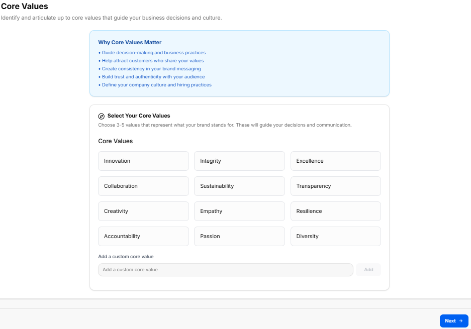
Sub-Stage 3: Core Values
This sub-stage centers on identifying and articulating the core foundational values that guide your business choices, shape your organizational culture, and keep your marketing messages clear and consistent.
Canvas Layout & Workspace Components
-
Main Workspace Title: Displays "Core Values" with a guiding subtitle: “Identify and articulate up to core values that guide your business decisions and culture.”
-
Educational Information Panel: A full-width light-blue callout container positioned at the top of the workspace:
-
Header: Why Core Values Matter
-
Bullet Points:
-
Guide decision-making and business practices
-
Help attract customers who share your values
-
Create consistency in your brand messaging
-
Build trust and authenticity with your audience
-
Define your company culture and hiring practices
-
-
Core Values Selection Suite
A comprehensive configuration area below the educational panel allows founders to choose and build out their cultural anchors:
-
Selection Header: Select Your Core Values (accompanied by a target/compass icon)
-
Instructional Label: “Choose 3-5 values that represent what your brand stands for. These will guide your decisions and communication.”
-
Preset Values Grid: Twelve modular select buttons arranged in a clean, three-column layout:
-
Innovation | Integrity | Excellence
-
Collaboration | Sustainability | Transparency
-
Creativity | Empathy | Resilience
-
Accountability | Passion | Diversity
-
-
Custom Core Value Utility: Includes an input field labeled “Add a custom core value” with an adjacent Add button, allowing users to define specific individual tenets that might not be captured by the defaults.
Navigation Controls
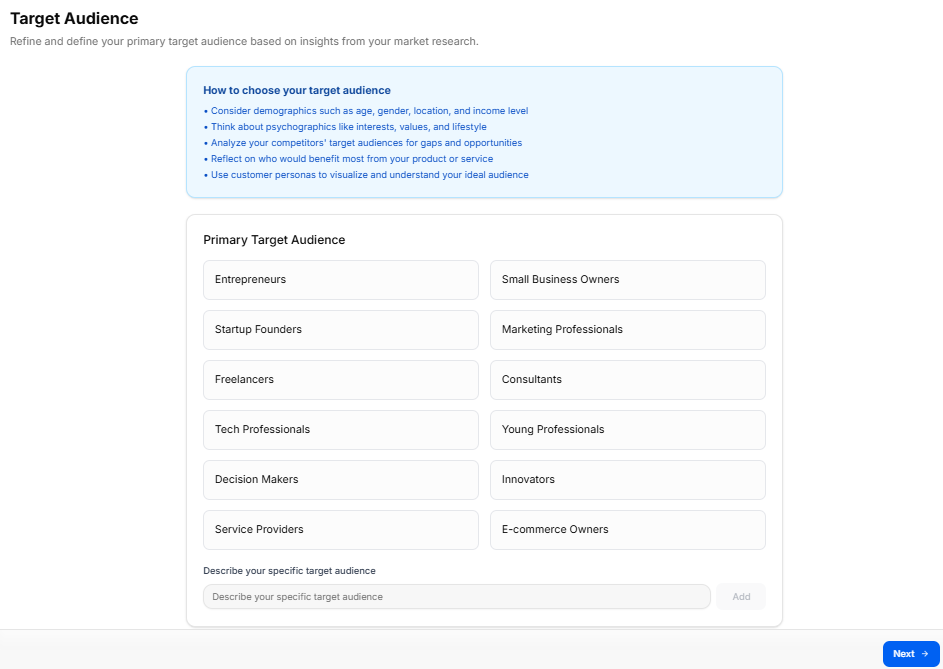
Sub-Stage 4: Target Audience
This sub-stage centers on refining and defining your primary target audience based on your market research insights. Selecting these audience tags ensures your upcoming visual identity and messaging connect with the right groups.
Canvas Layout & Workspace Components
-
Main Workspace Title: Displays "Target Audience" accompanied by an instructional subtitle: “Refine and define your primary target audience based on insights from your market research.”
-
Educational Information Panel: A full-width blue callout container positioned at the top of the workspace canvas:
-
Header: How to choose your target audience
-
Bullet Points:
-
Consider demographics such as age, gender, location, and income level
-
Think about psychographics like interests, values, and lifestyle
-
Analyze your competitors' target audiences for gaps and opportunities
-
Reflect on who would benefit most from your product or service
-
Use customer personas to visualize and understand your ideal audience
-
-
Primary Target Audience Selection Suite
A wide configuration panel below the guide area allows creators to segment their primary user profiles:
-
Selection Header: Primary Target Audience
-
Preset Audience Tags Grid: Twelve interactive selection options organized neatly into a two-column layout:
-
Entrepreneurs | Small Business Owners
-
Startup Founders | Marketing Professionals
-
Freelancers | Consultants
-
Tech Professionals | Young Professionals
-
Decision Makers | Innovators
-
Service Providers | E-commerce Owners
-
-
Custom Audience Utility: Includes a manual text entry line labeled “Describe your specific target audience” paired with an adjacent Add button to register unique user segments.
Navigation Controls
-
Next Button: A blue Next → action button is positioned at the lower right-hand edge of the footer line. Clicking this locks in your selected audience criteria and moves directly to Sub-Stage 5 (Fonts).
Sub-Stage 5: Fonts
This sub-stage workspace lets founders select, preview, and assign their platform's official typography pairing, defining separate font styles for core marketing headlines and general readable body content.
Canvas Layout & Workspace Components
-
Main Workspace Title: Displays "Fonts".
-
Instructional Subtitle: “Select your brand typography including heading and body families.”
-
Typography Preview Card: A sticky vertical container docked on the right side of the workspace to display real-time configuration changes:
-
Header Title: Typography Preview (accompanied by an eye icon).
-
Live Render Content: Displays a sample layout structure reading: “Your Brand Name — Welcome to Our Brand — This is how your main content will appear to your audience. Supporting text and captions will use your body font to maintain consistency across all touchpoints.”
-
Font Selection & Discovery Tools
The workspace details three main interaction methods to browse and assign typography choices:
-
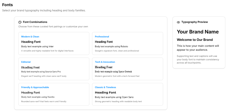
1. Curated Font Combinations Suite (Upper Left):
-
Header: Font Combinations (accompanied by a palette icon).
-
Description: “Choose from these curated font pairings or customize your own”.
-
Preset Pairing Choices: Six pre-packaged design blocks are available for quick selection:
-
Modern & Clean: Heading Font / Body text example using Inter.
-
Professional: Heading Font / Body text example using Roboto.
-
Editorial: Heading Font / Body text example using Source Sans Pro.
-
Tech & Innovation: Heading Font / Body text example using Space Grotesk.
-
Friendly & Approachable: Heading Font / Body text example using Nunito.
-
Classic & Timeless: Heading Font / Body text example using Open Sans.
-
-
-
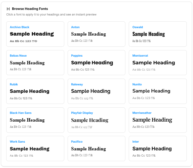
2. Browse Heading Fonts Catalog (Middle Panel):
-
Header: Browse Heading Fonts (accompanied by a large "H" letter icon).
-
Description: “Click a font to apply it to your headings and see an instant preview”.
-
Font Library Grid: Displays 15 selectable heading options, showing typography styling for options like Archivo Black, Anton, Oswald, Bebas Neue, Poppins, Montserrat, Rubik, Raleway, Nunito, Black Han Sans, Playfair Display, Merriweather, Work Sans, Pacifico, and Inter.
-
-
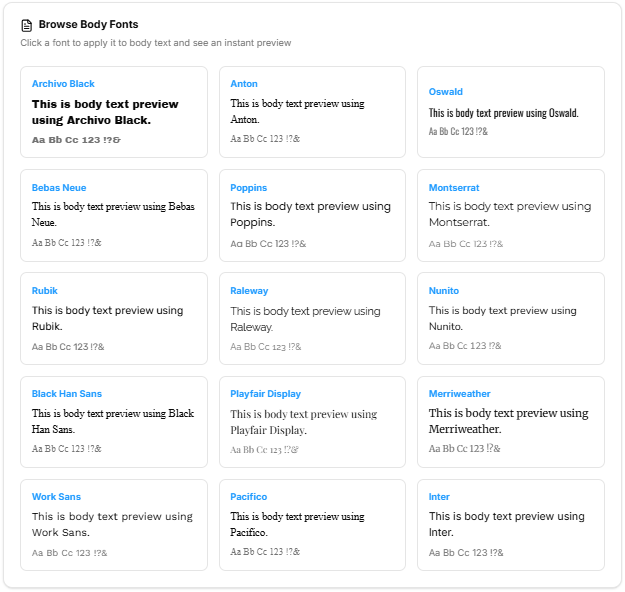
3. Browse Body Fonts Catalog (Lower Panel):
-
Header: Browse Body Fonts (accompanied by a document text icon).
-
Description: “Click a font to apply it to body text and see an instant preview”.
-
Font Library Grid: Offers the same 15 selectable style options optimized for paragraphs, long descriptions, and readable layouts.
-
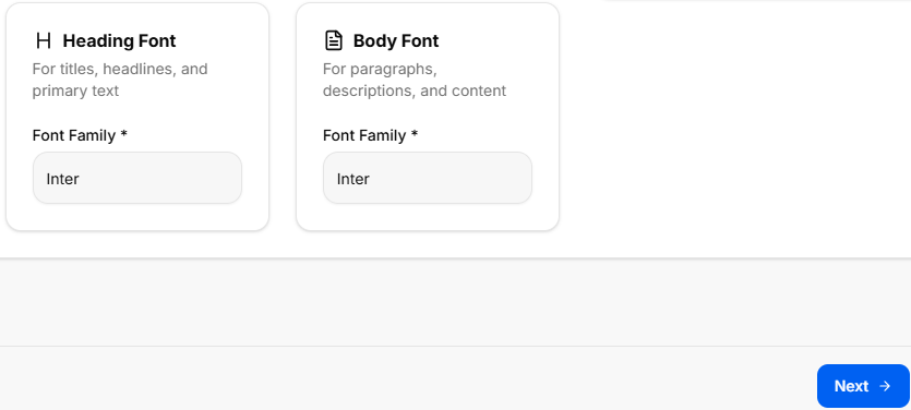
Final Font Assignment Matrix (Bottom Canvas)
Once specific options are selected from the menus above, the system locks them into the primary setup inputs:
-
Heading Font Selection Card:
-
Details: “For titles, headlines, and primary text”.
-
Selection Field: Required dropdown menu labeled Font Family * (e.g., displaying Inter).
-
-
Body Font Selection Card:
-
Details: “For paragraphs, descriptions, and content”.
-
Selection Field: Required dropdown menu labeled Font Family * (e.g., displaying Inter).
-
Navigation Controls
-
Next Button: A blue Next → navigation utility button is located at the lower right margin of the footer. Clicking this saves your assigned font configuration preferences and routes directly to Sub-Stage 6 (Color Palette).
Sub-Stage 6: Color Palette
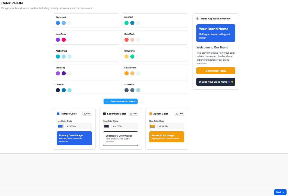
This sub-stage workspace allows founders to design and implement a cohesive brand color system. By selecting primary, secondary, and accent colors, creators establish a visual hierarchy that ensures consistency across all digital and physical brand touchpoints.
Canvas Layout & Workspace Components
-
Main Workspace Title: Displays "Color Palette".
-
Instructional Subtitle: “Design your brand’s color system including primary, secondary, and accent colors.”
-
Brand Application Preview Card: A sticky vertical container docked on the right side of the workspace to demonstrate real-time color application:
-
Header Title: Brand Application Preview (accompanied by a palette icon).
-
Live Render Content: Shows how the selected palette applies to a sample interface, including the brand name, descriptive text, and a primary action button labeled "Get Started Today".
-
Color Selection & Customization Suite
The workspace provides multiple ways to discover and lock in the brand's color identity:
-
1. Predefined Color Palettes (Top Left):
-
Description: A grid of eight professionally curated color schemes designed for different brand personalities:
-
Skybound, MindShift, NoirGlow, PastelBloom, ArcticWave, CitrusGrid, Oceanic, and SlateMist.
-
-
Interaction: Clicking a palette automatically updates the primary, secondary, and accent fields below.
-
-
2. Automated Generation:
-
Action Button: A "Generate Random Palette" utility button centered above the customization fields for rapid ideation.
-
-
3. Color Specification Matrix (Bottom Canvas):
-
A row of three interactive color-configuration blocks:
-
Primary Color (Blue Icon): Labeled for usage in “Buttons, links, and main elements.” Includes a Hex Color Code input (e.g., #0263fb) and a Lock toggle.
-
Secondary Color (Navy Icon): Labeled for usage in “Icons, borders, and subtle elements.” Includes a Hex Color Code input (e.g., #1e293b) and a Lock toggle.
-
Accent Color (Yellow Icon): Labeled for usage in “Highlights and call-to-action.” Includes a Hex Color Code input (e.g., #f5b02b) and a Lock toggle.
-
-
Navigation Controls
Sub-Stage 7: Export Brand Foundations & Brand Kit Results
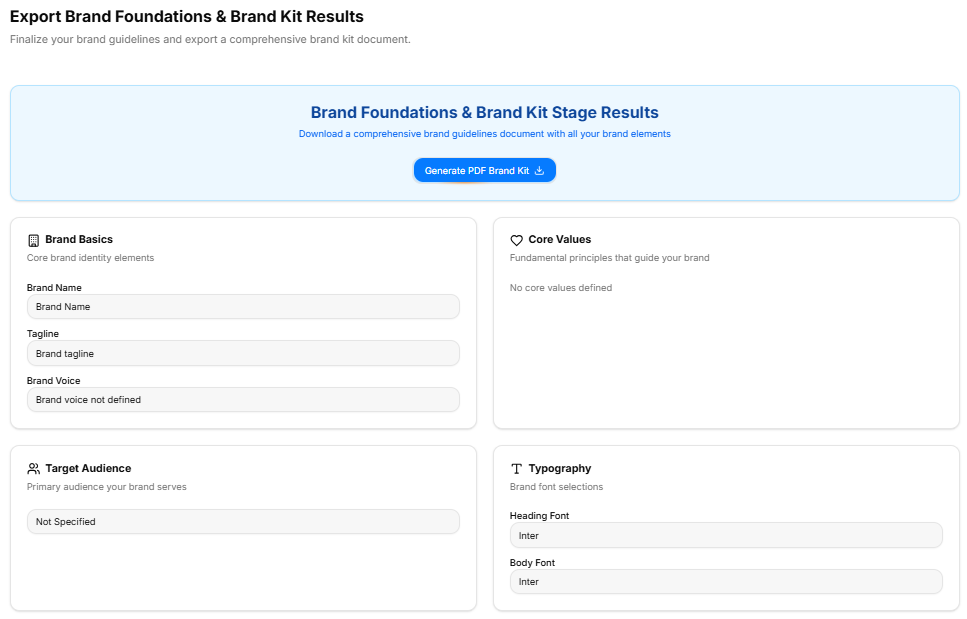
This final checkpoint compiles all inputs, selections, and chosen brand identity assets from the Brand Foundations phase into a centralized review layout. It offers a read-only historical overview alongside file export features before finalizing the stage.
Canvas Layout & Workspace Components
-
Main Workspace Title: Displays "Export Brand Foundations & Brand Kit Results" accompanied by an instructional subtitle: “This is an overview of what you told us in the brand foundations & brand kit stage, you can also export a brief summary of your findings as a pdf file.”
-
Document Generation Panel: A full-width light-blue callout container positioned at the top of the canvas:
-
Description: Instructs the user to “Download a comprehensive PDF report containing all your brand foundations & brand kit findings”.
-
Action Button: Features a centered blue Generate PDF Report action key with an integrated download tray icon.
-
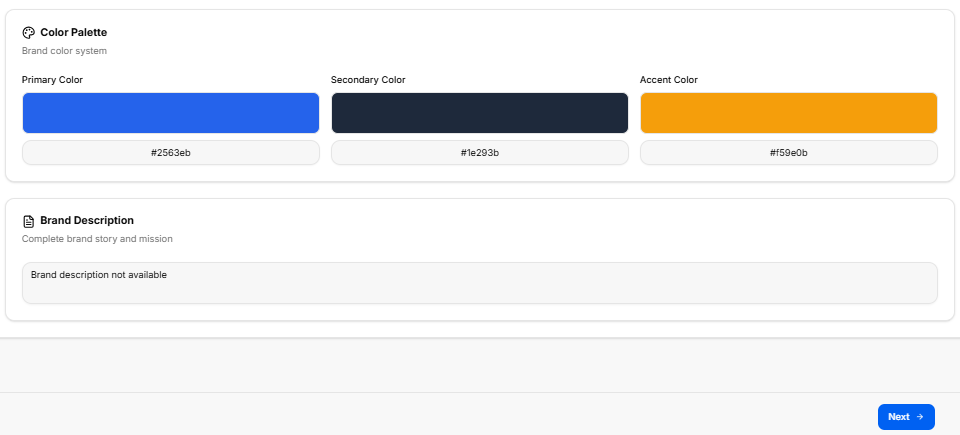
Core Identity Settings Summary Grid (Upper Panel)
The top half of the summary layout utilizes a two-column grid framework to display foundational identity selections:
-
Brand Basics Card:
-
Label: “Your brand basics details”
-
Data Rows: Displays the confirmed brand name, tagline, description, chosen brand tone, and industry NAICS code classification.
-
-
Core Values Card:
-
Label: “The core values for your brand”
-
Data Field: Displays the list of selected cultural anchors and operational principles.
-
-
Target Audience Card:
-
Label: “The target audience classification for your brand”
-
Data Field: Displays the chosen audience segments and primary user profiles.
-
Visual Brand Kit Summaries (Lower Panel)
The bottom section tracks the visual assets, color systems, and typographic pairings logged throughout the creative development phase:
-
Fonts Summary Block:
-
Header Title: Fonts Summary
-
Label: “Your chosen typography families for heading and body text”
-
Data Field: Displays the locked-in heading and body text font family designations.
-
-
Color Palette Summary Block:
-
Header Title: Color Palette Summary
-
Label: “Your designed brand color system including primary, secondary, and accent colors”
-
Data Field: Displays the verified primary, secondary, and accent hexadecimal color codes.
-
Navigation Controls
Admin & Operations Stage
Admin & Operations Stage
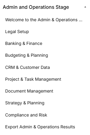
The Admin and Operations Stage is the operational phase of the roadmap, broken down into eight distinct sequential sub-stages accessed via the left-hand sidebar dropdown:
Sub-Stage 1: Welcome to the Admin & Operations Stage This is the initial onboarding landing view that provides corporate setup context, introductory media, and operational overviews before legal structural work begins.
Sub-Stage 2: Legal Setup The second item listed within the administrative sequence, focusing on legal entity formats, registration requirements, and liability rules.
Sub-Stage 3: Banking & Finance The third item listed within the administrative sequence, tracking institutional business banking setups, EIN tax identity keys, accounting methods, and integrated financial management tools.
Sub-Stage 4: CRM & Customer Data The fourth item listed within the administrative sequence, managing client relationship platforms, tracking incoming lead sources, and setting operational follow-up cadences.
Sub-Stage 5: Project & Task Management The fifth item listed within the administrative sequence, evaluating project spaces, configuring workflow methodologies, and defining day-to-day task trackers.
Sub-Stage 6: Document Management The sixth item listed within the administrative sequence, establishing secure cloud storage solutions, folder hierarchy standards, and data access policies.
Sub-Stage 7: Strategy and Planning The seventh item listed within the administrative sequence, mapping short-term execution goals, long-term visions, and foundational organizational roadmap milestones.
Sub-Stage 8: Compliance and Risk The eighth item listed within the administrative sequence, addressing data privacy standards, liability insurance safeguards, operational risk audits, and mitigation strategies.
Sub-Stage 9: Export Admin & Operations Results The final technical milestone within this phase, concluding the operational documentation sequence before next stage parameters unlock.
Stage Controls Next Button: A blue Next → link utility centered at the bottom of the active frame allows the user to save current progress or cycle sequentially to the next sub-stage item.
Stage Controls
Sub-Stage 1: Welcome to the Admin & Operations Stage
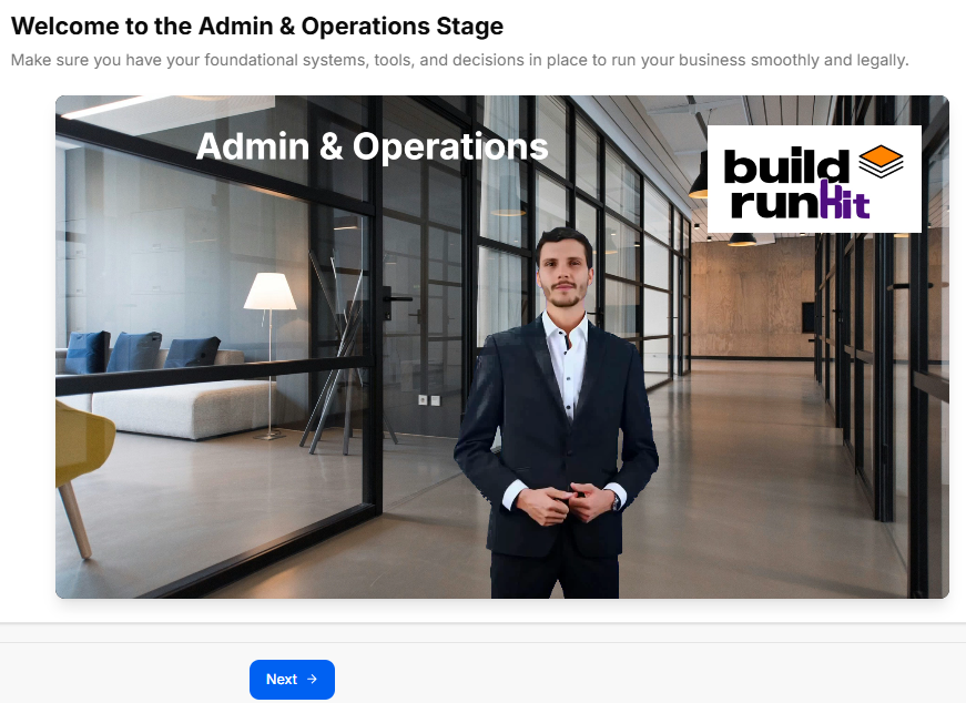
This sub-stage serves as the welcome landing screen for the administrative and operational setup phase. It establishes an overview of the core legal, financial, and procedural steps required to construct a firm corporate infrastructure.
Canvas Layout & Workspace Components
-
Main Workspace Title: Displays "Welcome to the Admin & Operations Stage".
-
Instructional Subtitle: “Get an overview of the Admin & Operations process and learn how this stage will help you set up your business structure, legal requirements, and operational workflows.”
-
Operations Launch Media Panel: Features a full-width workspace graphic or video element set in an open modern office environment. The media layout showcases the clean title card text "Admin & Operations" on the upper-left section and incorporates the official buildrunkit logo badge on the upper-right corner.
Navigation Controls
-
Next Button: A solid blue Next → navigation action button is centered directly below the primary media display card to lock in the stage preview and proceed smoothly to Sub-Stage 2 (Legal Setup).
Sub-Stage 2: Legal Setup
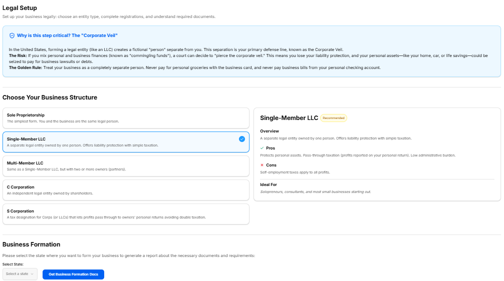
This sub-stage workspace guides founders through selecting their legal business structure, registering their formal business entity name, and completing foundational regulatory checkboxes required to establish operations legally.
Canvas Layout & Workspace Components
-
Main Workspace Title: Displays "Legal Setup".
-
Instructional Subtitle: “Choose your business structure, register your business name, and complete the necessary legal requirements to set up your entity.”
Legal Configuration Panels
The workspace organizes entity structure and registration across three specific modular cards:
-
1. Business Structure (Top Left):
-
Instructional Label: “Select your business structure entity option.”
-
Entity Options Grid: Features four interactive choice cards arranged in a 2x2 grid:
-
Sole Proprietorship
-
Partnership
-
Limited Liability Company (LLC)
-
C-Corporation
-
-
-
2. Business Registration Details (Top Right):
-
Instructional Label: “Define your business structure registration details.”
-
Registration Form Field: Contains a text entry block labeled Registered Business Name * displaying the placeholder text: “Enter your registered business name”.
-
-
3. Legal Requirements (Bottom Left):
-
Instructional Label: “Select your business structure legal requirement details.”
-
Compliance Checklist: Provides five distinct interactive checkboxes to track mandatory legal milestones:
-
Register Business Name
-
Apply for EIN / Tax ID
-
Obtain Business Licenses
-
Open Business Bank Account
-
Register for State Taxes
-
-
Navigation Controls
Sub-Stage 3: Banking & Finance
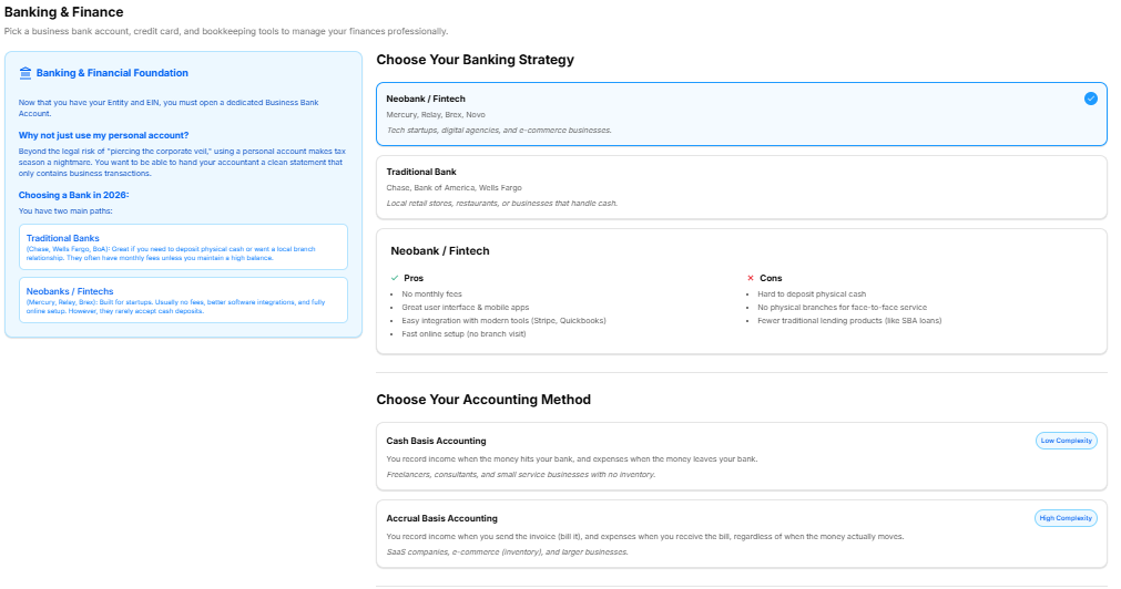
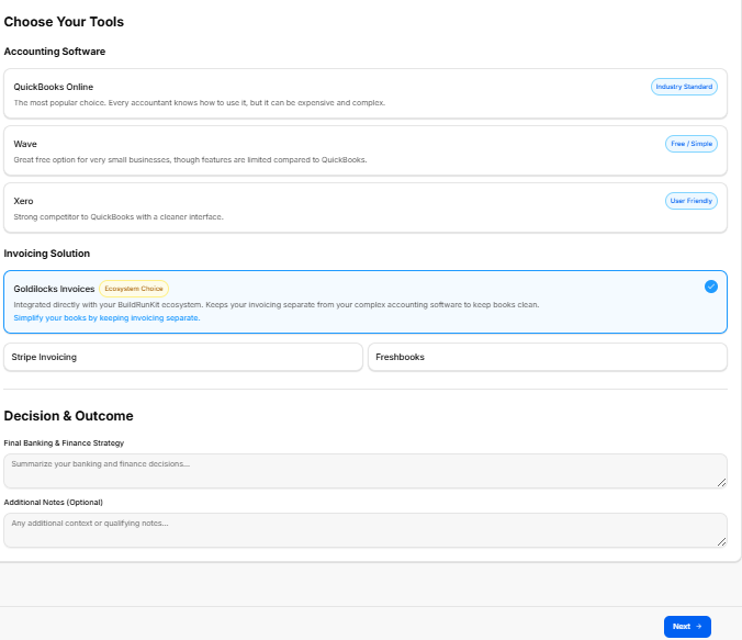
This sub-stage workspace focuses on setting up your business's financial infrastructure, including managing institutional banking relationships, establishing tax identifiers, and selecting integrated software solutions for accounting and invoicing.
Canvas Layout & Workspace Components
-
Main Workspace Title: Displays "Banking & Finance".
-
Instructional Subtitle: “Set up your financial infrastructure including business banking, employer identification numbers, and accounting frameworks.”
Financial Configuration Panels
The workspace organizes primary details across four modular selection and text entry cards:
-
1. Business Banking (Top Left):
-
Instructional Label: “Define your business structure banking option.”
-
Banking Options Grid: Features four interactive choice cards for major commercial banking platforms arranged in a 2x2 grid:
-
Chase
-
Bank of America
-
Wells Fargo
-
Mercury
-
-
-
2. Identification Details (Top Right):
-
Instructional Label: “Define your business structure tax identity numbers.”
-
Tax Identifier Form Field: Contains a text entry block labeled EIN / Tax ID Number * displaying the placeholder text: “Enter your EIN / Tax ID number”.
-
Tools Suite Selection
-
Section Title: "Choose Your Tools"
-
1. Accounting Software: Features three selectable configuration choices:
-
QuickBooks Online (Industry Standard): The most popular choice. Every accountant knows how to use it, but it can be expensive and complex.
-
Wave (Free / Simple): Great free option for very small businesses, though features are limited compared to QuickBooks.
-
Xero (User Friendly): Strong competitor to QuickBooks with a cleaner interface.
-
-
2. Invoicing Solution: Features three integrated billing choices:
-
Goldilocks Invoices (Ecosystem Choice): Integrated directly with your BuildRunKit ecosystem. Keeps your invoicing separate from your complex accounting software to keep books clean. Simplify your books by keeping invoicing separate.
-
Stripe Invoicing
-
Freshbooks
-
Strategy & Summary Documentation
-
3. Decision & Outcome:
-
Form Field: A large text block labeled Final Banking & Finance Strategy * where the user outlines their selected operational path.
-
Optional Field: A secondary text input labeled Additional Notes (Optional) for supplemental documentation.
-
Navigation Controls
Sub-Stage 4: Budget & Planning
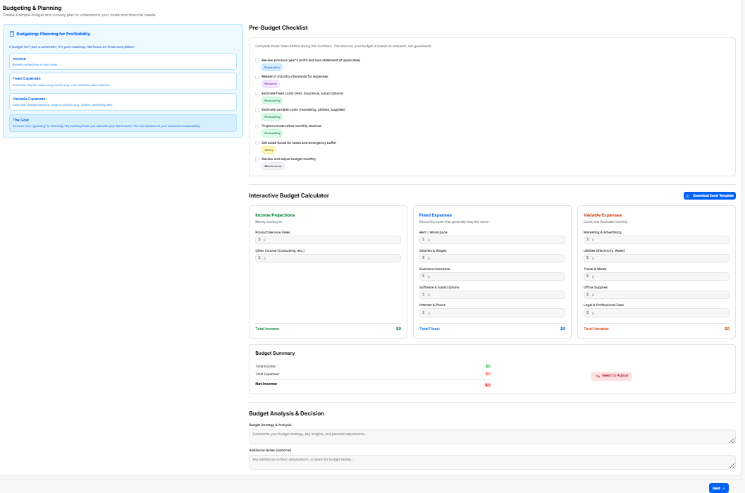
This sub-stage workspace guides founders through projecting their startup's financial path, analyzing crucial operational costs, establishing runway metrics, and defining final strategic spending choices.
Canvas Layout & Workspace Components
-
Main Workspace Title: Displays "Budget & Planning".
-
Instructional Subtitle: “Plan your business finances, project your startup cost, and estimate your runway.”
Financial Planning & Strategy Sections
The workspace relies on explicit text logs to document financial trajectories and notes:
-
1. Financial Planning & Strategy:
-
Instructional Label: “Define your business structure budget option.”
-
Form Field: A required text entry block labeled Final Budget & Planning Strategy * displaying the placeholder text: “Enter your final budget & planning strategy”.
-
Optional Field: A large text container labeled Additional Notes (Optional) displaying the placeholder text: “Enter your additional notes”.
-
Navigation Controls
Sub-Stage 4: CRM & Customer Data
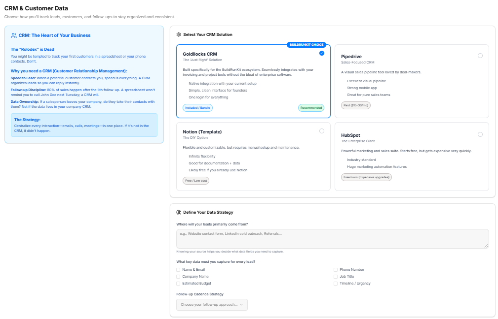
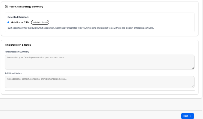
This sub-stage workspace helps founders choose how to track leads, customers, and follow-ups to keep their business organized and consistent.
Canvas Layout & Workspace Components
-
Main Workspace Title: Displays "CRM & Customer Data".
-
Instructional Subtitle: “Choose how you'll track leads, customers, and follow-ups to stay organized and consistent.”
CRM Selection Panels
The primary section allows founders to evaluate and select their CRM software:
-
Section Title: "Select Your CRM Solution"
-
CRM Options Grid: Features four interactive options with specific pricing and feature details:
-
Goldilocks CRM (The 'Just Right' Solution / BuildRunKit Choice / Recommended): Built specifically for the BuildRunKit ecosystem. Seamlessly integrates with your invoicing and project tools without the bloat of enterprise software.
-
Bullet features: Native integration with your current setup; Simple, clean interface for founders; One login for everything.
-
Tag: Included / Bundle.
-
-
Pipedrive (Sales-Focused CRM): A visual sales pipeline tool loved by deal-makers.
-
Bullet features: Excellent visual pipeline; Strong mobile app; Great for pure sales teams.
-
Tag: Paid ($15-30/mo).
-
-
Notion (Template) (The DIY Option): Flexible and customizable, but requires manual setup and maintenance.
-
Bullet features: Infinite flexibility; Good for documentation + data; Likely free if you already use Notion.
-
Tag: Free / Low cost.
-
-
HubSpot (The Enterprise Giant): Powerful marketing and sales suite. Starts free, but gets expensive very quickly.
-
Bullet features: Industry standard; Huge marketing automation features.
-
Tag: Freemium (Expensive upgrades).
-
-
Data Strategy Parameters
-
Section Title: "Define Your Data Strategy"
-
Lead Source Input: An open text field labeled “Where will your leads primarily come from?” with placeholder text “e.g., Website contact form, LinkedIn cold outreach, Referrals...”
-
Key Data Checkboxes: A multi-select area asking “What key data must you capture for every lead?” containing options for:
-
Name & Email
-
Company Name
-
Estimated Budget
-
Phone Number
-
Job Title
-
Timeline / Urgency
-
-
Follow-up Cadence: A dropdown menu component labeled Follow-up Cadence Strategy with the placeholder text “Choose your follow-up approach...”
Strategy Summary & Notes
-
Section Title: "Your CRM Strategy Summary"
-
Selected Solution Display: Dynamically shows the chosen platform based on the user's selection (e.g., Goldilocks CRM—Included / Bundle) along with its brief operational description.
-
Final Decision Summary: A structured input block titled Final Decision Summary with the placeholder “Summarize your CRM implementation plan and next steps...”
-
Additional Notes: A secondary text container labeled Additional Notes with the placeholder “Any additional context, concerns, or implementation notes...”
Navigation Controls
Sub-Stage 5: Project & Task Management
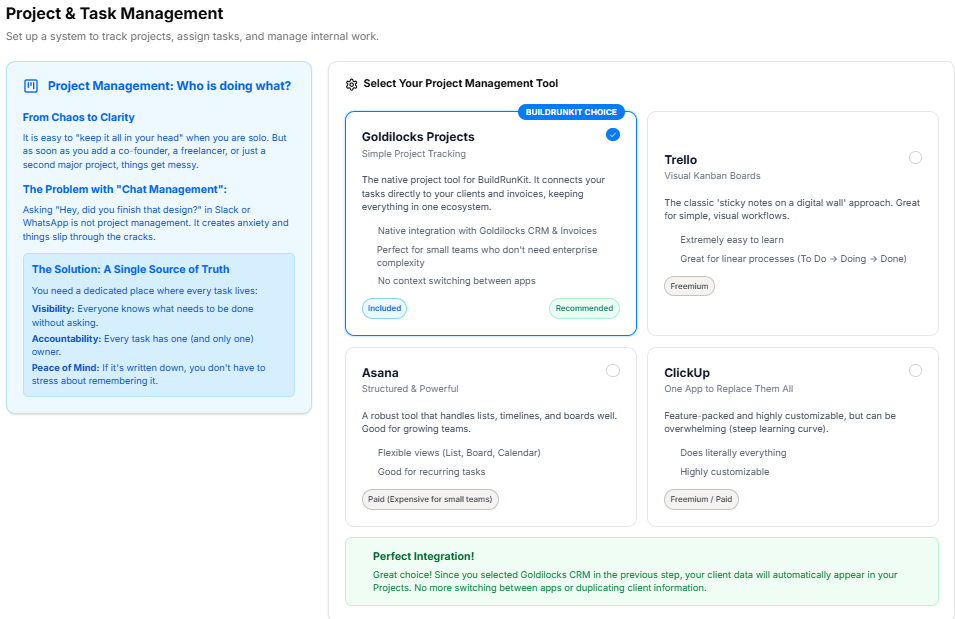
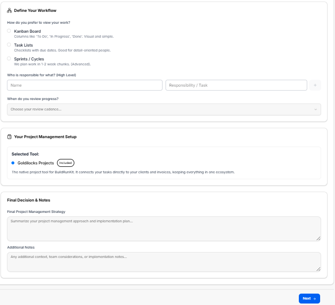
This sub-stage workspace guides founders through evaluating, choosing, and establishing their workflow tracking systems to keep daily operational tasks and milestone delivery structured.
Canvas Layout & Workspace Components
-
Main Workspace Title: Displays "Project & Task Management".
-
Instructional Subtitle: “Choose how you'll manage your tasks, projects, and team workflows to stay execution-focused.”
Platform Selection Panels
The workspace provides an options matrix for evaluating project management tools:
-
Section Title: "Select Your Project Management Tool"
-
Tool Options Grid: Features four interactive choices with explicit ecosystem relevance and operational characteristics:
-
Goldilocks Projects (The 'Just Right' Workspace / BuildRunKit Choice / Recommended): Built directly into your BuildRunKit ecosystem. Connect tasks directly to your CRM leads and client invoices without jumping between open tabs.
-
Bullet features: Native ecosystem integration; Zero configuration required; Task-to-invoice tracking.
-
Tag: Included / Bundle.
-
-
Trello (Simple Kanban Boards): A visual card-based system great for simple linear workflows.
-
Bullet features: Extremely easy to learn; Great visual card layout; Free tier covers basics.
-
Tag: Freemium.
-
-
Asana (Team & Timeline Focused): Structured project maps with list, board, and timeline views.
-
Bullet features: Powerful subtask management; Built-in team workloads; Great for collaboration.
-
Tag: Paid ($10-25/mo).
-
-
ClickUp (The Everything App): Highly customizable with massive features, though learning curves are steep.
-
Bullet features: Dozens of custom view types; Built-in docs and goals; Highly customizable dashboards.
-
Tag: Freemium (Feature complex).
-
-
Workflow Parameters
-
Section Title: "Define Your Internal Workflow"
-
Methodology Dropdown: A selector field labeled Primary Methodology with the placeholder text “Choose your methodology approach...”
-
Task Management Checkboxes: A multi-select area asking “What project elements will you track here?” featuring the options:
-
Internal Tasks
-
Client Deliverables
-
Product Roadmap
-
Content Calendar
-
Bug / Issue Tracking
-
Team Availability
-
-
Meeting Cadence Input: An open text entry field labeled “What is your team meeting / review cadence?” containing the placeholder text “e.g., Daily standup, Weekly sprint planning, Bi-weekly retrospectives...”
Strategy Summary & Notes
-
Section Title: "Your Workspace Strategy Summary"
-
Selected Solution Display: Dynamically displays the user's active choice (e.g., Goldilocks Projects—Included / Bundle) alongside its operational summary text.
-
Final Decision Summary: A required, structured text block labeled Final Decision Summary * with the placeholder “Summarize your task management implementation plan and sprint setup...”
-
Additional Notes: An open text block labeled Additional Notes (Optional) with the placeholder “Any additional workflow context, custom statuses, or onboarding steps...”
Navigation Controls
Sub-Stage 6: Document Management
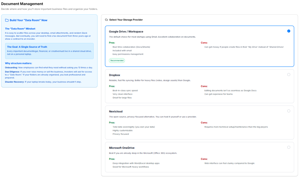
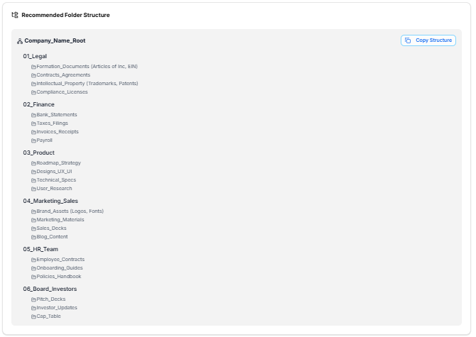
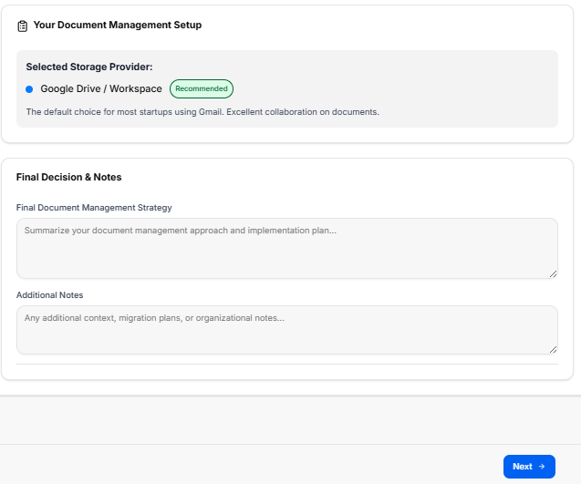
This sub-stage workspace guides founders through setting up their company's document storage system, choosing file organization frameworks, and implementing basic data security protocols to keep critical business data secure and accessible.
Canvas Layout & Workspace Components
-
Main Workspace Title: Displays "Document Management".
-
Instructional Subtitle: “Choose where you'll store files, how you'll organize them, and how you'll keep your business data safe.”
Platform Selection Panels
The workspace provides an options matrix for evaluating cloud storage solutions:
-
Section Title: "Select Your Document Storage Solution"
-
Storage Options Grid: Features four interactive choices with explicit ecosystem relevance and operational characteristics:
-
Goldilocks Drive (Ecosystem Integration / BuildRunKit Choice / Recommended): Secure storage built directly into your dashboard. Best for linking contract PDFs and operational assets directly to your client profiles.
-
Bullet features: Native ecosystem file linking; Zero external accounts needed; Automatic client folder creation.
-
Tag: Included / Bundle.
-
-
Google Drive (Collaboration Focused): Excellent real-time editing and collaboration through Google Workspace docs.
-
Bullet features: Best-in-class live document editing; Powerful internal search tools; Ubiquitous platform familiarity.
-
Tag: Free / Part of Workspace.
-
-
Microsoft OneDrive (Enterprise Integration): Deep integration with desktop Office applications and corporate Windows setups.
-
Bullet features: Perfect sync with desktop Word/Excel; Strong enterprise security controls; Part of Microsoft 365.
-
Tag: Free / Part of M365.
-
-
Dropbox (Pure Storage & Sync): Reliable file synchronization engine with advanced shared folder link features.
-
Bullet features: Fast, bulletproof file syncing; Advanced link sharing permissions; Great standalone storage tool.
-
Tag: Freemium ($10-20/mo).
-
-
Security & Folder Strategy Parameters
-
Section Title: "Define Your File Strategy"
-
Folder Structure Dropdown: A selector field labeled Folder Structure Framework with the placeholder text “Choose your organization approach...”
-
Security & Access Checkboxes: A multi-select area asking “What security practices will you implement?” featuring the options:
-
Enforce 2FA on Storage Accounts
-
Restricted Client Data Access
-
Regular Backup Cadence
-
Standardized File Naming Rules
-
NDA Requirements for Team Share
-
-
Retention Policy Input: An open text entry field labeled “What is your document retention / archive policy?” containing the placeholder text “e.g., Keep financial records for 7 years, Archive inactive client folders after 12 months...”
Strategy Summary & Notes
-
Section Title: "Your Storage Strategy Summary"
-
Selected Solution Display: Dynamically displays the user's active choice (e.g., Goldilocks Drive—Included / Bundle) alongside its operational summary text.
-
Final Decision Summary: A required, structured text block labeled Final Decision Summary * with the placeholder “Summarize your document management implementation plan, naming conventions, and security rules...”
-
Additional Notes: An open text block labeled Additional Notes (Optional) with the placeholder “Any additional storage context, third-party backup tools, or onboarding notes...”
Navigation Controls
Sub-Stage 7: Strategy and Planning
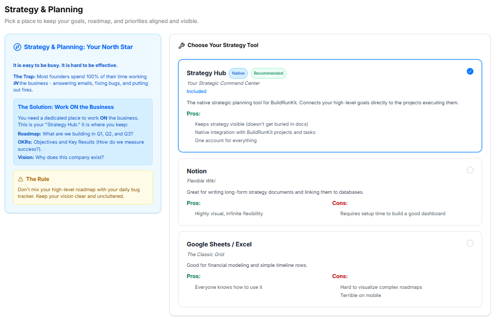
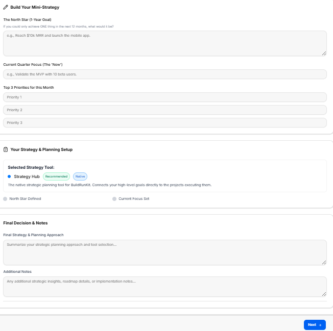
This sub-stage workspace serves as the master planning canvas where founders define their high-level business strategy, align on execution milestones, and establish clear operational frameworks to steer long-term growth.
Canvas Layout & Workspace Components
-
Main Workspace Title: Displays "Strategy and Planning".
-
Instructional Subtitle: “Define your high-level business strategy, execution roadmap, and long-term planning frameworks.”
Operational Roadmap Panels
The layout organizes strategic alignment across three major structured sections:
-
1. Define Strategy Framework (Top Left):
-
Instructional Label: “Define your business structure strategy option.”
-
Strategic Focus Area Dropdown: A structural selection menu labeled Strategic Focus Area with the active placeholder text: “Choose your strategic focus approach...”
-
Execution Framework Checkboxes: A multi-select area asking “What execution elements will you prioritize?” containing five key organizational options:
-
Milestone Tracking
-
Resource Allocation
-
Risk Mitigation
-
Growth Metrics
-
Timeline Alignment
-
-
-
2. Core Business Strategy Logs (Top Right):
-
Instructional Label: “Outline your main strategy goals and operational roadmap milestones.”
-
Strategy Plan Inputs: Provides two large, structured text entry forms:
-
Short-Term Goals (Next 90 Days) *: A mandatory field with the placeholder text: “Enter your short-term operational goals...”
-
Long-Term Vision (1-3 Years) *: A mandatory field with the placeholder text: “Enter your long-term business vision...”
-
-
-
3. Strategy Summary & Documentation (Lower Section):
-
Section Title: "Your Strategy Summary"
-
Strategic Path Detail Block: A wide input block labeled Final Strategy & Planning Strategy * displaying the placeholder text: “Enter your final strategy & planning strategy”.
-
Supplemental Context Block: A large text container labeled Additional Notes (Optional) displaying the placeholder text: “Enter your additional notes”.
-
Navigation Controls
Sub-Stage 8: Compliance & Risk
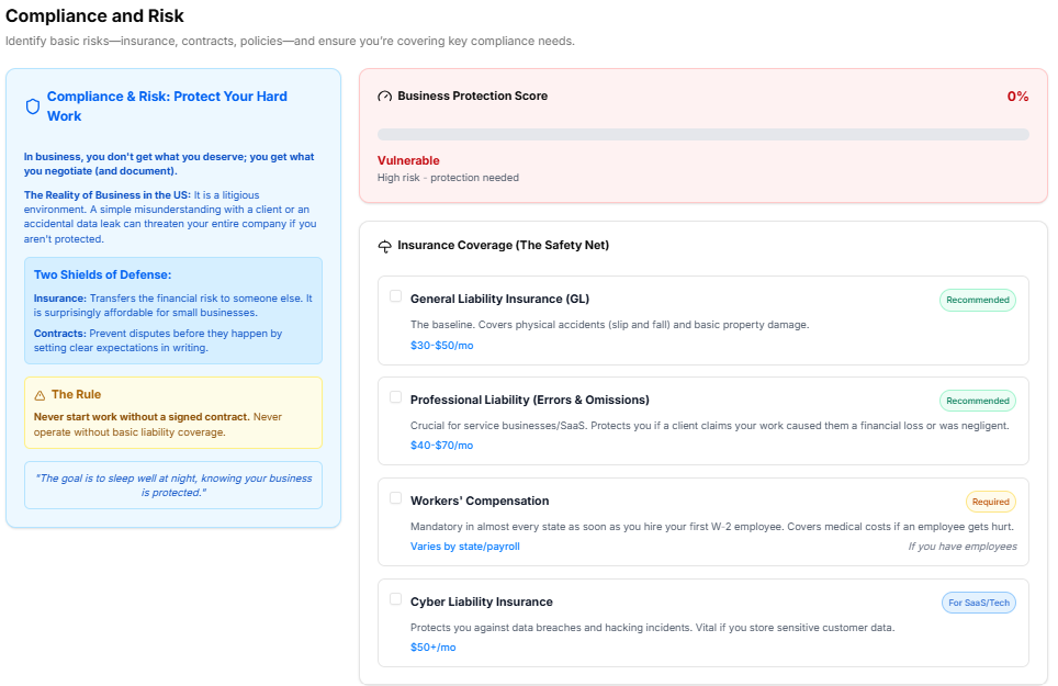
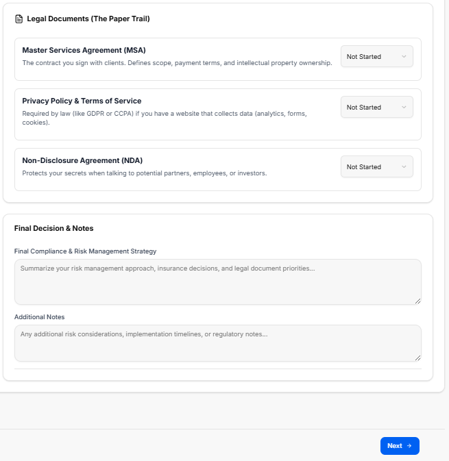
This sub-stage workspace provides founders with a structured environment to evaluate organizational exposure, establish clear compliance policies, check off liability safeguards, and document their overall risk mitigation strategy.
Canvas Layout & Workspace Components
-
Main Workspace Title: Displays "Compliance & Risk".
-
Instructional Subtitle: “Identify potential risks, establish compliance protocols, and ensure your business is protected against legal and operational vulnerabilities.”
Risk Mitigation & Policy Panels
The workspace divides regulatory safety and policy formulation into three targeted modular layout cards:
-
1. Define Compliance Framework (Top Left):
-
Instructional Label: “Define your business structure compliance option.”
-
Risk Level Dropdown: A menu component labeled Risk Level Assessment displaying the active placeholder text: “Choose your risk level approach...”
-
Mitigation Checkboxes: A multi-select area asking “What compliance protocols will you implement?” containing five operational options:
-
Data Privacy Compliance (GDPR/CCPA)
-
Workplace Safety Policies
-
Intellectual Property Protection
-
Regular Audits Cadence
-
Liability Insurance Coverage
-
-
-
2. Core Compliance Strategy Logs (Top Right):
-
Instructional Label: “Outline your main compliance goals and risk mitigation milestones.”
-
Compliance Inputs: Provides two large text entry blocks for descriptive documentation:
-
Key Operational Risks *: A mandatory field with the placeholder text: “Enter your key operational risks...”
-
Mitigation Plan *: A mandatory field with the placeholder text: “Enter your risk mitigation plan...”
-
-
-
3. Compliance Summary & Documentation (Lower Section):
-
Section Title: "Your Compliance Summary"
-
Final Strategy Detail Block: A wide input area labeled Final Compliance & Risk Strategy * displaying the placeholder text: “Enter your final compliance & risk strategy”.
-
Supplemental Context Block: A large text container labeled Additional Notes (Optional) displaying the placeholder text: “Enter your additional notes”.
-
Navigation Controls
Sub-Stage 9: Export Admin & Operations Results
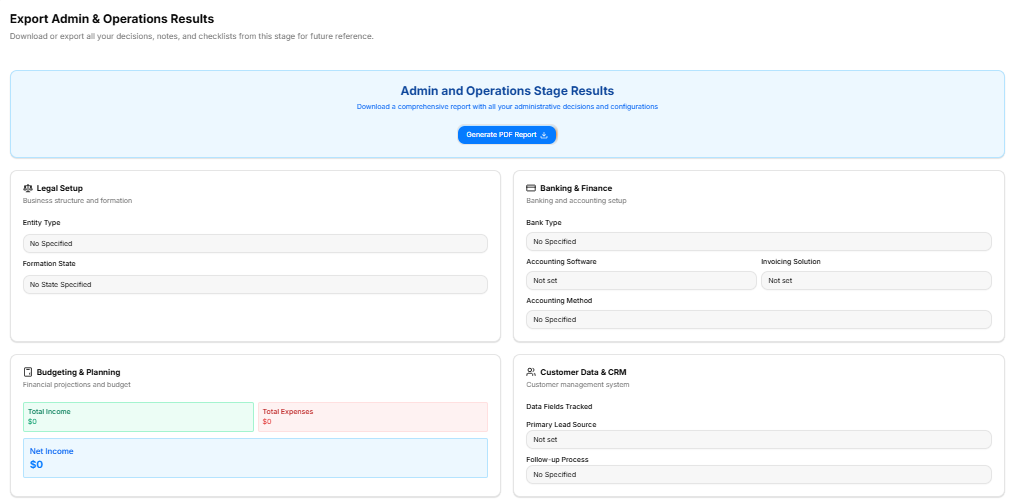
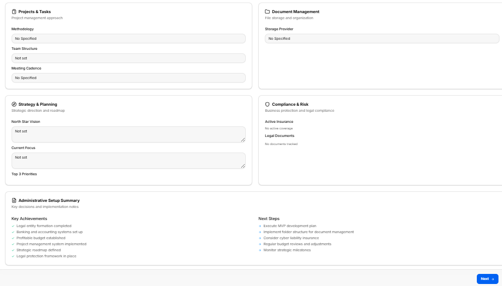
This final technical milestone acts as the master review dashboard for the Admin and Operations Stage. It aggregates all data inputs, structural choices, financial configurations, and strategic entries logged across the previous eight sub-stages into a single overview canvas, allowing founders to review their setup and download a comprehensive permanent record before proceeding.
Canvas Layout & Workspace Components
-
Main Workspace Title: Displays "Export Admin & Operations Results".
-
Instructional Subtitle: “Download or export all your decisions, notes, and checklists from this stage for future reference.”
Master Report Generation Box
-
Admin and Operations Stage Results Banner: A prominent blue header block reading “Download a comprehensive report with all your administrative decisions and configurations.”
-
Action Button: Centered within the banner is a blue Generate PDF Report button featuring a download icon, allowing immediate local file compilation.
Stage Summary Data Grid Panels
The workspace populates eight separate display cards reflecting the core configurations finalized throughout this stage:
-
1. Legal Setup: Reviews core formation choices, explicitly tracking:
-
Entity Type
-
Formation State
-
-
2. Banking & Finance: Reviews institutional money setups, detailing:
-
Bank Type
-
Accounting Software
-
Invoicing Solution
-
Accounting Method
-
-
3. Budgeting & Planning: Displays high-level programmatic financial ledger stats:
-
Total Income indicator block (Green)
-
Total Expenses indicator block (Red)
-
Net Income final balance summary block (Blue)
-
-
4. Customer Data & CRM: Summarizes operational target fields:
-
Data Fields Tracked matrix
-
Primary Lead Source parameters
-
Follow-up Process protocols
-
-
5. Projects & Tasks: Recaps coordination preferences:
-
Methodology approach
-
Team Structure settings
-
Meeting Cadence requirements
-
-
6. Document Management: Confirms baseline digital files architecture:
-
Storage Provider choice
-
-
7. Strategy & Planning: Displays vision targets locked on the canvas:
-
North Star Vision text review box
-
Current Focus text review box
-
Top 3 Priorities list
-
-
8. Compliance & Risk: Monitors basic organizational safety status:
-
Active Insurance summary
-
Legal Documents tracker list
-
Administrative Setup Summary & Next Steps Footer
At the lower margin of the page layout, a double-column summary card helps founders review historical progress and anticipate next tasks:
-
Key Achievements (Left Column): A green checkmark list indicating six completed administrative milestones:
-
Legal entity formation completed
-
Banking and accounting systems set up
-
Profitable budget established
-
Project management system implemented
-
Strategic roadmap defined
-
Legal protection framework in place
-
-
Next Steps (Right Column): A blue arrow indicator list outlining upcoming strategic suggestions:
-
Execute MVP development plan
-
Implement folder structure for document management
-
Consider cyber liability insurance
-
Regular budget reviews and adjustments
-
Monitor strategic milestones
-
Navigation Controls
Go-to-Market Stage
Go-to-Market Stage
The Go-to-Market Stage is a strategic marketing and execution phase of the roadmap, broken down into eight distinct sequential sub-stages accessed via the left-hand sidebar dropdown:
-
Sub-Stage 1: Welcome to the Go-to-Market Stage
-
The initial landing view providing the phase overview and introduction to launch marketing strategies.
-
-
Sub-Stage 2: Product Positioning & Messaging
-
The second item listed within the sequence, defining how your product is communicated to the market.
-
-
Sub-Stage 3: Ideal Customer Profiles (ICP) & Personas
-
The third item listed within the sequence, outlining target buyer data and segment mapping.
-
-
Sub-Stage 4: Pre-Launch Plan
-
The fourth item listed within the sequence, covering audience building and waitlist acquisition tactics.
-
-
Sub-Stage 5: Launch Plan
-
The fifth item listed within the sequence, managing the specific execution steps for public release day.
-
-
Sub-Stage 6: Post-Launch Growth Plan
-
The sixth item listed within the sequence, outlining organic traffic, backlink building, and scaling frameworks.
-
-
Sub-Stage 7: Measurement & Optimization
-
The seventh item listed within the sequence, tracking core metrics and performance data.
-
-
Sub-Stage 8: Export Go-to-Market Results
-
The final technical milestone within this phase, concluding the marketing sequence to download your complete record before transition parameters unlock.
-
Stage Controls
Sub-Stage 1: Welcome to the Go-to-Market Stage
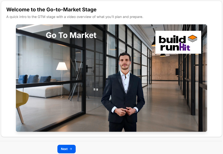
This introductory screen serves as the gateway to your launch strategy, aligning your business goals with your customer acquisition roadmaps before you dive into heavy tactical execution.
Canvas Layout & Workspace Components
-
Main Workspace Title: Displays "Welcome to the Go-to-Market Stage".
-
Instructional Subtitle: “A quick intro to the GTM stage with a video overview of what you’ll plan and prepare.”
Media & Briefing Section
-
Video Player Card: A large, centered interactive media module features an overview briefing with the phase label "Go To Market" clearly displayed on the left and the official BuildRunKit logo branded in the top-right corner. This presentation introduces you to the core concepts of positioning, pre-launch preparation, and post-launch optimization.
Navigation Controls
Sub-Stage 2: Product Positioning & Messaging

This sub-stage workspace allows you to map out exactly what you offer, who your core audience is, and why your solution is better than the alternatives. It establishes your strategic core values across five structured exercises.
Canvas Layout & Workspace Components
-
Main Workspace Title: Displays "Product Positioning & Messaging".
-
Instructional Subtitle: “Define what you offer, who it's for, and why it's better - including your unfair advantage, value prop, niche, and tagline.”
1. Unfair Advantage Panel
-
Section Objective: Answer the core question: Why can’t someone just copy you tomorrow? Pick your primary leverage.
-
Primary Leverage Options (Selectable Radio Items):
-
Insider Knowledge: Deep domain expertise or secrets.
-
Technology/Process: Proprietary system that cuts cost/time.
-
Access/Relationships: Exclusive networks or distribution.
-
Reputation: Trust that cannot be cloned.
-
Momentum/Timing: Moving faster than the market.
-
-
Context Statement Field: A text area prompting you to finish the sentence: "Our unfair advantage is [Selection], which gives us a durable edge because..." (e.g., "...we have exclusive data rights that take years to acquire.")
2. Value Proposition Panel
-
Section Objective: Define your core promise to the customer by answering who it is for, what problem it solves, and why it is better.
-
Input Fields:
-
Audience: (e.g., busy founders)
-
Desirable Outcome: (e.g., manage client work without chaos)
-
How you do it: (e.g., combining CRM and invoices in one interface)
-
3. Category & Niche Panel
-
Section Objective: Stop trying to be everything to everyone. Own a corner.
-
Reference Guide Blocks:
-
Category Block: The broad playground (e.g., Project Management, Fitness Coaching).
-
Niche Block: Your specific corner (e.g., Freelancers who hate spreadsheets, Post-partum fitness).
-
-
Input Fields:
-
Broad Category: (e.g., Email Marketing)
-
Specific Niche: (e.g., For independent newsletters)
-
Core Problem in Niche: (e.g., Open rates are too low)
-
4. Before vs. After Panel
-
Section Objective: Contrast customer experiences under the philosophy: People don’t buy features; they buy a better version of themselves.
-
The 'Before' State Columns:
-
How do they feel? (Frustrated, Overwhelmed)
-
What is the experience? (Manual, Messy)
-
What is the cost? (Lost time, Missed sales)
-
-
The 'After' State Columns:
-
How do they feel? (Confident, In Control)
-
What is the experience? (Automated, Clean)
-
What is the win? (Predictable growth)
-
5. Competitive Landscape Matrix Panel
-
Section Objective: Don't ignore competitors. Define where you fit on the map.
-
Interactive 2D Matrix Chart: A quadrant plot featuring adjustable axes to visually pin your market positioning relative to others.
-
X-Axis Configuration:
-
Label Input: Sets the horizontal axis criteria (Default: Simplicity vs. Complexity).
-
Low Bounds / High Bounds Fields: Custom text fields to specify axis extremes (Defaults: Simple / Complex).
-
-
Y-Axis Configuration:
-
Label Input: Sets the vertical axis criteria (Default: Audience Focus).
-
Low Bounds / High Bounds Fields: Custom text fields to specify axis extremes (Defaults: Generic / Niche).
-
-
Competitors Directory:
-
Displays your current tracked brands list (e.g., tracking a baseline plot for Your Business).
-
Click the blue + Add button to create and overlay a new competitor marker onto the grid workspace.
-
-
Action Utilities:
-
Download PNG: Click the button at the top-right of the canvas block to save a local visual capture of your filled matrix chart.
-
Navigation Controls
-
Next Button: A blue Next → navigation utility button is located at the bottom-right margin of the footer row. Clicking this control saves all text elements and axis configurations, progressing the interface view directly to Sub-Stage 3: Ideal Customer Profiles (ICP) & Personas.
Sub-Stage 3: Ideal Customer Profiles (ICP) & Personas
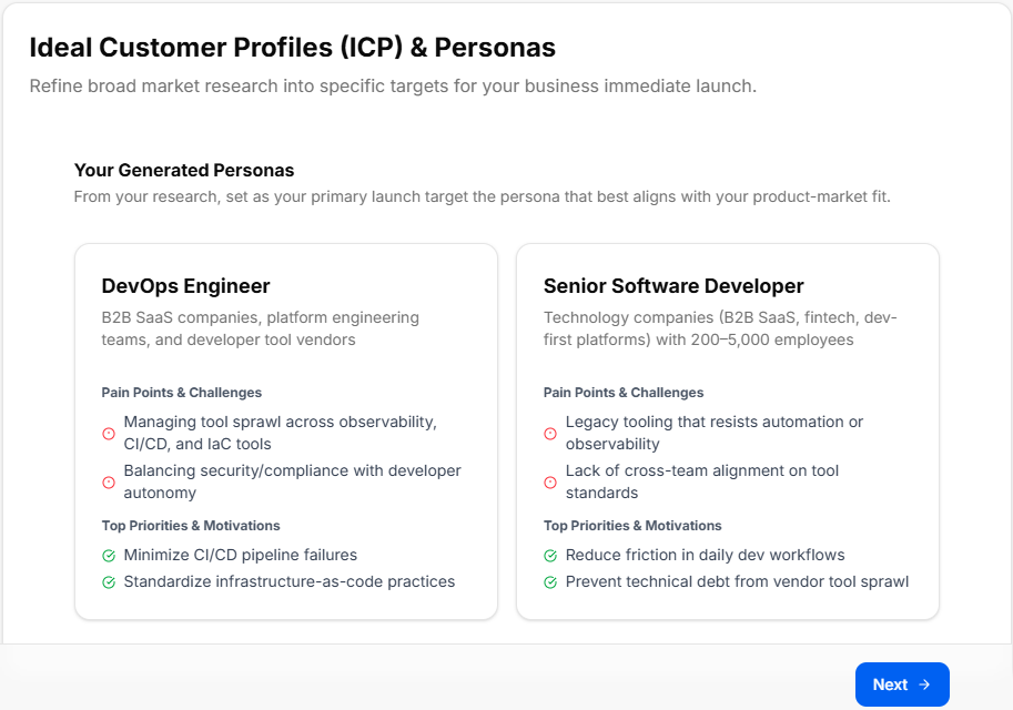
This sub-stage workspace visualizes your target buyer segments to refine broad market data into specific strategic priorities for your immediate launch.
The system bridges your historical research by automatically carrying over and displaying the primary target profiles you chose back in the Market Research Stage.
Canvas Layout & Workspace Components
-
Main Workspace Title: Displays "Ideal Customer Profiles (ICP) & Personas".
-
Instructional Subtitle: “Refine broad market research into specific targets for your business immediate launch.”
Your Generated Personas Section
This area populates dynamically based on the choices selected during your earlier market research sub-stages, prompting you to keep your core product-market fit in mind.
-
Section Subtitle: “From your research, set as your primary launch target the persona that best aligns with your product-market fit.”
-
Dynamic Persona Display Cards: The canvas layouts render comprehensive breakdown metrics for your selected target categories (such as the DevOps Engineer or Senior Software Developer layout components shown in). Each profile block reviews:
-
Target Segment Description: Summarizes industry focus, team environments, and organizational scale parameters.
-
Pain Points & Challenges: A red-alert indicator list highlighting critical target frictions to address in marketing messaging.
-
Top Priorities & Motivations: A green checkmark list detailing the specific positive outcomes and metrics the target profiles care about most.
-
Navigation Controls
-
Next Button: A blue Next → navigation utility button is located at the bottom-right margin of the footer line. Clicking this control confirms your launch targets and moves the platform view sequentially into Sub-Stage 4: Pre-Launch Plan.
Sub-Stage 4: Pre-Launch Plan


This sub-stage workspace focuses on building anticipation, generating early audience lists, and organizing promotional assets before your official public release. It establishes an active pre-launch roadmap across five operational strategy sections and a contextual briefing area.
Canvas Layout & Workspace Components
-
Main Workspace Title: Displays "Pre-Launch Plan".
-
Instructional Subtitle: “This stage is about building anticipation and assets before the official release. It involves planning teaser content and touchdowns , setting up waitlists to collect interest , and organizing a Beta program for early feedback.”
Progress Tracker & Contextual Briefing
-
Pre-Launch Plan Progress Tracker: A visual metrics card displaying an interactive circular progress gauge tracking your setup status across the "0% Complete / 0 of 5 sections completed" benchmark milestones.
-
The Art of the Pre-Launch Box: An orange-accented briefing panel reminding founders: "Launching to an empty room is a risk." It lists three core strategic values:
-
Validate Demand: If people won't give you an email address, they definitely won't give you money.
-
Build Momentum: You need a 'Day 1 Army' ready to engage, share, and buy the moment you go live.
-
Refine the Product: Use a closed Beta group to catch embarrassing bugs before the public sees them.
-
1. Teaser Content & Buzz Panel
-
Section Objective: How will you announce you are building something new?
-
Primary Announcement Channel Options (Selectable Chips):
-
LinkedIn (Professional/B2B)
-
Twitter/X (Tech/Indie)
-
Personal Email List
-
Instagram/TikTok (Visual/B2C)
-
Industry Forums/Communities
-
-
Content Format Options (Selectable Chips):
-
Behind-the-scenes screenshots
-
Video Demos / Previews
-
Problem/Agitation posts (Storytelling)
-
Countdown Timers
-
-
Custom Inputs: Both modules contain an "Add a custom value" field line with a right-aligned Add button to inject customized channels or unique media types into your plan.
2. Waitlist & Capture Panel
-
Section Objective: How are you collecting interest?
-
Collection Tool Strategy (Selectable Chips):
-
Early Access
-
Free Resource (PDF/Guide)
-
Exclusive Discount
-
Lock in your username
-
-
The Hook (Why join?) Strategy (Selectable Chips):
-
Early Access
-
Free Resource (PDF/Guide)
-
Exclusive Discount
-
Lock in your username
-
-
Custom Inputs: Includes explicit "Add a custom value" open text fields to append personalized signup incentives or lead magnets.
3. Beta / Pilot Program Panel
-
Section Objective: Who will test it first?
-
Target Cohort Size Field: A text entry field to lock in clear testing caps (e.g., 10, 50, 100 users).
-
Feedback Method Options (Selectable Chips):
-
1-on-1 Interviews (High touch)
-
In-App Feedback Widget
-
Private Community (Discord/Slack/WhatsApp)
-
Email Surveys
-
-
Custom Inputs: An "Add a custom value" option lines the footer of this card for logging unique testing communication paths.
4. Influencer & Partner Seeding Panel
-
Section Objective: Who can amplify your message?
-
Target Validators Registry: An open form field line prompting you to “List 3-5 people whose endorsement would matter” (e.g., Name of industry leader, newsletter writer, or power user...). Clicking the right-aligned plus (+) button registers the validator target to your layout matrix.
5. Assets Checklist Panel
-
Section Objective: Mark the assets you need to create.
-
Asset Tracking Selection Matrix (Selectable Chips):
-
Pitch Deck (for investors/partners)
-
Explainer Video / Demo
-
Welcome Email Sequence
-
Press Kit (Logos, Founder Bio, Screenshots)
-
Social Media Banners/Graphics
-
-
Custom Inputs: Features an "Add a custom value" box to track specific content or multimedia collateral requirements unique to your pipeline.
Additional Notes & Context Panel
Located at the base of your planning canvas, this space acts as your strategic summary log:
-
Final Decision Summary Block: A text area to write down your macro strategy conclusions.
-
Additional Notes Block: A text space to freely register timelines, operational variables, launch days, or specific tactical tasks.
Navigation Controls
-
Next Button: A blue Next → navigation utility button is located at the absolute bottom-right margin of the footer block. Clicking this control saves your pre-launch variables and steps your view sequentially forward into Sub-Stage 5: Launch Plan.
Sub-Stage 5: Launch Plan
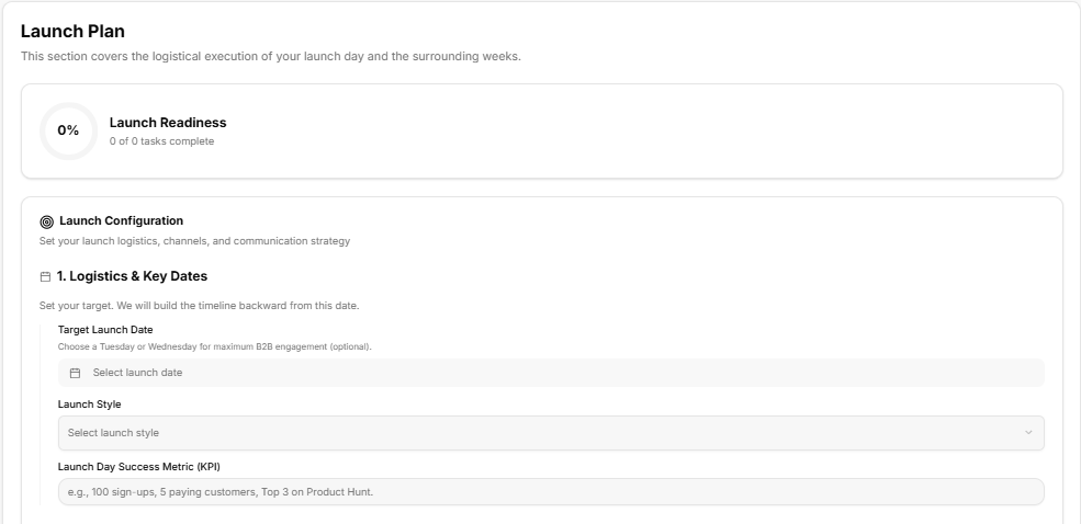
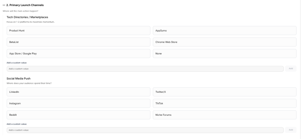
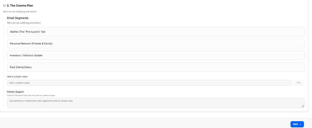
This sub-stage covers the logistical execution of your launch day and the surrounding weeks. It consolidates target milestones, primary distribution platforms, and audience outreach timelines into three operational modules.
Canvas Layout & Workspace Components
-
Main Workspace Title: Displays "Launch Plan".
-
Instructional Subtitle: “This section covers the logistical execution of your launch day and the surrounding weeks.”
Launch Readiness Tracker
-
Launch Readiness Gauge: A dedicated metrics tracking card positioned at the top of the canvas, displaying a circular status gauge calibrated at "0% Launch Readiness / 0 of 0 tasks complete" to track prerequisite setup completion.
Launch Configuration Settings
The lower canvas layout groups your logistics entries under a master configuration block reading “Set your launch logistics, channels, and communication strategy.”
1. Logistics & Key Dates Panel
-
Section Objective: “Set your target. We will build the timeline backward from this date.”
-
Target Launch Date Selection: An interactive date picker field accompanied by an operational tip: “Choose a Tuesday or Wednesday for maximum B2B engagement (optional).”
-
Launch Style Menu: A dropdown menu selection tool to finalize your execution approach (e.g., Select launch style).
-
Launch Day Success Metric (KPI) Input: An open input field to define concrete target milestones (e.g., 100 sign-ups, 5 paying customers, Top 3 on Product Hunt).
2. Primary Launch Channels Panel
-
Section Objective: Manage distribution paths under the guiding header: “Where will the main action happen?”
-
Tech Directories / Marketplaces: A list of selection chips instructed to “Focus on 1-2 platforms to maximize momentum”:
-
Product Hunt
-
BetaList
-
App Store / Google Play
-
AppSumo
-
Chrome Web Store
-
None
-
-
Social Media Push: Selection chips mapping audience presence by asking: “Where does your audience spend their time?”
-
LinkedIn
-
Instagram
-
Reddit
-
Twitter/X
-
TikTok
-
Niche Forums
-
-
Custom Inputs: Both categories provide an open text bar labeled "Add a custom value" with an Add button to introduce specific target directories or unique community channels.
3. The Comms Plan Panel
-
Section Objective: Organizes contact lists under the operational brief: “Who are we notifying and when?”
-
Email Segments: Selection chips identifying core communication cohorts:
-
Waitlist (The 'Pre-Launch' list)
-
Personal Network (Friends & Family)
-
Investors / Advisors Update
-
Past Clients/Users
-
-
Custom Inputs: Includes an "Add a custom value" row to add specialized mailing tags or segmented customer cohorts.
-
Partner Support Logging: A wide-form text block noted with “Confirm the exact time they will post to create a surge,” prompting you to “List partners or influencers who agreed to post on launch day.”
Navigation Controls
Sub-Stage 6: Post-Launch Growth Plan
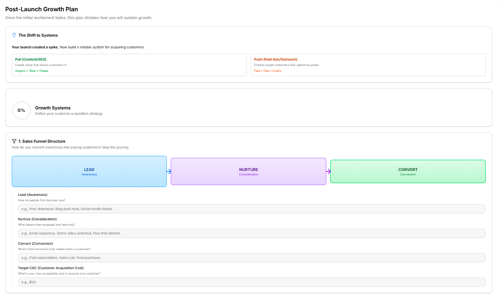
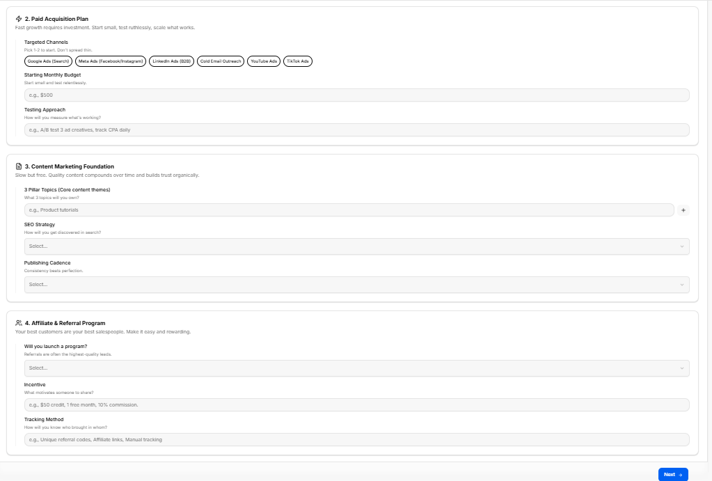
This sub-stage workspace shifts the focus from launch-day excitement to long-term sustainability. It helps founders map out customer acquisition systems across four core operational pipelines to turn initial momentum into repeatable growth.
Canvas Layout & Workspace Components
-
Main Workspace Title: Displays "Post-Launch Growth Plan".
-
Instructional Subtitle: “Once the initial excitement fades, this plan dictates how you will sustain growth.”
Strategic Framework Briefing & Progress
-
The Shift to Systems Box: A top-tier strategic panel highlighting: "Your launch created a spike. Now build a reliable system for acquiring customers." It contrasts the two primary acquisition mechanisms:
-
Pull (Content/SEO): Create value that draws customers in (Organic • Slow • Cheap).
-
Push (Paid Ads/Outreach): Directly target customers with spending power (Paid • Fast • Costly).
-
-
Growth Systems Tracker: A tracking card displaying a circular performance gauge calibrated at "0% Growth Systems / Define your customer acquisition strategy" to monitor strategic form completion.
1. Sales Funnel Structure Panel
-
Section Objective: Answer the core question: How do you convert awareness into paying customers? Map the journey.
-
Visual Journey Flow Matrix: Displays a sequential pipeline mapping the transition from LEAD (Awareness) $\rightarrow$ NURTURE (Consideration) $\rightarrow$ CONVERT (Conversion).
-
Input Fields:
-
Lead (Awareness): How do people first discover you? (e.g., Free download, Blog post read, Social media follow.)
-
Nurture (Consideration): What keeps them engaged and learning? (e.g., Email sequence, Demo video watched, Free trial started.)
-
Convert (Conversion): What's the final action that makes them a customer? (e.g., Paid subscription, Sales call, Final purchase.)
-
Target CAC (Customer Acquisition Cost): What's your max acceptable cost to acquire one customer? (e.g., $50)
-
2. Paid Acquisition Plan Panel
-
Section Objective: Fast growth requires investment. Start small, test ruthlessly, scale what works.
-
Targeted Channels: Multi-select chips stating: Pick 1-2 to start. Don't spread thin. Options include:
-
Google Ads (Search)
-
Meta Ads (Facebook/Instagram)
-
LinkedIn Ads (B2B)
-
Cold Email Outreach
-
YouTube Ads
-
TikTok Ads
-
-
Starting Monthly Budget Field: Start small and test relentlessly. (e.g., $500)
-
Testing Approach Field: How will you measure what's working? (e.g., A/B test 3 ad creatives, track CPA daily)
3. Content Marketing Foundation Panel
-
Section Objective: Slow but free. Quality content compounds over time and builds trust organically.
-
3 Pillar Topics (Core content themes): An open field to determine your authority areas: What 3 topics will you own? (e.g., Product tutorials). Click the right-aligned plus (+) icon to add themes to your tracking grid.
-
SEO Strategy Dropdown: Selectable menu to define your discovery model: How will you get discovered in search?
-
Publishing Cadence Dropdown: Selectable schedule matrix emphasizing: Consistency beats perfection.
4. Affiliate & Referral Program Panel
-
Section Objective: Your best customers are your best salespeople. Make it easy and rewarding.
-
Will you launch a program? Dropdown: A menu item to confirm referral integrations: Referrals are often the highest-quality leads.
-
Incentive Field: What motivates someone to share? (e.g., $50 credit, 1 free month, 10% commission.)
-
Tracking Method Field: How will you know who brought in whom? (e.g., Unique referral codes, Affiliate links, Manual tracking)
Navigation Controls
Sub-Stage 7: Measurement & Optimization
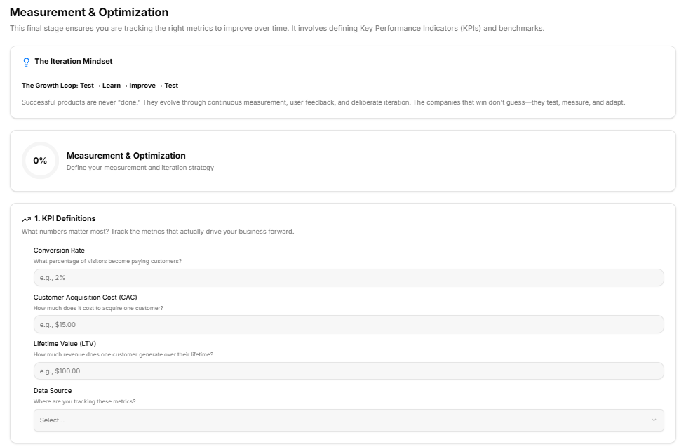
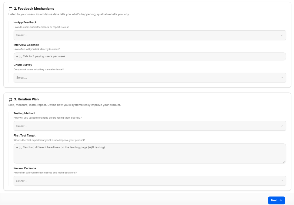
This final sub-stage workspace provides a structured framework for defining key metrics, user feedback channels, and systematic product iteration loops to ensure long-term, sustainable growth.
Canvas Layout & Workspace Components
-
Main Workspace Title: Displays "Measurement & Optimization".
-
Instructional Subtitle: “This final stage ensures you are tracking the right metrics to improve over time. It involves defining Key Performance Indicators (KPIs) and benchmarks.”
Strategic Mindset & Progress Tracking
As documented in "image_33e7d7.png", the top section provides a master context block for metric definitions:
-
The Iteration Mindset Panel: A light blue-accented briefing card summarizing The Growth Loop: Test $\rightarrow$ Learn $\rightarrow$ Improve $\rightarrow$ Test. It advises founders: “Successful products are never "done." They evolve through continuous measurement, user feedback, and deliberate iteration. The companies that win don't guess—they test, measure, and adapt.”
-
Measurement & Optimization Progress Tracker: A visual performance card containing a status wheel calibrated at "0% Complete / Define your measurement and iteration strategy".
1. KPI Definitions Panel
Visible at the base of "image_33e7d7.png", this module focuses on data-driven business benchmarks:
-
Section Objective: “What numbers matter most? Track the metrics that actually drive your business forward.”
-
Conversion Rate Field: A text entry field to specify target conversions: What percentage of visitors become paying customers? (e.g., 2%)
-
Customer Acquisition Cost (CAC) Field: An input block to outline acquisition targets: How much does it cost to acquire one customer? (e.g., $15.00)
-
Lifetime Value (LTV) Field: A text entry row to project long-term user revenue: How much revenue does one customer generate over their lifetime? (e.g., $100.00)
-
Data Source Dropdown: A selectable drop-menu asking founders: Where are you tracking these metrics? (Select...)
2. Feedback Mechanisms Panel
Located at the top of "image_33e716.png", this card helps capture qualitative user insight:
-
Section Objective: “Listen to your users. Quantitative data tells you what's happening; qualitative tells you why.”
-
In-App Feedback Dropdown: A drop-menu mapping issue submission channels: How do users submit feedback or report issues? (Select...)
-
Interview Cadence Field: An open text block establishing a conversational timeline: How often will you talk directly to users? (e.g., Talk to 3 paying users per week.)
-
Churn Survey Dropdown: A dropdown tool to evaluate user departures: Do you ask users why they cancel or leave? (Select...)
3. Iteration Plan Panel
Positioned at the lower half of "image_33e716.png", this final strategic box establishes product improvement cycles:
-
Section Objective: “Ship, measure, learn, repeat. Define how you'll systematically improve your product.”
-
Testing Method Dropdown: A structured drop-menu to manage feature testing: How will you validate changes before rolling them out fully? (Select...)
-
First Test Target Input Block: A multi-line text area to document immediate validation milestones: What's the first experiment you'll run to improve your product? (e.g., Test two different headlines on the landing page (A/B testing).)
-
Review Cadence Dropdown: A selectable schedule menu determining data analysis cycles: How often will you review metrics and make decisions? (Select...)
Navigation Controls
Sub-Stage 8: Export Go-to-Market Results
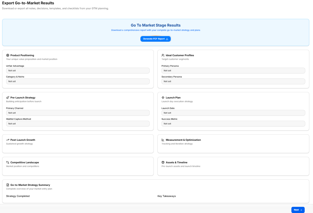
This final substage workspace compiles all the data, strategy cards, and parameters configured across your previous steps into a central export portal, allowing founders to generate a master strategy document.
Canvas Layout & Workspace Components
-
Main Workspace Title: Displays "Export Go-to-Market Results".
-
Instructional Subtitle: “Download or export all notes, decisions, templates, and checklists from your GTM planning.”
Master Export Utility
As shown in "image_338254.png", a prominent, blue-bordered action box is centered at the top of the workspace:
-
Go To Market Stage Results Header: “Download a comprehensive report with your complete go-to-market strategy and plans”.
-
Export Action Button: A solid blue button labeled Generate PDF Report 📥 triggers the document compilation pipeline.
GTM Data Field Overview Matrix
The remainder of the canvas in "image_338254.png" acts as a multi-grid review matrix, displaying summary fields currently reading "Not set" across several foundational components:
-
Product Positioning Panel:
-
Objective: Your unique value proposition and market position.
-
Fields: Unfair Advantage, Category & Niche.
-
-
Ideal Customer Profiles Panel:
-
Objective: Target customer segments.
-
Fields: Primary Persona, Secondary Persona.
-
-
Pre-Launch Strategy Panel:
-
Objective: Building anticipation before launch.
-
Fields: Primary Channel, Waitlist Capture Method.
-
-
Launch Plan Panel:
-
Objective: Launch day execution strategy.
-
Fields: Launch Date, Success Metric.
-
-
Post-Launch Growth Panel:
-
Objective: Sustained growth strategy.
-
-
Measurement & Optimization Panel:
-
Objective: Tracking and iteration strategy.
-
-
Competitive Landscape Panel:
-
Objective: Market position and competitors.
-
-
Assets & Timeline Panel:
-
Objective: Pre-launch assets and launch timeline.
-
Summary & Action Footer
-
Go-to-Market Strategy Summary Panel: Spans the lower width of the layout to present a “Complete overview of your market entry plan”, tracking Strategy Completed logs alongside macro Key Takeaways.
-
Navigation Controls: A blue Next → navigation utility button anchors the absolute bottom-right corner of the footer page to conclude the framework pipeline.
Finalize and Export Stage
Finalize and Export Stage
This represents the absolute final milestone in the user experience pipeline, consolidating the entirety of the operational strategy modules into a single, definitive conclusion block.
Navigation & Collapse Component
This area acts as the final dropdown or accordion checkpoint in your mapping list:
-
Stage Header: Displays "Finalize and Export Stage". A right-aligned collapse arrow indicates its position within a larger navigation structure.
-
Active Substage Link: Displays "Finalize and Export Founder Journey Results", which serves as the ultimate target portal where a founder can lock in their inputs and generate their master report.
Master Overview: Finalize and Export Founder Journey Results
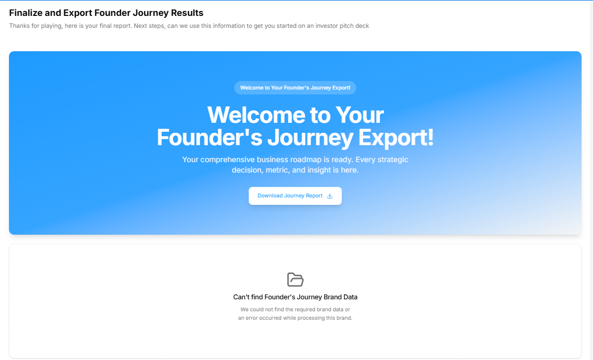
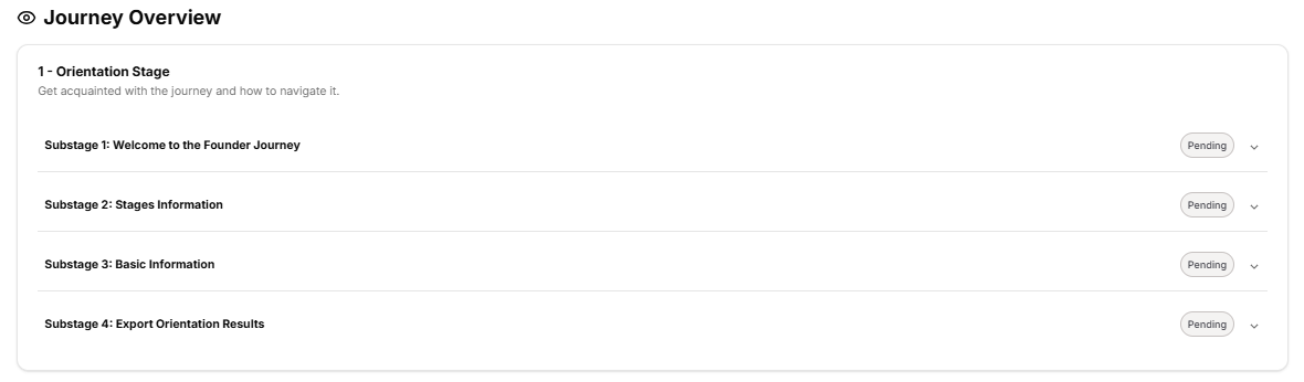
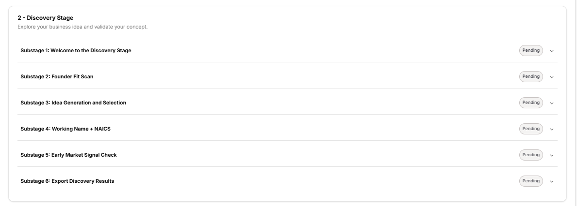
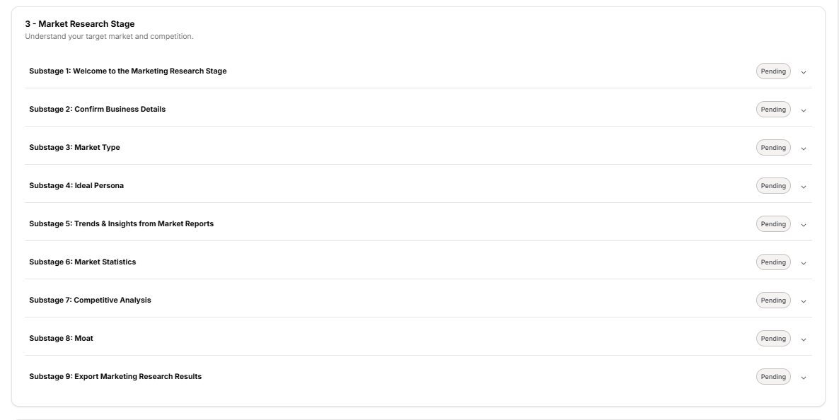
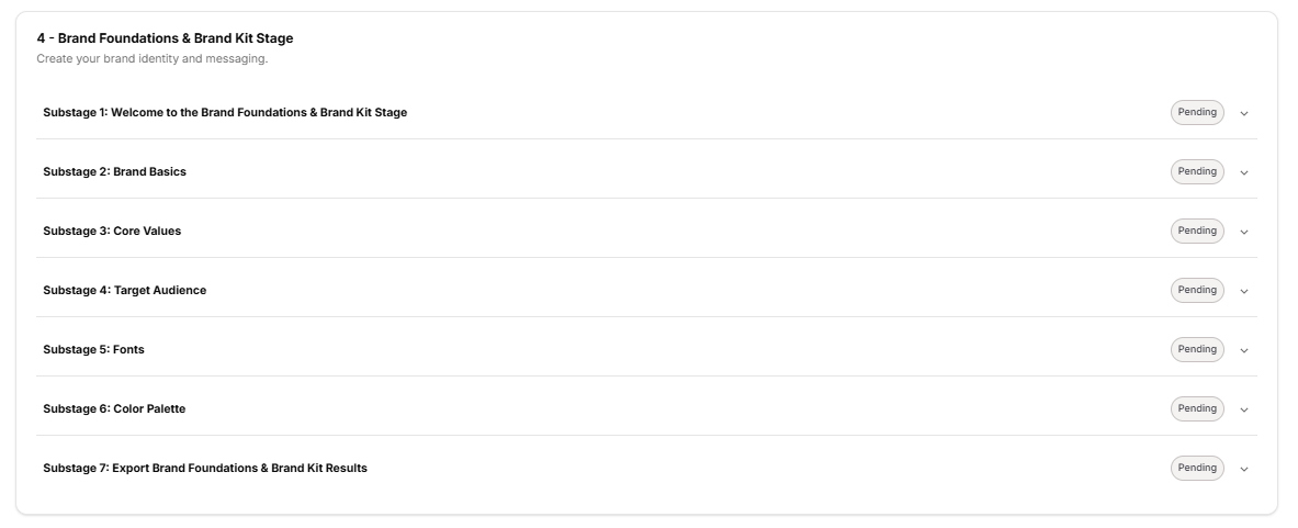
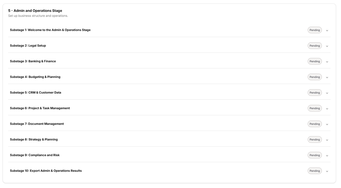
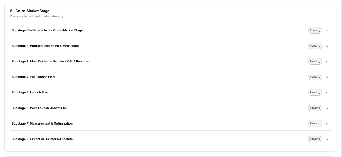
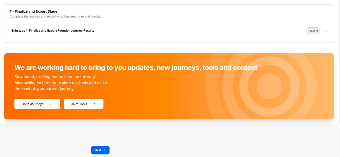
This final platform component serves as the ultimate summary dashboard for the entire entrepreneurial roadmap. It consolidates high-level brand data, key business metrics, and an interactive, stage-by-stage breakdown of the user's progress.
1. Export Portal & Header Summary
The workspace opens with an actionable recap layout:
-
Main Stage Title: Displays "Finalize and Export Founder Journey Results".
-
Instructional Subtitle: “Thanks for playing, here is your final report. Next steps, can we use this information to get you started on an investor pitch deck”.
-
Welcome Banner: A prominent blue gradient card welcoming the user with: “Welcome to Your Founder's Journey Export! Your comprehensive business roadmap is ready. Every strategic decision, metric, and insight is here.”.
-
Download Utility: Features a prominent white action button labeled Download Journey Report 📥.
-
System Notification Box: A card at the base of this initial screen reads, “Can't find Founder's Journey Brand Data. We could not find the required brand data or an error occurred while processing this brand.” (Note: This appears because the metrics have not yet been fully populated).
2. Performance & Positioning Summary
This section maps the financial benchmarks and distribution models configured throughout the application:
-
Key Business Metrics Grid:
-
Total Addressable Market: N/A (Business Opportunity).
-
Serviceable Market: N/A (Target Audience Reach).
-
Monthly Revenue Target: No available (Sales revenue projection).
-
Customer Acquisition Cost: No available (Target CAC per customer).
-
-
Strategic Positioning Layout:
-
Target Personas Card: Prompts for “Who you're building for”, displaying an empty user icon reading “No target personas available”.
-
Launch Strategy Card: Outlines “Your go-to-market channels” split across Social Platforms (“No launch strategy available”) and Direct Channels (“No launch strategy available”) alongside a Launch Date entry reading “No available”.
-
3. Interactive Journey Overview (The 7-Stage Checklist)
The platform itemizes every milestone of the application across a sequential collection of dropdown blocks. Each individual substage line features a right-aligned downward arrow chevron; clicking this chevron expands the module to display details like the substage description, estimated time, and completion date.
Currently, because the modules are unfilled, they display an oval badge reading "Pending".
-
1 - Orientation Stage ("Get acquainted with the the journey and how to navigate it."):
-
Substage 1: Welcome to the Founder Journey
-
Substage 2: Stages Information
-
Substage 3: Basic Information
-
Substage 4: Export Orientation Results
-
-
2 - Discovery Stage ("Explore your business idea and validate your concept."):
-
Substage 1: Welcome to the Discovery Stage
-
Substage 2: Founder Fit Scan
-
Substage 3: Idea Generation and Selection
-
Substage 4: Working Name + NAICS
-
Substage 5: Early Market Signal Check
-
Substage 6: Export Discovery Results
-
-
3 - Market Research Stage ("Understand your target market and competition."):
-
Substage 1: Welcome to the Marketing Research Stage
-
Substage 2: Confirm Business Details
-
Substage 3: Market Type
-
Substage 4: Ideal Persona
-
Substage 5: Trends & Insights from Market Reports
-
Substage 6: Market Statistics
-
Substage 7: Competitive Analysis
-
Substage 8: Moat
-
Substage 9: Export Marketing Research Results
-
-
4 - Brand Foundations & Brand Kit Stage ("Create your brand identity and messaging."):
-
Substage 1: Welcome to the Brand Foundations & Brand Kit Stage
-
Substage 2: Brand Basics
-
Substage 3: Core Values
-
Substage 4: Target Audience
-
Substage 5: Fonts
-
Substage 6: Color Palette
-
Substage 7: Export Brand Foundations & Brand Kit Results
-
-
5 - Admin and Operations Stage ("Set up business structure and operations."):
-
Substage 1: Welcome to the Admin & Operations Stage
-
Substage 2: Legal Setup
-
Substage 3: Banking & Finance
-
Substage 4: Budgeting & Planning
-
Substage 5: CRM & Customer Data
-
Substage 6: Project & Task Management
-
Substage 7: Document Management
-
Substage 8: Strategy & Planning
-
Substage 9: Compliance and Risk
-
Substage 10: Export Admin & Operations Results
-
-
6 - Go-to-Market Stage ("Plan your launch and market strategy"):
-
Substage 1: Welcome to the Go-to-Market Stage
-
Substage 2: Product Positioning & Messaging
-
Substage 3: Ideal Customer Profiles (ICP) & Personas
-
Substage 4: Pre-Launch Plan
-
Substage 5: Launch Plan
-
Substage 6: Post-Launch Growth Plan
-
Substage 7: Measurement & Optimization
-
Substage 8: Export Go-to-Market Results
-
-
7 - Finalize and Export Stage ("Complete the journey and export your business plan and results."):
-
Substage 1: Finalize and Export Founder Journey Results
-
4. Future Ecosystem Roadmap & Navigation
The workspace concludes with a secondary user retention card and controls:
-
Ecosystem Update Banner: An orange notification panel stating: “We are working hard to bring to you updates, new journeys, tools and content. Stay tuned, exciting features are on the way! Meanwhile, feel free to explore our tools and make the most of your current journey.”.
-
Quick-Link Hubs: Offers two white direction buttons inside the orange layout panel:
-
Go to Journeys →
-
Go to Tools →
-
-
Final Form Control: A solid blue button marked Next → anchors the bottom-center of the entire frame to finalize the master reporting application.