BuildRunKit - Account and core features
- Overview and Account Setup
- BuildRunKit Dashboard Infrastructure Overview
- BuildRunKit Platform: Brands Management Walkthrough
- Saved Outcomes Repository
- Tools Ecosystem
- Settings
- Feedback, Help & Support Navigation
Overview and Account Setup

BuildRunKit is an all-in-one business operating system designed for founders, entrepreneurs, and growing teams. It bridges the gap between high-level strategy and daily execution by providing a unified workspace for planning, building, and running every aspect of a modern business.
Creating Your Account:

How to Sign Up:
Starting your journey with BuildRunKit is quick and easy. Follow these steps to set up your new account:
-
Email Address: Enter your primary email address in the Email field.
-
Create a Password: Enter a strong, secure password. Use the eye icon to double-check your typing.
-
Terms & Privacy: Review the Terms of Service and Privacy Policy, then check the box to confirm your agreement. This is required to proceed.
-
Complete Registration: Click the blue Sign Up button to create your account.
-
Alternative Options: You can also register instantly using your existing Google or GitHub account by clicking the buttons at the bottom.
-
Already a User? If you accidentally landed on this page, click "Sign in here" at the bottom to go back to the login screen.
Accessing Your Workspace

How to Sign In:
Accessing BuildRunKit is simple and secure. Follow these steps to log in to your account:
-
Email & Password: Enter your registered work email address and password in the provided fields. You can click the eye icon in the password field to verify your entry.
-
Social Login: For faster access, you can choose to sign in using your Google or GitHub account by clicking the respective buttons at the bottom.
-
Forgot Password: If you’ve forgotten your credentials, click the "Forgot your password?" link just above the Sign In button to receive a reset link via email.
-
New Users: If you don't have an account yet, click the "Sign up for free" link at the very bottom to begin your registration.
Initial Onboarding & Role-Based Dashboards
Wizard-Style Onboarding: After completing your registration or signing in for the first time, you are greeted with a streamlined, wizard-style interface. This walkthrough allows you to instantly input your basic information, select your initial User Type, and start configuring your personal brand right from the start.
Theme & Device Compatibility: The onboarding screens and all subsequent dashboard components are engineered to ensure smooth responsiveness across all devices and perfect compatibility with both Light and Dark themes.
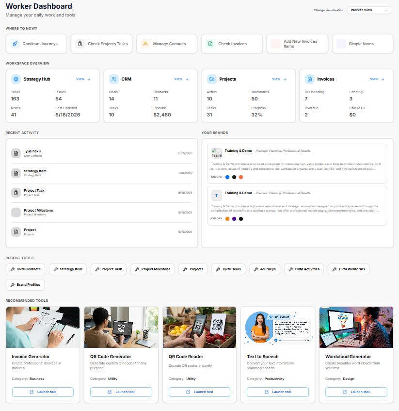
The 4 Role-Based Dashboards: Once onboarding is complete, the platform provides 4 distinct, role-based dashboard architectures. Each layout filters out background noise to highlight the exact workspace metrics and tools most relevant to your specific job type:
-
Founder View: Tailored for high-level startup execution and business oversight.
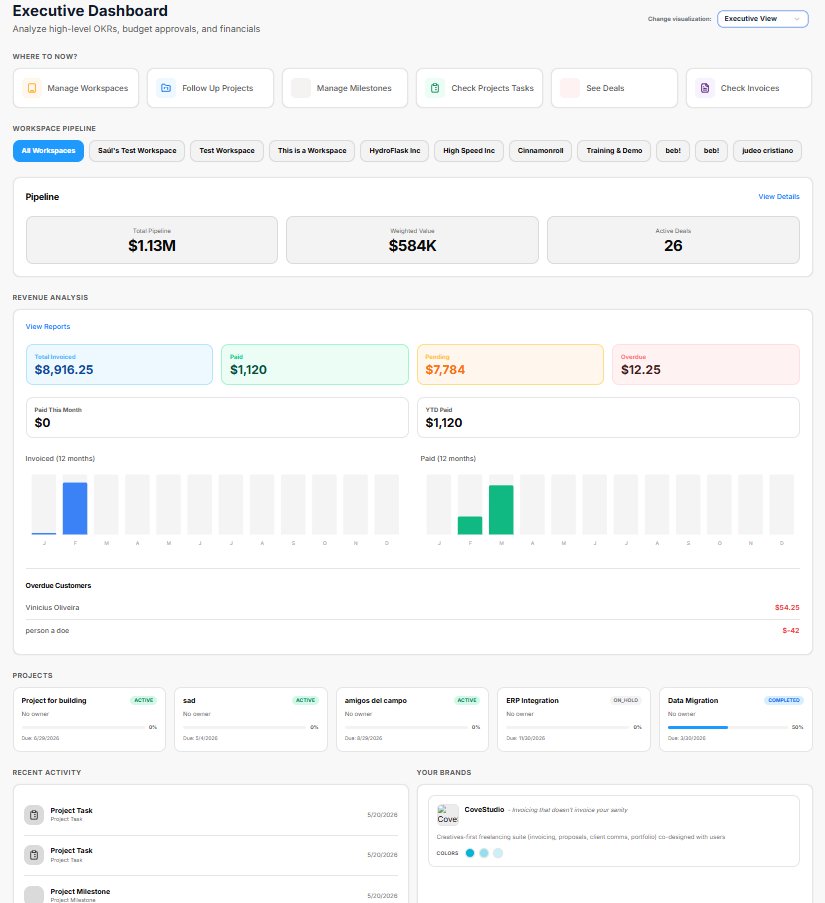
-
Executive View: Optimized for corporate management, tracking, and leadership oversight.

-
Business Coach View: Structured for mentorship tracking, strategy planning, and cohort overviews.
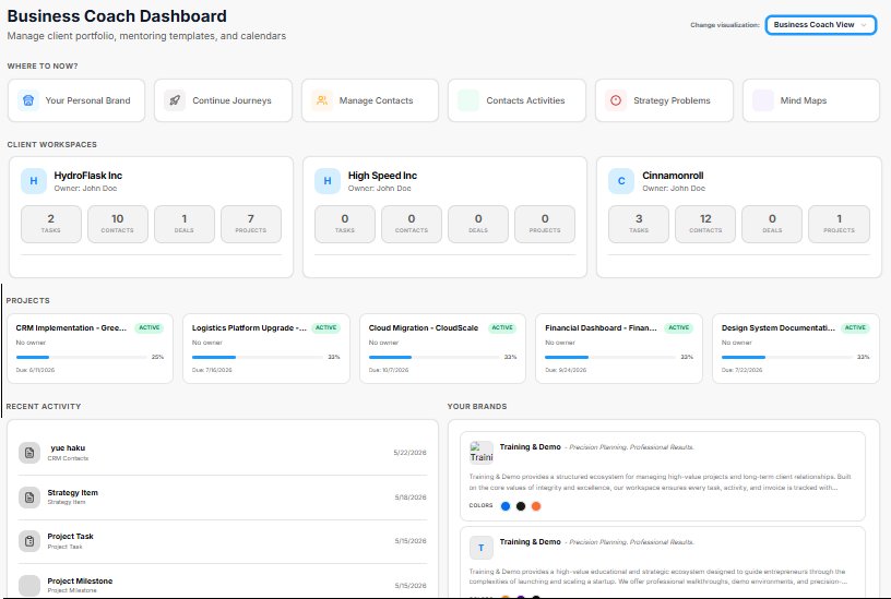
-
Worker View: Focused heavily on day-to-day task execution, individual assignments, and direct workflows.
Dynamic User Type Switching: The home screen includes a "Dashboard Select" interface menu. Whenever you manually switch your dashboard view to a different role, the system automatically updates your active User Type in the background to match your current workflow seamlessly.
Universal Shortcuts: No matter which of the 4 dashboards you are using, each home screen features a dedicated "Shortcuts" section. This allows you to rapidly launch specific tools and jump directly to different sections of the application with a single click.
BuildRunKit Dashboard Infrastructure Overview
BuildRunKit Dashboard Infrastructure Overview
The BuildRunKit interface provides a multi-layered, role-based dashboard system tailored for modern startup ecosystems. The core setup features deep integration with the Goldilocks Suite and supports seamless switching between operational perspectives.
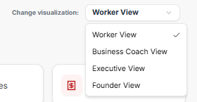
1. Role-Based Dashboards & Visualization Switching
Users can dynamically shift their view depending on their operational focus via a dropdown menu in the upper right-hand corner of the platform. The system architecture supports four distinct, role-based dashboard options:
-
Worker View (Currently Selected)
-
Business Coach View
-
Executive View
-
Founder View
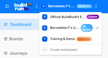
2. Workspace Selector
-
Official BuildRunKit Ecosystem (Labeled as "Custom")
-
Bernadette.F's Workspace (Currently Active with "All Access" privileges)
-
Training & Demo (Labeled as "Enterprise")
-
Create Workspace ($+$): A dedicated utility to deploy new isolated team environments.
3. Main Interface Layout (Worker View)
The full workspace structure is segmented into distinct navigational, strategic, and tool-based panels designed for day-to-day workflow tracking.
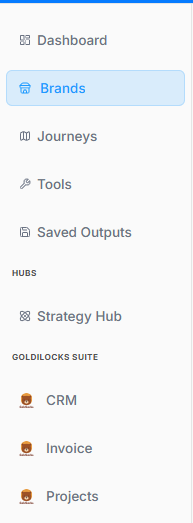
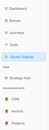
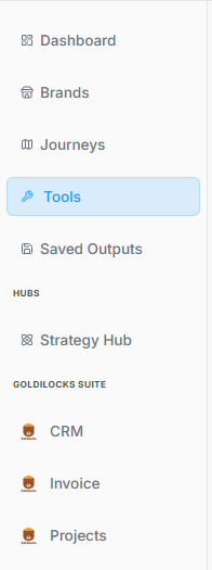
Sidebar Navigation & Hubs
-
Core Paths: Dashboard, Brands, Journeys, Tools, and Saved Outputs.
-
Hubs Section: A dedicated entry point for the Strategy Hub.
-
Goldilocks Suite Integration: Direct sidebar modules for managing CRM, Invoice, and Projects.
-
Footer Utilities: Settings, Feedback, and Help & Support.
"Where to Now?" Action Bar
Positioned right at the top of the main canvas to guide immediate focus:
-
Finish Onboarding
-
Continue Journeys
-
Check Projects Tasks
-
Manage Contacts
-
Check Invoices
-
Add New Invoices Items
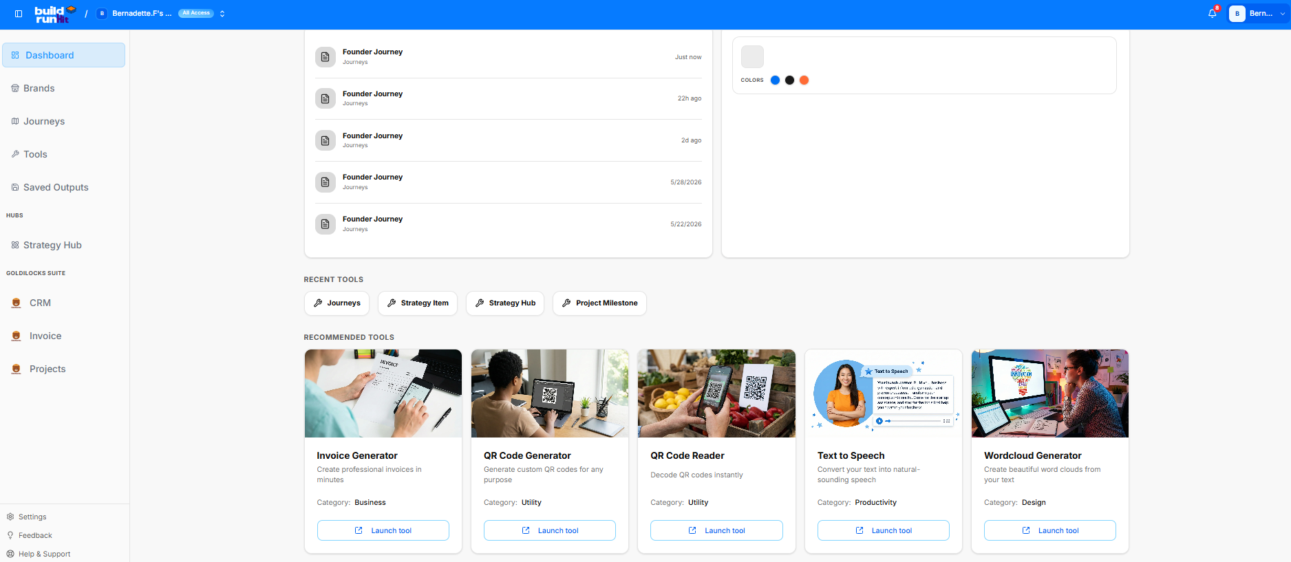
Workspace Overview Grid
This section details active numbers, pipeline evaluations, and tracking counters across individual hubs:
-
Strategy Hub: Tracks 100 Tasks, 1 Issue, 3 Notes, and notes a Last Updated milestone of 5/21/2026.
-
CRM: Tracks 0 Deals, 10 Contacts, 0 Tasks, and a $0 Pipeline.
-
Projects: Displays 11 Active elements, 50 Milestones, 0 Tasks, and 0% Progress.
-
Invoices: Features clear zeroed baselines (0 Outstanding, 0 Pending, 0 Overdue, and $0 Paid MTD) waiting for financial entry data.
4. Ecosystem Tools & Recent History
The lower portion of the workspace dashboard transitions into chronological tracking and immediate tool deployment options:
-
Recent Activity Log: Chronologically lists ongoing iterations of the Founder Journey, tracking updates from "Just now," "22h ago," "2d ago," stretching back through 5/28/2026 and 5/22/2026.
-
Recent Tool Short-keys: Quick buttons to spawn new entries for Journeys, Strategy Items, Strategy Hubs, or Project Milestones.
-
Recommended Tools Grid:
-
Invoice Generator: Built to create professional invoices in minutes (Category: Business).
-
QR Code Generator: Designed to generate custom QR codes for any purpose (Category: Utility).
-
QR Code Reader: Instant decoding optimization for mobile or layout use (Category: Utility).
-
Text to Speech: Converts raw text inputs into natural-sounding audio speech assets (Category: Productivity).
-
Wordcloud Generator: Visualizes input copy into beautifully mapped brand word clouds (Category: Design).
-
BuildRunKit Platform: Brands Management Walkthrough
BuildRunKit Platform: Brands Management Walkthrough
Here is the breakdown of the user flow when navigating, viewing, and managing brand properties within the workspace ecosystem, moving step-by-step through the layout interfaces.
1. Navigation Sidebar Initialization
The process begins on the platform's primary left-hand navigation panel:
-
Active Tab: The Brands menu option is highlighted with a light blue background, indicating it has been selected to open the brand repository.
2. Brands Directory Dashboard
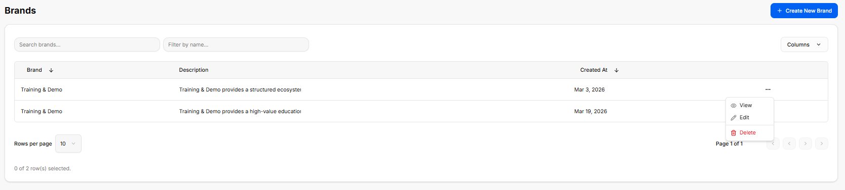
Once inside the directory, the workspace loads a master data table displaying all configured brand profiles:
-
Global Actions: A blue + Create New Brand button anchors the top right corner for deploying brand templates.
-
Search & Filter Utilities: Features a text input for "Search brands..." alongside a "Filter by name..." drop-menu tool.
-
The Brand Registry Table: Currently lists two active entries under the same primary name:
-
First Entry: Training & Demo | Description: "Training & Demo provides a structured ecosystem..." | Created At: Mar 3, 2026.
-
Second Entry: Training & Demo | Description: "Training & Demo provides a high-value education..." | Created At: Mar 19, 2026.
-
-
Inline Action Submenu: Clicking the ellipsis (
...) tool on a row unrolls an active contextual menu with three administrative routes: View, Edit, and a red-text Delete button.
3. Brand Profile Workspace Overview
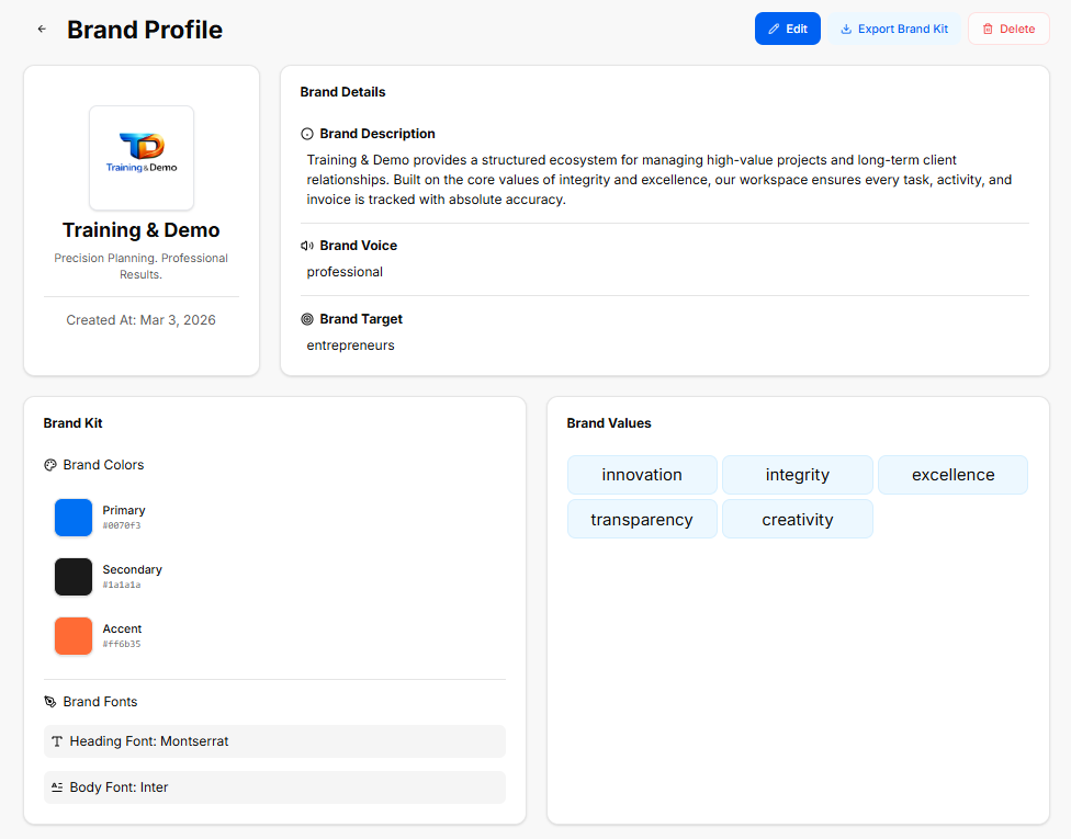
The Brand Profile is a central hub within the platform designed to store, manage, and showcase a company's foundational identity. It ensures that all technical workflows, marketing campaigns, and business documents stay strictly aligned with a unified corporate image.
Brand Details & Identity
This section defines the core parameters of the business entity, serving as the strategic reference point for all generated content:
-
Brand Description: A definitive summary explaining what the business does, its operational framework, and how it handles client relationships or projects.
-
Brand Voice: The consistent tone, style, and personality used across all company communications (for example, keeping language strictly professional and avoiding specific forbidden internal terms).
-
Brand Target: The primary audience, demographic, or ideal customer profile the platform's tools and messaging are tailored to reach.
Visual Asset Specification (The Brand Kit)
The Brand Kit acts as a visual guide, ensuring that any user-facing asset matches the company's aesthetic requirements:
-
Brand Colors: A structured palette containing hexadecimal color codes for consistent interface and asset styling:
-
Primary: The dominant color used for primary buttons, headers, and major brand elements.
-
Secondary: A supporting shade used for text, background contrast, or neutral structural components.
-
Accent: A high-contrast color reserved for call-to-action buttons, notifications, or specific highlights.
-
-
Brand Fonts: The typography rules defined for the ecosystem, standardizing a clean look across both high-level Headings and readable Body text.
The Role of Brand Values
Instead of looking at them as operational settings, the platform treats Brand Values as the definitive identity markers of your company:
-
The Core Identity: They define the unchanging principles, ethics, and beliefs that your brand is built upon.
-
The Blueprint for Trust: They show clients, partners, and your team exactly what your business cares about and how you commit to showing up every single day.
-
The Foundation of the Brand: They are the deep-seated standards that give the business its unique personality, making it more than just a list of products or services.
Saved Outcomes Repository
Saved Outcomes Repository
The Saved Outcomes section serves as a centralized digital filing cabinet for your progress. Instead of holding static text or marketing assets, this repository acts as a running historical record of every major decision, milestone, and phase completion achieved across the platform.
1. Accessing Your Saved Work
Locating your historical logs is straightforward within the workspace structure:
2. Managing the Master Log Dashboard
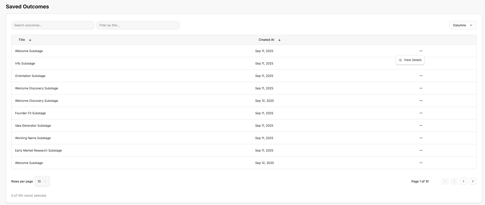
Once inside the repository, the platform provides a structured, high-level data table built to help organize and locate individual business milestones:
-
Search and Filter Functions: Text entry fields at the top allow quick sorting by specific titles or keywords to pull up exact records instantly.
-
Chronological Record Keeping: Every generated milestone is logged as a separate row, showing the precise title of the entry alongside an automatic timestamp indicating exactly when it was achieved.
-
Actionable Entries: Selecting the horizontal ellipsis (
...) on any logged row opens up a quick action menu where you can click View Details to pull up the deeper record.
3. Reviewing Individual Milestone Details
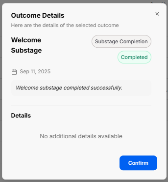
Opening a specific record triggers a clean pop-up window that breaks down exactly what that historical log represents:
-
Status & Type Badges: The window clearly labels the entry type (such as a Substage Completion) and displays a distinct green stamp confirming its status as Completed.
-
Logged Activity Summary: The window provides a quick text confirmation of the milestone reached, followed by a Details canvas. When a stage is marked complete, this space holds the specific notes, operational logs, or data blocks tied directly to that point in the journey.
-
Context Control: A prominent Confirm action button at the bottom allows you to easily acknowledge the historical view and return to the main tracking list.
Tools Ecosystem
Tools Ecosystem
The Tools suite acts as an integrated workshop within the platform, providing standalone utilities to generate creative, visual, and operational assets for business development.
1. Accessing the Tools Suite
-
Sidebar Control: The Tools option is located on the main left-hand navigation panel, directly below Journeys. Clicking it highlights the button with a light blue background and opens the full application directory.
-
Workspace Positioning: It sits directly above Saved Outputs and remains accessible alongside your core operational hubs, allowing you to quickly switch over and generate specific assets as needed.
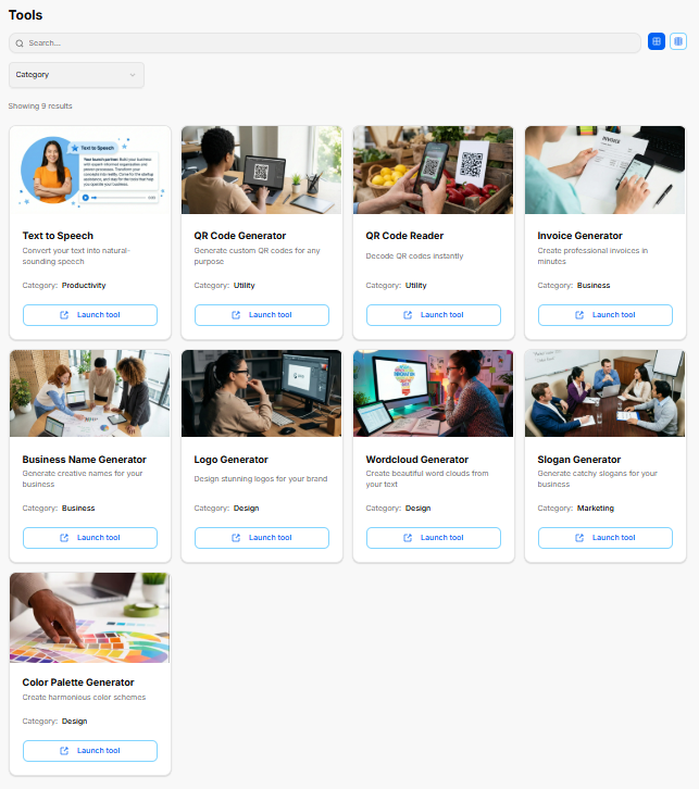
2. Directory Features & Interface Layout
The main catalog workspace organizes all available utilities into a clean, searchable matrix:
-
Search Functionality: A comprehensive search field at the top of the workspace allows for quick filtering to locate specific standalone generators.
-
Category Sorting: A dedicated dropdown menu allows you to sort utilities by specific focus types, such as Business, Utility, Productivity, Design, or Marketing.
-
Layout Toggles: Located in the top-right corner, grid and list icon toggles let you customize how the tool modules are displayed. The directory indicates a current count of 9 results available in the ecosystem.
3. Available Platform Tools
Each item in the directory is represented by a dedicated card detailing its primary function, categorized type, and a direct action button to boot up the utility:
-
Text to Speech: Converts your written text into natural-sounding audio assets. (Category: Productivity)
-
QR Code Generator: Generates custom, scannable QR codes for any operational or marketing purpose. (Category: Utility)
-
QR Code Reader: Decodes QR codes instantly via direct layout or image input. (Category: Utility)
-
Invoice Generator: Built to compile professional invoices in minutes to handle transactional needs. (Category: Business)
-
Business Name Generator: Helps brainstorm and generate creative naming structures for new business ideas. (Category: Business)
-
Logo Generator: Provides a design environment to create clean logos for your brand profile. (Category: Design)
-
Wordcloud Generator: Generates beautiful word clouds out of your input copy to summarize visual themes. (Category: Design)
-
Slogan Generator: Builds catchy taglines and slogans tailored to your business identity. (Category: Marketing)
-
Color Palette Generator: Creates cohesive, balanced color schemes to help establish primary, secondary, and accent options. (Category: Design)
Every card is anchored by a clear Launch tool → button, which seamlessly opens the respective application workspace.
Text to Speech Generator
The Text to Speech Generator is a platform utility designed to convert written text into natural-sounding audio. It offers customizable settings for voice and style selection to create polished audio outputs.
1. Generator Constraints and Tracking
The workspace features built-in allocation tracking to ensure fair usage across the platform:
-
Usage Limits:
-
Daily allocation: A maximum of 3 requests per user each day.
-
Character limit: A maximum of 1,000 characters is allowed per individual request.
-
-
Real-Time Status: A dedicated tracking badge displays your remaining requests for the day.
-
Clear Option: A dedicated Clear button resets the active text configuration fields instantly.
2. Configuration Options
The generation panel contains fields to input your text data and customize the audio behavior:
-
Text to be Converted: A dedicated text area where you type or paste your copy. A character counter at the bottom monitors your length in real time against the 1,000-character maximum.
-
Select a Voice: A dropdown menu to choose from different vocal personas and energy profiles.
-
Select a Voice Style: A dropdown menu to alter the delivery format.
Once all parameters are adjusted, hitting the prominent Generate Speech button initiates the audio assembly.
3. Output Canvas and Best Practices
-
Audio Playback Display: The central panel provides a real-time playback arena. When empty, it displays a placeholder state prompting you to enter copy and run the generator. Once compiled, the audio player mounts here to let you listen or export.
-
Workflow Guidelines: The right sidebar houses a Tips & Tricks checklist to optimize your results:
-
Write out the exact text you want to be processed as speech.
-
Select your desired voice profile from the available male or female options.
-
Select the speaking style, choosing whether a formal or casual approach fits the brand best.
-
Click the 'Generate Speech' button to initiate the audio rendering process.
-
Listen to the generated file directly or download it as an
.mp3or Base64 file based on your project requirements.
-
QR Code Generator
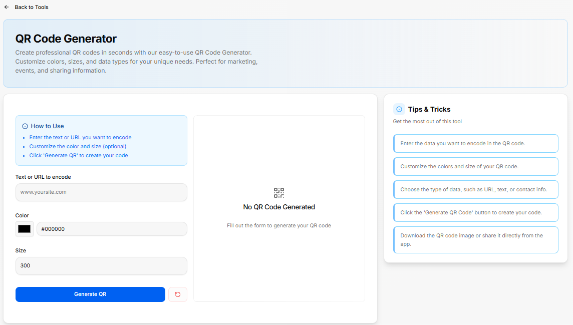
The QR Code Generator is a platform utility designed to build custom QR codes for marketing campaigns, events, and information sharing. It allows you to customize the data, sizing, and color scheme to match your requirements.
1. Quick-Start Guide
The configuration panel includes a clear reference box summarizing the core steps to build an asset:
-
Enter the text or URL: Supply the specific destination or text string you want the code to hold.
-
Customize styles (optional): Modify color selections and dimensions.
-
Click 'Generate QR': Finalize the details to assemble your code.
2. Input Configuration Fields
The left-hand workspace contains your primary setup fields:
-
Text or URL to encode: A data input bar pre-populated with a placeholder (
[www.yoursite.com](https://www.yoursite.com)) where you enter your target link or message. -
Color Selection: A color picker option featuring a direct hex code input bar (defaulting to solid black
#000000). -
Size: A dimension entry field (defaulting to a standard pixel scale of
300) to determine output resolution.
The workspace is anchored by a solid blue Generate QR action button, paired alongside a red accent Reset utility icon to clear all custom inputs instantly.
3. Output Canvas & Best Practices
-
Live Preview Space: The central frame handles your real-time asset rendering. If no form data has been processed, it remains in a placeholder state displaying a "No QR Code Generated" status icon, prompting you to fill out the form details.
-
Tips & Tricks Sidebar: The right-hand column outlines actionable recommendations to get the most out of the tool:
-
Enter the exact data you want to encode in the QR code.
-
Customize the colors and size of your QR code.
-
Choose the type of data, such as a URL, plain text, or specific contact info.
-
Click the 'Generate QR Code' button to create your custom code.
-
Download the completed QR code image file or share it directly from the app interface.
-
QR Code Reader
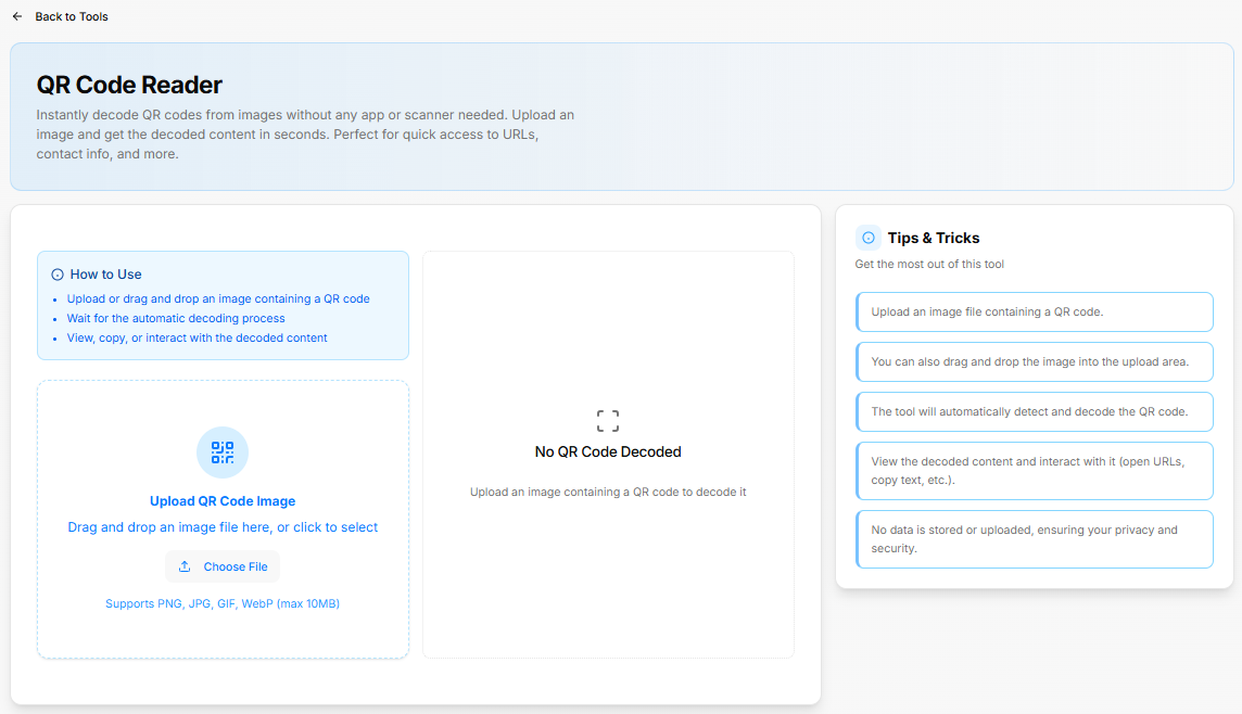
The QR Code Reader is a utility designed to instantly decode QR codes from images without requiring an external app or separate hardware scanner. It provides quick access to embedded URLs, contact info, and raw data strings.
1. Quick-Start Guide
The interface features a dedicated user guide panel outlining the core processing flow:
-
Upload or drag and drop an image containing a QR code.
-
Wait for the system's automatic decoding sequence to process.
-
View, copy, or interact with the resulting decoded text content.
2. Upload Control Area
The left side of the dashboard manages image intake via an interactive upload zone:
-
Interaction Options: Users can drag and drop an image file directly into the designated dashed-border area, or click the Choose File button to open a local directory explorer.
-
File Constraints: The system explicitly supports
PNG,JPG,GIF, andWebPimage formats, up to a maximum file size limit of10MB.
3. Output Canvas & Best Practices
-
Decoding Results Panel: The central live preview card showcases results or displays current decoding status. Until an image file has been uploaded and analyzed, it rests on a placeholder screen showing a "No QR Code Decoded" status icon accompanied by instructions to upload an image.
-
Tips & Tricks Sidebar: The right-hand column outlines operational guidance and privacy details:
-
Upload an image file containing a clear QR code.
-
Drag-and-drop actions are fully supported directly in the upload box window.
-
The utility handles detection and translation automatically upon file arrival.
-
Users can interact directly with the extracted content to launch decoded web links or instantly copy raw text strings.
-
Privacy Guard: No data is permanently stored or uploaded to external servers, protecting user privacy and internal data security.
-
Invoice Generator
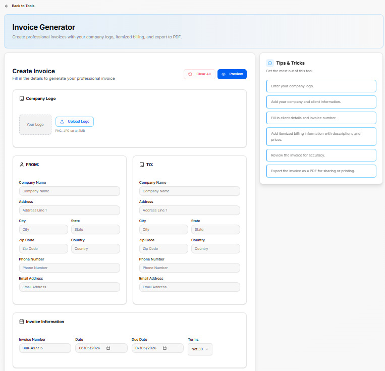
The Invoice Generator is a tool built to create professional invoices equipped with custom logo integration, itemized billing tracking, and direct PDF data export options. The interface is split across multiple configuration blocks to organize transaction records.
1. Header Controls & Visual Assets
The top workspace sets up the layout framework and global actions:
-
Action Bar: Features a pink Clear All button to reset all input forms alongside a blue Preview button to generate an invoice view.
-
Company Logo Upload: A dedicated image module supporting
PNGandJPGformats up to2MBallows users to drag or click Upload Logo to mount corporate branding.
2. Contact & Metadata Fields
The main body organizes administrative information into distinct sections:
-
FROM Panel: Collects your organization's data, including Company Name, Address, City, State, Zip Code, Country, Phone Number, and Email Address.
-
TO Panel: Collects the recipient's details using identical tracking fields (Company Name, Address, Contact details).
-
Invoice Information: Handles specific metadata parameters, displaying entry bars for Invoice Number, Date tracking, Due Date selection, and a dropdown menu to select structural payment Terms (defaulting to Net 30).
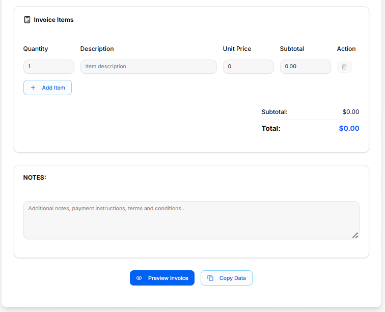
3. Itemized Billing & Notes Canvas
The calculation area manages deliverables and balances:
-
Invoice Items Table: An adjustable ledger to track specific deliverables with columns for Quantity, Description, Unit Price, and Subtotal, paired with an icon action to remove rows. Clicking + Add Item appends a blank billing line to the grid.
-
Financial Aggregates: Automatically displays summary rows tracking the calculated Subtotal and final Total amount due.
-
Notes Block: A rich text input field dedicated to appending custom payout descriptions, payment instructions, banking details, or legal terms and conditions.
The absolute bottom of the canvas features primary action keys to launch the Preview Invoice viewer or instantly execute a Copy Data clipboard command.
4. Workflow Guidelines
The tool includes a step-by-step checklist to format your export:
-
Enter your company logo.
-
Add your company and client information.
-
Fill in client details and the invoice number.
-
Add itemized billing information with descriptions and prices.
-
Review the invoice for accuracy.
-
Export the completed invoice as a PDF for direct sharing or printing.
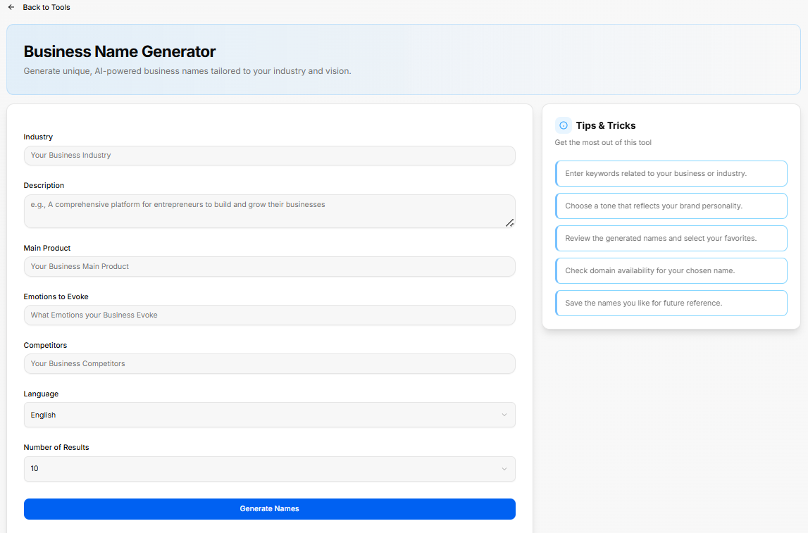
Business Name Generator
The Business Name Generator is an AI-powered platform utility designed to brainstorm and generate unique company naming options tailored directly to a specific industry, vision, and core offering.
1. Input Configuration Parameters
The setup canvas contains a series of detailed criteria blocks to guide the generation engine:
-
Industry: An entry field to specify your primary sector or business field.
-
Description: A multi-line text block to outline your company's core mission, operational framework, or a brief overview of how it functions.
-
Main Product: A dedicated line to call out the specific primary product, core application, or flagship service being brought to market.
-
Emotions to Evoke: A field to list the key feelings, cultural impressions, or psychological connections you want your business title to stir up.
-
Competitors: An input space to name existing brands or operational models in your niche to help the system avoid duplication and establish market contrast.
-
Language: A selection dropdown to dictate the output language (defaulting to English).
-
Number of Results: A configuration dropdown to set the exact size of the generated list (defaulting to 10 options).
The setup dashboard is anchored by a solid blue Generate Names action button to process your inputs.
2. Workflow Guidelines
The right-hand column outlines actionable recommendations to get the best out of the naming tool:
-
Enter keywords related specifically to your business or broader industry.
-
Choose a distinct tone that accurately reflects your brand personality.
-
Review the generated name list and select your favorites.
-
Check domain availability for your chosen name.
-
Save the names you like for future reference.
Logo Generator
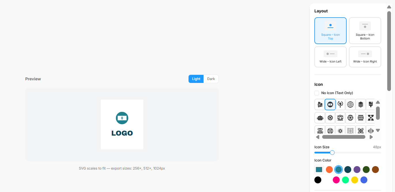
The Logo Generator is an interactive design workspace that lets you build, customize, and export clean vector-based logos. The interface provides a live canvas paired with granular controls over visual layouts, typography, backgrounds, and cohesive color palettes.
1. Main Canvas & Structural Layout
The core design arena structures how your visual assets sit together:
-
Live Preview Window: Displays your logo elements in real time. It features quick toggle keys at the top to check how your composition renders against a Light or Dark interface backdrop.
-
Output Specifications: The asset area generates scalable vector configurations, explicitly noting that the SVG scales to fit with standard package export sizes at $256\times$, $512\times$, and $1024\times$ pixels.
-
Layout Selection Grid: A configuration block that establishes the orientation between your graphics and copy. Available options include:
-
Square – Icon Top (Default selected template)
-
Square – Icon Bottom
-
Wide – Icon Left
-
Wide – Icon Right
-
2. Icon Customization
The graphic module adjustments let you select and style an accompanying emblem:
-
Icon Selection Matrix: A scrollable grid containing specialized graphic shapes, tech glyphs, and business symbols. It includes a No Icon (Text Only) checkbox if you prefer a typographic wordmark.
-
Icon Size: A sliding scale bar that fine-tunes graphic dimensions (defaulted to a standard
48px). -
Icon Color: A direct swatch panel allowing you to select an independent color theme for your active graphic emblem.
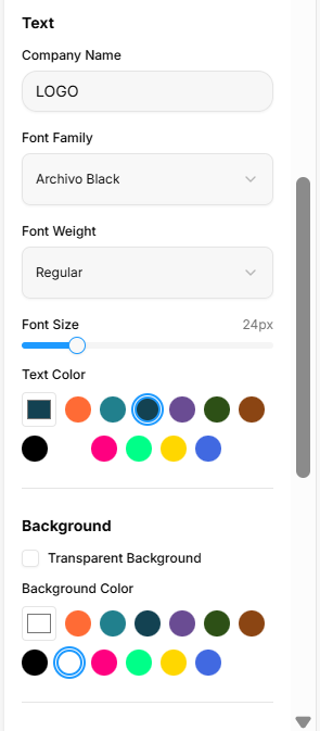
3. Typography & Background Settings
The customization panels unlock direct text and canvas editing:
-
Text Configurations:
-
Company Name: A text entry block where you input your literal brand name (defaulted to
LOGO). -
Font Family: A dropdown menu loaded with typography styles (such as Archivo Black).
-
Font Weight: A dropdown setting to pick typeface density (such as Regular).
-
Font Size: A fluid horizontal slider to scale text proportions (defaulted to
24px). -
Text Color: A circular swatch palette to instantly alter the wording hue.
-
-
Background Parameters: Features a Transparent Background option checkbox to clear out flat fills for overlay usage, paired with a separate Background Color selection grid to assign solid base backdrops.
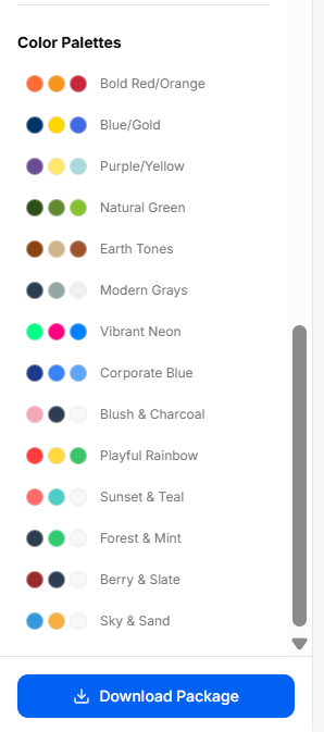
4. Curated Color Palettes & Global Export
The final configuration blocks coordinate unified aesthetic harmonies and handle project output:
-
Color Palettes Directory: A scrollable index of pre-packaged, three-tone color groupings designed to jumpstart balanced brand themes. Curated styling sets include options like Bold Red/Orange, Blue/Gold, Natural Green, Earth Tones, Modern Grays, and Corporate Blue.
-
Global Export Action: A prominent blue Download Package button anchors the bottom of the tool, packaging all necessary vector sizes and transparent layouts into a single download.
Word Cloud Generator
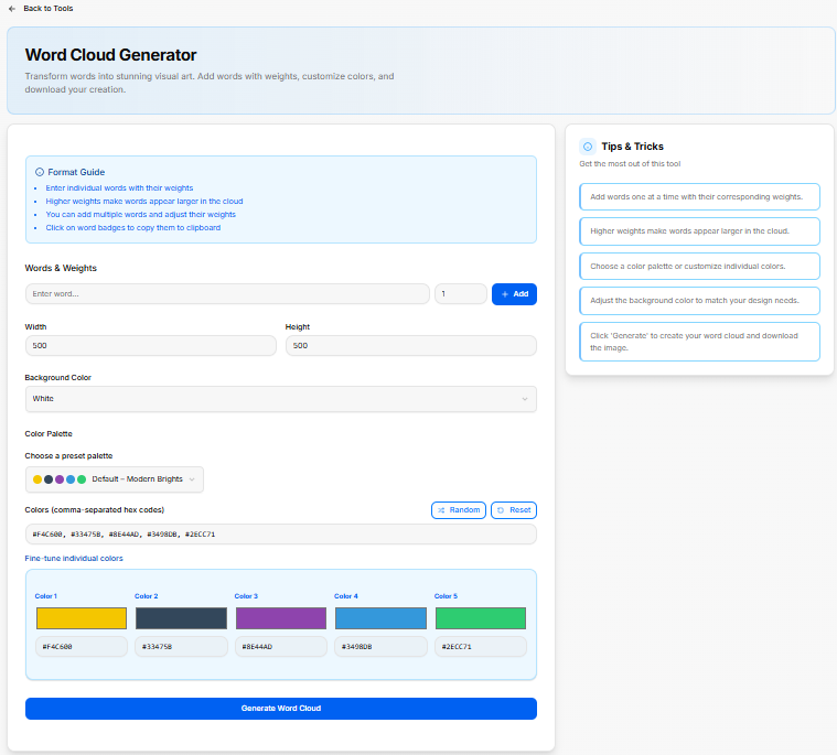
The Word Cloud Generator is a tool designed to transform text terms into custom visual graphics. It features granular configuration controls to weight individual words, modify workspace dimensions, and assign specific color profiles.
1. Interface Setup Guides
The generator includes structured instructions to help configure the text layouts smoothly:
-
Format Guide Summary:
-
Enter individual words paired with unique size weighting factors.
-
Assigning higher numerical values ensures those specific words appear larger in the cloud framework.
-
Add multiple distinct words sequentially and adjust their individual scale weight metrics.
-
Select active word badges within the workspace to instantly copy them to your clipboard.
-
2. Canvas and Content Configurations
The main control panel handles data input and canvas properties:
-
Words & Weights: A combined text field where you type your chosen word, followed by a numerical input slot (defaulted to
1) to set its prominence. Hitting the blue + Add button locks the term into the collection. -
Dimensions: Two numeric inputs for Width and Height scale the absolute size of your output graphic area (both defaulted to
500). -
Background Color: A dropdown menu to select the backdrop fill style for the graphic canvas (defaulted to White).
3. Color Palette Tools
The workspace lets you customize the visual presentation using preset schemes or individual hex values:
-
Choose a Preset Palette: A dropdown menu featuring ready-made theme combinations (such as Default – Modern Brights).
-
Hex Code Vector: A text block displaying raw, comma-separated hex codes for rapid pasting or extraction.
-
Palette Modifiers: A Random utility button shuffles color hex selections instantly, while a Reset button restores your starting color profile.
-
Fine-Tune Individual Colors: A color block area featuring individual swatch controls (Color 1 through Color 5) with clear text input boxes to adjust specific hex codes individually.
The absolute bottom of the layout features a primary blue Generate Word Cloud button to render and process the final asset.
4. Workflow Guidelines
A checklist highlights the steps to build your custom graphic:
-
Add words one at a time with their corresponding structural weights.
-
Assign higher weights to make important words appear larger in the cloud.
-
Choose an overall color palette or customize individual swatches.
-
Adjust the canvas background color to match your design requirements.
-
Click the execution button to create your custom word cloud and download the finalized image file.
Slogan Generator
The Slogan Generator is an AI-powered utility designed to create catchy, memorable taglines for a brand based on specified topics, operational themes, and customized tone settings.
1. Input Configuration Fields
The main setup console provides clear input fields to guide the copywriting engine:
-
Topic: A text entry field where you type in your specific core business topic, campaign theme, or company area.
-
Tone: A dropdown selection menu to establish the emotional delivery and brand personality of the output (defaulted to Clever).
-
How many?: A volume input field to dictate the exact number of variations to produce in a single run (defaulted to
5).
The module is anchored by a solid blue Generate Slogan button to execute the request and produce the list of taglines.
2. Workflow Guidelines
A built-in checklist outlines practical steps to refine brand copy:
-
Enter your brand name or a brief business description into the text area.
-
Select a tone setting that matches your established brand personality, choosing from profiles like professional, playful, or bold.
-
Click the execution button to create AI-powered taglines.
-
Review the generated list and pick your top favorites.
-
Regenerate the outputs or refine the input descriptions until you find the perfect match.
Color Palette Generator
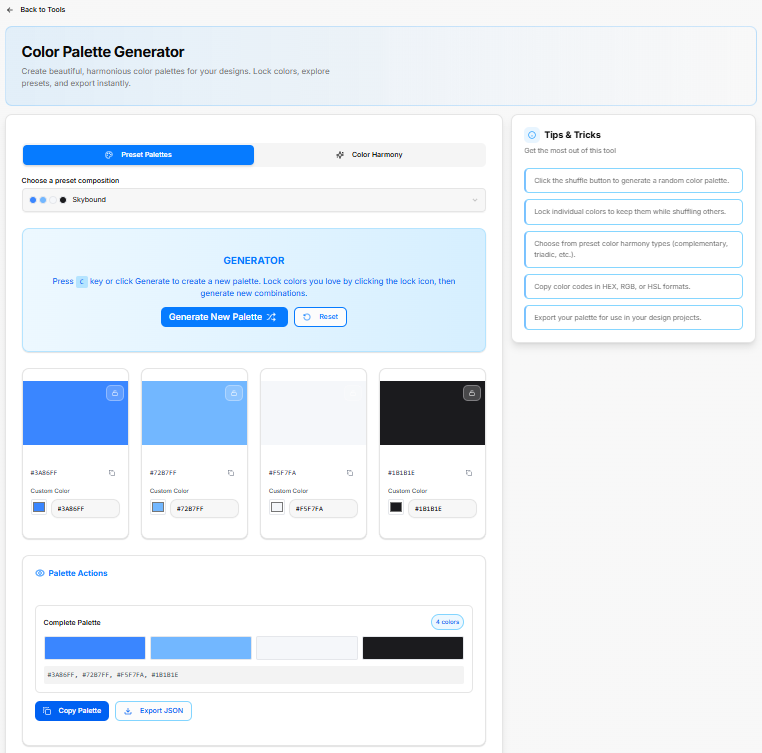
The Color Palette Generator is a platform utility built to assemble cohesive visual themes. It features tools to generate random color balances, lock specific favorites, choose structural color harmonies, and instantly export color schemes for digital products.
1. Composition Selection & Generation Modes
-
Preset Palettes: A tab configuration to browse pre-assembled color themes from a dedicated selection menu (such as the Skybound preset composition).
-
Color Harmony: A separate tab option built to establish arrangements based on formal design rules.
-
The Generator Canvas: A central control box providing keyboard and mouse shortcuts to rapidly cycle options. Pressing the
ckey or clicking the blue Generate New Palette button rolls a fresh combination. A Reset action button restores the canvas back to the baseline configurations.
2. Individual Color Customization Cards
The midsection displays an interactive matrix of columns representing each active shade in your palette. Each card includes independent management controls:
-
Lock Utility: A lock icon badge positioned at the top right of each color block allows you to freeze individual colors, preserving them while shuffling and randomizing the remaining columns.
-
Hex Copy Button: A quick-copy icon lets you copy a single specific hex code to your clipboard instantly.
-
Custom Color Input: A text input box displaying the exact hex value (such as
#3A86FF,#72B7FF,#F5F7FA, or#1B1B1E) paired with a live color-picker box, enabling you to fine-tune shades precisely.
3. Palette Actions & Global Export Options
The lower workspace consolidates the individual shades into a unified design scheme:
-
Complete Palette Tracker: Groups the visual blocks into a continuous ribbon, displaying a notification badge indicating the layout scale (such as 4 colors).
-
Hex Vector Bar: A text block displaying a comma-separated list of all active color values for high-level copying or pasting.
-
Export Functions: Anchored by two primary export keys: a blue Copy Palette action button to save the entire string sequence, alongside an Export JSON option to format the data block for engineering integration.
4. Workflow Guidelines
A reference list outlines operational best practices to build balanced interfaces:
-
Click the shuffle button to generate a random color palette.
-
Lock individual colors to keep them safe while shuffling others.
-
Choose from preset color harmony types like complementary or triadic schemas.
-
Copy color codes directly in HEX, RGB, or HSL formats based on your project needs.
-
Export your palette for use in your active design projects.
Settings
Settings

The Settings option serves as the main entry point for managing your entire account and platform configuration.
-
Function: Clicking this item opens up the central administrative hub of the application.
-
Purpose: It allows you to access and modify your personal profile details, look over your active subscription, adjust team permissions, change layout languages, and update security credentials like your password.
Profile & Settings
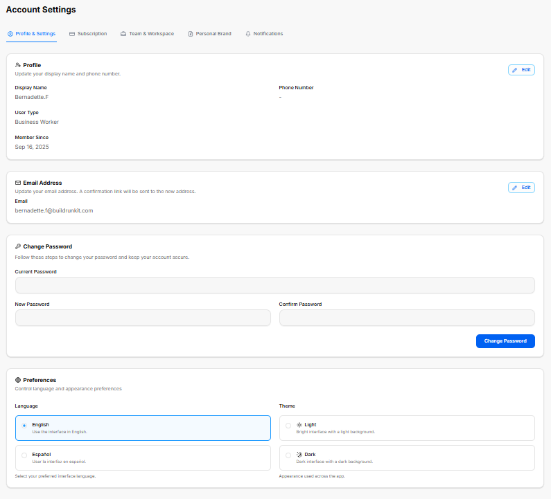
The Profile & Settings workspace is the primary tab within the global Account Settings dashboard. It consolidates personal identity details, contact information, authentication security fields, and universal layout preferences into an organized interface.
1. Account Navigation Framework
The main workspace header provides top-level tab links to access alternative configuration dashboards:
-
Profile & Settings: The default view for user identity and workspace customization.
-
Subscription: Manages billing, platform tiers, and payment options.
-
Team & Workspace: Coordinates organizational permissions, collaborator access, and team roles.
-
Personal Brand: Manages custom branding visual assets and identity configurations.
-
Notifications: Configures system alerts, email updates, and messaging parameters.
2. Profile Identity Management
The Profile block tracks basic identification and user classification data:
-
Display Name: Sets the visible name across the platform.
-
User Type: Displays your assigned system operational tier.
-
Member Since: Records the exact creation date of the account.
-
Phone Number: Displays the linked mobile or direct contact number.
-
Edit Control: A dedicated Edit action button opens an override panel to update display credentials and contact numbers.
3. Contact Security
The Email Address block handles communication routing and updates:
-
Email Field: Displays the active corporate electronic mail address linked to the profile.
-
Verification Note: Advises that changing this address triggers an automated confirmation security link to the newly requested location.
-
Edit Control: A dedicated Edit button toggles input capabilities for this field.
4. Password Authentication
The Change Password section handles credential security updates and account protection:
-
Current Password: A full-width input block where you type your active password to verify identity.
-
New Password: A secure data entry bar where you input your fresh passphrase combination.
-
Confirm Password: A secondary verification entry block to match and confirm the new string entry exactly.
-
Execution Key: A solid blue Change Password action button processes and locks in the update.
5. System Preferences
The Preferences workspace controls the language framework and visual appearance settings:
-
Language Options: Large toggle blocks change the system translation output:
-
English: Configures the user interface to use English strings.
-
Español: Configures the user interface to use Spanish translations.
-
-
Theme Options: Direct selection cards switch the application backdrop profile:
-
Light: Enforces a bright background interface.
-
Dark: Transitions the app layout to a dark background interface.
-
Subscription Settings
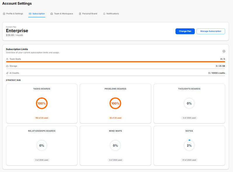
The Subscription dashboard lets you track active membership tiers, monitor data resource usage caps, and purchase modular resource upgrades.
1. Plan Overview
The top workspace displays structural tier statuses and direct subscription controls:
-
Current Plan: Shows your active membership level, price, and billing cycle.
-
Change Plan: A blue action button to transition to a completely different tier.
-
Manage Subscription: A secondary button to modify billing methods or update payment profiles.
2. Subscription Limits & Allocation Meters
This panel charts real-time usage metrics against your plan parameters to track overages or open capacity:
-
Global Account Seats & Resources:
-
Team Seats: Track allocated user slots against plan allowances.
-
Storage: Monitors active media, file, and asset storage allocations.
-
AI Credits: Displays available generation allowances used by automated modules.
-
-
Core Modules Tracker:
-
Tasks Boards: Measures layout parameters and active task counts.
-
Problems Boards: Monitors active problem-tracking logs.
-
Thoughts Boards: Measures dedicated long-form brainstorming inputs.
-
Relationships Boards: Tracks customer profiles or network directories.
-
Mind Maps: Counts active organizational layouts.
-
Notes: Tracks basic scratchpads and text documents.
-
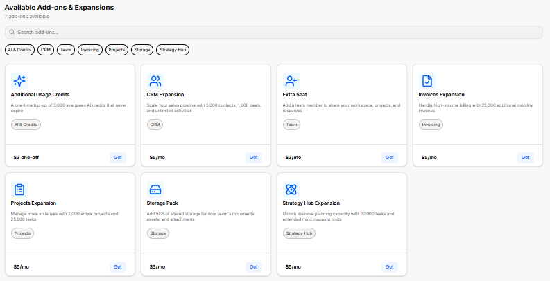
3. Available Add-ons & Expansions
A modular store lets you expand specific capacity allocations without upgrading your entire core plan tier. It includes a search filter bar alongside category tags to quickly isolate upgrades:
-
Additional Usage Credits: Provides a one-time purchase top-up for evergreen AI credits that do not expire.
-
CRM Expansion: Scales sales pipelines by adding contacts, deals, and activities.
-
Extra Seat: Appends a team member slot to share workspace projects and assets.
-
Invoices Expansion: Raises monthly billing limits for high-volume invoice generation.
-
Projects Expansion: Increases your maximum allowed active projects and tasks.
-
Storage Pack: Adds blocks of shared cloud storage for team documentation and attachments.
-
Strategy Hub Expansion: Unlocks extra planning capacity for tasks and extended mind-mapping elements.
Team & Workspace Settings
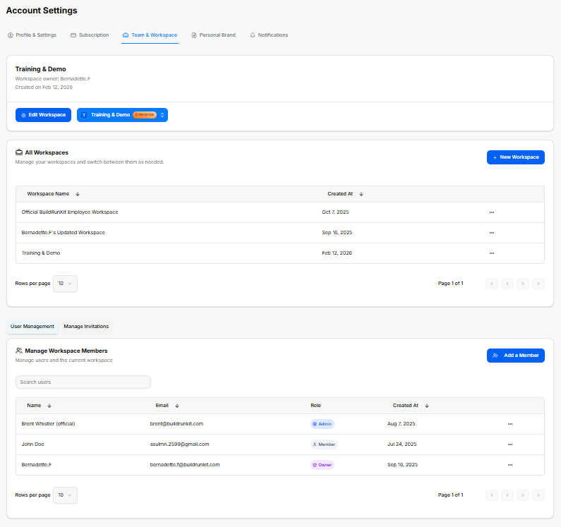
The Team & Workspace dashboard allows you to organize multiple operational environments, manage collaborator permissions, and control user access across your organization.
1. Active Workspace Summary
The top section highlights details for the workspace you are currently modifying:
-
Workspace Identity: Displays the current workspace name, its designated owner, and the exact creation date.
-
Workspace Controls:
-
Edit Workspace: A blue action button to update the active workspace's configuration or change its main settings.
-
Workspace Selector Switcher: A dropdown button labeled with your active plan tier that lets you swap or pivot between active accounts.
-
2. All Workspaces Directory
A master data table structures all environments tied to your profile, allowing you to manage environments and switch between them as needed:
-
Workspace Creation: A blue + New Workspace button allows you to instantly spin up a separate operational environment.
-
Workspace Ledger: Tracks all created environments with dedicated columns for Workspace Name and Created At timestamp records, complete with a settings icon menu for individual row actions.
3. Member Management Hub
The bottom management suite coordinates access controls and is split into two administrative tabs: User Management and Manage Invitations. Under the active User Management view, you can configure users and the current workspace:
-
Add a Member: A blue button to invite new collaborators directly into the workspace.
-
Search Box: A filter bar to quickly search users by name or credential.
-
Manage Workspace Members Table: A detailed directory tracking all active team members using four descriptive data columns:
-
Name: Displays the user's name.
-
Email: Lists the direct communication address linked to their seat.
-
Role: Displays designated permission levels using colored badges (such as Admin, Member, or Owner).
-
Created At: Logs the exact historical date the user was added to the platform.
-
Personal Brand Settings
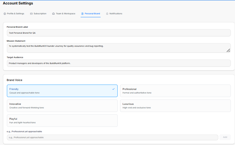
The Personal Brand settings dashboard is a comprehensive workspace divided across two view areas to configure your unique professional identity framework. These parameters feed direct context to the platform's AI generation engines.
1. Core Identity & Formatting Fields
The upper console segment manages the foundational details of your professional persona:
-
Personal Brand Label: A clear text entry box to input an internal identification name for the specific profile.
-
Mission Statement: A multi-line text block designed to frame your core operational focus, long-term targets, or business purpose.
-
Target Audience: A baseline input line to specify the exact consumer demographics, professionals, or market sectors your content aims to reach.
2. Brand Voice Profiles
The system lets you select the exact tonal delivery for your platform outputs using distinct selectable cards or completely custom entries:
-
Friendly: A casual and approachable style.
-
Professional: A formal and authoritative communication style.
-
Innovative: A creative and forward-thinking perspective.
-
Luxurious: A high-end, highly premium, and exclusive tone.
-
Playful: A fun, dynamic, and light-hearted tone.
-
Custom Selection: An extension line at the base to type in unique, specific stylistic traits (e.g., Professional yet approachable) and register them with the Add key.
3. Professional Foundation Pillars
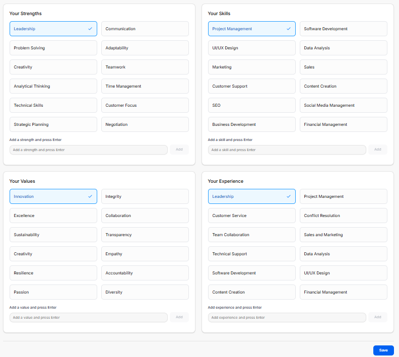
The lower portion of the setup space is organized into a interactive four-quadrant selection grid to map out your skillsets and professional philosophy:
-
Your Strengths: High-level individual traits and core soft skills. Selectable tags include options like Leadership, Problem Solving, Creativity, Analytical Thinking, Technical Skills, Strategic Planning, Communication, Adaptability, Teamwork, Time Management, Customer Focus, and Negotiation.
-
Your Skills: Direct execution capabilities and industrial focus areas. Selectable options include Project Management, UI/UX Design, Marketing, Customer Support, SEO, Business Development, Software Development, Data Analysis, Sales, Content Creation, Social Media Management, and Financial Management.
-
Your Values: Underlying corporate standards and driving execution principles. Preset toggles include Innovation, Excellence, Sustainability, Creativity, Resilience, Passion, Integrity, Collaboration, Transparency, Empathy, Accountability, and Diversity.
-
Your Experience: Key professional environments and functional roles you have operated within. Quick tags list Leadership, Customer Service, Team Collaboration, Technical Support, Software Development, Content Creation, Project Management, Conflict Resolution, Sales and Marketing, Data Analysis, UI/UX Design, and Financial Management.
Each of the four quadrants includes an internal generation field at its baseline where you can type an unlisted trait, press your enter key, or click Add to expand your profile matrix.
4. Committing Changes
-
Global Save: Once you have selected your voice traits and structured your background vectors across both segments, clicking the solid blue Save action button in the bottom-right corner locks the dataset into your profile.
Notifications Settings
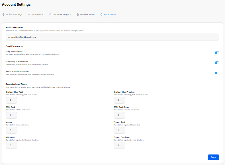
The Notifications dashboard lets you manage where you receive system alerts, toggle specific email delivery preferences, and customize automated reminder timelines for deadlines.
1. Notification Routing
-
Notification Email: A centralized text entry field that designates where your platform updates are sent. By default, the system routes notifications directly to your registered account email, but it can be manually overridden here.
2. Email Preferences
A suite of master toggle switches allows you to opt into or out of specific communication streams:
-
Daily Email Digest: Toggles a single, consolidated daily email summarizing your unread platform notifications.
-
Marketing & Promotions: Controls the delivery of general newsletters, special campaign offers, and seasonal promotional content.
-
Feature Announcements: Manages alerts regarding new software modules, immediate product updates, and continuous platform improvements.
3. Reminder Lead Times
This section lets you configure exactly how many days in advance you want to be system-notified before a specific item type hits its official due date:
-
Strategy Hub Task: Adjusts the advance notice window before a strategy hub task is due.
-
Strategy Hub Problem: Configures the advance warning buffer before an active strategy hub problem reaches its due date.
-
CRM Task: Sets the number of warning days leading up to an assigned CRM task deadline.
-
CRM Deal Close: Coordinates advance notification lead times before a specific customer deal's target close date.
-
Invoice: Establishes the advance warning period prior to an invoice falling due.
-
Project Task: Restructures the day buffer leading up to an assigned project task deadline.
-
Milestone: Dictates the long-term warning buffer sent before an overarching project milestone deadline arrives.
-
Project Due Date: Sets the general reminder lead time before a project's absolute final completion deadline.
Once all alert preferences and calendar day buffers are updated, clicking the solid blue Save action button in the lower right-hand corner commits the rules to your profile.
Feedback, Help & Support Navigation
Feedback, Help & Support Navigation

The bottom section of the primary application sidebar menu manages direct user input channels, technical support ticketing, and educational platform resources.
Navigation Utilities Overview
The two bottom items on the sidebar provide straightforward gateways to assist with operational questions or platform evaluations:
-
Feedback: Clicking this option opens an interactive portal designed for submitting tool feature suggestions, performance reviews, or specific software optimization requests.
-
Help & Support: Selecting this final option launches the platform’s customer service hub, providing immediate access to technical troubleshooting articles, user documentation, and live support resources.
Give Us Feedback
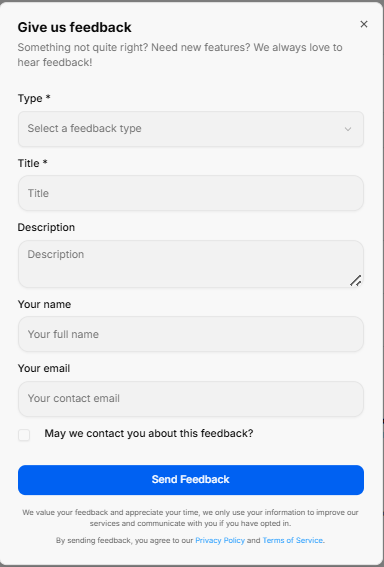
The Give us feedback portal opens as a dedicated pop-up modal designed to collect user input, feature requests, and system evaluations directly.
1. Feedback Input Fields
The submission form contains structured fields to accurately categorize and detail user input:
-
Type: A required dropdown menu to select the specific category of input, such as choosing a feature idea.
-
Title: A required text field to provide a brief, high-level summary of your input.
-
Description: A multi-line text area to expand on your idea, issue, or enhancement request with full context.
-
Your name: An optional text block to enter your full identification name.
-
Your email: An optional field to input your primary contact email address for follow-up correspondence.
2. Permissions & Execution
-
Contact Permission: A checkbox labeled May we contact you about this feedback? allows you to opt into direct follow-up communications regarding your submission.
-
Send Feedback: A solid blue action button centered at the base to execute and submit the form data to the support team.
Support Center
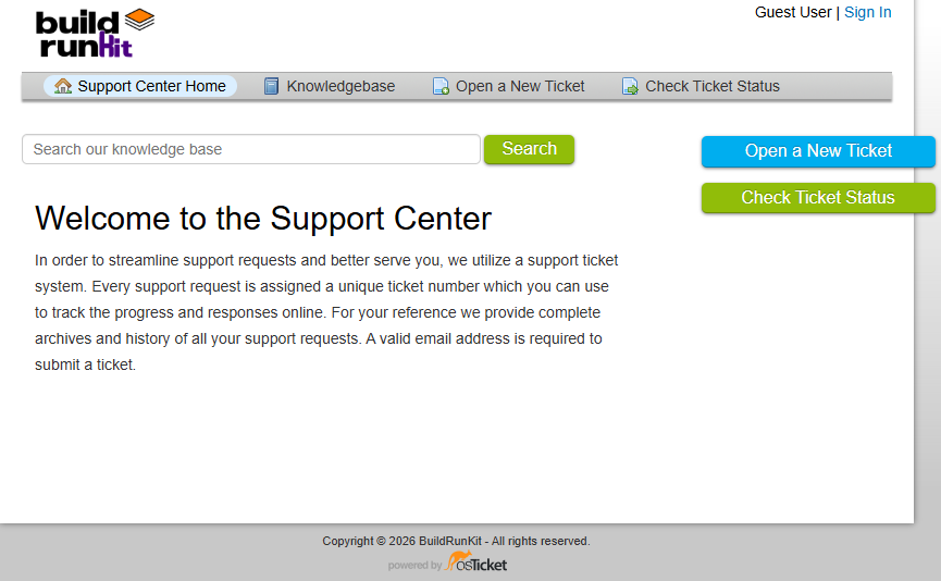
The Support Center is a dedicated external portal designed to streamline assistance requests and provide self-service documentation. It operates on a structured ticketing system to track, archive, and manage technical inquiries.
1. Main Navigation Header
The upper dashboard contains a persistent menu bar to jump between standard support desks:
-
Support Center Home: Navigates back to the main welcome dashboard landing page.
-
Knowledgebase: Opens a repository of self-service articles, setup documentation, and platform user guides.
-
Open a New Ticket: Toggles the submission form to file a new technical assistance request.
-
Check Ticket Status: Opens a login and tracking screen to check the history or updates of an active request.
-
Authentication Links: Located in the top right corner, allowing users to sign in or view their profile status.
2. Search Engine & Core Features
-
Knowledge Base Search: A prominent search bar sits beneath the header navigation. Users can type keywords, tools, or errors directly into the input line and click the green Search button to query documentation.
-
Ticketing System Overview: To maintain organization and response quality, every submitted request is instantly assigned a unique ticket number. This reference string allows you to review historical archives, monitor progress, and read technician responses online. A valid email address is mandatory to lodge a ticket.
3. Direct Action Sidebar
Two high-visibility action buttons are anchored on the right side of the layout for fast access:
-
Open a New Ticket: A bright blue tab providing an immediate shortcut to create a help request.
-
Check Ticket Status: A green tab offering a quick shortcut to log in and look over active ticket histories.